一.边框
1.边框圆角
border-radius
2.边框阴影
box-shadow
3.边框图片
border-inage-source:url("")
border-image-repeat:设置背景图的平铺方式,streth(拉伸)round(图片自动调整缩放比例)
border-image-slice裱框切割
border-image-outset边框向外边框背景图的扩展
border-image-width:边框背景图的厚度
二.浏览器私有化的前缀
-webkit:谷歌和苹果浏览器的私有化前缀
-moz:火狐浏览器私有化前缀
-o:表示Opera浏览器私有化前缀
-ms:表示IE浏览器私有化前缀
三.文本阴影
1.text-shadow
例:
Text-shadow:10px(水平偏移量) 20px(垂直的偏移量) 10px(模糊程度) 2px(阴影的大小) #fff(阴影的颜色)
2.多个阴影显示:
例:
Text-shadow:10px(水平偏移量)20px(垂直的偏移量)10px(模糊程度) 2px(阴影的大小) #fff(阴影的颜色),
10px(水平偏移量) 20px(垂直的偏移量) 10px(模糊程度) 2px(阴影的大小) #fff(阴影的颜色)
3.内阴影:Text-shadow:inset 10px(水平偏移量) 20px(垂直的偏移量) 10px(模糊程度) 2px(阴影的大小) #fff(阴影的颜色)
四.背景
1.背景图片background:url( ) no-repeat;//no-repeat,去除图片重复性//
2.background-size: 背景图片的大小尺寸
3.background-origin: 背景图片的起始点(border-box以边框为起始点;content-box默认值以内容为起始点;padding-box以内边距为起始点)
4.背景裁剪区域 background-clip:border-box/content-box
5.多背景
background:url() left top no-repeat,
url() right top no-repeat,
url() right bottom no-repeat,
url() left bottom no-repeat,
url() no-repeat center center;
五.渐变
1.线性渐变
background:linear-gradient(to left ,yellow ,green );
background: linear-gradient(90deg,yellow,green,red);//deg设置角度//
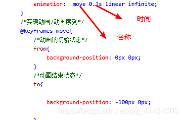
2.动画
3.径向渐变
background:radial-gradient();
例:
background: radial-gradient(at center,yellow,green);
background: radial-gradient(50px at left top,yellow,green);//at之前设置向外辐射的范围//
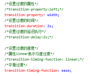
六.过渡
1.transition:param1 param2;
param1 要过渡的属性 param2要过渡的时间
例:transition: width 8s,height 3s;
2.transition: all 2s;(all表示该元素的所有属性)
3.分开写: