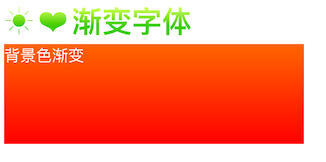
预览效果 :
<style>
 .type i{
			background: -webkit-linear-gradient(-90deg, #caff55 20%, #45cd00 60%); /*背景渐变色*/
			-webkit-background-clip: text;  /* 规定背景的绘制区域为文字区域*/
			-webkit-text-fill-color: transparent; /* 文字填充颜色(这里一定要设置 transparent,不然会覆盖底部的背景色)*/
			font-style: normal;
			font-size:30px;
			font-weight:bold;
		}

.box{
	width:300px;
	height:100px;
	color:#fff;
	background: -webkit-linear-gradient(-90deg, #ff6600 0%, #ff0000 100%);
	background: -moz-linear-gradient(-90deg, #ff6600 0%, #ff0000 100%);
	background: -o-linear-gradient(-90deg, #ff6600 0%, #ff0000 100%);
	background: -ms-linear-gradient(-90deg, #ff6600 0%, #ff0000 100%);
	background: linear-gradient(-90deg, #ff6600 0%, #ff0000 100%);
}

</style>

<div class="type">
	<i class="iconfont icon-remen fs26">☀</i>
	<i class="iconfont icon-remen fs26">❤</i>
	<i class="iconfont icon-remen fs26">渐变字体</i>
</div>

<div class="box"> 背景色渐变</div>