JS 自学笔记05
下面的注释的代码,自己试一试噶,举例的话太不方便了,
实验时请把上一个的效果代码注释,
<!DOCTYPE html>
<html lang="zh">
<head>
	<meta charset="UTF-8" />
	<meta name="viewport" content="width=device-width, initial-scale=1.0" />
	<meta http-equiv="X-UA-Compatible" content="ie=edge" />
	<title>Document</title>
	<style type="text/css">
		.div-1{
			width: 500px;
			height: 500px;
			border: 1px solid black;
			display: flex;            /*flex弹性盒子属性*/

			/*flex-direction: column;   /*纵向排列*/*/
	/*flex-direction: 参数如下
	row 默认值。灵活的项目将水平显示,正如一个行一样。 尝试一下 »
	row-reverse 与 row 相同,但是以相反的顺序。 尝试一下 »
	column 灵活的项目将垂直显示,正如一个列一样。 尝试一下 »
	column-reverse 与 column 相同,但是以相反的顺序。 尝试一下 »
	initial 设置该属性为它的默认值。请参阅 initial。 尝试一下 »
	inherit 从父元素继承该属性。请参阅 inherit;
	注意:如果元素不是弹性盒对象的元素,则 flex-direction 属性不起作用 */

			/*justify-content: space-between;  纵轴排列属性--两端对齐*/
			justify-content: center;
			/*justify-content: space-around;*/
	/*justify-content:参数有以下
	flex-start 默认值。项目位于容器的开头。
	flex-end 项目位于容器的结尾。
	center 项目位于容器的中心。
	space-between 项目位于各行之间留有空白的容器内。
	space-around 项目位于各行之前、之间、之后都留有空白的容器内。
	initial 设置该属性为它的默认值。请参阅 initial。
	inherit 从父元素继承该属性。请参阅 inherit。 */

			/*align-items: center;*/
	/*align-items 属性定义flex子项在flex容器的当前行的侧轴(纵轴)方向上的对齐方式。*/
	/*stretch 默认值。元素被拉伸以适应容器。
	如果指定侧轴大小的属性值为'auto',则其值会使项目的边距盒的尺寸尽可能接近所在行的尺寸,但同时会遵照'min/max-width/height'属性的限制。
	center 元素位于容器的中心。
	弹性盒子元素在该行的侧轴(纵轴)上居中放置。(如果该行的尺寸小于弹性盒子元素的尺寸,则会向两个方向溢出相同的长度)。
	flex-start 元素位于容器的开头。
	弹性盒子元素的侧轴(纵轴)起始位置的边界紧靠住该行的侧轴起始边界。
 	flex-end 元素位于容器的结尾。
	弹性盒子元素的侧轴(纵轴)起始位置的边界紧靠住该行的侧轴结束边界。
	baseline 元素位于容器的基线上。
	如弹性盒子元素的行内轴与侧轴为同一条,则该值与'flex-start'等效。其它情况下,该值将参与基线对齐。
	initial 设置该属性为它的默认值。请参阅 initial。 测试 »
	inherit 从父元素继承该属性。请参阅 inherit。 */

			flex-wrap: wrap;   /*进行一个换行*/
			align-content:flex-start;
	/*align-content 属性在弹性容器内的各项没有占用交叉轴上所有可用的空间时对齐容器内的各项(垂直)。
	/*stretch 默认值。元素被拉伸以适应容器。
	各行将会伸展以占用剩余的空间。如果剩余的空间是负数,该值等效于'flex-start'。在其它情况下,剩余空间被所有行平分,以扩大它们的侧轴尺寸。
	center 元素位于容器的中心。
	各行向弹性盒容器的中间位置堆叠。各行两两紧靠住同时在弹性盒容器中居中对齐,
	保持弹性盒容器的侧轴起始内容边界和第一行之间的距离与该容器的侧轴结束内容边界与第最后一行之间的距离相等。
	(如果剩下的空间是负数,则各行会向两个方向溢出的相等距离。)
	flex-start 元素位于容器的开头。
	各行向弹性盒容器的起始位置堆叠。弹性盒容器中第一行的侧轴起始边界紧靠住该弹性盒容器的侧轴起始边界,之后的每一行都紧靠住前面一行。
	flex-end 元素位于容器的结尾。
	各行向弹性盒容器的结束位置堆叠。弹性盒容器中最后一行的侧轴起结束界紧靠住该弹性盒容器的侧轴结束边界,之后的每一行都紧靠住前面一行。
	space-between 元素位于各行之间留有空白的容器内
	各行在弹性盒容器中平均分布。如果剩余的空间是负数或弹性盒容器中只有一行,该值等效于'flex-start'。
	在其它情况下,第一行的侧轴起始边界紧靠住弹性盒容器的侧轴起始内容边界,最后一行的侧轴结束边界紧靠住弹性盒容器的侧轴结束内容边界,
	剩余的行则按一定方式在弹性盒窗口中排列,以保持两两之间的空间相等。
	space-around 元素位于各行之前、之间、之后都留有空白的容器内。
	各行在弹性盒容器中平均分布,两端保留子元素与子元素之间间距大小的一半。如果剩余的空间是负数或弹性盒容器中只有一行,
	该值等效于'center'。在其它情况下,各行会按一定方式在弹性盒容器中排列,以保持两两之间的空间相等,同时第一行前面及最后一行后面的空间是其他空间的一半。*/


		}
		.div-2{
			width: 100px;
			height: 100px;
			background: red;

		}
		.div-3{
			width: 100px;
			height: 100px;
			background: blue;
		}
		.div-4{
			width: 100px;
			height: 100px;
			background: yellow;
		}
		.div-5{
			width: 100px;
			height: 100px;
			background: salmon;
		}
		.div-6{
			width: 100px;
			height: 100px;
			background: skyblue;
		}
		.div-7{
			width: 100px;
			height: 100px;
			background: steelblue;
		}
	</style>
</head>
<body>
	<div class="div-1">
		<div class="div-2">2</div>
		<div class="div-3">3</div>
		<div class="div-4">4</div>
		<div class="div-5">5</div>
		<div class="div-6">6</div>
		<div class="div-7">7</div>
	</div>
</body>
</html>
<!--
<!DOCTYPE html>
<html lang="zh">
<head>
	<meta charset="UTF-8" />
	<meta name="viewport" content="width=device-width, initial-scale=1.0" />
	<meta http-equiv="X-UA-Compatible" content="ie=edge" />
	<title>Document</title>
	<style type="text/css">
		.div-a1{
			width: 500px;
			height: 500px;
			border: 1px solid black;
			display: flex;            /*flex弹性盒子属性*/
		}
		.div-a4{
			width: 100px;
			height: 100px;
			background: yellow;

			/*position: absolute;
			order: 1;*/
			/*前提要先进行定位 order 的值越小,越先展示,而z-index值越大越先展示,*/
			/*order:单独使用时按照顺序进行排列*/

			flex-grow: 4;
			/*当最外面的盒子给的空间足够大时,里面的盒子宽度不足以占据最外层盒子的宽度时*/
			/*按照数值来放大盒子充满最外面的盒子*/

		}
		.div-a5{
			width: 100px;
			height: 100px;
			background: salmon;

			/*position: absolute;
			order: 2;*/

			flex-grow: 1;
		}
		.div-a6{
			width: 100px;
			height: 100px;
			background: skyblue;

			/*position: absolute;
			order: 3;*/

			flex-grow: 1;
		}
		.div-a7{
			width: 100px;
			height: 100px;
			background: steelblue;

			/*position: absolute;
			order: 4;*/

			flex-grow: 1;
		}
	</style>
</head>
<body>
	<div class="div-a1">
		<div class="div-a4">4</div>
		<div class="div-a5">5</div>
		<div class="div-a6">6</div>
		<div class="div-a7">7</div>
	</div>
</body>
</html>-->
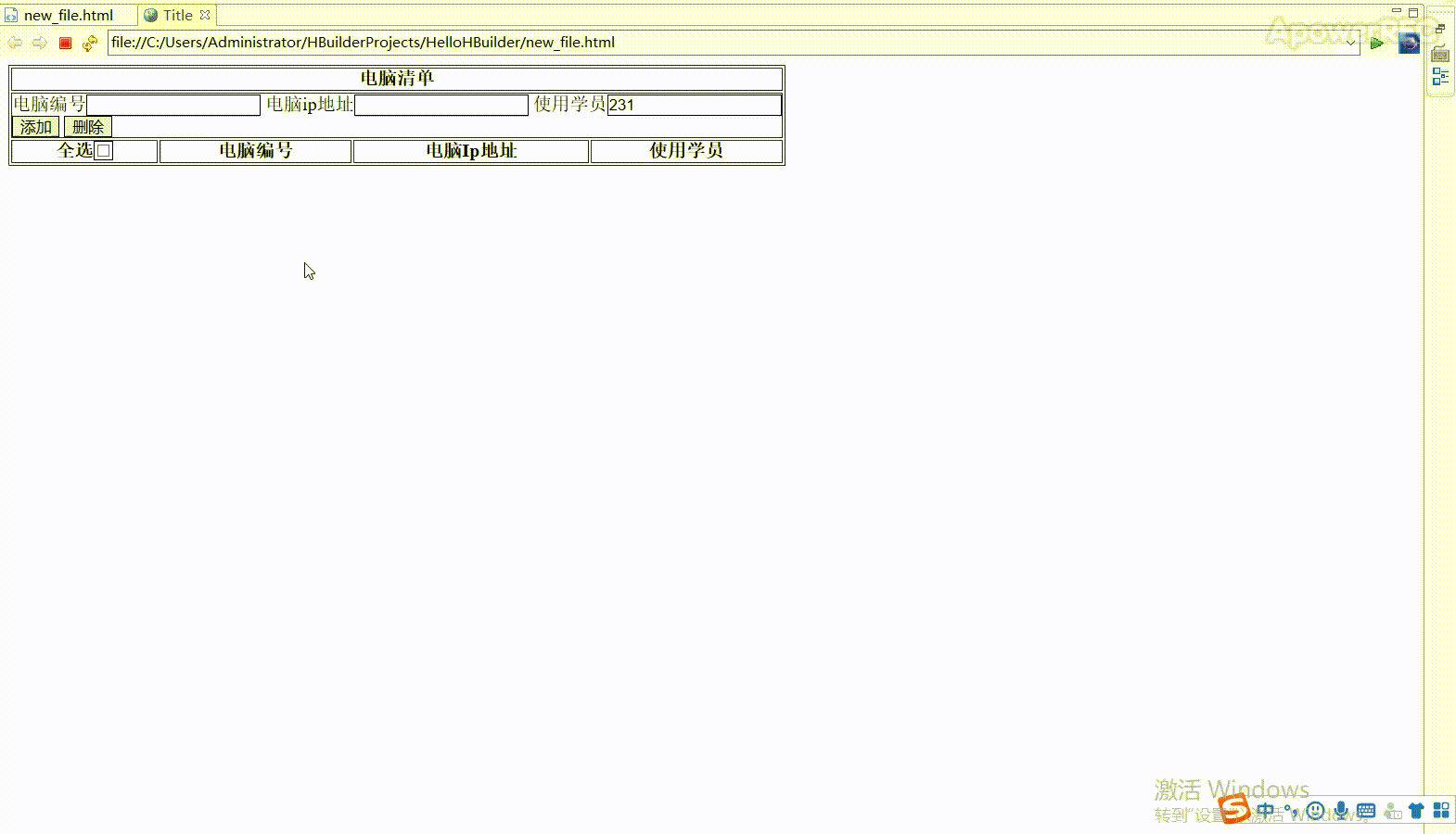
简单的信息录入表格练习
可添加删除,全选择,全删除,指定删除
其他需要自行添加
<!DOCTYPE html>
<html lang="en">
<head>
    <meta charset="UTF-8">
    <title>Title</title>
    <style>
        input {
            border: 1px solid;
        }

    </style>
    <script src="http://libs.baidu.com/jquery/2.1.1/jquery.min.js" >
		</script>


</head>
<body>
<table border="1px solid" cellpadding="0">
    <thead align="center">
    <tr>
        <th colspan="4">瑞峰电脑清单</th>
    </tr>
    </thead>
    <tbody id="tb">
    <tr>
        <td colspan="4">
            <form>
                <label for="num">电脑编号</label><input type="text" id="num">
                <label for="ip">电脑ip地址</label><input type="text" id="ip">
                <label for="student">使用学员</label><input type="text" id="student">
                <br>
                <input type="button" id="add" value="添加">
                <input type="button" id="delete" value="删除">
            </form>
        </td>
    </tr>
    <tr id="tr1">
        <th>
            <label for="s_all">全选</label><input id="s_all" type="checkbox">
        </th>
        <th>
            电脑编号
        </th>
        <th>
            电脑Ip地址
        </th>
        <th>
            使用学员
        </th>
    </tr>
    </tbody>
</table>
<script>
	$("#add").click(function(){
		var num = $("#num").val();
		var ip = $("#ip").val();
		var student = $("#student").val();
		if(num ===undefined || num === null || num === "" ){
			alert("请输入电脑编号");
			return false
		}
		if(ip ===undefined || ip === null || ip === "" ){
			alert("请输入id");
			return false
		}
		if(student ===undefined || student === null || student === "" ){
			alert("请输入学生");
			return false
		}
		$("#tb").append(
			"<tr class='normal' style='text-align: center;'>"+
			"<td><label>选择</label><input type='checkbox' class='td_check'/></td>"+
			"<td>"+num+"</td>"+
			"<td>"+ip+"</td>"+
			"<td>"+student+"</td>"+
			"</tr>"
		);
	});

	$("#s_all").click(function(){
		if($("#s_all").prop("checked") === true){
			$(".td_check").prop("checked",true);
		}else{
			$(".td_check").prop("checked",false);
		}
	});

	$("#delete").click(function(){
		$(".normal :checked").parent().parent().remove();
	})


</script>
</body>
</html>