在gridCSS属性速记属性显式设置所有的网格性质(grid-template-rows,grid-template-columns,和grid-template-areas和所有的网格性质(隐式grid-auto-rows,grid-auto-columns,和grid-auto-flow),在一个单独的宣言。
例如:
语法:
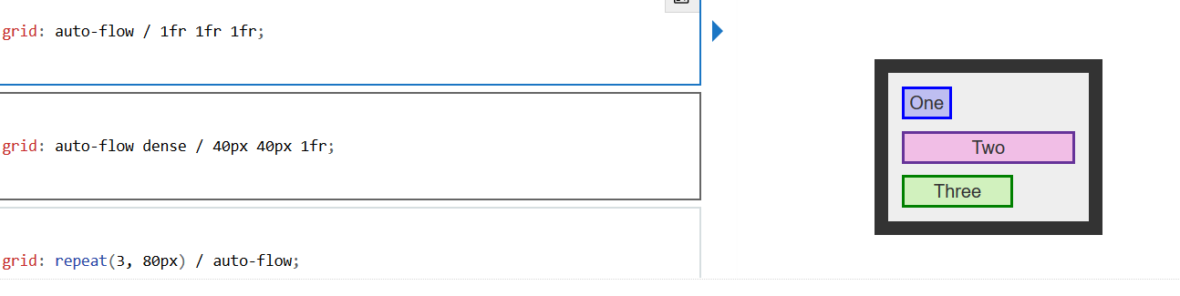
/* <'grid-template'> values */ grid: none; grid: "a" 100px "b" 1fr; grid: [linename1] "a" 100px [linename2]; grid: "a" 200px "b" min-content; grid: "a" minmax(100px, max-content) "b" 20%; grid: 100px / 200px; grid: minmax(400px, min-content) / repeat(auto-fill, 50px); /* <'grid-template-rows'> / [ auto-flow && dense? ] <'grid-auto-columns'>? values */ grid: 200px / auto-flow; grid: 30% / auto-flow dense; grid: repeat(3, [line1 line2 line3] 200px) / auto-flow 300px; grid: [line1] minmax(20em, max-content) / auto-flow dense 40%; /* [ auto-flow && dense? ] <'grid-auto-rows'>? / <'grid-template-columns'> values */ grid: auto-flow / 200px; grid: auto-flow dense / 30%; grid: auto-flow 300px / repeat(3, [line1 line2 line3] 200px); grid: auto-flow dense 40% / [line1] minmax(20em, max-content); /* Global values */ grid: inherit; grid: initial; grid: unset;
例子:
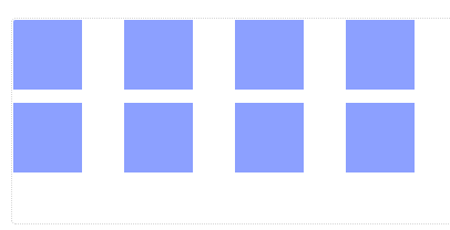
HTML语句:
<div id="container"> <div></div> <div></div> <div></div> <div></div> <div></div> <div></div> <div></div> <div></div> </div>
CSS 语句:
#container {
  display: grid;
  grid: repeat(2, 60px) / auto-flow 80px; } #container > div { background-color: #8ca0ff; width: 50px; height: 50px; }
界面演示结果: