版权声明:本文为博主原创文章,未经博主允许不得转载。 https://blog.csdn.net/wangxingfan316/article/details/81158165
R有shiny,应该是非常好用的,python像shiny的交互可视化的库不多,dash其中之一,简单实用,但整体似乎还不如shiny。
1安装
pip install dash

pip install dash-renderer

pip install dash-html-components

pip install dash-core-components
2官方实例
#!/user/bin/env python
#-*- coding:utf-8 -*-
import dash
import dash_core_components as dcc
import dash_html_components as html
import pandas as pd
import plotly.graph_objs as go
app = dash.Dash()
df = pd.read_csv(
'https://gist.githubusercontent.com/chriddyp/'
'cb5392c35661370d95f300086accea51/raw/'
'8e0768211f6b747c0db42a9ce9a0937dafcbd8b2/'
'indicators.csv')
available_indicators = df['Indicator Name'].unique()
app.layout = html.Div([
html.Div([
html.Div([
dcc.Dropdown(
id='crossfilter-xaxis-column',
options=[{'label': i, 'value': i} for i in available_indicators],
value='Fertility rate, total (births per woman)'
),
dcc.RadioItems(
id='crossfilter-xaxis-type',
options=[{'label': i, 'value': i} for i in ['Linear', 'Log']],
value='Linear',
labelStyle={'display': 'inline-block'}
)
],
style={'width': '49%', 'display': 'inline-block'}),
html.Div([
dcc.Dropdown(
id='crossfilter-yaxis-column',
options=[{'label': i, 'value': i} for i in available_indicators],
value='Life expectancy at birth, total (years)'
),
dcc.RadioItems(
id='crossfilter-yaxis-type',
options=[{'label': i, 'value': i} for i in ['Linear', 'Log']],
value='Linear',
labelStyle={'display': 'inline-block'}
)
], style={'width': '49%', 'float': 'right', 'display': 'inline-block'})
], style={
'borderBottom': 'thin lightgrey solid',
'backgroundColor': 'rgb(250, 250, 250)',
'padding': '10px 5px'
}),
html.Div([
dcc.Graph(
id='crossfilter-indicator-scatter',
hoverData={'points': [{'customdata': 'Japan'}]}
)
], style={'width': '49%', 'display': 'inline-block', 'padding': '0 20'}),
html.Div([
dcc.Graph(id='x-time-series'),
dcc.Graph(id='y-time-series'),
], style={'display': 'inline-block', 'width': '49%'}),
html.Div(dcc.Slider(
id='crossfilter-year--slider',
min=df['Year'].min(),
max=df['Year'].max(),
value=df['Year'].max(),
step=None,
marks={str(year): str(year) for year in df['Year'].unique()}
), style={'width': '49%', 'padding': '0px 20px 20px 20px'})
])
@app.callback(
dash.dependencies.Output('crossfilter-indicator-scatter', 'figure'),
[dash.dependencies.Input('crossfilter-xaxis-column', 'value'),
dash.dependencies.Input('crossfilter-yaxis-column', 'value'),
dash.dependencies.Input('crossfilter-xaxis-type', 'value'),
dash.dependencies.Input('crossfilter-yaxis-type', 'value'),
dash.dependencies.Input('crossfilter-year--slider', 'value')])
def update_graph(xaxis_column_name, yaxis_column_name,
xaxis_type, yaxis_type,
year_value):
dff = df[df['Year'] == year_value]
return {
'data': [go.Scatter(
x=dff[dff['Indicator Name'] == xaxis_column_name]['Value'],
y=dff[dff['Indicator Name'] == yaxis_column_name]['Value'],
text=dff[dff['Indicator Name'] == yaxis_column_name]['Country Name'],
customdata=dff[dff['Indicator Name'] == yaxis_column_name]['Country Name'],
mode='markers',
marker={
'size': 15,
'opacity': 0.5,
'line': {'width': 0.5, 'color': 'white'}
}
)],
'layout': go.Layout(
xaxis={
'title': xaxis_column_name,
'type': 'linear' if xaxis_type == 'Linear' else 'log'
},
yaxis={
'title': yaxis_column_name,
'type': 'linear' if yaxis_type == 'Linear' else 'log'
},
margin={'l': 40, 'b': 30, 't': 10, 'r': 0},
height=450,
hovermode='closest'
)
}
def create_time_series(dff, axis_type, title):
return {
'data': [go.Scatter(
x=dff['Year'],
y=dff['Value'],
mode='lines+markers'
)],
'layout': {
'height': 225,
'margin': {'l': 20, 'b': 30, 'r': 10, 't': 10},
'annotations': [{
'x': 0, 'y': 0.85, 'xanchor': 'left', 'yanchor': 'bottom',
'xref': 'paper', 'yref': 'paper', 'showarrow': False,
'align': 'left', 'bgcolor': 'rgba(255, 255, 255, 0.5)',
'text': title
}],
'yaxis': {'type': 'linear' if axis_type == 'Linear' else 'log'},
'xaxis': {'showgrid': False}
}
}
@app.callback(
dash.dependencies.Output('x-time-series', 'figure'),
[dash.dependencies.Input('crossfilter-indicator-scatter', 'hoverData'),
dash.dependencies.Input('crossfilter-xaxis-column', 'value'),
dash.dependencies.Input('crossfilter-xaxis-type', 'value')])
def update_y_timeseries(hoverData, xaxis_column_name, axis_type):
country_name = hoverData['points'][0]['customdata']
dff = df[df['Country Name'] == country_name]
dff = dff[dff['Indicator Name'] == xaxis_column_name]
title = '<b>{}</b><br>{}'.format(country_name, xaxis_column_name)
return create_time_series(dff, axis_type, title)
@app.callback(
dash.dependencies.Output('y-time-series', 'figure'),
[dash.dependencies.Input('crossfilter-indicator-scatter', 'hoverData'),
dash.dependencies.Input('crossfilter-yaxis-column', 'value'),
dash.dependencies.Input('crossfilter-yaxis-type', 'value')])
def update_x_timeseries(hoverData, yaxis_column_name, axis_type):
dff = df[df['Country Name'] == hoverData['points'][0]['customdata']]
dff = dff[dff['Indicator Name'] == yaxis_column_name]
return create_time_series(dff, axis_type, yaxis_column_name)
if __name__ == '__main__':
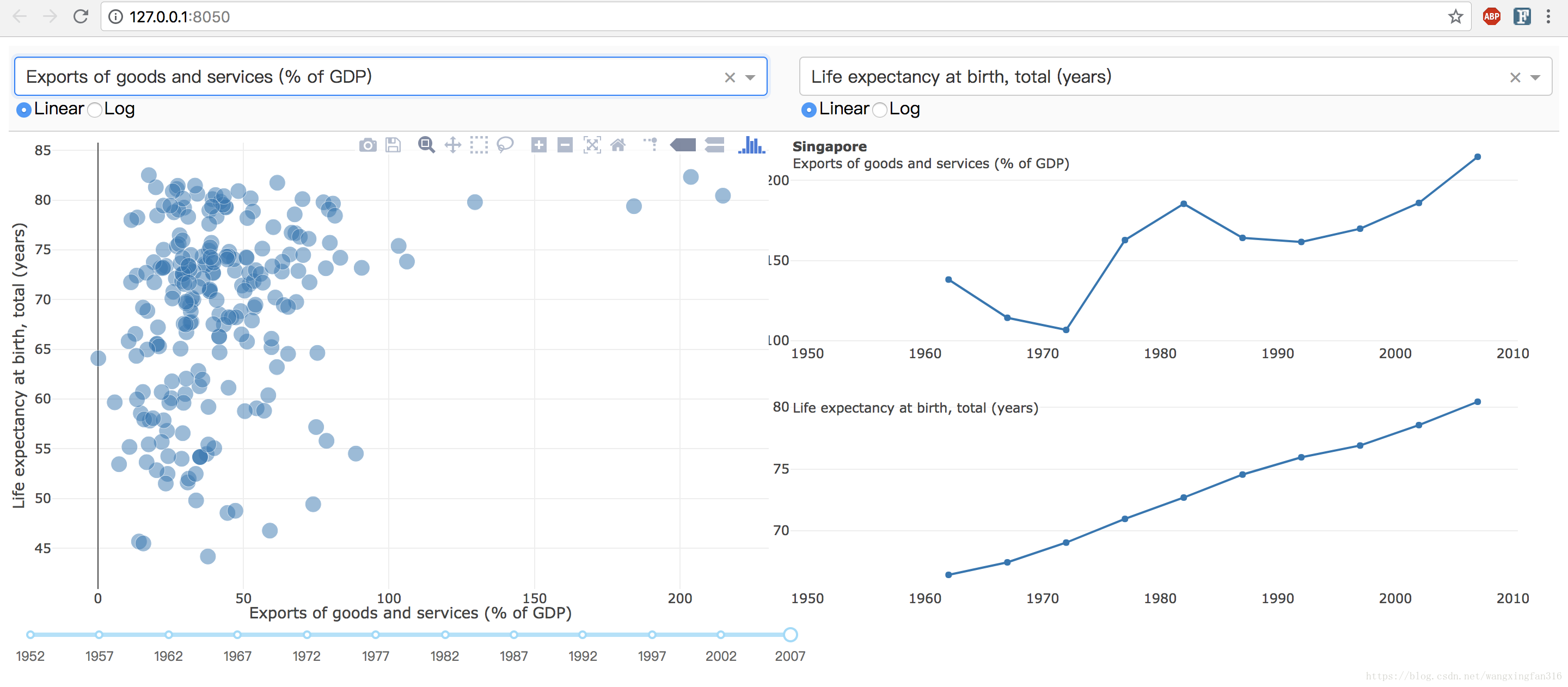
app.run_server()打印出得结果:
 * Serving Flask app "dash-1" (lazy loading)
 * Environment: production
   WARNING: Do not use the development server in a production environment.
   Use a production WSGI server instead.
 * Debug mode: off
 * Running on http://127.0.0.1:8050/ (Press CTRL+C to quit)
3结果
点击链接即可,交互的页面