1.拔河效应
水平居中:设置居中元素的left,right都为0,然后加一个margin:auto;即可。
举个栗子:
<!DOCTYPE html>
<html lang="en">
<head>
<meta charset="UTF-8">
<title>Document</title>
<style type="text/css">
.container{
width: 400px;
height: 200px;
border:1px solid;
position: relative;
}
.main{
width: 100px;
height: 50px;
background: blue;
position: absolute;
left: 0;
right: 0;
margin: auto;
}
</style>
</head>
<body>
<div class="container">
<div class="main"></div>
</div>
</body>
</html>
方便记忆可以把margin:auto;理解为“开始拔河吧!”
垂直方向上的居中也是同理,只要设置top和bottom即可,上下左右居中的话那就全部写上就ok啦
2.transform居中
直接放个栗子:
<!DOCTYPE html>
<html lang="en">
<head>
<meta charset="UTF-8">
<title>Document</title>
<style type="text/css">
.container{
width: 400px;
height: 200px;
border:1px solid;
position: relative;
}
.main{
width: 100px;
height: 50px;
background: blue;
position: absolute;
left: 50%;
transform: translate(-50% ,0);
}
</style>
</head>
<body>
<div class="container">
<div class="main"></div>
</div>
</body>
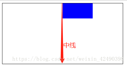
</html>首先给要居中元素设置left:50%; 居中元素就出现在父元素的中间处,
此时只要让居中元素向左偏移自身的50%就达到居中效果了,此时可以用
transform: translate(-50% ,0);即可。上下居中也是同理。
3.felx布局居中
也可以给父元素设置为弹性盒子display:flex; 然后设置主轴方向为居中对齐即可,(默认主轴为水平方向)举个栗子:
父元素.container{
…
display:felx;
justify-content:center;
}
如果想要在垂直方向上居中,则先改变主轴方向为垂直flex-direction:column;
再设置justify-content:center;即可。(justify-content代表在主轴方向的对齐方式)
~自己学习过程记下的一些笔记,觉得有用就会分享出来,如有错误还请大神们指点!