html代码
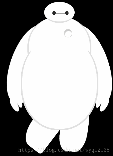
<div id="dabai">
		<div id="head">
			<div id="eye"></div>
			<div id="eye2"></div>
			<div id="mouth"></div>
		</div>
		<!-- 躯干 包括心脏 -->
		<div id="torso">
			<div id="heart"></div>
		</div>
		<div id="belly">
			<div id="cover"></div>
		</div>
		<div id="left-arm">
			<div id="l-bigfinger"></div>
			<div id="l-smallfinger"></div>
		</div>
		<div id="right-arm">
			<div id="r-bigfinger"></div>
			<div id="r-smallfinger"></div>
		</div>
		<div id="left-leg"></div>
		<div id="right-leg"></div>
	</div>
css3代码
<style>
		body{background: #000;}
		#dabai{
			margin: 0 auto;
			height: 600px;
			overflow:hidden;
		}
		#head{
			height: 64px;
			width: 100px;
			border-radius:50%;
			background: #fff;
			margin: 0 auto;
			margin-bottom: -20px;
			border-bottom: 5px solid #e0e0e0;
			z-index:100;
			position: relative;
		}
		#eye,#eye2{
			width: 11px;
			height: 13px;
			background: #282828;
			border-radius:50%;
			position: relative;
			top: 30px;
			left: 27px;

			transform:rotate(8deg);
		}
		#eye2{
			transform:rotate(-8deg);
			left: 69px;
			top: 17px;
		}
		#mouth{
			width: 38px;
			height: 1.5px;
			background: #282828;
			position: relative;
			left: 34px;
			top: 10px;
		}
		#torso,#belly{
			margin: 0 auto;
			height: 200px;
			width: 200px;
			background: #fff;
			border-radius:47%;

			border:5px solid #e0e0e0;
			border-top:none;
			z-index:1;
		}
		#belly{
			height: 300px;
			width: 245px;
			margin-top: -140px;
			z-index:5;
		}
		#cover{
			width: 190px;
			height: 150px;
			background: #fff;
			margin: 0 auto;
			position: relative;
			top: -20px;
			border-radius:50%;
		}
		#heart{
			width: 25px;
			height: 25px;
			border-radius:50%;
			position: relative;
			z-index:111;
			box-shadow:2px 5px 2px #ccc inset;
			right: -115px;
			top: 40px;
			border:1px solid #ccc;
		}
		#left-arm,#right-arm{
			height: 270px;
			width: 120px;
			border-radius:50%;
			background: #fff;
			margin: 0 auto;
			position: relative;
			top: -350px;
			left: -100px;
			transform:rotate(20deg);
			z-index:-1;
		}
		#right-arm{
			transform:rotate(-20deg);
			left: 100px;
			top: -620px;
		}
		#l-bigfinger,#r-bigfinger{
			height: 50px;
			width: 20px;
			border-radius:50%;
			background: #fff;
			position: relative;
			top: 250px;
			left: 50px;
			transform:rotate(-50deg);
		}
		#r-bigfinger{
			left: 50px;
			transform:rotate(50deg);
		}
		#l-smallfinger,#r-smallfinger{
			height: 35px;
			width: 15px;
			border-radius:50%;
			background: #fff;
			position: relative;
			top: 195px;
			left: 66px;
			transform:rotate(-40deg);
		}
		#r-smallfinger{
			transform:rotate(40deg);
			left: 37px;
		}
		#left-leg,#right-leg{
			height: 170px;
			width: 90px;
			border-radius: 40% 30% 10px 45%;
			background: #fff;
			position: relative;
			top: -640px;
			left: -45px;
			transform:rotate(-1deg);
			margin: 0 auto;
			z-index:-2;
		}
		#left-leg{
			animation:lmove 5s infinite;
		}
		#right-leg{
			position: relative;
			top: -810px;
			left: 50px;
			transform:rotate(-210deg);
			animation:rmove 5s infinite;
		}
		@-webkit-keyframes lmove{
			0%{transform:rotate(40deg);}
			25%{transform:rotate(-1deg);}
			75%{transform:rotate(40deg);}
			100%{transform:rotate(-1deg);}
		}
		@-webkit-keyframes rmove{
			0%{transform:rotate(-170deg);}
			25%{transform:rotate(-210deg);}
			75%{transform:rotate(-170deg);}
			100%{transform:rotate(-211deg);}
		}
	</style>
主要知识点:熟悉掌握css3