hicharts.js的优势
- 兼容ie6以上浏览器
- 完美支持移动端
- api全面而丰富
- 自适应浏览器宽度
实例演示基础折线图
html部分
<!--引入hicharts.js框架的提供的js文件-->
<script src="https://img.hcharts.cn/highcharts/highcharts.js"></script>
<script src="https://img.hcharts.cn/highcharts/modules/exporting.js"></script>
<script src="https://img.hcharts.cn/highcharts/modules/series-label.js"></script>
<script src="https://img.hcharts.cn/highcharts/modules/oldie.js"></script>
<script src="https://img.hcharts.cn/highcharts-plugins/highcharts-zh_CN.js"></script>

<!--设置一个带有id的空白div-->
<div id="box"></div>
js部分
var chart = Highcharts.chart('box',{
    chart: {
        type: 'column'
    },
    title: {
        text: '月平均降雨量'
    },
    subtitle: {
        text: '数据来源: WorldClimate.com'
    },
    xAxis: {
        categories: [
            '一月','二月','三月','四月','五月','六月','七月','八月','九月','十月','十一月','十二月'
        ],
        crosshair: true
    },
    yAxis: {
        min: 0,
        title: {
            text: '降雨量 (mm)'
        }
    },
    tooltip: {
        // head + 每个 point + footer 拼接成完整的 table
        headerFormat: '<span style="font-size:10px">{point.key}</span><table>',
        pointFormat: '<tr><td style="color:{series.color};padding:0">{series.name}: </td>' +
        '<td style="padding:0"><b>{point.y:.1f} mm</b></td></tr>',
        footerFormat: '</table>',
        shared: true,
        useHTML: true
    },
    plotOptions: {
        column: {
            borderWidth: 0
        }
    },
    series: [{
        name: '东京',
        data: [49.9, 71.5, 106.4, 129.2, 144.0, 176.0, 135.6, 148.5, 216.4, 194.1, 95.6, 54.4]
    }, {
        name: '纽约',
        data: [83.6, 78.8, 98.5, 93.4, 106.0, 84.5, 105.0, 104.3, 91.2, 83.5, 106.6, 92.3]
    }, {
        name: '伦敦',
        data: [48.9, 38.8, 39.3, 41.4, 47.0, 48.3, 59.0, 59.6, 52.4, 65.2, 59.3, 51.2]
    }, {
        name: '柏林',
        data: [42.4, 33.2, 34.5, 39.7, 52.6, 75.5, 57.4, 60.4, 47.6, 39.1, 46.8, 51.1]
    }]
});
效果图如下
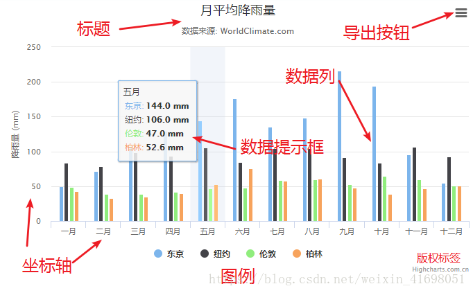
现在一个基本的柱状图就完成,上面特意加了一些标注
然后就是自定义折线图的样式
- 设置版权信息
credits: {
    enabled:true,                    // 默认值,如果想去掉版权信息,设置为false即可
    text: 'www.hcharts.cn',             // 显示的文字
    href: 'http://www.hcharts.cn',      // 链接地址
    position: {                         // 位置设置
        align: 'left',
        x: 400,
        verticalAlign: 'bottom',
        y: -100
    },
    style: {                            // 样式设置
        cursor: 'pointer',
        color: 'red',
        fontSize: '30px'
    }
}
- 坐标轴
xAxis:{
	title:{
	    text:'x轴标题',
	 	align: 'high'		//对齐方式
	}
}
yAxis:{
	title: {
		text: 'y轴标题',
		align: 'high',		//对齐方式
		offset: 0,
		rotation: 0,
		y: -10
	}
}
- 数据列颜色
colors: ['#7cb5ec', '#434348', '#90ed7d', '#f7a35c', '#8085e9',
    '#f15c80', '#e4d354', '#8085e8', '#8d4653', '#91e8e1'] 		//这里是默认颜色值,可以直接修改
- 图例
legend: {
	itemStyle: {			//图例样式
		color: '#444444',
		fontSize: '16px',
		fontWeight: '400'
	},
	align: 'right',		//图例对齐方式
	verticalAlign: 'top',
	y: 0,
	symbolWidth: 40,	 //图例宽度
},
- 数据列
series:[{
	data:[],		//数据
    animation: true,		//动画属性
	marker: {				//引入图片
		symbol: "url(.png)"
	}
}]
- 数据提示框
tooltip:{
	animation: true, 		//动画属性
	style: {				//自定义样式
	}
}
- Ajax 请求数据接口
$.get(url, {
    // 参数
}, function(data) {
    // data 为服务器返回的数据
});