版权声明:本文为博主原创文章,未经博主允许不得转载。 https://blog.csdn.net/duxu24/article/details/73916678
在概要统计里,箱线图是一种好用的查看统计信息的工具。
- 高效表达数据的千分位数、异常值点、总体结构;
- 标出水平中位线。指明数据的位置;
- 箱体扩展到四分位范围,用来衡量数据的分布;
- 一系列的虚线从中间的箱体或横或纵伸展,表明数据的尾部分布。
操作方法
from sklearn.datasets import load_iris
import matplotlib.pyplot as plt

#加载数据
data = load_iris()
x = data['data']
plt.close('all')

#绘制箱线图
fig = plt.figure(1)
ax = fig.add_subplot(111)
ax.boxplot(x)
ax.set_xticklabels(data['feature_names'])
plt.show()
绘制出的箱线图:
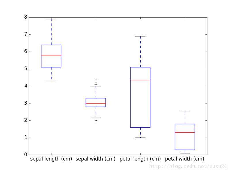
由于x中有4列,所以共有4个箱线图。包括数据的位置和分布都清晰地展示出来了。红色的水平线表示中位数,指明了数据的位置。箱体均扩展到四分位范围,表明了数据的分布。
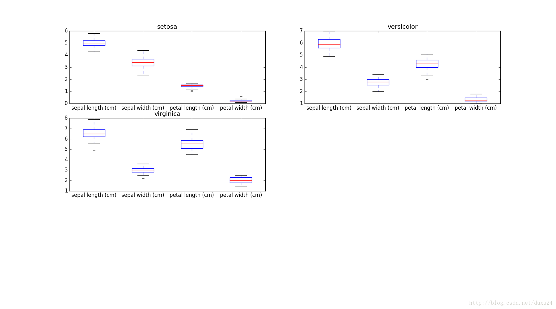
如果能看到数据在不同类别标签下如何分布的情况,那更有趣。接下来展示如何在多个类别标签绘制箱线图。
import numpy as py

y = data['target']
class_labels = data['target_names']

fig = plt.figure(2, figsize=(18, 10))
sub_plt_count = 321

for t in range(0, 3):
    ax = fig.add_subplot(sub_plt_count)
    y_index = np.where(y==t)[0]
    x_ = x[y_index, :]
    ax.boxplot(x_)
    ax.set_title(class_labels[t])
    ax.set_xticklabels(data['feature_names'])
    sub_plt_count += 1
plt.show()
对每个类别分别绘制箱线图,如下图: