本文是针对之前Android 仿淘宝选中商品不同尺寸的按钮组(一)存在的一些问题进行修改与完善,希望各位能再次给予意见
GoodsViewGroup修改与完善有以下几点:
一、这里就只支持TextView模式,以为在Button模式下,padding设置比其默认的更小时是看不到作用的,所以做了修整
二、添加GoodsViewGroupItem里面有key跟value两个字段,用户在这里可以自行修改,添加GoodsViewGroupItem比较方便管理跟数据的整理
三、在res——>values目录下添加attrs.xml属性给GoodsViewGroup自定义一些属性值,这样我们在布局文件中就可以来设置其(isSelector,normal_drawable,selected_drawable等等)
四、不然其修改按钮组里面的按钮高度,而现在是改用设置padding比较好点,设置固定高度可能你字体设置大了就会出现一些变形
五、该按钮添加支持有边框的设置,如果你想做的效果跟我的一模一样的话,你可以直接在colors.xml去修改其样色就ok了,效果资源中的drawable就是直接引用colors.xml中的颜色,或许你想去掉边框等等,你也可以设置GoodsViewGroup的属性(normal_drawable,selected_drawable)
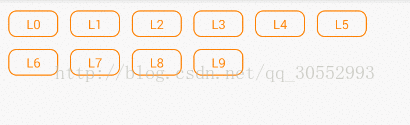
下面还是一样先给效果图:
1、这里先展示主角,也是上图中的按钮组控件:GoodsViewGroup.class
/**
 * Created by SoBan on 2016/8/22.
 * 这里是类似淘宝中商品尺寸按钮组
 */
public class GoodsViewGroup extends ViewGroup {

    private List<GoodsViewGroupItem> mItems = new ArrayList<>();
    private Context mContext;

    private int horInterval; //水平间隔
    private int verInterval; //垂直间隔

    private int viewWidth;   //控件的宽度
    private int viewHeight;  //控件的高度

    //按钮水平跟垂直内边距
    private int horPadding;
    private int verPadding;

    //正常样式
    private float textSize;
    private int bgResoureNor;
    private int textColorNor;

    //选中的样式
    private int bgResoureSel;
    private int textColorSel;

    private boolean isSelector; //是否做选择之后的效果

    public GoodsViewGroup(Context context) {
        this(context, null);
    }

    public GoodsViewGroup(Context context, AttributeSet attrs) {
        super(context, attrs);
        getResources().getColor(R.color.goods_item_text_normal);
        init(context, attrs);
    }

    private void init(Context context, AttributeSet set) {
        mContext = context;
        TypedArray attrs = mContext.obtainStyledAttributes(set, R.styleable.GoodsViewGroup);
        isSelector = attrs.getBoolean(R.styleable.GoodsViewGroup_isSelector, true);
        textSize = attrs.getDimensionPixelSize(R.styleable.GoodsViewGroup_itemTextSize, 0);
        if (textSize == 0) {
            textSize = getResources().getDimensionPixelSize(R.dimen.goods_item_text);//14sp
        }
        horInterval = attrs.getDimensionPixelSize(R.styleable.GoodsViewGroup_horInterval, 20);
        verInterval = attrs.getDimensionPixelSize(R.styleable.GoodsViewGroup_verInterval, 20);
        horPadding = attrs.getDimensionPixelSize(R.styleable.GoodsViewGroup_horPadding, 20);
        verPadding = attrs.getDimensionPixelSize(R.styleable.GoodsViewGroup_verPadding, 10);
        bgResoureNor = attrs.getResourceId(R.styleable.GoodsViewGroup_normal_drawable, R.drawable.goods_item_btn_normal);
        bgResoureSel = attrs.getResourceId(R.styleable.GoodsViewGroup_selected_drawable, R.drawable.goods_item_btn_selected);
        textColorNor = attrs.getColor(R.styleable.GoodsViewGroup_normal_textColor, getColorResoure(R.color.goods_item_text_normal));
        textColorSel = attrs.getColor(R.styleable.GoodsViewGroup_selected_textColor, getColorResoure(R.color.goods_item_text_selected));
        attrs.recycle();
    }

    private int getColorResoure(int resId) {
        return getResources().getColor(resId);
    }

    /**
     * 计算控件的大小
     */
    @Override
    protected void onMeasure(int widthMeasureSpec, int heightMeasureSpec) {
        super.onMeasure(widthMeasureSpec, heightMeasureSpec);
        viewWidth = measureWidth(widthMeasureSpec);
        viewHeight = measureHeight(heightMeasureSpec);
        // 计算自定义的ViewGroup中所有子控件的大小
        measureChildren(widthMeasureSpec, heightMeasureSpec);
        // 设置自定义的控件ViewGroup的大小
        setMeasuredDimension(viewWidth, getViewHeight());
    }

    private int measureWidth(int pWidthMeasureSpec) {
        int result = 0;
        int widthMode = MeasureSpec.getMode(pWidthMeasureSpec);
        int widthSize = MeasureSpec.getSize(pWidthMeasureSpec);
        switch (widthMode) {
            case MeasureSpec.AT_MOST:
            case MeasureSpec.EXACTLY:
                result = widthSize;
                break;
        }
        return result;
    }

    private int measureHeight(int pHeightMeasureSpec) {
        int result = 0;
        int heightMode = MeasureSpec.getMode(pHeightMeasureSpec);
        int heightSize = MeasureSpec.getSize(pHeightMeasureSpec);
        switch (heightMode) {
            case MeasureSpec.UNSPECIFIED:
                result = getSuggestedMinimumHeight();
                break;
            case MeasureSpec.AT_MOST:
            case MeasureSpec.EXACTLY:
                result = heightSize;
                break;
        }
        return result;
    }

    /**
     * 计算控件的自适应高度
     */
    private int getViewHeight() {
        int viewwidth = horInterval;
        int viewheight = verInterval;
        //初始化控件的高度等于第一个元素
        if (getChildCount() > 0) {
            viewheight = getChildAt(0).getMeasuredHeight() + verInterval;
        }
        for (int i = 0; i < getChildCount(); i++) {
            View childView = getChildAt(i);
            // 获取在onMeasure中计算的视图尺寸
            int measureHeight = childView.getMeasuredHeight();
            int measuredWidth = childView.getMeasuredWidth();
            //------------当前按钮按钮是否在水平上够位置(2017/7/10)------------
            if (viewwidth + getChildCurrentWidth(i) > viewWidth) {
                viewwidth = (measuredWidth + horInterval * 2);
                viewheight += (measureHeight + verInterval);
            } else {
                viewwidth += (measuredWidth + horInterval);
            }
        }
        return viewheight;
    }

    /**
     * 覆写onLayout,其目的是为了指定视图的显示位置,方法执行的前后顺序是在onMeasure之后,因为视图肯定是只有知道大小的情况下,
     * 才能确定怎么摆放
     */
    @Override
    protected void onLayout(boolean changed, int l, int t, int r, int b) {
        // 遍历所有子视图
        int posLeft = 0;
        int posTop = verInterval;
        int posRight = horInterval;
        int posBottom;
        for (int i = 0; i < getChildCount(); i++) {
            View childView = getChildAt(i);
            // 获取在onMeasure中计算的视图尺寸
            int measureHeight = childView.getMeasuredHeight();
            int measuredWidth = childView.getMeasuredWidth();
            if (posRight + getChildCurrentWidth(i) > viewWidth) {
                posLeft = 0;
                posTop += (measureHeight + verInterval);
            }
            posRight = posLeft + measuredWidth;
            posBottom = posTop + measureHeight;
            childView.layout(posLeft, posTop, posRight, posBottom);
            posLeft += (measuredWidth + horInterval);
        }
    }


    /**
     * 获得当前按钮所需的宽度
     *
     * @param i
     * @return
     */
    private int getChildCurrentWidth(int i) {
        return getChildAt(i).getMeasuredWidth() + horInterval;
    }

    private OnGroupItemClickListener onGroupItemClickListener;

    public void setGroupClickListener(OnGroupItemClickListener listener) {
        onGroupItemClickListener = listener;
        for (int i = 0; i < getChildCount(); i++) {
            final TextView childView = (TextView) getChildAt(i);
            final int itemPos = i;
            childView.setOnClickListener(new OnClickListener() {
                @Override
                public void onClick(View view) {
                    String valueName = ((TextView) view).getText().toString(); //白色
                    onGroupItemClickListener.onGroupItemClick(itemPos, getItemKey(valueName), valueName);
                    if (isSelector) {
                        chooseItemStyle(itemPos);
                    }
                }
            });
        }
    }

    /**
     * 获取按钮的颜色的按钮去找1 , value->key
     *
     * @param itemBtnText
     * @return
     */
    private String getItemKey(String itemBtnText) {
        for (int i = 0; i < mItems.size(); i++) {
            if (mItems.get(i).getValue().equals(itemBtnText)) {
                return mItems.get(i).getKey();
            }
        }
        return "";
    }

    /**
     * 选中那个的样式
     *
     * @param pos
     */
    public void chooseItemStyle(int pos) {
        clearItemsStyle();
        if (pos < getChildCount()) {
            TextView childView = (TextView) getChildAt(pos);
            childView.setBackgroundResource(bgResoureSel);
            childView.setTextColor(textColorSel);
            setItemPadding(childView);
        }
    }

    /**
     * 清除ViewGroup所有的样式
     */
    private void clearItemsStyle() {
        for (int i = 0; i < getChildCount(); i++) {
            TextView childView = (TextView) getChildAt(i);
            childView.setBackgroundResource(bgResoureNor);
            childView.setTextColor(textColorNor);
            setItemPadding(childView);
        }
    }

    private void setItemPadding(TextView view) {
        view.setPadding(horPadding, verPadding, horPadding, verPadding);
    }

    public void addItemViews(List<GoodsViewGroupItem> items) {
        if (items != null) {
            mItems = items;
            removeAllViews();
            for (GoodsViewGroupItem item : items) {
                addItemView(item);
            }
        }
    }

    private void addItemView(GoodsViewGroupItem item) {
        TextView childView = new TextView(mContext);
        childView.setLayoutParams(new LayoutParams(LayoutParams.WRAP_CONTENT, LayoutParams.WRAP_CONTENT));
        childView.setTextSize(TypedValue.COMPLEX_UNIT_PX, textSize);
        childView.setBackgroundResource(bgResoureNor);
        setItemPadding(childView);
        childView.setTextColor(textColorNor);
        childView.setText(item.getValue());
        this.addView(childView);
    }

    public void setSelector(boolean selector) {
        isSelector = selector;
    }

    public interface OnGroupItemClickListener {
        void onGroupItemClick(int itemPos, String key, String value);
    }
}
2、数据模型bean:GoodsViewGroupItem.class
/**
 * @author SoBan
 * @create 2017/1/7 15:25.
 */
public class GoodsViewGroupItem {
    private String key;
    private String value;

    public GoodsViewGroupItem(String key, String value) {
        this.key = key;
        this.value = value;
    }

    public String getKey() {
        return key;
    }

    public void setKey(String key) {
        this.key = key;
    }

    public String getValue() {
        return value;
    }

    public void setValue(String value) {
        this.value = value;
    }
}
3、属性资源:res—>values 中添加 attrs.xml
<?xml version="1.0" encoding="utf-8"?>
<resources>

    <declare-styleable name="GoodsViewGroup">
        <attr name="isSelector" format="boolean" />
        <attr name="normal_drawable" format="reference" />
        <attr name="selected_drawable" format="reference" />
        <attr name="normal_textColor" format="color" />
        <attr name="selected_textColor" format="color" />
        <attr name="itemTextSize" format="dimension" />
        <attr name="horInterval" format="dimension" />
        <attr name="verInterval" format="dimension" />
        <attr name="horPadding" format="dimension" />
        <attr name="verPadding" format="dimension" />
    </declare-styleable>

</resources>
4、颜色资源:res—>values 中添加 colors.xml
<?xml version="1.0" encoding="utf-8"?>
<resources>
    <color name="goods_item_text_normal">#ff8000</color>
    <color name="goods_item_text_selected">#ffffff</color>
    <color name="goods_item_btn_bg_normal">#ffffff</color>
    <color name="goods_item_btn_bg_selected">#ff8000</color>
    <color name="goods_item_btn_bg_border">@color/goods_item_btn_bg_selected</color>
</resources>
5、按钮正常drawable:goods_item_btn_normal.xml
<?xml version="1.0" encoding="utf-8"?>
<shape xmlns:android="http://schemas.android.com/apk/res/android"
    android:shape="rectangle">
    <solid android:color="@color/goods_item_btn_bg_normal" />
    <stroke
        android:width="1dip"
        android:color="@color/goods_item_btn_bg_border" />
    <corners android:radius="8dip" />
</shape>
6、按钮选中drawable:goods_item_btn_selected.xml
<?xml version="1.0" encoding="utf-8"?>
<shape xmlns:android="http://schemas.android.com/apk/res/android"
    android:shape="rectangle">
    <solid android:color="@color/goods_item_btn_bg_border" />
    <stroke
        android:width="1dip"
        android:color="@color/goods_item_btn_bg_border" />
    <corners android:radius="8dip" />
</shape>
7、例子:MainActivity.class
public class MainActivity extends Activity {

    private static final String TAG = MainActivity.class.getName();

    private GoodsViewGroup mGoodsViewGroup;

    @Override
    protected void onCreate(Bundle savedInstanceState) {
        super.onCreate(savedInstanceState);
        setContentView(R.layout.activity_main);

        mGoodsViewGroup = (GoodsViewGroup) findViewById(R.id.goods_viewgroup);
        mGoodsViewGroup.addItemViews(getItems());
        mGoodsViewGroup.setGroupClickListener(new GoodsViewGroup.OnGroupItemClickListener() {
            @Override
            public void onGroupItemClick(int itemPos, String key, String value) {
//                Toast.makeText(MainActivity.this, value, Toast.LENGTH_SHORT).show();
                Log.e(TAG, value);
            }
        });
    }

    private List<GoodsViewGroupItem> getItems() {
        List<GoodsViewGroupItem> items = new ArrayList<>();
        for (int i = 0; i < 10; i++) {            items.add(new GoodsViewGroupItem(i + "", "L" + i));
        }
        return items;
    }
}
8、例子布局:activity_main.xml
<?xml version="1.0" encoding="utf-8"?>
<LinearLayout xmlns:android="http://schemas.android.com/apk/res/android"
    xmlns:hk="http://schemas.android.com/apk/res-auto"
    android:layout_width="match_parent"
    android:layout_height="match_parent"
    android:orientation="vertical">

    <saobin.goodsviewgroup.GoodsViewGroup
        android:id="@+id/goods_viewgroup"
        android:layout_width="match_parent"
        android:layout_height="wrap_content"
        android:layout_marginLeft="10dip"
        hk:horPadding="20dip"
        hk:verPadding="5dip" />
</LinearLayout>
这里我把该给的文件都罗列出来了,如果还有发现欠缺的欢迎联系我
该文章已经不做更新,由于没有时间整理,推荐Github上一款比较好的框架给大家——LabelsView