ConstraintLayout介绍与具体使用
ConstraintLayout是2016年 Google I/O 大会上发布,是一种新的布局控件:约束布局。现在都2018年了,还说2016年的技术,其实是这样的:ConstraintLayout使用是图形化布局,对比以前布局都是手写的,而且ConstraintLayout使用还要重新开始学习。相当于RelativeLayout的升级版,减少布局层次,基本需要一层既可以完成简单的布局。
如何使用
引入ConstraintLayout
在Android studio 2.3以后,谷歌为了推行这种布局,创建布局文件,默认顶层布局为ConstraintLayout;在Android studio 2.3之前,需要在app的build.gradle文件中引入ConstraintLayout(API>=9才能使用):
compile 'com.android.support.constraint:constraint-layout:1.0.2'
这里不介意的话先看下Google 对ConstraintLayout的优势分析:
了解使用 ConstraintLayout 的性能优势
- Relative positioning 相对定位
相对定位是在ConstraintLayout中创建布局的基本构建块之一。这些约束允许您将给定的小部件相对于另一个小部件进行定位。你可以在水平和垂直轴上约束一个小部件,可以相对于另一个布局或者父容器。具体属性如下:
app:layout_constraintLeft_toLeftOf="@+id/xxx"   表示当前控件的左边相对于在xxx控件的左边
app:layout_constraintLeft_toRightOf="@+id/xxx"	表示当前控件的左边相对于在xxx控件的右边
app:layout_constraintRight_toLeftOf="@+id/xxx"	表示当前控件的右边相对于在xxx控件的左边
app:layout_constraintRight_toRightOf="@+id/xxx"	表示当前控件的右边相对于在xxx控件的右边
app:layout_constraintTop_toTopOf="@+id/xxx"		表示当前控件的上边相对于在xxx控件的上边
app:layout_constraintTop_toBottomOf="@+id/xxx"	表示当前控件的上边相对于在xxx控件的下边
app:layout_constraintBottom_toTopOf="@+id/xxx"	表示当前控件的下边相对于在xxx控件的上边
app:layout_constraintBottom_toBottomOf="@+id/xxx"	表示当前控件的下边相对于在xxx控件的下边
app:layout_constraintBaseline_toBaselineOf="@+id/xxx"	表示当前控件的基准线相对于在xxx控件的基准线
app:layout_constraintStart_toEndOf="@+id/xxx"	表示当前控件的开始相对于在xxx控件的结束
app:layout_constraintStart_toStartOf="@+id/xxx"	表示当前控件的开始相对于在xxx控件的开始
app:layout_constraintEnd_toStartOf="@+id/xxx"	表示当前控件的结束相对于在xxx控件的开始
app:layout_constraintEnd_toEndOf="@+id/xxx"		表示当前控件的结束相对于在xxx控件的结束
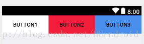
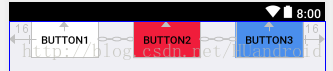
先看个例子:
1的right相对于2在2的left,2的right相对于3在3的left,3的right相对于在父控件的右边,所以button的上边都相对于父控件所以xml文件如下:

<?xml version="1.0" encoding="utf-8"?>
<android.support.constraint.ConstraintLayout
    xmlns:android="http://schemas.android.com/apk/res/android"
    xmlns:app="http://schemas.android.com/apk/res-auto"
    xmlns:tools="http://schemas.android.com/tools"
    android:layout_width="match_parent"
    android:layout_height="match_parent"
    android:background="@color/line_bg">

    <Button
        android:id="@+id/button1"
        android:layout_width="0dp"
        android:layout_height="wrap_content"
        android:layout_marginBottom="519dp"
        android:background="@color/white"
        android:text="Button1"
        app:layout_constraintBottom_toBottomOf="parent"
        app:layout_constraintEnd_toStartOf="@+id/button2"
        app:layout_constraintStart_toStartOf="parent"
        app:layout_constraintTop_toTopOf="parent"
        />
    <Button
        android:id="@+id/button2"
        android:layout_width="0dp"
        android:layout_height="wrap_content"
        android:layout_marginBottom="519dp"
        android:background="@color/red_line"
        android:elevation="0dp"
        android:text="Button2"
        app:layout_constraintBottom_toBottomOf="parent"
        app:layout_constraintEnd_toStartOf="@+id/button3"
        app:layout_constraintStart_toEndOf="@+id/button1"
        app:layout_constraintTop_toTopOf="parent"/>
    <Button
        android:id="@+id/button3"
        android:layout_width="0dp"
        android:layout_height="wrap_content"
        android:layout_marginBottom="519dp"
        android:background="@color/blue_4a8eec"
        android:text="Button3"
        app:layout_constraintBottom_toBottomOf="parent"
        app:layout_constraintEnd_toEndOf="parent"
        app:layout_constraintStart_toEndOf="@+id/button2" app:layout_constraintTop_toTopOf="parent"
    />

</android.support.constraint.ConstraintLayout>
记住要图形操作,别去手写。优势啊
个别图形介绍:


- Margins边缘距离
margin和以往的使用一致,注意margin不能为负数即可。
如果设置了侧边距,它们将应用于相应的约束条件(如果存在的话),将边距作为目标和源侧之间的空间执行。通常的布局边距属性可用于此效果:
android:layout_marginStart
android:layout_marginEnd
android:layout_marginLeft
android:layout_marginTop
android:layout_marginRight
android:layout_marginBottom
当位置约束目标控件的可见性设置成View.Gone是,为了防止控件隐藏约束关系发生变化。可以使用以下属性来确保约束存在:控件隐藏了,相对于存在一个点,goneMargin相对于被约束控件到该点的外边距。
layout_goneMarginStart
layout_goneMarginEnd
layout_goneMarginLeft
layout_goneMarginTop
layout_goneMarginRight
layout_goneMarginBottom
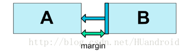
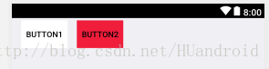
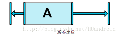
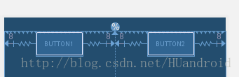
例子如下:当Button1隐藏时候,为了保持Button2对于Button1的约束。需要设置_goneMargin
如果我们需要上面的图,在1被隐藏后,仍然保持B的位置不变,那么我们就要设置2的goneMargin的值为1的宽度和margin与2的margin值的和,也就是
goneMarginStart = 1.width + 1.marginStart + 2.marginStart
所以要设置为:
<?xml version="1.0" encoding="utf-8"?>
<android.support.constraint.ConstraintLayout
    xmlns:android="http://schemas.android.com/apk/res/android"
    xmlns:app="http://schemas.android.com/apk/res-auto"
    xmlns:tools="http://schemas.android.com/tools"
    android:layout_width="match_parent"
    android:layout_height="match_parent"
    android:background="@color/line_bg">

    <Button
        android:id="@+id/button1"
        android:layout_width="80dp"
        android:layout_height="wrap_content"
        android:layout_marginLeft="16dp"
        android:layout_marginStart="16dp"
        android:layout_marginTop="4dp"
        android:visibility="gone"
        android:background="@color/white"
        android:text="Button1"
        app:layout_constraintLeft_toLeftOf="parent"
        app:layout_constraintStart_toStartOf="parent"
        app:layout_constraintTop_toTopOf="parent"
        app:layout_goneMarginRight="@dimen/_100dp"/>
    <Button
        android:id="@+id/button2"
        android:layout_width="80dp"
        android:layout_height="wrap_content"
        android:layout_marginTop="4dp"
        android:background="@color/red_line"
        android:text="Button2"
        app:layout_goneMarginLeft="112dp"
        app:layout_constraintEnd_toEndOf="parent"
        app:layout_constraintHorizontal_bias="0.0"
        app:layout_constraintStart_toEndOf="@+id/button1"
        app:layout_constraintTop_toTopOf="parent"
        android:layout_marginLeft="16dp"/>
</android.support.constraint.ConstraintLayout>
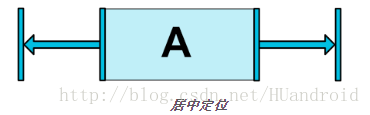
- **Centering positioning 中心定位 **
我们给控件建立约束的时候,当前控件在同方向上添加约束,像如下图:
		<android.support.constraint.ConstraintLayout ...>
             <Button android:id="@+id/button" ...
                 app:layout_constraintLeft_toLeftOf="parent"
                 app:layout_constraintRight_toRightOf="parent/>
         </>
在这种情况下发生的事情是,约束的作用就像是相反的力量将小部件拉开一样(图4)。这样小部件将最终以父容器为中心。这对垂直约束也适用。如果控件尺寸与父控件一样,就铺满父控件了,居中也无意义,约束也是没有意义的

- bias 偏移
相比于上面,bias就好比打破上面平衡一样,可以调整比例属性,让居中的控件向一边偏移。
layout_constraintHorizontal_bias 横向偏移
layout_constraintVertical_bias 纵向偏移
以下内容将使左侧的偏差为30%,而不是默认的50%,这样左侧会变短,并且控件倾向更靠左侧
<android.support.constraint.ConstraintLayout ...>
             <Button android:id="@+id/button" ...
                 app:layout_constraintHorizontal_bias="0.3"
                 app:layout_constraintLeft_toLeftOf="parent"
                 app:layout_constraintRight_toRightOf="parent/>
         </>
- Circular positioning 圆形定位
可以以一定的角度和距离限制相对于其他控件中心,这可以让其放在其中心的圆上,可以使用以下属性:
layout_constraintCircle :引用另一个小部件ID
layout_constraintCircleRadius :到其他小部件中心的距离
layout_constraintCircleAngle :小部件应处于的角度(度数,从0到360)
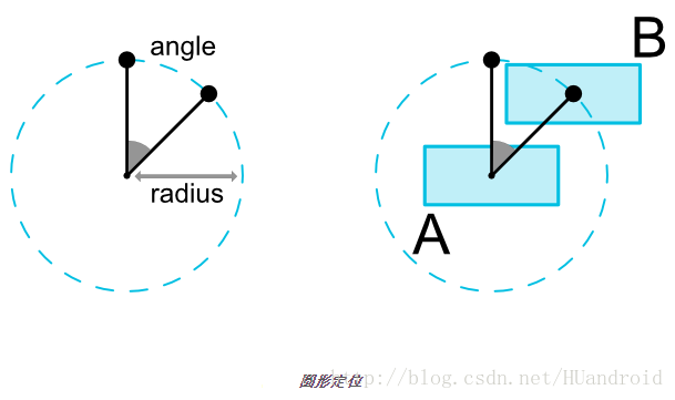
<Button android:id="@+id/buttonA" ... />
  <Button android:id="@+id/buttonB" ...
      app:layout_constraintCircle="@+id/buttonA"
      app:layout_constraintCircleRadius="100dp"
      app:layout_constraintCircleAngle="45" />
- Dimension constraints 尺寸限制
ConstraintLayout可以为控件设置最小和最大尺寸:
android:minWidth 设置布局的最小宽度
android:minHeight 设置布局的最小高度
android:maxWidth 设置布局的最大宽度
android:maxHeight 设置布局的最大高度
经常会用到限定可变化的区域,比如button内的文字:
<Button
        android:id="@+id/button1"
        android:layout_width="80dp"
        android:layout_height="wrap_content"
        android:layout_marginLeft="16dp"
        android:minHeight="50dp"
        android:maxHeight="100dp"
        android:layout_marginTop="4dp"
	    android:background="@color/white"       android:text="Button1Button1Button1Button1Button1Button1Button1Button1Button1Button1Button1Button1"
        app:layout_constraintLeft_toLeftOf="parent"
        app:layout_constraintStart_toStartOf="parent"
        app:layout_constraintTop_toTopOf="parent"
        app:layout_goneMarginRight="@dimen/_100dp"/>
- Radio 比例设置
在ConstraintLayout中可以为某个控件一个维度和另一个维度的比例,为了做到这一点,您至少需要将一个约束维度设置为0dp(即MATCH_CONSTRAINT),并将该属性layout_constraintDimensionRatio(宽:高)设置为给定比率。

<Button
        android:id="@+id/button1"
        android:layout_width="80dp"
        android:layout_height="0dp"
        android:layout_marginLeft="16dp"
        app:layout_constraintDimensionRatio="1:1"
        android:layout_marginTop="4dp"
        android:background="@color/white"
        android:text="Button1"
        app:layout_constraintLeft_toLeftOf="parent"
        app:layout_constraintStart_toStartOf="parent"
        app:layout_constraintTop_toTopOf="parent"
        app:layout_goneMarginRight="@dimen/_100dp"/>
如果两个维都设置为MATCH_CONSTRAINT(0dp),您也可以使用比率。在这种情况下,系统设置满足所有约束的最大尺寸并保持指定的宽高比。为了约束一个基于另一个维的特定边,你可以预先附加W,“或者H,分别限制宽度或者高度。例如,如果一个维被两个目标约束(例如宽度为0dp并且居中在父亲上),你可以指示哪一边应该受到约束,方法 是在比率前面加上字母W(用于限制宽度)或H(用于限制高度),用逗号分隔:
		 <Button android:layout_width="0dp"
                   android:layout_height="0dp"
                   app:layout_constraintDimensionRatio="H,16:9"
                   app:layout_constraintBottom_toBottomOf="parent"
                   app:layout_constraintTop_toTopOf="parent"/>
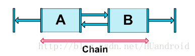
- Chains 链
链条在同一个轴上(水平或者垂直)提供一个类似群组的统一表现。另一个轴可以单独控制。
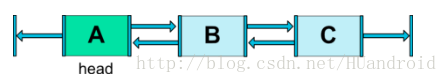
链头
链由链的第一个元素(链的“头”)上设置的属性控制:
链的margin
如果使用中指定了边距,则将被考虑在内:
<?xml version="1.0" encoding="utf-8"?>
<android.support.constraint.ConstraintLayout
    xmlns:android="http://schemas.android.com/apk/res/android"
    xmlns:app="http://schemas.android.com/apk/res-auto"
    xmlns:tools="http://schemas.android.com/tools"
    android:layout_width="match_parent"
    android:layout_height="match_parent"
    android:background="@color/line_bg" tools:layout_editor_absoluteY="25dp">

    <Button
        android:id="@+id/button1"
        android:layout_width="wrap_content"
        android:layout_height="wrap_content"
        android:layout_marginEnd="16dp"
        android:layout_marginStart="16dp"
        android:background="@color/white"
        android:text="Button1"
        app:layout_constraintEnd_toStartOf="@+id/button2"
        app:layout_constraintStart_toStartOf="parent"
        app:layout_constraintTop_toTopOf="parent"/>
    <Button
        android:id="@+id/button2"
        android:layout_width="wrap_content"
        android:layout_height="wrap_content"
        android:layout_marginEnd="16dp"
        android:layout_marginStart="16dp"
        android:background="@color/red_line"
        android:text="Button2"
        app:layout_constraintEnd_toStartOf="@+id/button3"
        app:layout_constraintStart_toEndOf="@+id/button1"
        app:layout_constraintTop_toTopOf="parent"/>

    <Button
        android:id="@+id/button3"
        android:layout_width="wrap_content"
        android:layout_height="wrap_content"
        android:layout_marginEnd="16dp"
        android:layout_marginStart="16dp"
        android:background="@color/blue_4a8eec"
        android:text="Button3"
        app:layout_constraintEnd_toEndOf="parent"
        app:layout_constraintStart_toEndOf="@+id/button2"
        app:layout_constraintTop_toTopOf="parent"/>
</android.support.constraint.ConstraintLayout>
发送约束视图中存在双链,我中有你,你中有我。Button1和Button3分别与父控件对其,形成一条横线整链。
头是水平链最左边的部件,也是垂直链最顶端的部件。
Chain Style 链式
设置属性layout_constraintHorizontal_chainStyle或layout_constraintVertical_chainStyle链条的第一个元素时,链条的行为将根据指定的样式(默认为CHAIN_SPREAD)更改。
a.CHAIN_SPREAD - 元素将被分散(默认样式)
b.加权链式CHAIN_SPREAD模式下,如果某些小部件设置为MATCH_CONSTRAINT,它们将拆分可用空间
c.CHAIN_SPREAD_INSIDE - 类似,但链条的终点不会被分散
d.CHAIN_PACKED - 链条的元素将被打包在一起。小孩的水平或垂直偏向属性将影响打包元素的位置
e.Paced Chain with Bias 跟前面讲过Bias 的使用
还是上面代码,已经创建好链条了,现在去掉边距,便于演示属性的实现:


加权链(Weighted chains)
链的默认行为是在可用空间中均匀分布元素。如果一个或多个元素正在使用MATCH_CONSTRAINT,他们将使用可用的空白区域(在它们之间平均分配)。属性layout_constraintHorizontal_weight和layout_constraintVertical_weight 将控制如何将空间利用的元素之间进行分配MATCH_CONSTRAINT。例如,在包含两个使用元素的链中MATCH_CONSTRAINT,第一个元素使用权重2,第二个权重为1,第一个元素占用的空间将是第二个元素的两倍。类比线性布局里面的权重weight,例子:Button1:Button2:Button3 = 1:2:3
<?xml version="1.0" encoding="utf-8"?>
<android.support.constraint.ConstraintLayout
    xmlns:android="http://schemas.android.com/apk/res/android"
    xmlns:app="http://schemas.android.com/apk/res-auto"
    xmlns:tools="http://schemas.android.com/tools"
    android:layout_width="match_parent"
    android:layout_height="match_parent"
    android:background="@color/line_bg" tools:layout_editor_absoluteY="25dp">

    <Button
        android:id="@+id/button1"
        android:layout_width="0dp"
        android:layout_height="wrap_content"
        android:background="@color/white"
        android:text="Button1"
        app:layout_constraintHorizontal_weight="1"
        app:layout_constraintEnd_toStartOf="@+id/button2"
        app:layout_constraintStart_toStartOf="parent"
        app:layout_constraintTop_toTopOf="parent"/>
    <Button
        android:id="@+id/button2"
        android:layout_width="0dp"
        android:layout_height="wrap_content"
        android:background="@color/red_line"
        android:text="Button2"
        app:layout_constraintHorizontal_weight="2"
        app:layout_constraintEnd_toStartOf="@+id/button3"
        app:layout_constraintStart_toEndOf="@+id/button1"
        app:layout_constraintTop_toTopOf="parent"/>

    <Button
        android:id="@+id/button3"
        android:layout_width="0dp"
        android:layout_height="wrap_content"
        android:background="@color/blue_4a8eec"
        android:text="Button3"
        app:layout_constraintHorizontal_weight="3"
        app:layout_constraintEnd_toEndOf="parent"
        app:layout_constraintStart_toEndOf="@+id/button2"
        app:layout_constraintTop_toTopOf="parent"/>
</android.support.constraint.ConstraintLayout>

- Guideline
作为constraintLayout的辅助工具,辅助对象是不会显示在设备上(被标记为Gone),仅用于布局目的。作为引导基准线,可以是水平的或者垂直的。
定位Guideline有三种方式:
指定距离左侧或顶部的固定距离(layout_constraintGuide_begin)
指定距离右侧或底部的固定距离(layout_constraintGuide_end)
指定在父控件中的宽度或高度的百分比(layout_constraintGuide_percent)
比如,我们要让两个Button在一半的布局中居中,就需要加入辅助类Guideline了,直接开代码:
<?xml version="1.0" encoding="utf-8"?>
<android.support.constraint.ConstraintLayout
    xmlns:android="http://schemas.android.com/apk/res/android"
    xmlns:app="http://schemas.android.com/apk/res-auto"
    xmlns:tools="http://schemas.android.com/tools"
    android:layout_width="match_parent"
    android:layout_height="match_parent"
    android:background="@color/line_bg">

    <Button
        android:id="@+id/button1"
        android:layout_width="wrap_content"
        android:layout_height="wrap_content"
        android:layout_marginEnd="8dp"
        android:layout_marginStart="8dp"
        android:background="@color/white"
        android:text="Button1"
        app:layout_constraintEnd_toStartOf="@+id/guideline"
        app:layout_constraintStart_toStartOf="parent"/>
    <android.support.constraint.Guideline
        android:id="@+id/guideline"
        android:layout_width="wrap_content"
        android:layout_height="wrap_content"
        android:orientation="vertical"
        app:layout_constraintEnd_toEndOf="parent"
        app:layout_constraintGuide_percent="0.5"
        app:layout_constraintStart_toStartOf="parent"
        app:layout_constraintTop_toTopOf="parent"/>
    <Button
        android:id="@+id/button2"
        android:layout_width="wrap_content"
        android:layout_height="wrap_content"
        android:layout_marginEnd="8dp"
        android:layout_marginStart="8dp"
        android:background="@color/red_line"
        android:text="Button2"
        app:layout_constraintEnd_toEndOf="parent"
        app:layout_constraintStart_toStartOf="@+id/guideline"
       />

</android.support.constraint.ConstraintLayout>
是不是相对于多了一个基准线,用来参考,很方便。
总结
非常好用的ConstraintLayout,虽然早就知道了,过了2年才用上,一用才发现真的不错,人啊,还是不能太懒~~
需要注意的是,需要注意的是,需要注意的是,重要的话说三遍,不要手敲,图形化操作,一定要以真机上界面为准,studio上的视图不是很可靠。