本文为本人(Maggie)原创,转载请标明出处~
1、开关switch实现
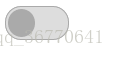
效果
如图,实现一开关效果,鼠标点击可切换状态:
思路
- 两种状态,on和off
- off时,背景灰色,左边圆深灰色,右边圆与背景同色以实现隐藏
- on时,背景绿色,右边圆白色,左边圆与背景同色以实现隐藏
- 初识时状态为off,为整个开关绑定一个click事件,用来toggleClass(交换on和off)
代码
<style>
	.switch
	{
		display: flex;
		border: solid 1px #aaa;
		width: 62px;
		height: 32px;
		background: #ccc;
	}

	.button
	{
		margin: 2px;
		width: 28px;
		height: 28px;
		cursor: pointer;
	}

	.round
	{
		border-radius: 16px;
	}

	.off
	{
		background: #ddd;
	}

	.off div:first-child {
		background: #aaa;
	}

	.off div:last-child {
		background: transparent;
	}

	.on
	{
		background: #3a7;
	}

	.on div:first-child {
		background: transparent;
	}

	.on div:last-child {
		background: #fff;
	}
</style>

<script src="jquery.js"></script>

<script>
	$(document).ready( function () {
		$(".button").click( function() {
			$(".switch").toggleClass("on", "off");
		});
	});
</script>

<div class="switch round off">
	<div class="button round"></div>
	<div class="button round"></div>
</div>
2、list鼠标交互列表(纯CSS实现)
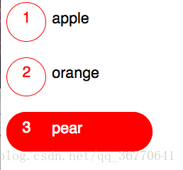
效果
如图,鼠标放上时列表会有颜色、形状的变化
思路
- :hover实现鼠标悬浮
- :first-child、:last-child选中第一个孩子和最后一个孩子
代码
版本1:
<style>
	* {
		font-family: "Calibri";
		font-size: 1.05em;
	}

	ul {
		list-style: none;
		margin: 0;
		padding: 0;
		width: 20em;
	}

	li div:first-child {
		padding: .5em 0 0 1em;
		width: 1.5em;
		height: 2em;
		border: solid 1px red;
		border-radius: 2em;
		color: red;
		transition: all 0.5s ease-in-out;
	}

	li div:last-child {
		position: relative;
		top: -2em;
		left: 3em;
		width: 8em;
	}

	li:hover div:first-child {
		width: 8.5em;
		text-align: left;
		color: white;
		background: red;
	}

	li:hover div:last-child {
		color: white;
	}
</style>

<div>
	<ul>
		<li><div>1</div><div>apple</div></li>
		<li><div>2</div><div>orange</div></li>
		<li><div>3</div><div>pear</div></li>
	</ul>
</div>
版本2:(flex实现)
<style >
	ul,li{
		list-style: none;
		margin: 0;
		padding: 0;
	}

	li{
		position: relative;
		left: 0;
		display: flex;

	}

	li div:first-child
	{
		display: flex;
		text-indent: 1.2rem;
		align-items: center;
		width: 3rem;
		height: 3rem;
		color: orange;
		border: solid 2px orange;
		border-radius: 2rem; /*所有的边长*/

		transition: all 0.5s ease-in-out;

	}

	li div:last-child
	{
		display: flex;
		align-items: center;
		height: 3rem;
		position: absolute;;
		left:4rem;
	}

	li:hover div:first-child
	{
		background: crimson;
		color:white;
        width: 10rem;
	}

	li:hover div:last-child
	{
		color:white;
	}

</style>

<div>
	<ul>
		<li><div>1</div> <div>apple</div></li>
		<li><div>2</div> <div>orange</div></li>
		<li><div>3</div> <div>pear</div></li>
	</ul>
</div>
3、动态交互菜单栏
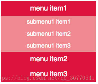
效果
如图,点击主菜单栏menu item时会展开子菜单栏,并收起其它菜单栏:
思路
- 自定义属性parent
- 点击添加类active并下拉,同时上滑原有active类
- .attr获取元素id,[parent=${id}]进行判断,实现点击哪个menu item,就展开它对应的子菜单
代码
<style>
	*{
		font-family: "Segoe UI Light";
		font-size:1.2rem;	   /*150%,百分比存在问题,跟屏幕大小有关*/
	}
	ul,li{
		list-style: none;
		margin:0;
		padding: 0;
	}

	.menu{
		width: 16rem;
		background: crimson;
	}

	li{
		display: flex;
		justify-content: center;
		align-items: center;
		cursor: pointer;		/*光标由插入改为可点*/
	}

	.menu > li{		/*menu下直接的li子元素*/
		height: 2.5rem;
		color: white;
	}

	.submenu > li{		/*menu下直接的li子元素*/
		height: 2rem;
		color: white;
		font-size: 1rem;
		background: #f08890;
	}

	.submenu{
		display: none;
	}
</style>

<script src="jquery.js"></script>
<script>
	$(function(){
		$(".menu>li").click(function(){
			$(".active").slideUp();
			var id =$(this).attr("id");
			$(`.submenu[parent=${id}]`).addClass("active").slideDown();
		});
	});
</script>
<div>
	<ul id="main" class="menu">
		<li id="p1">menu item1</li>
			<ul class="submenu" parent="p1">	<!--parent是自定义的属性-->
				<li>submenu1 item1</li>
				<li>submenu1 item2</li>
				<li>submenu1 item3</li>
			</ul>
		<li id="p2">menu item2</li>
			<ul class="submenu"  parent="p2">
				<li>submenu2 item1</li>
				<li>submenu2 item2</li>
				<li>submenu2 item3</li>
				<li>submenu2 item4</li>
			</ul>
		<li id="p3">menu item3</li>
			<ul class="submenu"  parent="p3">
				<li>submenu3 item1</li>
				<li>submenu3 item2</li>
				<li>submenu3 item3</li>
			</ul>
	</ul>
</div>
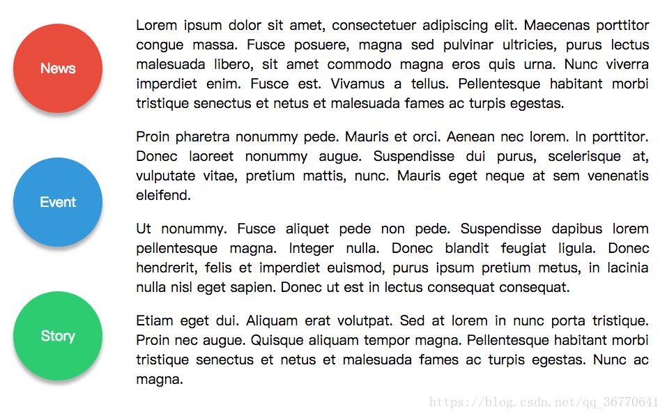
4、交互动态导航栏
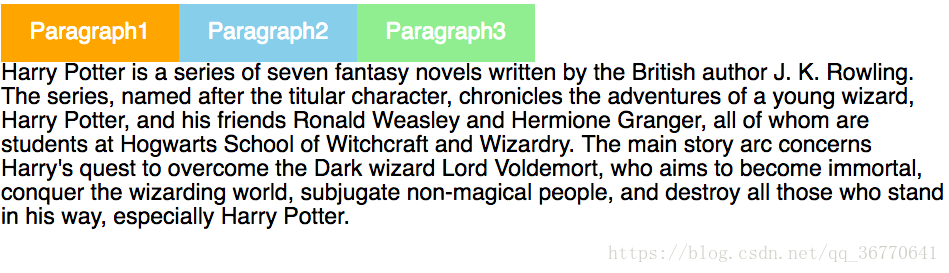
效果
如图,点击的导航栏呈现橙色,并且下方会显示其对应的段落内容;
鼠标悬停的导航栏呈天蓝色;
没有任何操作的导航栏呈浅绿色。
思路
- 初始时显示第一段(即设置为active),其它设置为none
- .hover 设置颜色变化
- event.preventDefault() 阻止缺省事件
- .attr获取属性,展现导航栏对应的段落内容,同时隐藏其它段落。
代码
<style>
	*{
		font-family: "Segoe UI Light";
		font-size:1.2rem;	   /*150%,百分比存在问题,跟屏幕大小有关*/
	}
	ul,li{
		list-style: none;
		margin:0;
		padding: 0;
	}
	a{
		text-decoration: none;
	}

	.tab>ul{	/*使仅对导航有效*/
		display: flex;
	}

	.tab>ul a{		/*为a而不是li做样式,因为可点击的是a元素,让它去找父元素很麻烦*/
		display: flex;
		align-items: center;
		padding:0 1.5rem;
		height: 3rem;
		color: white;
		background: lightgreen;
	}
	.tab>ul a:hover{
		background: skyblue;
	}

	.tab>div{
		display: none;
	}

	.tab>div.active{
		display: block;
	}

	.tab>ul a.active{
		background: orange;
	}
</style>

<script src="jquery.js"></script>
<script>
	$(function(){
		$(".tab>ul a").click(function(event){
			 event.preventDefault();	//阻止缺省事件

			$(".tab>ul a.active").removeClass("active");
			$(this).addClass("active");

			$(".tab>div.active").removeClass("active").hide();

			var id=$(this).attr("href");
			$(`.tab>div[id=${id}]`).addClass("active").show();
		});
	});
</script>

<div class="tab">
	<ul>
		<li><a href="p1" class="active">Paragraph1</a></li>
		<li><a href="p2">Paragraph2</a></li>
		<li><a href="p3">Paragraph3</a></li>
	</ul>
    <div id="p1" class="active">
        Harry Potter is a series of seven fantasy novels written by the British author J. K. Rowling. The series, named after the titular character, chronicles the adventures of a young wizard, Harry Potter, and his friends Ronald Weasley and Hermione Granger, all of whom are students at Hogwarts School of Witchcraft and Wizardry. The main story arc concerns Harry's quest to overcome the Dark wizard Lord Voldemort, who aims to become immortal, conquer the wizarding world, subjugate non-magical people, and destroy all those who stand in his way, especially Harry Potter.
    </div>
    <div id="p2">
        Since the release of the first novel, Harry Potter and the Philosopher's Stone, on 30 June 1997, the books have gained immense popularity, critical acclaim, and commercial success worldwide.[2] The series has also had some share of criticism, including concern for the increasingly dark tone. As of July 2013, the book series had sold between 400 and 450 million copies, making it the best-selling book series in history, and had been translated into 73 languages.[3][4] The last four books consecutively set records as the fastest-selling books in history, with the final instalment selling approximately 11 million copies in the United States within the first twenty-four hours of its release.
    </div>
    <div id="p3">
        A series of many genres, including fantasy, coming of age, and the British school story, (with elements of mystery, thriller, adventure, and romance), it has many cultural meanings and references.[5] According to Rowling, the main theme is death.[6] There are also many other themes in the series, such as prejudice and corruption.[7]
    </div>
</div>
5、换肤系统
效果
如图,通过点击“change theme”即可实现换肤。
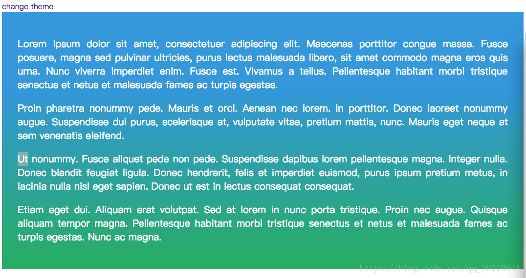
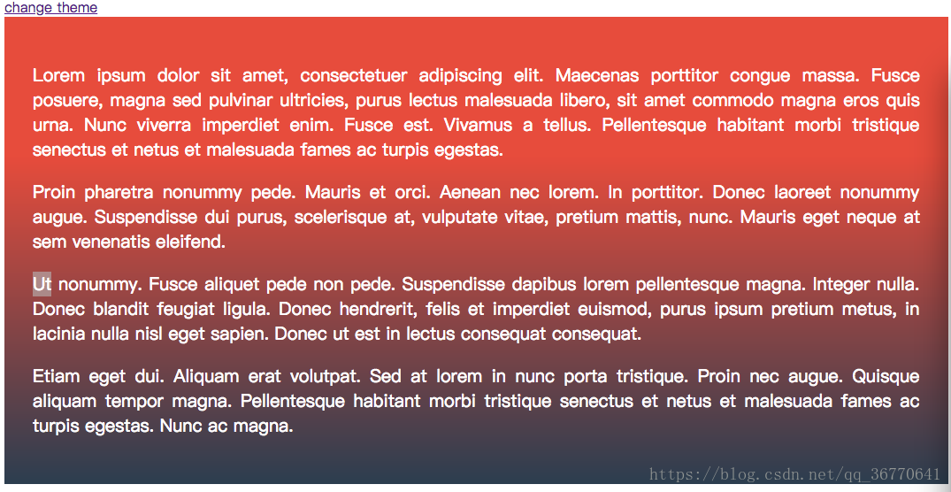
思路
- :root 设置颜色变量
- 两种主题 .themered, .themeblue 分别设置不同的color1、color2
- text-align: justify 设置文字对齐
- linear-gradient(to bottom,var(--color1) 30%,var(--color2)) 设置渐变
- event.preventDefault() 阻止缺省事件
- toggleClass 交换两类
代码
<!DOCTYPE html>
<html>
<head>
    <meta charset="utf-8">
    <meta http-equiv="X-UA-Compatible" content="IE=edge">
    <title></title>
    <link rel="stylesheet" href="">
    <style>
    :root {
        --turquoise: #1abc9c;
        --greensea: #16a085;

        --emerald: #2ecc71;
        --nephritis: #27ae60;

        --river: #3498db;
        --hole: #2980b9;

        --asphalt: #34495e;
        --midnight: #2c3e50;

        --sunflower: #f1c40f;
        --orange: #f39c12;

        --cloud: #ecf0f1;
        --silver: #bdc3c7;

        --alizarin: #e74c3c;
        --pome: #c0392b;
    }

    .themered{
        --color1:var(--alizarin);
        --color2:var(--midnight);
    }

    .themeblue{
        --color1:var(--river);
        --color2:var(--nephritis);
    }

    article{
        font-family: "Segoe UI Light";
        font-size: 1.25rem;
        padding: 2rem;
        text-align: justify;
        color: white;
        background: linear-gradient(to bottom,var(--color1) 30%,var(--color2))
        /*background: linear-gradient(to bottom,red,green);*/
    }
</style>
</head>
<body>
    <script src="jquery.js"></script>
    <script type="text/javascript">
    $(function(){
        $("a").click(function(e){
            e.preventDefault();
            $("article").toggleClass("themered themeblue");
        });
    });
    </script>

<a href="#">change theme</a>

<article class="themeblue">
    <p>Lorem ipsum dolor sit amet, consectetuer adipiscing elit. Maecenas porttitor congue massa. Fusce posuere, magna sed pulvinar ultricies, purus lectus malesuada libero, sit amet commodo magna eros quis urna. Nunc viverra imperdiet enim. Fusce est. Vivamus a tellus. Pellentesque habitant morbi tristique senectus et netus et malesuada fames ac turpis egestas.</p>
    <p>Proin pharetra nonummy pede. Mauris et orci. Aenean nec lorem. In porttitor. Donec laoreet nonummy augue. Suspendisse dui purus, scelerisque at, vulputate vitae, pretium mattis, nunc. Mauris eget neque at sem venenatis eleifend.</p>
    <p>Ut nonummy. Fusce aliquet pede non pede. Suspendisse dapibus lorem pellentesque magna. Integer nulla. Donec blandit feugiat ligula. Donec hendrerit, felis et imperdiet euismod, purus ipsum pretium metus, in lacinia nulla nisl eget sapien. Donec ut est in lectus consequat consequat.</p>
    <p>Etiam eget dui. Aliquam erat volutpat. Sed at lorem in nunc porta tristique. Proin nec augue. Quisque aliquam tempor magna. Pellentesque habitant morbi tristique senectus et netus et malesuada fames ac turpis egestas. Nunc ac magna.</p>
</article>
</body>
</html>
6、动画标题效果(纯CSS实现)
效果
如图,当鼠标悬停到左侧圆圈上时,会有动画效果;当鼠标离开时,同样有离开的动画效果。
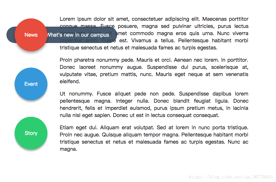
思路
- 同样设置了颜色变量,设置了三种颜色类.red、.blue、.green。注意这种方法,修改时非常方便。
- fr 表示剩余填充
- 圆圈position设置为relative,动画出来的横条position设置为absolute,并设置横条相对于圆圈的位置
- transform-origin: 6rem 2rem 设置横条旋转中心; transform:rotate(-90deg) 设置横条旋转角度
- opacity设置透明度,初始时其值设为0,即全透明
- transition: all .6s ease-in-out 动画,渐入渐出
- boxshadow设置阴影
- 圆圈同样设置动画(鼠标悬停阴影变化)
- .c .a:hover+.b + 号 表示紧邻
代码
<style>
:root {
    --turquoise: #1abc9c;
    --greensea: #16a085;

    --emerald: #2ecc71;
    --nephritis: #27ae60;

    --river: #3498db;
    --hole: #2980b9;

    --asphalt: #34495e;
    --midnight: #2c3e50;

    --sunflower: #f1c40f;
    --orange: #f39c12;

    --cloud: #ecf0f1;
    --silver: #bdc3c7;

    --alizarin: #e74c3c;
    --pome: #c0392b;
}

.red{
    --bk1:var(--alizarin);
    --bk2:var(--asphalt);
}

.blue{
    --bk1:var(--river);
    --bk2:var(--pome);
}

.green{
    --bk1:var(--emerald);
    --bk2:var(--greensea);
}

body{
    text-align: center;
    font-family: "Segoe UI Light";
    font-size: 1.25rem;

}

.page{
    margin: auto;
    display: flex;
    width: 90%;

}

aside{
    width: 8rem;
}

article{
    /*width: 8rem;*/
    width: 1fr;
    text-align: justify;
    padding: 2rem 3rem;
}

.c{
    position: relative;
    margin: 4rem 0;
}

.c .a{
    position: relative; /*为了显示出来,位置也要设置为相对*/
    z-index: 2;
    display: flex;
    justify-content: center;
    align-items: center;
    width: 8rem;
    height: 8rem;
    color: white;
    background: var(--bk1);
    border-radius: 50%;
    box-shadow: 0 6px 8px rgba(0,0,0,.3);   /*  阴影*/
    transition: all .6s ease;
}

.c .b{
    display: flex;
    align-items: center;
    justify-content: flex-end;  /*右对齐*/
    position: absolute;
    top: 2rem;
    left: -2rem;
    width: 25rem;
    height: 4rem;
    padding-right: 2rem;
    color: white;
    background: var(--bk2);
    border-radius: 2rem;
    transform-origin: 6rem 2rem;    /*旋转中心*/
    transform:rotate(-90deg);       /*旋转角度*/
    opacity: 0; /*初始不透明度为0(即全透明)*/
    transition: all .6s ease-in-out;

}

.c .a:hover{
     box-shadow: 0 6px 16px rgba(0,0,0,.4);   /*  阴影*/
}

.c .a:hover+.b{     /*+表示紧邻*/
    opacity: .9;
    transform: rotate(0);

}
</style>

<body>
    <div class="page">
        <aside>
            <div class="c red">
                <div class="a">News</div>
                <div class="b">What's new in our campus</div>
            </div>
            <div class="c blue">
                <div class="a">Event</div>
                <div class="b">What happened recently</div>
            </div>
            <div class="c green">
                <div class="a">Story</div>
                <div class="b">Tell you our stories</div>
            </div>
        </aside>
        <article>
            <p>Lorem ipsum dolor sit amet, consectetuer adipiscing elit. Maecenas porttitor congue massa. Fusce posuere, magna sed pulvinar ultricies, purus lectus malesuada libero, sit amet commodo magna eros quis urna. Nunc viverra imperdiet enim. Fusce est. Vivamus a tellus. Pellentesque habitant morbi tristique senectus et netus et malesuada fames ac turpis egestas.</p>
            <p>Proin pharetra nonummy pede. Mauris et orci. Aenean nec lorem. In porttitor. Donec laoreet nonummy augue. Suspendisse dui purus, scelerisque at, vulputate vitae, pretium mattis, nunc. Mauris eget neque at sem venenatis eleifend.</p>
            <p>Ut nonummy. Fusce aliquet pede non pede. Suspendisse dapibus lorem pellentesque magna. Integer nulla. Donec blandit feugiat ligula. Donec hendrerit, felis et imperdiet euismod, purus ipsum pretium metus, in lacinia nulla nisl eget sapien. Donec ut est in lectus consequat consequat.</p>
            <p>Etiam eget dui. Aliquam erat volutpat. Sed at lorem in nunc porta tristique. Proin nec augue. Quisque aliquam tempor magna. Pellentesque habitant morbi tristique senectus et netus et malesuada fames ac turpis egestas. Nunc ac magna.</p>
        </article>
    </div>
</body>