<div class="checkBox">
  <input type="checkbox" id="check1">
  <label for="check1"></label>
</div>
*{
  padding:0;
  margin:0;
}
.checkBox{
  width:20px;
  margin:20px;
  position:relative;
}
.checkBox label{
  position:absolute;
  left:0;
  top:0;
  width:20px;
  height:20px;
  cursor:pointer;
  background:linear-gradient(to top,#222 0%,#45484d 100%);
  border-radius:4px;
  box-shadow: inset 0px 1px 1px rgba(0,0,0,0.5), 0px 1px 0px rgba(255,255,255,.4);
}
.checkBox label:after{
  position:absolute;
  top:4px;
  left:4px;
  content:'';
  width:9px;
  height:5px;
  background:transparent;
  border:3px solid #fcfff4;
  transform:rotate(-45deg);
  border-top:0;
  border-right:0;
  opacity:0;
}

input[type=checkbox]:checked +label:after{
  opacity:1;
}


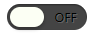
<div class="checkbox2">
  <input type="checkbox" id="check2">
  <label for="check2"></label>
</div>
.checkbox2{
  width:80px;
  height:26px;
  background:#444;
  margin:20px;
  position:relative;
  border-radius:50px;
  box-shadow:inset 0px 1px 1px rgba(0,0,0,0.4),0px 1px 0px rgba(255,255,255,0.2);
}
.checkbox2:after{
  content:'OFF';
  color:#000;
  position:absolute;
  right:10px;
  z-index:0;
  font-size:12px;
  line-height:26px;
  text-shadow:1px 1px 0px rgba(255,255,255,.15);
}
.checkbox2:before{
  content:'ON';
  color:#27ae60;
  position:absolute;
  left:10px;
  z-index:0;
  font-size:12px;
  line-height:26px;
}
.checkbox2 label{
  display:block;
  width:34px;
  height:20px;
  cursor:pointer;
  position:absolute;
  top:3px;
  left:3px;
  z-index:1;
  background:#fcfff4;
  background: linear-gradient(top, #fcfff4 0%, #dfe5d7 40%, #b3bead 100%);
  border-radius: 50px;
  box-shadow: 0px 2px 5px 0px rgba(0,0,0,0.3);
  trnasition:all 0.4s ease;
}
.checkbox2 input[type=checkbox]{
  visibility:hidden;
}
.checkbox2 input[type=checkbox]:checked +label{
  left:43px;
}