Bootstrap(二): 栅格系统点击打开链接如果和表单熟悉结课起来用会有非常强大的功能,网上对于bootstrap的学习资源很多,表单作为一个学习重点,很多大佬在自己的博客中都分享了自己对表单的理解,在这里我推荐一篇自己认为关于bootstrap表单学习写得很详细的文章:http://www.cnblogs.com/sankexin/p/5509955.html点击打开链接
我的这篇博文,接下去会重点针对form-group和form-control这两个类进行分析,还包含form-inline和input一些类的使用。
首先,创建一个注册表单(包括:姓、名、学号、年龄四个内容):
<!doctype html>
<html lang="en">
<head>
    <meta charset="UTF-8">
    <meta name="viewport"
          content="width=device-width, user-scalable=no, initial-scale=1.0, maximum-scale=1.0, minimum-scale=1.0">
    <meta http-equiv="X-UA-Compatible" content="ie=edge">
    <link rel="stylesheet" href="https://cdn.bootcss.com/bootstrap/4.0.0/css/bootstrap.css">
    <link rel="stylesheet" href="css/main.css">
    <title>Document</title>
</head>
<body>
<form class="container container-small">//这里的container-small类是自己在css/main.css中定义的,定义了max-width: 500px;
    <h1>注册</h1>
    <div class="form-group">
        <lable>姓</lable>
        <input type="text" class="form-control">
    </div>
    <div>
        <lable>名</lable>
        <input type="text" class="form-control">
    </div>
    <div class="form-group">
        <lable>学号</lable>
        <input type="text" class="form-control">
    </div>
    <div class="form-group">
        <lable>年龄</lable>
        <input type="text">
    </div>
</form>
</body>
</html>
效果图:
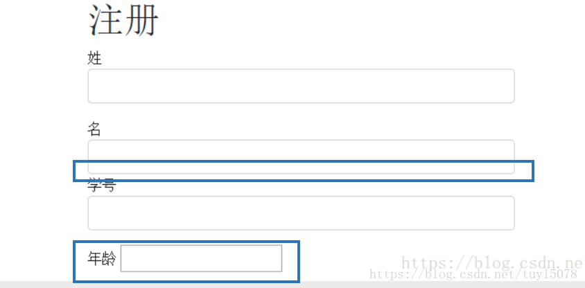
在上述代码中,我同时用到了form-group类和form-control类。为了方便分析这两个类的作用,针对姓和学号这两个lable引用了form-group类和form-control类,名没有引用form-group类,年龄没有引用form-control类。从效果图中可以很明显看出,名所占的那一块与学号连在一块,没有一个下方的边距框。年龄块没有填充满整个内容区。由此,我们可以知道:form-group的作用是增加当前模块的下边界 。form-control的作用是使内容填满整个父元素,并且可以换行。
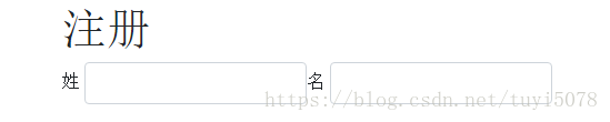
下面继续对这个页面代码进行改进(为了方便看效果图,在这里先删除上面代码中的学号和年龄这两个模块),由于考虑到姓和名没有那么长,所以可以把姓和名这两块放置在一行里面,这时就要引入bootstrap中的form-inline这个类,它的作用就是使该模块中的内容可以在一行显示,而且具有响应式布局的功能。按如下代码修改<body>里面的内容:给姓和名这两个模块的外面再套一个form-inline类的div,同时我把他们共有的form-group类移到最外层的div中。
<form class="container container-small">
    <h1>注册</h1>
    <div class="form-inline form-group">
        <div>
            <lable>姓</lable>
            <input type="text" class="form-control">
        </div>
        <div>
            <lable>名</lable>
            <input type="text" class="form-control">
        </div>
    </div>
</form>
效果图:
继续我们对form-group和form-control的学习,这两个类不仅可以加载在form元素上,也可以作用于别的元素,如我们定义一个选择项标签other,并引用这两个类:
  <div class="form-group">
        <lable>other</lable>
        <select class="form-control">
            <option value="1">张三</option>
            <option value="1">李四</option>
            <option value="1">王五</option>
            <option value="1">赵六</option>
        </select>
    </div>
效果图:

在这里,other块的内容占里父元素的整框且有下边距。form-group和form-control可以加载到任意的元素中。
有的时候,我们需要进行表单验证,当输入成功、输入有误、输入有警示时,输入框以不同颜色的高亮形式来提醒用户。在bootstrap有has-success、has-error、has-warning这三个类。现在分别在姓、名、学号这三个元素上作用这三个类:
<div class="form-group has-success">
            <lable>姓</lable>
            <input type="text" class="form-control">
        </div>
        <div class="form-group has-error">
            <lable>名</lable>
            <input type="text" class="form-control">
        </div>
        <div class="form-group has-warning">
            <lable>学号</lable>
            <input type="text" class="form-control">
        </div>
效果图:

success时,输入框会显示绿色;error时,输入框会显示红色;warning时,输入框会显示黄色。在这里还需要注意一点,这三个类我自己在使用时,bootstrap3.3.7这个版本可以适用成功,加载bootstrap4.0.0版本没法适用成功。
然后,我们在提一下input-group和input-group-addon类。有的时候在一个输入框前面,我们需要提示在这个输入框中需要填入什么类型的数据,所以需要在输入框前面加一个写了类别类似阴影的文本框。
    <div class="form-group">
        <lable>充值金额</lable>
            <div>$</div>
            <input type="text" class="form-control">
    </div>
效果图:
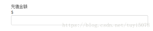
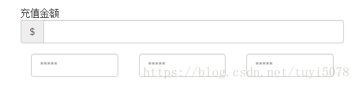
加入input-group和input-group-addon的混合使用,可以实现上述需求。input-group作为输入框组,是对表单的扩展,可在form的div中方便的组合span和input等。改进上述代码:
 <div class="form-group">
        <lable>充值金额</lable>
        <div class="input-group">
            <div class="input-group-addon">$</div>
            <input type="text" class="form-control">
        </div>
    </div>
效果图:

我们还可以对input的大小进行控制,使用类input-lg(大)、input-small(小)。
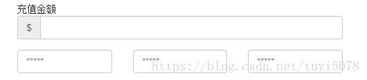
表单的使用可以和其他很多元素一起结合使用,比如:栅格系统。最后,我们就看看密钥输入的样式是如何设置的。步骤一:使用栅格系统将整个input块进行切分(col-sm-'n');步骤二:给每一块一个placehorder(占位符)类
 <div class="col-sm-4">
    <input type="text" class="form-control" placeholder="*****">
 </div>
 <div class="col-sm-4">
    <input type="text" class="form-control" placeholder="*****">
 </div>
 <div class="col-sm-4">
    <input type="text" class="form-control" placeholder="*****">
 </div>
效果图:
当我们不希望,这个被切分区域的input左右两边包含padding时,只需要把些元素全部装到一个类名为row的div中即可。
<div class="row">
   <div class="col-sm-4">
      <input type="text" class="form-control" placeholder="*****">
   </div>
   <div class="col-sm-4">
      <input type="text" class="form-control" placeholder="*****">
   </div>
   <div class="col-sm-4">
      <input type="text" class="form-control" placeholder="*****">
   </div>
</div>
效果图: