版权声明:本文为博主原创文章,未经博主允许不得转载。 https://blog.csdn.net/chi1130/article/details/82844489
前几天看了下网易官网 https://3g.163.com/touch/#/,切到移动端视图,发现:
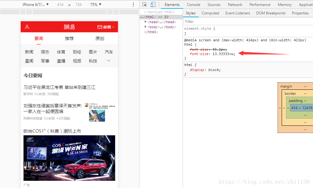
它的css写的是13.33vw;
再看看css文件,又发现:

依然写的都是13.33vw,那这个13.33是怎么来的呢?
如果你了解设计稿你就懂了,其实很简单:
首先要先说明:移动端的设计稿一般是width:750px,height:auto(这里指的是不确定),100vw = 100%,这个也没有问题吧;那么,设计稿拿过来,我们可以得出:750px = 100vw,这个也没有问题吧,那么1px等于多少vw呢? 是不是 1px = 100 / 750 vw = 0.3333vw;那么100px = 多少vw呢,这个应该知道了吧。100px = 13.33vw;
思路过程:
mobile.width = 750px => 750px = 100% =100vw => 750px = 100vw => 1px = 0.1333vw => 100px = 13.33vw => 1rem =100px;
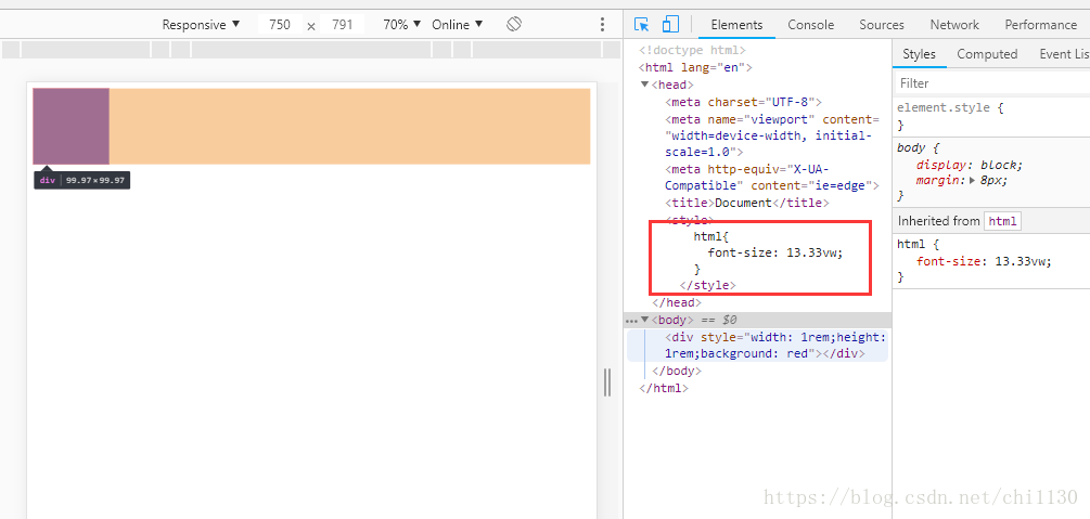
即:我们把html:{font-size: 13.33vw} // 也就是以100px位基准;1rem = 100px;
现在就好算多了;移动端的尺寸 / 100 = XXX rem;
另外这个简单的js也能做出这样的效果
扫描二维码关注公众号,回复:
3420508 查看本文章

(function (window, document) {
      var getRem = function () {
        if (document) {
          var html = document.documentElement;
          var hWidth = (html.getBoundingClientRect().width) * (750 / 352);
          console.log(hWidth)
          html.style.fontSize = hWidth / 16 + "px";
          console.log(html.style.fontSize)
        }
      };
      getRem();
      window.onresize = function () {
        getRem();
      }
    })(window, document)
测试得:这两种效果都是一样的

更多简单实用例子,包括vue,react,ant-design.......请转至https://github.com/chengheai,相互交流~~~~~~