本文出自:http://blog.csdn.net/dt235201314/article/details/52222088
MPAndroidChart常见设置属性(一)——应用层
MPAndroidChart项目实战(一)——实现对比性柱状图
MPAndroidChart项目实战(二)——双平滑曲线(双折线图)和MarkView实现
MPAndroidChart项目实战(三)——饼状图实现和文字重合问题解决
MPAndroidChart项目实战(四)——柱状图实现及X轴文字不显示问题和柱状图上显示文字
MPAndroidChart X轴文字斜着显示
MPAndroidChart项目实战(五)——组合图实现趋势图
MPAndroidChart项目实战(六)——自定义1MPAndroidChart滑动冲突解决(搞不定产品设计师就只能搞自己)
MPAndroidChart项目实战(七)——自定义横向柱状图
MPAndroidChart项目实战(八)——自定义分段堆积柱状图
MPAndroidChart项目实战(九)——自定义带文字分段堆积柱状图
一丶简述
上一篇简单介绍了有关MPAndroidChart,及一些相关得博文链接,并说到了工作上的问题。这一篇就总结一下应用层,如何运用MPAndroidChart
每一篇博文都有自己特点和不足,不可能满足有所读者的需求,相同的需求都会不同的UI
二丶MPAndroidChart常见设置属性(又是选择性copy)
代码居然被压缩了,主要看属性和效果图
一、使用
为了使用 LineChart, BarChart, ScatterChart, CandleStickChart, PieChart, BubbleChart or RadarChart ,要在 .xml 文件定义:
<com.github.mikephil.charting.charts.LineChart
        android:id="@+id/chart"
        android:layout_width="match_parent"
        android:layout_height="match_parent" />
然后在 Activity 或 Fragment 中拿到你定义的 chart:
LineChart chart = (LineChart) findViewById(R.id.chart);使用 java 代码创建它(如果不是在布局文件中定义,需要将其加入你的布局):
// programmatically create a LineChart
    LineChart chart = new LineChart(Context);

    // get a layout defined in xml
    RelativeLayout rl = (RelativeLayout) findViewById(R.id.relativeLayout);
    rl.add(chart); // add the programmatically created chart
二、刷新
- invalidate() : 在chart中调用会使其刷新重绘
- notifyDataSetChanged() : 让chart知道它依赖的基础数据已经改变,并执行所有必要的重新计算(比如偏移量,legend,最大值,最小值 …)。在动态添加数据时需要用到。
三、打印日志
- setLogEnabled(boolean enabled) : 设置为true将激活chart的logcat输出。但这不利于性能,如果不是必要的,应保持禁用。
四、基本chart风格
这里我们先定义一个LineChart范例:
<!--折线图,layout的背景色为 #bdbdbd 灰-->
        <com.github.mikephil.charting.charts.LineChart
            android:id="@+id/line_chart"
            android:layout_width="match_parent"
            android:layout_height="300dp"
            android:background="#ffffff"
            android:layout_margin="16dp"/>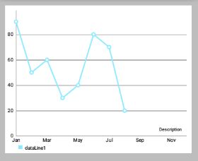
下面是一些可以直接在 chart 上使用的设置 style 的方法:
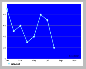
setBackgroundColor(int color): 设置背景颜色,将覆盖整个图表视图。 此外,背景颜色可以在布局文件.xml中进行设置。
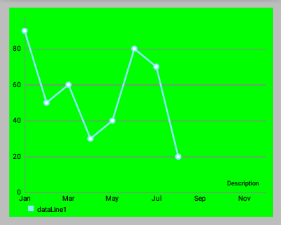
注意:设置颜色时要ARGB完整的八位(如 0xff00ff00),否则可能会被视为“设置透明颜色”(如 0xff0000)
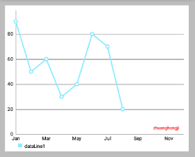
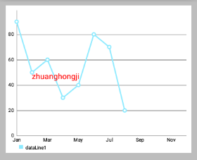
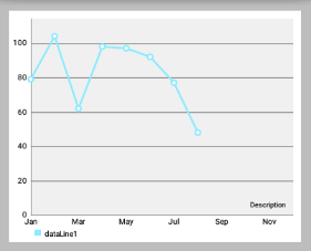
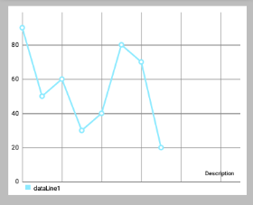
setDescription(String desc): 设置图表的描述文字,会显示在图表的右下角。-
setDescriptionColor(int color): 设置描述文字的颜色。 -
setDescriptionPosition(float x, float y): 自定义描述文字在屏幕上的位置(单位是像素)。 setDescriptionTypeface(Typeface t): 设置描述文字的 Typeface。-
setDescriptionTextSize(float size): 设置以像素为单位的描述文字,最小6f,最大16f。 -
setNoDataTextDescription(String desc): 设置当 chart 为空时显示的描述文字。 -
setDrawGridBackground(boolean enabled): 如果启用,chart 绘图区后面的背景矩形将绘制。 -
setGridBackgroundColor(int color): 设置网格背景应与绘制的颜色。 -
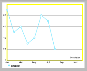
setDrawBorders(boolean enabled): 启用/禁用绘制图表边框(chart周围的线)。 setBorderColor(int color): 设置 chart 边框线的颜色。setBorderWidth(float width): 设置 chart 边界线的宽度,单位 dp。-
-
setMaxVisibleValueCount(int count): 设置最大可见绘制的 chart count 的数量。 只在setDrawValues()设置为true时有效。
启用/ 禁止 手势交互
setTouchEnabled(boolean enabled): 启用/禁用与图表的所有可能的触摸交互。setDragEnabled(boolean enabled): 启用/禁用拖动(平移)图表。setScaleEnabled(boolean enabled): 启用/禁用缩放图表上的两个轴。setScaleXEnabled(boolean enabled): 启用/禁用缩放在x轴上。setScaleYEnabled(boolean enabled): 启用/禁用缩放在y轴。setPinchZoom(boolean enabled): 如果设置为true,捏缩放功能。 如果false,x轴和y轴可分别放大。setDoubleTapToZoomEnabled(boolean enabled): 设置为false以禁止通过在其上双击缩放图表。setHighlightPerDragEnabled(boolean enabled): 设置为true,允许每个图表表面拖过,当它完全缩小突出。 默认值:truesetHighlightPerTapEnabled(boolean enabled): 设置为false,以防止值由敲击姿态被突出显示。 值仍然可以通过拖动或编程方式突出显示。 默认值:true
图表的 抛掷/减速
setDragDecelerationEnabled(boolean enabled): 如果设置为true,手指滑动抛掷图表后继续减速滚动。 默认值:true。setDragDecelerationFrictionCoef(float coef): 减速的摩擦系数在[0; 1]区间,数值越高表示速度会缓慢下降,例如,如果将其设置为0,将立即停止。 1是一个无效的值,会自动转换至0.9999。
高亮
highlightValues(Highlight[] highs): 高亮显示值,高亮显示的点击的位置在数据集中的值。 设置null或空数组则撤消所有高亮。highlightValue(int xIndex, int dataSetIndex): 高亮给定xIndex在数据集的值。 设置xIndex或dataSetIndex为-1撤消所有高亮。getHighlighted(): 返回一个Highlight[]其中包含所有高亮对象的信息,xIndex和dataSetIndex。
以java编程方式使得值高亮不会回调 OnChartValueSelectedListener .
选择回调
MPAndroidChart 提供了许多用于交互回调的方法,其中 OnChartValueSelectedListener 在点击高亮值时回调。
public interface OnChartValueSelectedListener {
    /**
    * Called when a value has been selected inside the chart.
    *
    * @param e The selected Entry.
    * @param dataSetIndex The index in the datasets array of the data object
    * the Entrys DataSet is in.
    * @param h the corresponding highlight object that contains information
    * about the highlighted position
    */
    public void onValueSelected(Entry e, int dataSetIndex, Highlight h);
    /**
    * Called when nothing has been selected or an "un-select" has been made.
    */
    public void onNothingSelected();
}
让你的类实现该接口并设置对 chart 进行监听,即可接受回调。
Simply let your class that should receive the callbacks implement this interface and set it as a listener to the chart:
chart.setOnChartValueSelectedListener(this);手势回调
监听器 OnChartGestureListener 可以使得 chart 与手势操作进行交互。
public interface OnChartGestureListener {

    /**
     * Callbacks when a touch-gesture has started on the chart (ACTION_DOWN)
     *
     * @param me
     * @param lastPerformedGesture
     */
    void onChartGestureStart(MotionEvent me, ChartTouchListener.ChartGesture lastPerformedGesture);

    /**
     * Callbacks when a touch-gesture has ended on the chart (ACTION_UP, ACTION_CANCEL)
     *
     * @param me
     * @param lastPerformedGesture
     */
    void onChartGestureEnd(MotionEvent me, ChartTouchListener.ChartGesture lastPerformedGesture);

    /**
     * Callbacks when the chart is longpressed.
     *
     * @param me
     */
    public void onChartLongPressed(MotionEvent me);

    /**
     * Callbacks when the chart is double-tapped.
     *
     * @param me
     */
    public void onChartDoubleTapped(MotionEvent me);

    /**
     * Callbacks when the chart is single-tapped.
     *
     * @param me
     */
    public void onChartSingleTapped(MotionEvent me);

    /**
     * Callbacks then a fling gesture is made on the chart.
     *
     * @param me1
     * @param me2
     * @param velocityX
     * @param velocityY
     */
    public void onChartFling(MotionEvent me1, MotionEvent me2, float velocityX, float velocityY);

   /**
     * Callbacks when the chart is scaled / zoomed via pinch zoom gesture.
     *
     * @param me
     * @param scaleX scalefactor on the x-axis
     * @param scaleY scalefactor on the y-axis
     */
    public void onChartScale(MotionEvent me, float scaleX, float scaleY);

   /**
    * Callbacks when the chart is moved / translated via drag gesture.
    *
    * @param me
    * @param dX translation distance on the x-axis
    * @param dY translation distance on the y-axis
    */
    public void onChartTranslate(MotionEvent me, float dX, float dY);
}
让你的类实现该接口并设置对 chart 进行监听,即可接受回调。
chart.setOnChartGestureListener(this);设置了监听器后,chart 会根据你的 setXXXEnable() 进行放缩移动等操作。不用在接口方法里对图表进行放缩移动等其他操作,接口方法可以让你实现其他对应功能,比如说你要打印放缩是的 ScaleX,ScaleY :
@Override
    public void onChartScale(MotionEvent me, float scaleX, float scaleY) {
        Log.i("Scale / Zoom", "ScaleX: " + scaleX + ", ScaleY: " + scaleY);
    }
打印的日志类似:
I/Gesture: START
I/Scale / Zoom: ScaleX: 1.0, ScaleY: 1.0
I/Scale / Zoom: ScaleX: 1.0, ScaleY: 1.0
I/Scale / Zoom: ScaleX: 1.0174584, ScaleY: 1.0174584
I/Scale / Zoom: ScaleX: 1.240304, ScaleY: 1.240304
I/Scale / Zoom: ScaleX: 1.4446417, ScaleY: 1.4446417
I/Scale / Zoom: ScaleX: 1.5617653, ScaleY: 1.5617653
I/Scale / Zoom: ScaleX: 1.0241176, ScaleY: 1.0241176
I/Scale / Zoom: ScaleX: 1.1038365, ScaleY: 1.1038365
I/Gesture: END, lastGesture: PINCH_ZOOM
下面是练习时写的一些 OnChartGestureListener 接口实现方法:
@Override
    public void onChartGestureStart(MotionEvent me, ChartTouchListener.ChartGesture lastPerformedGesture) {
        Log.i("Gesture", "START");
    }

    @Override
    public void onChartGestureEnd(MotionEvent me, ChartTouchListener.ChartGesture lastPerformedGesture) {
        Log.i("Gesture", "END, lastGesture: " + lastPerformedGesture);

        // un-highlight values after the gesture is finished and no single-tap
        if (lastPerformedGesture != ChartTouchListener.ChartGesture.SINGLE_TAP)
            mChart.highlightValues(null); // or highlightTouch(null) for callback to onNothingSelected(...)
    }

    @Override
    public void onChartLongPressed(MotionEvent me) {
        Log.i("LongPress", "Chart longpressed.");
    }

    @Override
    public void onChartDoubleTapped(MotionEvent me) {
        Log.i("DoubleTap", "Chart double-tapped.");
    }

    @Override
    public void onChartSingleTapped(MotionEvent me) {
        Log.i("SingleTap", "Chart single-tapped.");
    }

    @Override
    public void onChartFling(MotionEvent me1, MotionEvent me2, float velocityX, float velocityY) {
        Log.i("Fling", "Chart flinged. VeloX: " + velocityX + ", VeloY: " + velocityY);
    }

    @Override
    public void onChartScale(MotionEvent me, float scaleX, float scaleY) {
        Log.i("Scale / Zoom", "ScaleX: " + scaleX + ", ScaleY: " + scaleY);
    }

    @Override
    public void onChartTranslate(MotionEvent me, float dX, float dY) {
        Log.i("Translate / Move", "dX: " + dX + ", dY: " + dY);
    }

    @Override
    public void onValueSelected(Entry e, int dataSetIndex, Highlight h) {
        Log.i("Entry selected", e.toString());
        Log.i("", "low: " + mChart.getLowestVisibleXIndex() + ", high: " + mChart.getHighestVisibleXIndex());
    }

    @Override
    public void onNothingSelected() {
        Log.i("Nothing selected", "Nothing selected.");
    }
}
一、坐标轴
1.Document
在文档中,AxisBase是XAxis和YAxis的父类
-
AxisBase
Baseclass of all labels. -
XAxis
Class representing the x-axis labels settings. Only use the setter methods to modify it. Do not access public variables directly. Be aware that not all features the XLabels class provides are suitable for the RadarChart.
X轴标签设置。只使用setter方法来修改它,不要直接访问公共变量。请注意,not all features the XLabels class provides are suitable for the RadarChart(对于RadarChart蜘蛛网状图不是所有的Xlabels 都适用)。 -
YAxis
Class representing the y-axis labels settings and its entries. Only use the setter methods to modify it. Do not access public variables directly. Be aware that not all features the YLabels class provides are suitable for the RadarChart. Customizations that affect the value range of the axis need to be applied before setting data for the chart.
Y轴标签设置和它的条目。只使用setter方法来修改它,不要直接访问公共变量。请注意,not all features the XLabels class provides are suitable for the RadarChart(对于RadarChart蜘蛛网状图不是所有的Ylabels 都适用)。在为chart设置 data 之前,影响轴的值范围的 Customizations 需要先被应用。
2. 概述
下面提及的方法可以适用于两个轴 。
“轴”类允许特定的Style,由以下 components/parts 组成(可以包含):
- 轴的标签(y轴垂直绘制 或 x轴水平取向),contain 轴的描述值。
- 所谓
axis-line被直接绘制在便签旁且平行。 grid-lines在水平方向,且源自每一个轴标签。LimitLines允许呈现的特别信息,如边界或限制。
3. 控制轴的哪些部分被绘制
setEnabled(boolean enabled): 设置轴启用或禁用。如果false,该轴的任何部分都不会被绘制(不绘制坐标轴/便签等)。比如:-
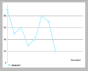
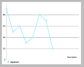
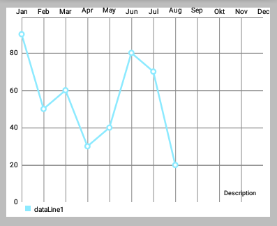
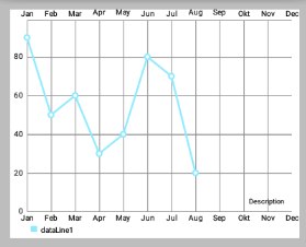
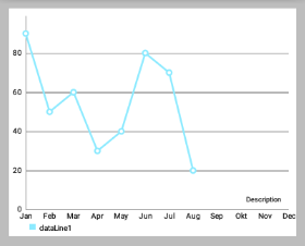
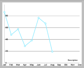
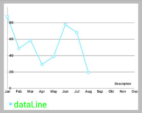
//上面右边效果图的部分代码,设置X轴
        XAxis xAxis = chart.getXAxis();
        xAxis.setPosition(XAxis.XAxisPosition.BOTTOM); // 设置X轴的位置
//        xAxis.setTypeface(mTf); // 设置字体
        xAxis.setEnabled(false);
        // 上面第一行代码设置了false,所以下面第一行即使设置为true也不会绘制AxisLine
        xAxis.setDrawAxisLine(true);

        // 前面xAxis.setEnabled(false);则下面绘制的Grid不会有"竖的线"(与X轴有关)
        xAxis.setDrawGridLines(true); // 效果如下图
setDrawGridLines(boolean enabled): 设置为true,则绘制网格线。-
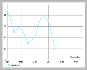
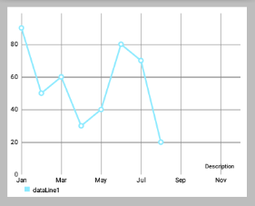
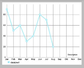
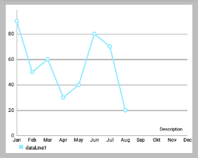
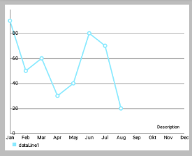
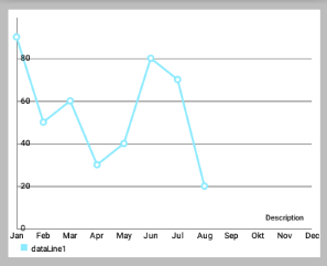
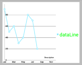
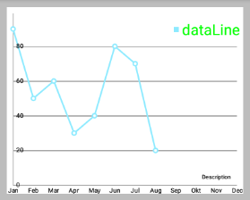
 // 上面左边效果图的代码
        // 两个都设置为 true
        xAxis.setEnabled(true);
        xAxis.setDrawGridLines(true);

        // 上面右边效果图的代码
        xAxis.setEnabled(false);
        // xAxis.setEnabled(false);则下面绘制的Grid不会有 "竖的线(与X轴有关)"
        xAxis.setDrawGridLines(true);
-
setDrawAxisLine(boolean enabled): 设置为true,则绘制该行旁边的轴线(axis-line)。 -
setDrawLabels(boolean enabled): 设置为true,则绘制轴的标签。

4. Styling / 修改轴
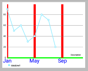
setTextColor(int color): 设置轴标签的颜色。setTextSize(float size): 设置轴标签的文字大小。setTypeface(Typeface tf): 设置轴标签的 Typeface。setGridColor(int color): 设置该轴的网格线颜色。setGridLineWidth(float width): 设置该轴网格线的宽度。setAxisLineColor(int color): 设置轴线的轴的颜色。setAxisLineWidth(float width): 设置该轴轴行的宽度。-
xAxis.setTextColor(Color.BLUE); xAxis.setTextSize(24f); xAxis.setGridLineWidth(10f); xAxis.setGridColor(Color.RED); xAxis.setAxisLineColor(Color.GREEN); xAxis.setAxisLineWidth(5f); -
enableGridDashedLine(float lineLength, float spaceLength, float phase): 启用网格线的虚线模式中得出,比如像这样“ - - - - - - ”。- “lineLength”控制虚线段的长度
- “spaceLength”控制线之间的空间
- “phase”controls the starting point.
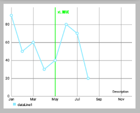
5. 限制线
两个轴支持 LimitLines 来呈现特定信息,如边界或限制线。LimitLines 加入到 YAxis 在水平方向上绘制,添加到 XAxis 在垂直方向绘制。 如何通过给定的轴添加和删除 LimitLines:
addLimitLine(LimitLine l): 给该轴添加一个新的 LimitLine 。removeLimitLine(LimitLine l): 从该轴删除指定 LimitLine 。- 还有其他的方法进行 添加/删除 操作。
-
 // 设置x轴的LimitLine,index是从0开始的
        LimitLine xLimitLine = new LimitLine(4f,"xL 测试");
        xLimitLine.setLineColor(Color.GREEN);
        xLimitLine.setTextColor(Color.GREEN);
        xAxis.addLimitLine(xLimitLine);

        // 设置x轴的LimitLine
        LimitLine yLimitLine = new LimitLine(50f,"yLimit 测试");
        yLimitLine.setLineColor(Color.RED);
        yLimitLine.setTextColor(Color.RED);
        // 获得左侧侧坐标轴
        YAxis leftAxis = chart.getAxisLeft();
        leftAxis.addLimitLine(yLimitLine);
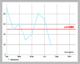
setDrawLimitLinesBehindData(boolean enabled): 控制LimitLines与actual data之间的z-order。 如果设置为 true,LimitLines 绘制在 actual data 的后面,否则在其前面。 默认值:false
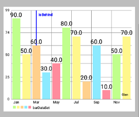
// 查看setLimitLinesBehindData()方法,true或false的效果图
        LimitLine xLimitLine = new LimitLine(2f,"is Behind");
        xLimitLine.setLineColor(Color.BLUE);
        xLimitLine.setTextColor(Color.BLUE);
        xAxis.addLimitLine(xLimitLine);
        xAxis.setDrawLimitLinesBehindData(true);
//        xAxis.setDrawLimitLinesBehindData(false);
Limit lines(LimitLine类) 用来为用户提供简单明了的额外信息。
再举一个例子,在用户登录用的应用程序中,图表可能会显示各种血压测量结果。 为了让用户知道超过140mmHg 的血压是被认为是一个健康风险的用户,可以添加一个 140 的 LimitLine 来提供该信息。示例代码 :
YAxis leftAxis = chart.getAxisLeft();

LimitLine ll = new LimitLine(140f, "血压偏高");
ll.setLineColor(Color.RED);
ll.setLineWidth(4f);
ll.setTextColor(Color.BLACK);
ll.setTextSize(12f);
// .. and more styling options

leftAxis.addLimitLine(ll);
二、X坐标轴
1. 概述
XAxis 类是 AxisBase 的一个子类。 XAxis 类是所有与水平轴相关的 “数据和信息容器”。
每个 Line-, Bar-, Scatter-, CandleStick- and RadarChart 都有一个 XAxis 对象。 XAxis 对象展示了以 ArrayList<String> 或 String[] ("xVals") 形式递交给 ChartData 对象的数据。
为了获得 XAxis 类的实例,可执行以下操作:
XAxis xAxis = chart.getXAxis();2. 自定义轴值
-
setSpaceBetweenLabels(int characters): 设置标签字符间的空隙,默认characters间隔是4 。 -
setLabelsToSkip(int count): 设置在”绘制下一个标签”时,要忽略的标签数。 This will disable the feature that automatically calculates an adequate space between the axis labels and set the number of labels to be skipped to the fixed number provided by this method. CallresetLabelsToSkip(...)to re-enable automatic calculation. -
resetLabelsToSkip(): 调用这个方法将使得通过setLabelsToSkip(...)的“忽略效果”失效 while drawing the x-axis. Instead, the number of values to skip will again be calculated automatically. -
// 上面左图的代码
    xAxis.setLabelsToSkip(4);
    // xAxis.resetLabelsToSkip();

    // 上面右图的代码,会发现 xAxis.setLabelsToSkip(4); 的效果并没有出现
    xAxis.setLabelsToSkip(4);
    xAxis.resetLabelsToSkip();
-
setAvoidFirstLastClipping(boolean enabled): 如果设置为true,则在绘制时会避免“剪掉”在x轴上的图表或屏幕边缘的第一个和最后一个坐标轴标签项。 -
setPosition(XAxisPosition pos): 设置XAxis出现的位置。TOP,BOTTOM,TOP_INSIDE,BOTTOM_INSIDE或BOTH_SIDED。 (从左到右,从上到下,对应下图)
3. 格式化值
setValueFormatter(XAxisValueFormatter formatter)设置自定义格式,在绘制之前动态调整x的值。
4. 范例代码
XAxis xAxis = chart.getXAxis();
xAxis.setPosition(XAxisPosition.BOTTOM);
xAxis.setTextSize(10f);
xAxis.setTextColor(Color.RED);
xAxis.setDrawAxisLine(true);
xAxis.setDrawGridLines(false);
// set a custom value formatter
xAxis.setXValueFormatter(new MyCustomFormatter());
// and more...
三、Y轴
1. 概述
YAxis 是 AxisBase 的一个子类。
YAxis 类是一切与垂直轴相关的数据和信息的容器。 每个 Line-, Bar-, Scatter or CandleStickChart 都有 left 和 right 的 YAxis 的对象,分别在左右两边。 但是 RadarChart 只有一个 YAxis 。 缺省情况下,图表的两个轴都被启用,并且将被绘制。
通过以下方法可获得 YAxis 类实例 :
YAxis leftAxis = chart.getAxisLeft();
YAxis rightAxis = chart.getAxisRight();

YAxis leftAxis = chart.getAxis(AxisDependency.LEFT);

YAxis yAxis = radarChart.getYAxis(); // this method radarchart only
在运行时,使用 public AxisDependency getAxisDependency() 方法以确定此轴表示图表的侧面。
2. 自定义轴值
setStartAtZero(boolean enabled): 设置为 true,则无论图表显示的是哪种类型的数据,该轴最小值总是0 。setAxisMaxValue(float max): 设置该轴的最大值。 如果设置了,这个值将不会是根据提供的数据计算出来的。resetAxisMaxValue(): 调用此方法撤销先前设置的最大值。 通过这样做,你将再次允许轴自动计算出它的最大值。setAxisMinValue(float min): 设置该轴的自定义最小值。 如果设置了,这个值将不会是根据提供的数据计算出来的。resetAxisMinValue(): 调用此撤销先前设置的最小值。 通过这样做,你将再次允许轴自动计算它的最小值。-
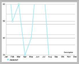
// 上面的右图是以下代码设置后的效果图 leftAxis.setStartAtZero(false); leftAxis.setAxisMinValue(30); leftAxis.setAxisMaxValue(60); -
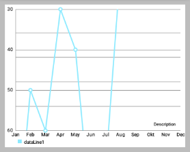
setInverted(boolean enabled): 如果设置为true,该轴将被反转,这意味着最高值将在底部,顶部的最低值。 -
setSpaceTop(float percent): 设置图表中的最高值的顶部间距占最高值的值的百分比(设置的百分比 = 最高柱顶部间距/最高柱的值)。默认值是10f,即10% 。 -
// 上面左图,间距长度是值长度的50%,间距长度是值长度的二分之一
    leftAxis.setSpaceTop(20f);

    // 上面左图,间距长度是值长度的100%,即两者相等
    leftAxis.setSpaceTop(100f);
-
setSpaceBottom(float percent): Sets the bottom spacing (in percent of the total axis-range) of the lowest value in the chart in comparison to the lowest value on the axis. -
setLabelCount(int count, boolean force): 设置y轴的标签数量。 请注意,这个数字是不固定if(force == false),只能是近似的。 如果if(force == true),则确切绘制指定数量的标签,但这样可能导致轴线分布不均匀。 setShowOnlyMinMax(boolean enabled): 如果启用,该轴将只显示它的最小值和最大值。 如果force == true这可能会被忽略/覆盖。-
// 上面的左图
    leftAxis.setLabelCount(5, false);
    leftAxis.setShowOnlyMinMax(true);

    // 上面的右图
    leftAxis.setLabelCount(5, false);
    leftAxis.setShowOnlyMinMax(true);
setPosition(YAxisLabelPosition pos): 设置,其中轴标签绘制的位置。 无论是OUTSIDE_CHART或INSIDE_CHART。
为图表设定数据前,影响图表轴所需的值范围要先定义好。
3. 自定义格式的轴标签
setValueFormatter(YAxisValueFormatterf): 设置该轴的自定义 ValueFormatter 。 该接口允许 格式化/修改 原来的标签文本,返回一个自定义的文本。
4. 示例代码
YAxis yAxis = mChart.getAxisLeft();
yAxis.setTypeface(...); // set a different font
yAxis.setTextSize(12f); // set the textsize
yAxis.setAxisMaxValue(100f); // the axis maximum is 100
yAxis.setTextColor(Color.BLACK);
yAxis.setValueFormatter(new MyValueFormatter());
yAxis.setLabelCount(6, false);
//... and more
一、ChartData 类
为了让大家更容易理解,这里先简单介绍下 MPAndroidChart 的数据模型 ChartData 。后面有文章再详细介绍该图标库的其它数据类型。
ChartData 类是所有数据类的基类,比如 LineData,BarData 等,它是用来为 Chart 提供数据的,通过 setData(ChartData data){...} 方法。
public class LineData extends ChartData { ...以下提到的方法是在 ChartData 类中被实现,因此可用于所有子类。
1. Styling data
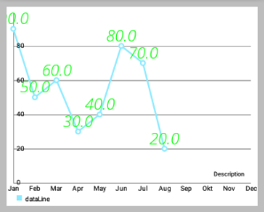
setDrawValues(boolean enabled): 启用/禁用 绘制所有DataSets数据对象包含的数据的值文本。setValueTextColor(int color): 设置DataSets数据对象包含的数据的值文本的颜色。setValueTextSize(float size): 设置DataSets数据对象包含的数据的值文本的大小(单位是dp)。-
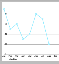
//LineDataSet可以看做是一条线
    LineDataSet dataSet = new LineDataSet(entryList, "dataLine");
    dataSet.setLineWidth(2.5f);
    dataSet.setCircleSize(4.5f);
    dataSet.setHighLightColor(Color.RED); // 设置点击某个点时,横竖两条线的颜色
    dataSet.setDrawValues(true); // 是否在点上绘制Value
    dataSet.setValueTextColor(Color.GREEN);
    dataSet.setValueTextSize(12f);
    allLinesList.add(dataSet);
setValueTypeface(Typeface tf): 设置Typeface的所有价值标签的所有DataSets这些数据对象包含。


 dataSet.setValueTextSize(24f);
        allLinesList.add(dataSet);

        // 设置上面左图的字体
        Typeface tf1 = Typeface.createFromAsset(getAssets(), "OpenSans-BoldItalic.ttf");
        dataSet.setValueTypeface(tf1);

        // 设置上面右图的字体
        Typeface tf2 = Typeface.createFromAsset(getAssets(), "OpenSans-LightItalic.ttf");
        dataSet.setValueTypeface(tf2);
setValueFormatter(ValueFormatter f): 为DataSets数据对象包含的数据设置自定义的ValueFormatter。
2. Getters / Convenience
getDataSetByIndex(int index): 返回目标DataSet列表中给定索引的数据对象。contains(Entry entry): 检查此数据对象是否包含指定的Entry 。 注:这个相当影响性能,性能严峻情况下,不要过度使用。contains(T dataSet): Returns true if this data object contains the provided DataSet , false if not.
3. Clear
clearValues(): 清除所有DataSet对象和所有Entries的数据 。 不会删除所提供的x-values。
4, 选中高亮
setHighlightEnabled(boolean enabled): 设置为true,允许通过点击高亮突出ChartData对象和其DataSets。
二、设置数据
1. 概述
如果你想为图表添加数据,你可以通过下面这个方法:
public void setData(ChartData data) { ... }基类 ChartData 封装了渲染过程中所需要的图表中的所有数据和信息。 对于每种类型的图表,不同的 ChartData 子类(例如 LineData)应该被用于为图表设置数据。 在构造函数中,你可以通过 ArrayList<? extends DataSet> 作为要显示的值,一个额外 ArrayList 的 String 用来描述 x 轴上的标签。 例如,通过 LineData 将数据添加到一个 LineChart :
public LineData(ArrayList<String> xVals, ArrayList<LineDataSet> sets) { ... }那么,DataSet 到底是什么和为什么你会需要它? 很简单,一个 DataSet 对象代表一组 entries(数据类型 Entry),在图表内属于一个整体。 它在图表中被设计成 逻辑上分离的不同组的值 。 每种类型的图表,通过一个不同的 DataSet 对象(如 LineDataSet)来做出特定的 style 。
2. 举个例子
你可能想用 LineChart 来 显示两个不同公司一年的季度收入 。在这种情况下,将建议创建两个不同的 LineDataSet 对象,每个包含四个值(四个季度)。 用一个 ArrayList 描述在x轴上的标签,您只需提供四个 String : “第一季度”,“第二季度”,“第三季度”,“第四季度” 。
当然,也有可能只提供一个包含两个公司的所有8个值的 LineDataSet 对象。
那么,如何建立一个 LineDataSet 对象?
// LineDataSet 类的源码
public class LineDataSet extends LineRadarDataSet<Entry> {
    ....
    public LineDataSet(List<Entry> yVals, String label) {
        super(yVals, label);

        // mCircleSize = Utils.convertDpToPixel(4f);
        // mLineWidth = Utils.convertDpToPixel(1f);

        mCircleColors = new ArrayList<Integer>();

        // default colors
        // mColors.add(Color.rgb(192, 255, 140));
        // mColors.add(Color.rgb(255, 247, 140));
        mCircleColors.add(Color.rgb(140, 234, 255));
    }
    ....
}
在构造函数中,很明显 LineDataSet 需要一个 Entry 的 ArrayList 参数,和一个 String 参数作为 图例 (Legend)的 label 来描述 LineDataSet 。 此外, this label can be used to find the LineDataSet amongst other LineDataSet objects in the LineData object.
该 Entry 类型的 ArrayList 封装了图表所有的值。 Entry 相当一个容器,用来封装并保存“一对值”,and it’s position on the x-axis (the index inside the ArrayList of String of the LineData object the value is mapped to ) :
public Entry(float val, int xIndex) { ... }3. 还是用之前的例子
以前面提到的(这两家公司一年的季度营收)为例:
0) 总的数据包含和操作类似:
// 假设是为 LineChart 设置数据,数据操作顺序大概如下:
new Entry(float val, int xIndex);
new ArrayList<Entry>();

new LineDataSet(ArrayList<Entry> , "label");
new ArrayList<LineDataSet>();

new LineData(List<String> xVals, List<LineDataSet> dataSets));
chart.setData(LineData);
// 详细步骤继续往下看
1) 首先,创建类型的列表Entry ,将保留您的值:
 ArrayList<Entry> valsComp1 = new ArrayList<Entry>();
    ArrayList<Entry> valsComp2 = new ArrayList<Entry>();
2) 然后,给 lists 集合添加 Entry 对象。
确保 Entry 对象包含的 index 都是正确的 (对于x轴来说)。
Entry c1e1 = new Entry(100.000f, 0); // 0 == quarter 1
    valsComp1.add(c1e1);
    Entry c1e2 = new Entry(50.000f, 1);  // 1 == quarter 2 ...
    valsComp1.add(c1e2);
    // and so on ...

    Entry c2e1 = new Entry(120.000f, 0); // 0 == quarter 1
    valsComp2.add(c2e1);
    Entry c2e2 = new Entry(110.000f, 1); // 1 == quarter 2 ...
    valsComp2.add(c2e2);
    //...
3) 现在,有了 Entry 对象的 lists 集合,再创建 LineDataSet 对象:
 LineDataSet setComp1 = new LineDataSet(valsComp1, "Company 1");
    setComp1.setAxisDependency(AxisDependency.LEFT);
    LineDataSet setComp2 = new LineDataSet(valsComp2, "Company 2");
    setComp2.setAxisDependency(AxisDependency.LEFT);
通过调用 setAxisDependency(...) 使得 DataSet 对应指定轴,进行绘制。
4) 通过 DataSets 集合和 x-axis entries 集合,来创建我们的 ChartData 对象:
//  public LineData(List<String> xVals, List<LineDataSet> dataSets) {
//        super(xVals, dataSets);
//  }

    ArrayList<LineDataSet> dataSets = new ArrayList<LineDataSet>();
    dataSets.add(setComp1);
    dataSets.add(setComp2);

    ArrayList<String> xVals = new ArrayList<String>();
    xVals.add("1.Q"); xVals.add("2.Q"); xVals.add("3.Q"); xVals.add("4.Q");

    LineData data = new LineData(xVals, dataSets);
    mLineChart.setData(data);
mLineChart.invalidate(); // refresh- 调用
invalidate()后图表被刷新,所提供的数据重新绘制。
三、设置颜色
1. ColorTemplate 类简介
- Class that holds predefined color integer arrays (e.g. ColorTemplate.VORDIPLOM_COLORS) and convenience methods for loading colors from resources.
该类封装有 预定义的颜色整数数组(例如ColorTemplate.VORDIPLOM_COLORS)和便利的从资源加载颜色的方法。 ColorTemplate类的源码
public class ColorTemplate {

    /**
     * an "invalid" color that indicates that no color is set
     */
    public static final int COLOR_NONE = -1;

    /**
     * this "color" is used for the Legend creation and indicates that the next
     * form should be skipped
     */
    public static final int COLOR_SKIP = -2;

    /**
     * THE COLOR THEMES ARE PREDEFINED (predefined color integer arrays), FEEL
     * FREE TO CREATE YOUR OWN WITH AS MANY DIFFERENT COLORS AS YOU WANT
     */
    public static final int[] LIBERTY_COLORS = {
            Color.rgb(207, 248, 246), Color.rgb(148, 212, 212), Color.rgb(136, 180, 187),
            Color.rgb(118, 174, 175), Color.rgb(42, 109, 130)
    };
    public static final int[] JOYFUL_COLORS = {
            Color.rgb(217, 80, 138), Color.rgb(254, 149, 7), Color.rgb(254, 247, 120),
            Color.rgb(106, 167, 134), Color.rgb(53, 194, 209)
    };
    public static final int[] PASTEL_COLORS = {
            Color.rgb(64, 89, 128), Color.rgb(149, 165, 124), Color.rgb(217, 184, 162),
            Color.rgb(191, 134, 134), Color.rgb(179, 48, 80)
    };
    public static final int[] COLORFUL_COLORS = {
            Color.rgb(193, 37, 82), Color.rgb(255, 102, 0), Color.rgb(245, 199, 0),
            Color.rgb(106, 150, 31), Color.rgb(179, 100, 53)
    };
    public static final int[] VORDIPLOM_COLORS = {
            Color.rgb(192, 255, 140), Color.rgb(255, 247, 140), Color.rgb(255, 208, 140),
            Color.rgb(140, 234, 255), Color.rgb(255, 140, 157)
    };

    /**
     * Returns the Android ICS holo blue light color.
     *
     * @return
     */
    public static int getHoloBlue() {
        return Color.rgb(51, 181, 229);
    }

    /**
     * turn an array of resource-colors (contains resource-id integers) into an
     * array list of actual color integers
     *
     * @param r
     * @param colors an integer array of resource id's of colors
     * @return
     */
    public static List<Integer> createColors(Resources r, int[] colors) {

        List<Integer> result = new ArrayList<Integer>();

        for (int i : colors) {
            result.add(r.getColor(i));
        }

        return result;
    }

    /**
     * Turns an array of colors (integer color values) into an ArrayList of
     * colors.
     *
     * @param colors
     * @return
     */
    public static List<Integer> createColors(int[] colors) {

        List<Integer> result = new ArrayList<Integer>();

        for (int i : colors) {
            result.add(i);
        }

        return result;
    }
}
当时自从 MPAndroidChart V1.4.0 之后,ColorTemplate 这个类就不再重要了。我们可以直接通过 DataSet 对象进行指定颜色,从而可以区分每个 DataSet 的 Style 。
2. 举例说明
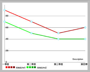
还是用公司季度营收的例子,我们有两个不同的 LineDataSet 代表两家公司,为此我们现在要设置不同的颜色。
我们希望:
- “公司1” 的颜色用四种不同变化“红”来表示
- “连队2” 的颜色用四种不同变化“绿”来表示
- (效果如下面效果图的右图,左图是单色的)
效果图如下所示: 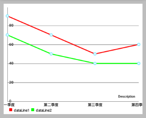
ArrayList<LineDataSet> allLinesList = new ArrayList<LineDataSet>();
    //LineDataSet可以看做是一条线
    LineDataSet dataSet1 = new LineDataSet(entryList1, "dataLine1");
    LineDataSet dataSet2 = new LineDataSet(entryList2, "dataLine2");

    // 上面左效果图的代码
    // dataSet1.setColor(Color.RED);
    // dataSet2.setColor(Color.GREEN);

    // sets colors for the dataset,
    // resolution of the resource name to a "real" color is done internally
    dataSet1.setColors(new int[]{R.color.red1, R.color.red2, R.color.red3,
        R.color.red4}, context);
    dataSet2.setColors(new int[]{R.color.green1, R.color.green2, R.color.green3,
        R.color.green4}, context);

    allLinesList.add(dataSet1);
    allLinesList.add(dataSet2);

    List<String> quarterStrs = new ArrayList<String>();
    quarterStrs.add("第一季度");
    quarterStrs.add("第二季度");
    quarterStrs.add("第三季度");
    quarterStrs.add("第四季度");
    //LineData表示一个LineChart的所有数据(即一个LineChart中所有折线的数据)
    LineData mChartData = new LineData(quarterStrs, allLinesList);
除此之外,还有很多其他的方法来设置 DataSet 的颜色 。 下面是完整的文档:
-
setColors(int [] colors, Context c): 设置该 DataSet 的颜色。
您可以使用new int[] {R.color.red,R.color.green,...}使得颜色值可以重用。 在内部,颜色是使用getResources().getColor(...)来实现获取的。 -
setColors(int [] colors): 设置该 DataSet 的颜色。Colors are reused as soon as the number of Entries the DataSet represents is higher than the size of the colors array. Make sure that the colors are already prepared (by callinggetResources().getColor(...))before adding them to the DataSet. -
setColors(ArrayList<Integer> colors): 设置该 DataSet 的颜色。Sets the colors that should be used fore this DataSet. Colors are reused as soon as the number of Entries the DataSet represents is higher than the size of the colors array. Make sure that the colors are already prepared (by callinggetResources().getColor(...))before adding them to the DataSet. -
setColor(int color): 设置该数据集 唯一的颜色。 在内部,实现方式类似上面的”颜色数组”,只不过”颜色数组都是同一种颜色”
3. ColorTemplate 的使用例子:
LineDataSet set = new LineDataSet(...);
set.setColors(ColorTemplate.VORDIPLOM_COLORS);- 如果没有为
DataSet设置颜色,则使用默认颜色。
一、概述
本章将重点介绍各个图表类型特定的设置。
默认情况下,所有的图表类型都支持 Legend 且在设置图表数据后会自动生成 Legend 。 Legend 通常由一个标签的 形式/形状 来表示多个条目( entries ) 的每一个。
entries 数量自动生成的 legend 取决于DataSet 的标签 不同颜色的数量(在所有 DataSet 的对象)。 Legend 的标签取决于图表中所使用的 DataSet对象。 如果没有为 DataSet 对象指定标签,图表将自动生成它们。 如果多个颜色用于一个 DataSet ,这些颜色分类 ,只通过一个标签说明。
对于定制的 Legend ,可以通过图表对象的 getLegend() 方法先获取 Legen 在进行调用对应方法:
Legend legend = chart.getLegend();二、是否绘制 Legend
setEnabled(boolean enabled): 设置Legend启用或禁用。 如果禁用,Legend将不会被绘制。
三、修改 Legend
setTextColor(int color): 设置图例标签的颜色。-
setTextSize(float size): 设置在DP传说标签的文字大小。
单位是”像素” min = 6f, max = 24f, default 10f -
setTypeface(Typeface tf): 设置自定义Typeface图例标签。

四、Wrapping / clipping avoidance
setWordWrapEnabled(boolean enabled): 如果启用,Legend 的内容将不会超出图表边界之外,而是创建一个新的行。 请注意,这会降低性能和仅适用于”legend 位于图表下面”的情况。setMaxSizePercent(float maxSize): 设置最大图例的百分比(相对整个图表大小)。 默认值:0.95f(95%)
五、自定义 Legend
-
setPosition(LegendPosition pos): 通过 LegendPosition 设置 Legend 出现的位置。RIGHT_OF_CHARTRIGHT_OF_CHART_CENTERRIGHT_OF_CHART_INSIDEBELOW_CHART_LEFTBELOW_CHART_RIGHTBELOW_CHART_CENTERPIECHART_CENTER(PieChart独有)等等。
-
setFormSize(float size): 设置 legend-forms 的大小,单位dp。 setForm(LegendForm shape): 设置LegendForm。This is the shape that is drawn next to the legend-labels with the color of the DataSet the legend-entry represents. 正方形,圆形或线。


legend.setFormSize(18f);
        legend.setForm(Legend.LegendForm.SQUARE);
        legend.setForm(Legend.LegendForm.CIRCLE);
        legend.setForm(Legend.LegendForm.LINE);
setXEntrySpace(float space): 设置在水平轴上legend-entries的间隙。setYEntrySpace(float space): 设置在垂直轴上legend-entries的间隙。setFormToTextSpace(float space): 设置legend-form和legend-label之间的空间。setWordWrapEnabled(boolean enabled): 设置 Legend 是否自动换行? 目前仅支持BelowChartLeft,BelowChartRight,BelowChartCenter。 / you may want to set maxSizePercent when word wrapping, to set the point where the text wraps.
六、设置自定义标签和颜色
setCustom(int[] colors, String[] labels): 设置自定义Legend的标签和颜色。 颜色数应该匹配标签数,并且相对应。A null label will start a group. A (-2) color will avoid drawing a form This will disable the feature that automatically calculates the legend labels and colors from the datasets. 调用resetCustom()重新启用自动计算(and then notifyDataSetChanged() is needed to auto-calculate the legend again)。resetCustom(): 调用此将禁用通过setCustom(...)方法自定义的图例标签。在notifyDataSetChanged()被调用后,标签将再次被自动计算。setExtra(int[] colors, String[] labels): Sets colors and labels that will be appended to the end of the auto calculated colors and labels arrays after calculating the legend. (if the legend has already been calculated, you will need to callnotifyDataSetChanged()to let the changes take effect)
七、代码范例
 Legend l = chart.getLegend();
    l.setFormSize(10f); // set the size of the legend forms/shapes
    l.setForm(LegendForm.CIRCLE); // set what type of form/shape should be used
    l.setPosition(LegendPosition.BELOW_CHART_LEFT);
    l.setTypeface(...);
    l.setTextSize(12f);
    l.setTextColor(Color.BLACK);
    l.setXEntrySpace(5f); // set the space between the legend entries on the x-axis
    l.setYEntrySpace(5f); // set the space between the legend entries on the y-axis

    // set custom labels and colors
    l.setCustom(ColorTemplate.VORDIPLOM_COLORS,
            new String[] { "Set1", "Set2", "Set3", "Set4", "Set5" });

    // and many more...