版权声明:本文为博主原创文章,未经博主允许不得转载。 https://blog.csdn.net/humanking7/article/details/80802435
原创文章,欢迎转载。转载请注明:转载自 祥的博客
原文链接:https://blog.csdn.net/humanking7/article/details/80802435
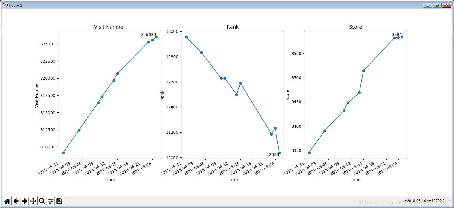
1.效果展示
主要效果就是,x轴 显示时间单位。
下图展示的就是想要到达的效果。
其实主要是运用了datetime.date这个类型的变量作为x轴坐标的数据输入。
2. 源码
将data.txt中的数据读入,用matplotlib中的pyplot画出,x轴为时间。
数据文本 data.txt,除了第一行表头外,每一列都用制表符Tab(\t)隔开。
         原创 粉丝 喜欢 评论 等级 访问 积分    排名
2018/06/01  69  134 266 64  5   309132  3345    12956
2018/06/05  72  137 267 65  5   312383  3390    12832
2018/06/10  74  141 268 68  5   316417  3432    12629
2018/06/11  75  142 269 69  5   317327  3448    12629
2018/06/14  76  148 270 70  5   319695  3469    12499
2018/06/15  79  149 278 73  5   320697  3514    12590

2018/06/23  84  149 278 73  5   325308  3582    12186
2018/06/24  84  149 278 73  5   325583  3583    12233
2018/06/25  84  149 278 73  5   326008  3584    12038
2018/06/25  84  149 279 73  5   326039  3584    12038
程序源码:
# read csdn data
from datetime import datetime
import matplotlib.pyplot as plt #引入绘图库


if __name__ == '__main__':

    # 打开文本文件 读取数据
    with open("data.txt",'r',encoding='utf-8') as f:
        data_lines = f.readlines()

    l_time    = []
    l_article = []
    l_fans    = []
    l_like    = []
    l_remark  = []
    l_level   = []
    l_visit   = []
    l_score   = []
    l_rank    = []

    num = len(data_lines)

    # ################
    #     整理数据
    # ################
    for i in range(1,num):
        line = data_lines[i]#从第1行开始[0行开始计数]
        if len(line) < 2:
            continue    #这行明显不是有效信息

        data = line.split('\t')
        time = data[0]
        # 使用最新日期的数据
        if len(l_time) != 0:
            if time == l_time[-1]:#如果这一行时间与上一行的时间相等,删除上一行数据
                print('删除上一行:' + time)
                l_time.pop(-1) #删除上一行记录的数据
                l_article.pop(-1)
                l_fans.pop(-1)
                l_like.pop(-1)
                l_remark.pop(-1)
                l_level.pop(-1)
                l_visit.pop(-1)
                l_score.pop(-1)
                l_rank.pop(-1)


        arti = int(data[1])
        fans = int(data[2])
        like = int(data[3])
        rmak = int(data[4])
        leve = int(data[5])
        visi = int(data[6])
        scor = int(data[7])
        rank = int(data[8])
        l_time.append(time)
        l_article.append(arti)
        l_fans.append(fans)
        l_like.append(like)
        l_remark.append(rmak)
        l_level.append(leve)
        l_visit.append(visi)
        l_score.append(scor)
        l_rank.append(rank)

    # ################
    #       画图
    # ################
    # X坐标,将str类型的数据转换为datetime.date类型的数据,作为x坐标
    xs = [datetime.strptime(d, '%Y/%m/%d').date() for d in l_time]

    plt.figure(1)
    plt.subplot(1, 3, 1)
    plt.title('Visit Number')
    plt.plot(xs, l_visit, 'o-')
    plt.xlabel('Time')
    plt.ylabel('Visit Number')

    # 只画最后一个元素点 - 数据点在文字的↘右下,文字在↖左上
    plt.text(xs[-1], l_visit[-1], l_visit[-1], ha='right', va='bottom', fontsize=10)


    plt.subplot(1, 3, 2)
    plt.title('Rank')
    plt.plot(xs, l_rank, 'o-')
    plt.xlabel('Time')
    plt.ylabel('Rank')
    # 只画最后一个元素点 - 数据点在文字的↗右上,文字在↙左下
    plt.text(xs[-1], l_rank[-1], l_rank[-1], ha='right', va='top', fontsize=10)


    plt.subplot(1, 3, 3)
    plt.title('Score')
    plt.plot(xs, l_score, 'o-')
    plt.xlabel('Time')
    plt.ylabel('Score')
    # 只画最后一个元素点 - 数据点在文字的↘右下,文字在↖左上
    plt.text(xs[-1], l_score[-1], l_score[-1], ha='right', va='bottom', fontsize=10)


    plt.gcf().autofmt_xdate()  # 自动旋转日期标记

    # show
    plt.show()
3. 分析
主要就是matplotlib.pyplot()可以支持datatime.date类型的变量。
datetime.strptime(str, '%Y/%m/%d').date()在shell里的运行情况:
In [5]: var = datetime.strptime('2018/3/15', '%Y/%m/%d').date()

In [6]: var
Out[6]: datetime.date(2018, 3, 15)

In [7]: type(var)
Out[7]: datetime.date所以,源码中变量xs为含有一群datetime.date变量的list。