版权声明:本文为博主原创文章,未经博主允许不得转载。 https://blog.csdn.net/xiaozhuanddapang/article/details/75095058
最近在做告警系统企业微信(原企业号)时,根据产品的需求,需要html的高度与手机屏幕高度相同。视图间以百分比来表示,并实现内容的居中、垂直居中、水平居中。
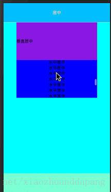
方法一:
实现效果:

1.创建detail.html
<!DOCTYPE html>
<html lang="en">
<head>
    <meta charset="UTF-8">
    <title>告警</title>
    <meta name="apple-mobile-web-app-capable" content="yes">
    <meta name="apple-mobile-web-app-status-bar-style" content="black">
    <meta name="viewport" content="width=device-width,height-device-height,initial-scale=1, maximum-scale=1, minimum-scale=1, user-scalable=no">
    <link href="./detail.css" rel="stylesheet">
</head>
<body>
    <div class="detail-header bottom-line-gray center">
        <b>居中</b>
    </div>

    <div class="detail-content bottom-line-gray">
        <div class="title vertical-center">
            垂直居中
        </div>
        <div class="msg horizontal-center">
            水平居中
        </div>
    </div>

    <div class="detail-footer center">
    </div>
<script src="/js/zepto.min.js"></script>
<script src="/js/common.js"></script>
</body>
</html>
2.创建detail.css
/*设置html,body高度与浏览器高度一致*/
html,body {
    margin: 0;
    width:100%;
    height: 100%;

    /*超出body范围部分隐藏*/
    overflow: hidden;
}

.detail-header {
    background-color: deepskyblue;
    height: 10%;
}

.detail-content {
    background-color: aqua;
    height: 80%;
    padding: 0 50px 0 50px;
}

.title {
    background-color: blueviolet;
    height: 25%;
}

.msg {
    background-color: blue;
    height: 25%;
}

.detail-footer {
    background-color: aquamarine;
    height: 10%;
}

/*视图底部线条*/
.bottom-line-gray {
    color: #d3d3d3;
    border-bottom: solid 1px;
}

/*三种居中方式*/
.center {
    display: -webkit-box;
    -webkit-box-pack: center;
    -webkit-box-align: center;

    display: -moz-box;
    -moz-box-pack: center;
    -moz-box-align: center;
}

.vertical-center {
    display: -webkit-box;
    -webkit-box-orient: vertical;
    -webkit-box-pack: center;

    display: -moz-box;
    -moz-box-orient: vertical;
    -moz-box-pack: center;
}

.horizontal-center {
    display: -webkit-box;
    -webkit-box-orient: horizontal;
    -webkit-box-pack: center;

    display: -moz-box;
    -moz-box-orient: horizontal;
    -moz-box-pack: center;
}
方法二:
实现效果:
想要实现内部滑动视图效果,只需在.msg中增加overflow:auto;即可
.msg {
    background-color: blue;
    width:100%;
    overflow:auto;
    height: 25%;
}