1、准备工作
# These are the "Tableau 20" colors as RGB.
tableau20 = [(31, 119, 180), (174, 199, 232), (255, 127, 14), (255, 187, 120),
             (44, 160, 44), (152, 223, 138), (214, 39, 40), (255, 152, 150),
             (148, 103, 189), (197, 176, 213), (140, 86, 75), (196, 156, 148),
             (227, 119, 194), (247, 182, 210), (127, 127, 127), (199, 199, 199),
             (188, 189, 34), (219, 219, 141), (23, 190, 207), (158, 218, 229)]

# Scale the RGB values to the [0, 1] range, which is the format matplotlib accepts.
for i in range(len(tableau20)):
    r, g, b = tableau20[i]
    tableau20[i] = (r / 255., g / 255., b / 255.)

#设置图的大小
plt.figure(figsize=(12, 14))
#限制坐标轴的范围,防止出现大片空白
plt.ylim(0, 90)
plt.xlim(1968, 2014)
#x,y上的数据名称
plt.xlabel("x")
plt.ylabel("y")
#去掉上下左右的黑色框线
ax = plt.subplot(111)
ax.spines["top"].set_visible(False)
ax.spines["bottom"].set_visible(False)
ax.spines["right"].set_visible(False)
ax.spines["left"].set_visible(False)

#坐标轴上的数字出现在上还是下,左还是右?
#ax.get_xaxis().tick_top()
ax.get_xaxis().tick_bottom()
#ax.get_yaxis().tick_left()
ax.get_yaxis().tick_right()

#调整坐标轴上的字体以及格式
plt.yticks(range(0, 91, 10), [str(x) + "%" for x in range(0, 91, 10)], fontsize=14)    #第一个参数是文字位置,第二个参数是文字
plt.xticks(fontsize=14)

#右上角的图例,元组形式
plt.legend((rect,),(u<span style="color:#ff00bf;">"图例"</span>,))

#沿着每个坐标绘制虚线,方便查看坐标值
for y in range(10, 91, 10):
    plt.plot(range(1968, 2012), [y] * len(range(1968, 2012)), "--", lw=0.5, color="black", alpha=0.3)


#去掉坐标上的数字和小线,top等是去掉tick mark,labelbottom是下边的文字标记
plt.tick_params(axis="both", which="both", bottom="off", top="off",
                labelbottom="on", left="off", right="off", labelleft="on")
2、曲线
</pre><pre name="code" class="python">
plt.plot(xilst, ylist, lw=2.5,  color=tableau20[0])
#在每个线的后面加上描述,其实就是指定位置添加文本
plt.text(x_pos, y_pos, info, fontsize=14, color=tableau20[rank])plt.text(1995, 93, "Percentage of Bachelor's degrees conferred to women in the U.S.A., by major (1970-2012)", fontsize=17, ha="center")在图里面包含数据来源以及版权:
plt.text(1966, -8, "Data source: nces.ed.gov/programs/digest/2013menu_tables.asp"
       "\nAuthor: Randy Olson (randalolson.com / @randal_olson)"
       "\nNote: Some majors are missing because the historical data "
       "is not available for them", fontsize=10)
保存成png格式或其他:
#bbox_inches="tight"表示去除边缘部分的空白
plt.savefig("percent-bachelors-degrees-women-usa.png", bbox_inches="tight") 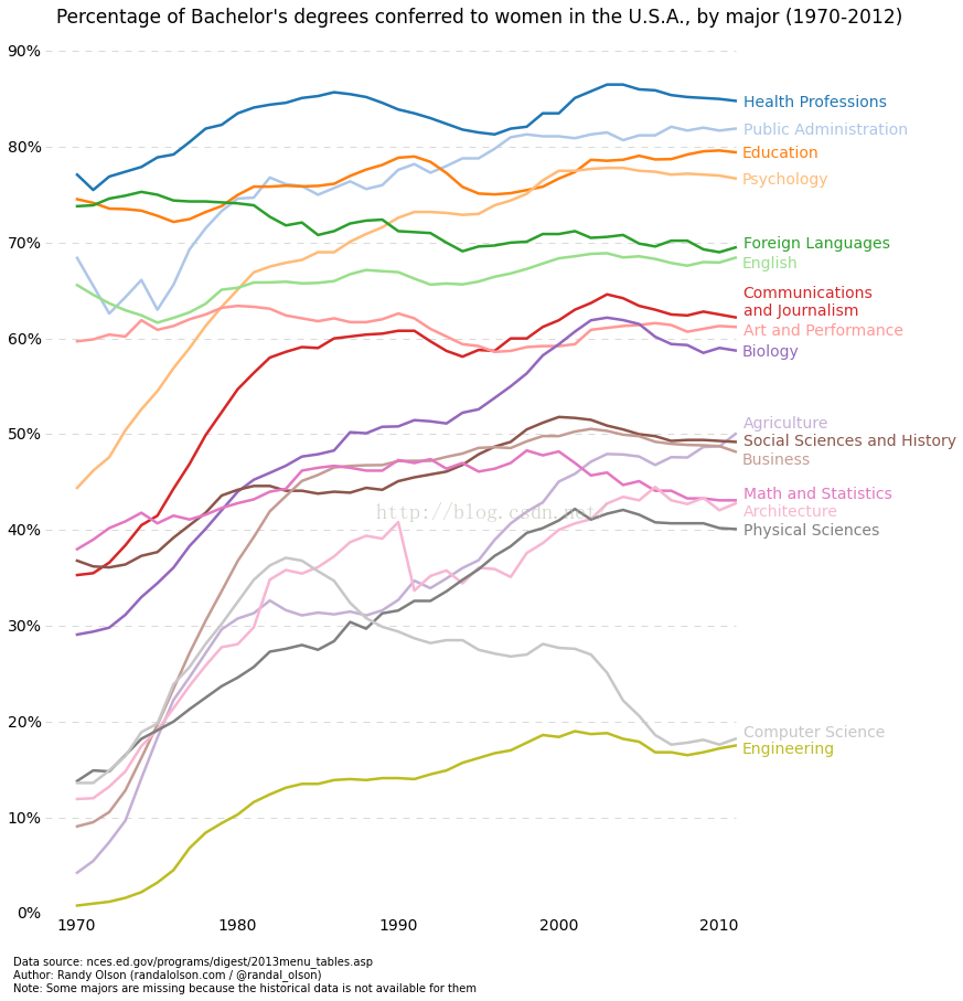
3、直方图
data = list(np.random.randn(10000))
data1 = list(2*np.random.randn(10000))


info = r'$\mu=0.1, \ \sigma= %f$' % (0.2)

plt.text(1, 0.1, info, bbox=dict(facecolor='red', alpha=0.25))#前两个值表示文本框放置的位置
plt.hist(data, 50, normed=True, facecolor='r', alpha=1)#50表示把数据的区间分成多少份进行统计, normed指求得是频数还是频率,alpha都表示透明程度,越小越透明</span>
plt.hist(data1, 100, normed=True, facecolor='g', alpha=0.8)
plt.grid(True)
plt.show()
现在plot.ly提供了交互的动态图,只需要添加一行代码即可。
4、实践一:绘制confusion matrix
import matplotlib.pyplot as plt
from sklearn.metrics import confusion_matrix
import numpy as np

def makeconf(conf_arr, model_name):
    # makes a confusion matrix plot when provided a matrix conf_arr
    # every row of conf_arr is normalized
    norm_conf = []
    for i in conf_arr:
        a = 0
        tmp_arr = []
        a = sum(i, 0)
        for j in i:
            tmp_arr.append(float(j)/float(a))
        norm_conf.append(tmp_arr)

    fig = plt.figure()
    plt.clf() #清除画布
    ax = fig.add_subplot(111) #参数的意思是把画布分成1行1列,把图画在第1块(从上到下从左到右数起)。也可以写成 fig.add_subplot(1,1,1)
    ax.set_aspect(1) #控制纵横比,1:1
    res = ax.imshow(np.array(norm_conf), cmap=plt.cm.jet,
                    interpolation='nearest') #根据np array的数组绘制图,第二个参数是配色,有jet、gray

    width = len(conf_arr)
    height = len(conf_arr[0])

    for x in xrange(width):
        for y in xrange(height):
            ax.annotate(str(conf_arr[x][y]), xy=(y, x),
                        horizontalalignment='center',
                        verticalalignment='center') #在每一块表上数字,第一个参数是要标上的字符串,第二个是坐标

    cb = fig.colorbar(res)  #在图的旁边绘制一个bar,展示颜色代表的数值
    indexs = '0123456789'
    plt.xticks(range(width), indexs[:width]) #x, y轴的坐标名
    plt.yticks(range(height), indexs[:height])
    # you can save the figure here with:
    # plt.savefig("pathname/image.png")
    plt.savefig("conf_matrix/{}_confusion_matrix.png".format(model_name))

if __name__=="__main__":
    y = [1,0,1,1,1,0,0]
    predicts = [1,1,0,1,0,1,0]
    conf_matrix = confusion_matrix(y, predicts)
    print conf_matrix
    makeconf(conf_matrix, "test")
问题:
想在绘制的图中显示中文信息,需要修改配置文件:/usr/local/lib/python2.7/dist-packages/matplotlib/mpl-data/matplotlibrc
把font.family和font.sans.seris前面的#去掉,并在font.sans.seris的第一个位置加上ubuntu已经安装的中文字体:Droid Sans Fallback。如果需要查看ubuntu下有哪些中文字体:
fc-list :lang=zh-cn
另外ubuntu中常见的中文字体是文泉驿微黑。
参考