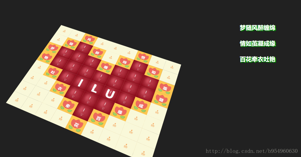
很久之前的作品,用JS和CSS3实现的,今天给大家分享一部分。
若要见完整版,请点击右侧链接下载:程序员浪漫表白“三行情书”一等奖(JS+CSS3)
注:这是一个3D场景,在PC端的话还可以按住鼠标左键并拖动鼠标,来从各个视角观察它。
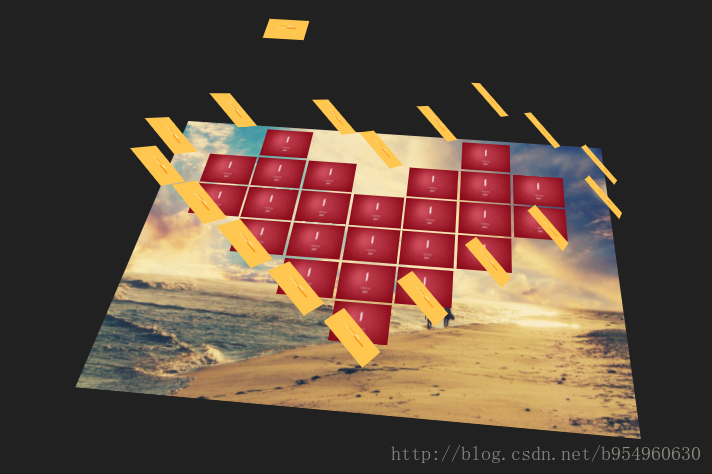
降低作品档次的效果图:

寓意解释:
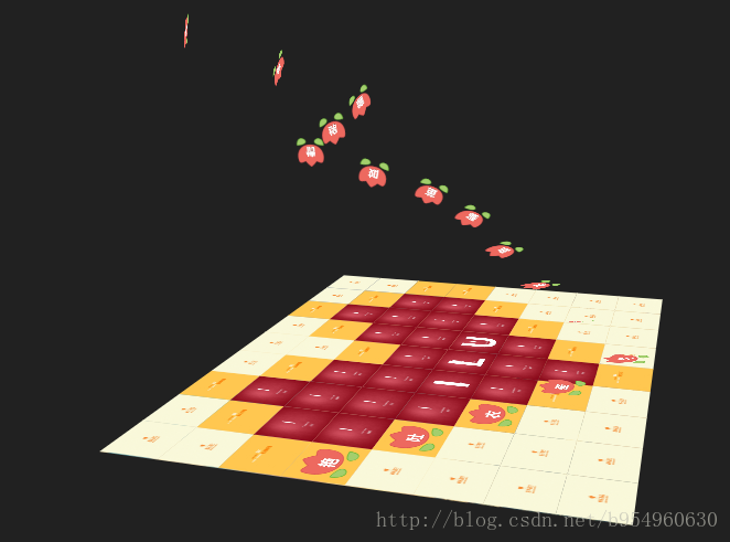
通过JS和CSS3组合实现的 碎片飘零效果。每个碎片都由一句情话组成,无数的情话碎片构成了心型。在【情歌】伴随下,当所有【情话】碎片飞开后,便出现了更高的感情表达——【情画】。
当两个人的情感不再需要用言语——情话来表达时(即当所有【情话】碎片飞开后),就出现了更高的感情境界——情画。
代码:
HTML代码
<!doctype html>
<html>
<head>
<meta charset="utf-8">
<title>#三行情书#</title>
<link rel="shortcut icon" href="./logo.ico" type="image/x-icon" />
<link type="text/css" rel="stylesheet" href='http://fonts.googleapis.com/css?family=Ubuntu:300italic,300,700' />
<link rel="stylesheet" type="text/css" href="./css/main.css">
<script type="text/javascript" src="js/jquery-1.7.2.min.js"></script>
<script type="text/javascript" src="./js/main.js"></script>
</head>
<body>
  <audio autoplay="autopaly">
      <source src="song.mp3" type="audio/mp3" />
  </audio>
  <div class="poem">
    梦随风醉缠绵<br>
    情如茧凝成缘<br>
    百花牵衣吐艳
  </div>
<div class="mosaica">计科1502 白XX<a href="index.html">上一页</a></div>
<div class="container">
  <div id="plane1" class="plane">
    <div class="items">
      <!-- 第一行 -->
      <div class="item" style="top: 0px; left: 0px; width: 100px; height: 87.5px; animation-delay: 8.64s;background: url('./img/13.jpg') no-repeat; background-size: 100% 87.5px;"></div>
      <div class="item" style="top: 0px; left: 100px; width: 100px; height: 87.5px; animation-delay: 8.56s; background: url('./img/13.jpg') no-repeat; background-size: 100% 87.5px;"></div>
      <div class="item3" style="top: 0px; left: 200px; width: 100px; height: 87.5px; animation-delay: 14.96s; background: url('./img/12.jpg') no-repeat; background-size: 100% 87.5px;"></div>
      <div class="item" style="top: 0px; left: 300px; width: 100px; height: 87.5px; animation-delay: 9.74s; background: url('./img/13.jpg') no-repeat; background-size: 100% 87.5px;"></div>
      <div class="item" style="top: 0px; left: 400px; width: 100px; height: 87.5px; animation-delay: 8.28s; background: url('./img/13.jpg') no-repeat; background-size: 100% 87.5px;"></div>
      <div class="item" style="top: 0px; left: 500px; width: 100px; height: 87.5px;animation-delay: 8.88s;  background: url('./img/13.jpg') no-repeat; background-size: 100% 87.5px;"></div>
      <div class="item" style="top: 0px; left: 600px; width: 100px; height: 87.5px;animation-delay: 14.96s;  background: url('./img/12.jpg') no-repeat; background-size: 100% 87.5px;"></div>
      <div class="item" style="top: 0px; left: 700px; width: 100px; height: 87.5px; animation-delay: 9.76s; background: url('./img/13.jpg') no-repeat; background-size: 100% 87.5px;"></div>
      <div class="item" style="top: 0px; left: 800px; width: 100px; height: 87.5px; animation-delay: 8.4s; background: url('./img/13.jpg') no-repeat; background-size: 100% 87.5px;"></div>

      <div class="item2" style="top: 0px; left: 200px; width: 100px; height: 87.5px; animation-delay: 1.64s; font-size: 25px;">风</div>
      <div class="item2" style="top: 0px; left: 600px; width: 100px; height: 87.5px; animation-delay: 2.44s;  font-size: 25px;">情</div>


       <!-- 第二行 -->
      <div class="item" style="top: 87.5px; left: 0px; width: 100px; height: 87.5px; animation-delay: 8.12s; background: url('./img/13.jpg') no-repeat; background-size: 100% 87.5px;"></div>
      <div class="item" style="top: 87.5px; left: 100px; width: 100px; height: 87.5px; animation-delay: 14.96s; background: url('./img/12.jpg') no-repeat; background-size: 100% 87.5px;"></div>
      <div class="item3" style="top: 87.5px; left: 200px; width: 100px;height: 87.5px;animation-delay: 15.96s;  background: url('./img/100.jpg') no-repeat; background-size: 100% 87.5px;"></div>
      <div class="item" style="top: 87.5px; left: 300px; width: 100px; height: 87.5px; animation-delay: 14.96s; background: url('./img/12.jpg') no-repeat; background-size: 100% 87.5px;"></div>
      <div class="item" style="top: 87.5px; left: 400px; width: 100px; height: 87.5px; animation-delay: 8.8s; background: url('./img/13.jpg') no-repeat; background-size: 100% 87.5px;"></div>
      <div class="item" style="top: 87.5px; left: 500px; width: 100px; height: 87.5px; animation-delay: 14.96s; background: url('./img/12.jpg') no-repeat; background-size: 100% 87.5px;"></div>
      <div class="item3" style="top: 87.5px; left: 600px; width: 100px;height: 87.5px;animation-delay: 15.96s;  background: url('./img/100.jpg') no-repeat; background-size: 100% 87.5px;"></div>
      <div class="item" style="top: 87.5px; left: 700px; width: 100px;height: 87.5px;animation-delay: 14.96s;  background: url('./img/12.jpg') no-repeat; background-size: 100% 87.5px;"></div>
      <div class="item" style="top: 87.5px; left: 800px; width: 100px; height: 87.5px; animation-delay: 9.48s; background: url('./img/13.jpg') no-repeat; background-size: 100% 87.5px;"></div>

      <div class="item2" style="top: 87.5px; left: 100px; width: 100px; height: 87.5px; animation-delay: 1.24s;font-size: 25px;">随</div>
      <div class="item2" style="top: 87.5px; left: 300px; width: 100px; height: 87.5px; animation-delay: 1.84s;font-size: 25px;">醉</div>
      <div class="item2" style="top: 87.5px; left: 500px; width: 100px; height: 87.5px; animation-delay: 2.24s;font-size: 25px;">绵</div>
      <div class="item2" style="top: 87.5px; left: 700px; width: 100px;height: 87.5px;animation-delay: 2.64s; font-size: 25px;">如</div>

       <!-- 第三行 -->
      <div class="item" style="top: 175px; left: 0px; width: 100px; height: 87.5px; animation-delay: 14.96s; background: url('./img/12.jpg') no-repeat; background-size: 100% 87.5px;"></div>
      <div class="item3" style="top: 175px; left: 100px; width: 100px; height: 87.5px; animation-delay: 15.96s; background: url('./img/100.jpg') no-repeat; background-size: 100% 87.5px;"></div>
      <div class="item3" style="top: 175px; left: 200px; width: 100px; height: 87.5px; animation-delay: 15.96s; background: url('./img/100.jpg') no-repeat; background-size: 100% 87.5px;"> </div>
      <div class="item3" style="top: 175px; left: 300px; width: 100px; height: 87.5px; animation-delay: 15.96s; background: url('./img/100.jpg') no-repeat; background-size: 100% 87.5px;"> </div>
      <div class="item" style="top: 175px; left: 400px; width: 100px; height: 87.5px; animation-delay: 14.96s; background: url('./img/12.jpg') no-repeat; background-size: 100% 87.5px;"> </div>
      <div class="item3" style="top: 175px; left: 500px; width: 100px; height: 87.5px;animation-delay: 15.96s;  background: url('./img/100.jpg') no-repeat; background-size: 100% 87.5px;"> </div>
      <div class="item3" style="top: 175px; left: 600px; width: 100px; height: 87.5px;animation-delay: 15.96s;  background: url('./img/100.jpg') no-repeat; background-size: 100% 87.5px;"> </div>
      <div class="item3" style="top: 175px; left: 700px; width: 100px; height: 87.5px; animation-delay: 15.96s; background: url('./img/100.jpg') no-repeat; background-size: 100% 87.5px;"></div>
      <div class="item" style="top: 175px; left: 800px; width: 100px; height: 87.5px; animation-delay: 14.96s; background: url('./img/12.jpg') no-repeat; background-size: 100% 87.5px;"> </div>

      <div class="item2" style="top: 175px; left: 0px; width: 100px; height: 87.5px; animation-delay: 1.04s;font-size: 25px;">梦</div>
      <div class="item2" style="top: 175px; left: 400px; width: 100px; height: 87.5px; animation-delay: 2.04s;font-size: 25px;">缠 </div>
      <div class="item2" style="top: 175px; left: 800px; width: 100px; height: 87.5px; animation-delay: 2.84s;font-size: 25px;">茧 </div>

       <!-- 第四行 -->
      <div class="item" style="top: 262.5px; left: 0px; width: 100px; height: 87.5px; animation-delay: 14.96s; background: url('./img/12.jpg') no-repeat; background-size: 100% 87.5px;"> </div>
      <div class="item3" style="top: 262.5px; left: 100px; width: 100px; height: 87.5px; animation-delay: 15.96s; background: url('./img/100.jpg') no-repeat; background-size: 100% 87.5px;"> </div>
      <div class="item3" style="top: 262.5px; left: 200px; width: 100px;height: 87.5px;animation-delay: 15.96s;  background: url('./img/100.jpg') no-repeat; background-size: 100% 87.5px;"> </div>
      <div class="item3" style="top: 262.5px; left: 300px; width: 100px; height: 87.5px; animation-delay: 15.96s; background: url('./img/100.jpg') no-repeat; background-size: 100% 87.5px;"></div>
      <div class="item3" style="top: 262.5px; left: 400px; width: 100px; height: 87.5px; animation-delay: 15.96s; background: url('./img/100.jpg') no-repeat; background-size: 100% 87.5px;"> </div>
      <div class="item3" style="top: 262.5px; left: 500px; width: 100px; height: 87.5px; animation-delay: 15.96s; background: url('./img/100.jpg') no-repeat; background-size: 100% 87.5px;"> </div>
      <div class="item3" style="top: 262.5px; left: 600px; width: 100px;height: 87.5px;animation-delay: 15.96s;  background: url('./img/100.jpg') no-repeat; background-size: 100% 87.5px;"> </div>
      <div class="item3" style="top: 262.5px; left: 700px; width: 100px;height: 87.5px;animation-delay: 15.96s;  background: url('./img/100.jpg') no-repeat; background-size: 100% 87.5px;"> </div>
      <div class="item" style="top: 262.5px; left: 800px; width: 100px; height: 87.5px; animation-delay: 14.96s; background: url('./img/12.jpg') no-repeat; background-size: 100% 87.5px;"></div>

      <div class="item2" style="top: 262.5px; left: 0px; width: 100px; height: 87.5px; animation-delay: 4.64s;font-size: 25px;">艳</div>
      <div class="item2" style="top: 262.5px; left: 800px; width: 100px; height: 87.5px; animation-delay: 3.04s;font-size: 25px;"> 凝</div>

       <!-- 第五行 -->
      <div class="item" style="top: 350px; left: 0px; width: 100px; height: 87.5px; animation-delay: 8.04s; background: url('./img/13.jpg') no-repeat; background-size: 100% 87.5px;"></div>
      <div class="item" style="top: 350px; left: 100px; width: 100px; height: 87.5px; animation-delay: 14.96s; background: url('./img/12.jpg') no-repeat; background-size: 100% 87.5px;"></div>
      <div class="item3" style="top: 350px; left: 200px; width: 100px; height: 87.5px; animation-delay: 15.96s; background: url('./img/100.jpg') no-repeat; background-size: 100% 87.5px;"> </div>
      <div class="item3" style="top: 350px; left: 300px; width: 100px; height: 87.5px; animation-delay: 15.96s; background: url('./img/100.jpg') no-repeat; background-size: 100% 87.5px;"> </div>
      <div class="item3" style="top: 350px; left: 400px; width: 100px; height: 87.5px; animation-delay: 15.96s; background: url('./img/100.jpg') no-repeat; background-size: 100% 87.5px;"> </div>
      <div class="item3" style="top: 350px; left: 500px; width: 100px; height: 87.5px;animation-delay: 15.96s;  background: url('./img/100.jpg') no-repeat; background-size: 100% 87.5px;"> </div>
      <div class="item3" style="top: 350px; left: 600px; width: 100px; height: 87.5px;animation-delay: 15.96s;  background: url('./img/100.jpg') no-repeat; background-size: 100% 87.5px;"> </div>
      <div class="item" style="top: 350px; left: 700px; width: 100px; height: 87.5px; animation-delay: 14.96s; background: url('./img/12.jpg') no-repeat; background-size: 100% 87.5px;"></div>
      <div class="item" style="top: 350px; left: 800px; width: 100px; height: 87.5px; animation-delay: 8.4s; background: url('./img/13.jpg') no-repeat; background-size: 100% 87.5px;"> </div>

      <div class="item2" style="top: 350px; left: 100px; width: 100px; height: 87.5px; animation-delay: 4.44s; font-size: 25px;">吐</div>
      <div class="item3" style="top: 350px; left: 300px; width: 100px; height: 87.5px; animation-delay: 5.64s; background:none; "> I</div>
      <div class="item3" style="top: 350px; left: 400px; width: 100px; height: 87.5px; animation-delay: 5.64s; background:none; "> L</div>
      <div class="item3" style="top: 350px; left: 500px; width: 100px; height: 87.5px; animation-delay: 5.64s;  background:none; "> U</div>
      <div class="item2" style="top: 350px; left: 700px; width: 100px; height: 87.5px; animation-delay: 3.24s; font-size: 25px;">成</div>


       <!-- 第六行 -->
      <div class="item" style="top: 437.5px; left: 0px; width: 100px; height: 87.5px; animation-delay: 9.68s; background: url('./img/13.jpg') no-repeat; background-size: 100% 87.5px;"> </div>
      <div class="item" style="top: 437.5px; left: 100px; width: 100px; height: 87.5px; animation-delay: 8.01s; background: url('./img/13.jpg') no-repeat; background-size: 100% 87.5px;"> </div>
      <div class="item" style="top: 437.5px; left: 200px; width: 100px;height: 87.5px;animation-delay: 14.96s;  background: url('./img/12.jpg') no-repeat; background-size: 100% 87.5px;"> </div>
      <div class="item3" style="top: 437.5px; left: 300px; width: 100px; height: 87.5px; animation-delay: 15.96s; background: url('./img/100.jpg') no-repeat; background-size: 100% 87.5px;"></div>
      <div class="item3" style="top: 437.5px; left: 400px; width: 100px; height: 87.5px; animation-delay: 15.96s; background: url('./img/100.jpg') no-repeat; background-size: 100% 87.5px;"> </div>
      <div class="item3" style="top: 437.5px; left: 500px; width: 100px; height: 87.5px; animation-delay: 15.96s; background: url('./img/100.jpg') no-repeat; background-size: 100% 87.5px;"> </div>
      <div class="item" style="top: 437.5px; left: 600px; width: 100px;height: 87.5px;animation-delay: 14.96s;  background: url('./img/12.jpg') no-repeat; background-size: 100% 87.5px;"> </div>
      <div class="item" style="top: 437.5px; left: 700px; width: 100px;height: 87.5px;animation-delay: 8.29s;  background: url('./img/13.jpg') no-repeat; background-size: 100% 87.5px;"> </div>
      <div class="item" style="top: 437.5px; left: 800px; width: 100px; height: 87.5px; animation-delay: 9.2s; background: url('./img/13.jpg') no-repeat; background-size: 100% 87.5px;"></div>

      <div class="item2" style="top: 437.5px; left: 200px; width: 100px; height: 87.5px; animation-delay: 4.24s;font-size: 25px;"> 衣</div>
      <div class="item2" style="top: 437.5px; left: 600px; width: 100px; height: 87.5px;animation-delay: 3.44s; font-size: 25px;"> 缘</div>

       <!-- 第七行 -->
      <div class="item" style="top: 525px; left: 0px; width: 100px; height: 87.5px; animation-delay: 8.98s; background: url('./img/13.jpg') no-repeat; background-size: 100% 87.5px;"> </div>
      <div class="item" style="top: 525px; left: 100px; width: 100px; height: 87.5px; animation-delay: 9.15s; background: url('./img/13.jpg') no-repeat; background-size: 100% 87.5px;"> </div>
      <div class="item" style="top: 525px; left: 200px; width: 100px;height: 87.5px;animation-delay: 8.78s;  background: url('./img/13.jpg') no-repeat; background-size: 100% 87.5px;"> </div>
      <div class="item" style="top: 525px; left: 300px; width: 100px; height: 87.5px; animation-delay: 14.96s; background: url('./img/12.jpg') no-repeat; background-size: 100% 87.5px;"></div>
      <div class="item3" style="top: 525px; left: 400px; width: 100px; height: 87.5px; animation-delay:15.96s; background: url('./img/100.jpg') no-repeat; background-size: 100% 87.5px;"> </div>
      <div class="item" style="top: 525px; left: 500px; width: 100px; height: 87.5px; animation-delay: 14.96s; background: url('./img/12.jpg') no-repeat; background-size: 100% 87.5px;"> </div>
      <div class="item" style="top: 525px; left: 600px; width: 100px;height: 87.5px;animation-delay: 8.12s;  background: url('./img/13.jpg') no-repeat; background-size: 100% 87.5px;"> </div>
      <div class="item" style="top: 525px; left: 700px; width: 100px;height: 87.5px;animation-delay: 8.68s;  background: url('./img/13.jpg') no-repeat; background-size: 100% 87.5px;"> </div>
      <div class="item" style="top: 525px; left: 800px; width: 100px; height: 87.5px; animation-delay: 8.97s; background: url('./img/13.jpg') no-repeat; background-size: 100% 87.5px;"></div>

      <div class="item2" style="top: 525px; left: 300px; width: 100px; height: 87.5px; animation-delay: 4.04s;font-size: 25px;"> 牵</div>
      <div class="item2" style="top: 525px; left: 500px; width: 100px; height: 87.5px;animation-delay: 3.64s; font-size: 25px;"> 百</div>

       <!-- 第八行 -->
      <div class="item" style="top: 612.5px; left: 0px; width: 100px; height: 87.5px; animation-delay: 8.89s; background: url('./img/13.jpg') no-repeat; background-size: 100% 87.5px;"> </div>
      <div class="item" style="top: 612.5px; left: 100px; width: 100px; height: 87.5px; animation-delay: 8.87s; background: url('./img/13.jpg') no-repeat; background-size: 100% 87.5px;"> </div>
      <div class="item" style="top: 612.5px; left: 200px; width: 100px;height: 87.5px;animation-delay: 8.99s;  background: url('./img/13.jpg') no-repeat; background-size: 100% 87.5px;"> </div>
      <div class="item" style="top: 612.5px; left: 300px; width: 100px; height: 87.5px; animation-delay: 8.25s; background: url('./img/13.jpg') no-repeat; background-size: 100% 87.5px;"></div>
      <div class="item" style="top: 612.5px; left: 400px; width: 100px; height: 87.5px; animation-delay:14.96s; background: url('./img/12.jpg') no-repeat; background-size: 100% 87.5px;"> </div>
      <div class="item" style="top: 612.5px; left: 500px; width: 100px; height: 87.5px; animation-delay: 8.97s; background: url('./img/13.jpg') no-repeat; background-size: 100% 87.5px;"> </div>
      <div class="item" style="top: 612.5px; left: 600px; width: 100px;height: 87.5px;animation-delay: 8.9s;  background: url('./img/13.jpg') no-repeat; background-size: 100% 87.5px;"> </div>
      <div class="item" style="top: 612.5px; left: 700px; width: 100px;height: 87.5px;animation-delay: 9s;  background: url('./img/13.jpg') no-repeat; background-size: 100% 87.5px;"> </div>
      <div class="item" style="top: 612.5px; left: 800px; width: 100px; height: 87.5px; animation-delay: 8.5s; background: url('./img/13.jpg') no-repeat; background-size: 100% 87.5px;"></div>

      <div class="item2" style="top: 612.5px; left: 400px; width: 100px; height: 87.5px; animation-delay: 3.84s;font-size: 25px;">花 </div>
    </div>
  </div>
</div>
</body>
</html>
CSS代码
* {
  box-sizing: border-box;
}

body {
  padding: 0;
  margin: 0;
  background: #212121;
  overflow: hidden;
}

.mosaica {
  position: fixed;
  left: 2px;
  bottom: 2px;
  padding: 4px 6px;
  color: #FFFFFF;
  font-family: "Montserrat";
  font-size: 11px;
  letter-spacing: 0.06em;
}
.mosaica a{
  color: #fff;
  font-size: 30px;
  text-decoration: none;
  margin: 0 0 0 30px;
}
.mosaica a:hover{
  color: orange;
}
.container {
  position: absolute;
  width: 0;
  height: 0;
  left: 43%;
  top: 50%;
  perspective: 1200px;
  transform-origin: center center;
  cursor: move;
}

.plane {
  position: absolute;
  display: block;
  width: 900px;
  height: 700px;
  border: 0;
  margin: -350px 0 0 -450px;
  transform-style: preserve-3d;
}
.plane:before {
  content: "";
  position: absolute;
  left: 0;
  top: 0;
  background: url('../img/background.jpg') no-repeat;
  background-size: 100% 700px;
  width: 100%;
  height: 100%;
  z-index: -1;
  transform: translateZ(-1px);
}

.items {
  position: relative;
  transform-style: preserve-3d;
}

.item {
  background-color: pink;
  position: absolute;
  overflow: hidden;
  /*border: 1px solid #2785db;*/
}
.item2,
.item3{
  position: absolute;
  left: 0;
  top:0;
  overflow: hidden;
  width: 100%;
  height: 100%;
  background:url(../img/heart.png) no-repeat center;
  background-size: 85px 69.5px;
  color: #fff;
  text-align: center;
  font-size: 75px;
  line-height: 87.5px;
  font-family: "微软雅黑","helvetica neue",arial,sans-serif;
  font-weight: 900;
  text-shadow:0 1px 0 rgba(0, 0, 0, 0.3);
}

@keyframes animate {
  0% {
    transform: translate3d(0px, 0px, 0px) rotateX(0deg) rotateY(0deg) rotateZ(0deg) scale3d(1, 1, 1);
    transform-origin: 50% 50% 0;
    opacity: 1;
  }
  100% {
    transform: translate3d(0px, 0px, 1200px) rotateX(180deg) rotateY(360deg) rotateZ(180deg) scale3d(0, 0, 0);
    transform-origin: 50% 50% 0;
    opacity: 1;
  }
}
@keyframes animate3 {
  0% {
    transform: translate3d(0px, 0px, 0px) rotateX(0deg) rotateY(0deg) rotateZ(0deg) scale3d(1, 1, 1);
    transform-origin: 50% 50% 0;
    font-size: 75px;
    opacity: 1;
  }
  100% {
    transform: translate3d(0px, 0px, 1200px) rotateX(0deg) rotateY(0deg) rotateZ(0deg) scale3d(0, 0, 0);
    transform-origin: 50% 50% 0;
    font-size: 150px;
    opacity: 1;
    color: orange;
  }
}

.item.animate {
  transform: translate3d(0px, 0px, 0px) rotateX(0deg) rotateY(0deg) rotateZ(0deg) scale3d(1, 1, 1);
  transform-origin: 50% 50% 0;
  animation: animate 15s forwards;
}
.item2.animate {
  transform: translate3d(0px, 0px, 0px) rotateX(0deg) rotateY(0deg) rotateZ(0deg) scale3d(1, 1, 1);
  transform-origin: 50% 50% 0;
  animation: animate 10s forwards;
}
.item3.animate {
  transform: translate3d(0px, 0px, 0px) rotateX(0deg) rotateY(0deg) rotateZ(0deg) scale3d(1, 1, 1);
  transform-origin: 50% 50% 0;

  animation: animate3 10s forwards;
}
.poem{
  position: absolute;
  top:18%;
  left: 78%;
  line-height: 80px;
  color: #fff;
  font-size: 30px;
  font-family: "微软雅黑","helvetica neue",arial,sans-serif;
  font-weight: 800;
  text-shadow:1px 0px #009807, 1px 2px #006705, 3px 1px #009807, 2px 3px #006705, 4px 2px #009807, 4px 4px #006705, 5px 3px #009807;
}
JavaScript代码
window.onload=function(){
  class Orbit {
  constructor(target, dumping=10, from={ x: 0, y: 0 }, to={ x: 0, y: 0 }) {
    this.__target = target
    this.dumping = dumping;
    this.desire_rotateZ = -to.y;
    this.desire_rotateX = -to.x;
    this.rz = from.y;
    this.rx = from.x;
    this.isDragging = false;
    this.previousMousePosition = {
      x: 0,
      y: 0
    };
    this.behaviours();
  }

  behaviours(){
    $(document).on("mousedown", this.handleDown.bind(this))
    $(document).on("mouseup",   this.handleUp.bind(this))
    $(document).on("mousemove", this.handleMove.bind(this))
    window.requestAnimationFrame(this.update.bind(this));
  }

  handleDown(e){
    this.isDragging = true;
    if( !this.firstDrag ){
      this.previousMousePosition = {
        x: e.pageX,
        y: e.pageY
      }
      this.firstDrag = true;
    }
  }

  handleUp(e){
    this.isDragging = false;
  }

  handleMove(e){
    let deltaMove = {
        x: e.pageX-this.previousMousePosition.x,
        y: e.pageY-this.previousMousePosition.y
    };

    if(this.isDragging){
      this.desire_rotateZ += deltaMove.x;
      this.desire_rotateX += deltaMove.y;
    }

    this.previousMousePosition = {
          x: e.pageX,
          y: e.pageY
    };
  }

  rotation(x, y){
    this.desire_rotateZ = x;
    this.desire_rotateX = y;
  }

  update(){
    this.rz += (( (this.desire_rotateZ*-1) - this.rz) / this.dumping);
    this.rx += (( (this.desire_rotateX*-1) - this.rx) / this.dumping);
    this.__target.css({
      "transform": "translateZ(-300px) rotateX("+this.rx+"deg) rotateZ("+this.rz+"deg)"
    })
    window.requestAnimationFrame(this.update.bind(this));
  }
}

let orbit1 = new Orbit( $("#plane1"), 40, { x: 0,  y: 0 }, { x: 40, y: 30 } )

function animate(){
  $(".item,.item2,.item3").removeClass("animate")
  setTimeout(function(){
    $(".item,.item2,.item3").addClass("animate")
  }, 250)
  setTimeout(animate, 25000);
}

animate()
}