先来看看应用场景效果图
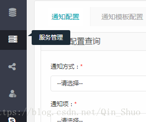
作用:悬浮左侧菜单栏时对该菜单进行简介
代码:
html:
<div class="float-flag" style="top: 15px; opacity: 0; display: none;">
    <div class="float-flag-shape"></div>
    <div class="float-flag-content">服务管理</div>
</div>
css:
.float-flag{
    position: absolute;
    top: 15px;
    left: 65px;
    color: #fefefe;
    height: 2.5em;
    line-height: 2.5em;
    width: 6.5em;
    opacity: 0;
    background-color: #1c2b36;
    text-align:center;
    border-radius:3px;
}
.float-flag-shape{
    position: absolute;
    top: 0.5em;
    border: 1px solid #000;
    height: 0;
    width: 0;
    border-left: 4px solid rgba(0,0,0,0);
    border-right: 4px solid #1c2b36;
    border-top: 3px solid rgba(0,0,0,0);
    border-bottom: 3px solid #1c2b36;
    left:-8px;
}
.float-flag-content{
    margin:auto;
}
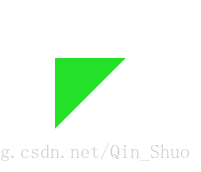
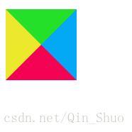
这里重点讲解下float-flag-shape,这部分其实是根据边距拼接成的,如图如果设置width,height为0分别对border进行颜色设置就不难看出4部分组成
css:
   .float-flag-shape{
    position: absolute;
    top: 0.5em;
    border: 1px solid #000;
    height: 0;
    width: 0;
    border-left: 50px solid #ece82b;
    border-right: 50px solid #03A9F4;
    border-top: 50px solid #25e028;
    border-bottom: 50px solid #f40355;
}
因此如果需要三角形的时候我们只需要隐藏任意三个边的border即可,如果需要一个直角三角形则直接隐藏相邻两个border即可,如果对三角形的边长比例有要求的话直接对应的统一修改top,bottom 或left ,right,具体操作如下