用flex,实现多级菜单分类展示,这里记录一下,方便以后查阅.
效果展示如下:
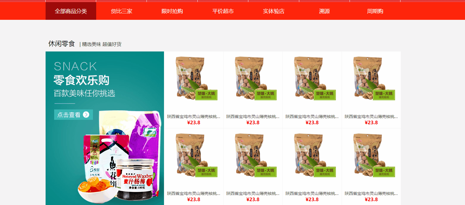
跟上面floor的设计差不多,鼠标hover全部商品分类的时候,将下拉列表展示在指定区域,这个类似鼠标悬浮商品图片期待上线的按钮出现的方式,不过由于一级分类和二级分类没有不是父子关系,在处理一级分类hover对应二级分类改变样式的时候,不得不使用了js改变二级分类的样式
html页面设计如下:
<div class="left-menu">
    <div class="left-menu-wrap">
        <div class="left-menu-top">
            <ul>
                <li class="all"><a href="#">全部商品分类</a></li>
                <li><a href="#">货比三家</a></li>
                <li><a href="#">限时抢购</a></li>
                <li><a href="#">平价超市</a></li>
                <li><a href="#">实体验店</a></li>
                <li><a href="#">溯源</a></li>
                <li><a href="#">周期购</a></li>
            </ul>
        </div>
        <div class="left-menu-bottom">
            <div class="left-menu-bottom-warp">
                <div class="left-menu-bottom-left">
                    <ul>
                        <li><a class="one" href="#">原汁原味</a></li>
                        <li><a class="two" href="#">特色零食</a></li>
                        <li><a class="three" href="#">高原鲜品</a></li>
                        <li><a class="four" href="#">生态粮油</a></li>
                        <li><a class="five" href="#">红茶特饮</a></li>
                        <li><a class="six" href="#">美酒佳酿</a></li>
                        <li><a class="seven" href="#">滋补养生</a></li>
                        <li><a class="eight" href="#">母婴专区</a></li>
                        <li><a class="nine" href="#">日用百货</a></li>
                        <li><a class="ten" href="#">生活家电</a></li>
                    </ul>
                </div>
                <div class="left-menu-bottom-right">
                    <ul style="padding-left: 20px;padding-right: 20px">
                        <li class="onehover"><a href="#">原汁原味</a><a href="#">原汁原味</a><a href="#">原汁原味</a></li>
                        <li class="twohover"><a href="#">特色零食</a><a href="#">特色零食</a><a href="#">特色零食</a></li>
                        <li class="threehover"><a href="#">高原鲜品</a><a href="#">高原鲜品</a></li>
                        <li class="fourhover"><a href="#">生态粮油</a><a href="#">生态粮油</a><a href="#">生态粮油</a><a href="#">生态粮油</a>
                        </li>
                        <li class="fivehover"><a href="#">茶特饮</a><a href="#">红茶特饮</a><a href="#">红茶特饮</a><a href="#">红茶特饮</a><a
                                href="#">红茶特饮</a><a
                                href="#">红茶特饮</a></li>
                        <li class="sixhover"><a href="#">美酒佳酿</a><a href="#">美酒佳酿</a><a href="#">美酒佳酿</a></li>
                        <li class="sevenhover"><a href="#">滋补养生</a><a href="#">滋补养生</a><a href="#">滋补养生</a></li>
                        <li class="eighthover"><a href="#">母婴专区</a><a href="#">母婴专区</a><a href="#">母婴专区</a><a href="#">母婴专区</a><a
                                href="#">母婴专区</a>
                        </li>
                        <li class="ninehover"><a href="#">日用百货</a><a href="#">日用百货</a><a href="#">日用百货</a></li>
                        <li class="tenhover"><a href="#">生活家电</a><a href="#">生活家电</a></li>
                    </ul>

                </div>
            </div>
        </div>
    </div>
</div>
css:
* {
    margin: 0;
    padding: 0;
    list-style: none;
    text-decoration: none;
    text-outline: none;
    background: none;
    text-align: justify;
    text-outline: none;
    line-height: 20px;
    text-space: 1px;
}

.left-menu {
    display: flex;
    flex-direction: column;
    align-items: center;
    justify-content: center;
    background: #ff260b;
    height: 60px;
}

.left-menu-wrap {
    width: 1200px;
}

.left-menu-top > ul {
    display: flex;
    flex-direction: row;
}

.left-menu-top > ul > li {
    flex: 1;
    float: left;
    display: flex;
    flex-direction: column;
    align-items: center;
    justify-content: center;
}

.left-menu-top > ul > li > a {
    font-size: 18px;
    flex: 1;
    padding-top: 20px;
    padding-bottom: 20px;
    color: #FFF;
    width: 100%;
    text-align: center;
}


.left-menu-bottom-warp {
    position: absolute;
    width: 300px;
    height: 813px;
    padding: 20px;
    background: #f4f4f4;
}

.left-menu-bottom {
    display: none;
    position: relative;
    top: 0;
    left: 0;
    z-index: 1000;
    transition: 100s;
}

.left-menu-bottom-left > ul > li {
    display: flex;
    flex-direction: row;
    justify-content: center;
    align-items: center;
}

.left-menu-bottom-left > ul > li > a {
    text-align: center;
    width: 100%;
    line-height: 80px;
    color: #0C0C0C;
    border-bottom: 1px solid #e0e0e0;
    border-top: 1px solid #e0e0e0;
    margin-top: -1px;
}

.left-menu-bottom-right {
    position: absolute;
    top: 0;
    left: 340px;
    width: 500px;
    background: rgba(244, 244, 244, 0.91);
    padding-top: 20px;
    padding-bottom: 20px;
}

.left-menu-bottom-right ul li {
    padding-left: 20px;
    padding-right: 20px;
    height: 80px;
    display: flex;
    flex-direction: row;
    flex-wrap: wrap;
    border-top: #e0e0e0 1px solid;
    border-bottom: #e0e0e0 1px solid;
    margin-top: -1px;
    justify-content: flex-start;
    align-items: center;

}

.left-menu-bottom-right ul li a {
    color: #0C0C0C;
    flex: 1;
}

.left-menu-bottom-right ul li a:hover {
    color: red;
}

.all {
    background: #9e0909;
}
.left-menu-bottom-right ul li:hover
{
    background: #FFFFFF;

}
javascript:
$(function () {
    let bottom = $(".left-menu-bottom");
    $(".all").hover(function () {
        bottom.css("display", "block")
    }, function () {
        bottom.css("display", "none")
    })
    bottom.hover(function () {
        bottom.css("display", "block")
    }, function () {
        bottom.css("display", "none")
    })
    $(".left-menu-bottom-left>ul li a").hover(function (e) {
        $('.' + e.target.className + 'hover').css("background", "#FFFF");
    }, function (e) {
        $('.' + e.target.className + 'hover').css("background", "none");
    });
    $("  .left-menu-bottom-right ul li").hover(function (e) {
        $(this).css("background", "#FFFFFF");
    }, function (e) {
        $(this).css("background", "none");
    })
});