本篇博客将把Flutter所有UI控件的使用方法写出,我学习Flutter是通过Flutter官网来学习的,不需要科学上网,比如这这个网址说的就是Flutter的UI控件的使用方法 https://flutter.io/widgets/widgetindex/
下面是我直接从这个官网控件目录里贴出来的,说的是Flutter所有的控件,超级多,而且还有Android和iOS类似控件
Flutter Widget Index
This is an alphabetical list of nearly every widget that is bundled with Flutter. You can also browse widgets by category.
-

AbsorbPointer
A widget that absorbs pointers during hit testing. When absorbing is true, this widget prevents its subtree from receiving pointer events by terminating hit testing at itself. It still consumes space during layout and paints its child as usual. It just prevents its children from being the target of located events, because it returns true from RenderBox.hitTest.
-

AlertDialog
Alerts are urgent interruptions requiring acknowledgement that inform the user about a situation. The AlertDialog widget implements this component.
-
Align
A widget that aligns its child within itself and optionally sizes itself based on the child's size.
-
AnimatedBuilder
A general-purpose widget for building animations. AnimatedBuilder is useful for more complex widgets that wish to include an animation as part of a larger build function. To use AnimatedBuilder, simply construct the widget and pass it a builder function.
扫描二维码关注公众号,回复: 2367553 查看本文章
-
AnimatedContainer
A container that gradually changes its values over a period of time.
-
AnimatedCrossFade
A widget that cross-fades between two given children and animates itself between their sizes.
-
AnimatedDefaultTextStyle
Animated version of DefaultTextStyle which automatically transitions the default text style (the text style to apply to descendant Text widgets without explicit style) over a given duration whenever the given style changes.
-
AnimatedListState
The state for a scrolling container that animates items when they are inserted or removed.
-
AnimatedModalBarrier
A widget that prevents the user from interacting with widgets behind itself.
-
AnimatedOpacity
Animated version of Opacity which automatically transitions the child's opacity over a given duration whenever the given opacity changes.
-
AnimatedPositioned
Animated version of Positioned which automatically transitions the child's position over a given duration whenever the given position changes.
-
AnimatedSize
Animated widget that automatically transitions its size over a given duration whenever the given child's size changes.
-
Appbar
A Material Design app bar. An app bar consists of a toolbar and potentially other widgets, such as a TabBar and a FlexibleSpaceBar.
-
AssetBundle
Asset bundles contain resources, such as images and strings, that can be used by an application. Access to these resources is asynchronous so that they can be transparently loaded over a network (e.g., from a NetworkAssetBundle) or from the local file system without blocking the application's user interface.
-
BackdropFilter
A widget that applies a filter to the existing painted content and then paints child. This effect is relatively expensive, especially if the filter is non-local, such as a blur.
-

BottomNavigationBar
Bottom navigation bars make it easy to explore and switch between top-level views in a single tap. The BottomNavigationBar widget implements this component.
-

BottomSheet
Bottom sheets slide up from the bottom of the screen to reveal more content. You can call showBottomSheet() to implement a persistent bottom sheet or showModalBottomSheet() to implement a modal bottom sheet.
-
Checkbox
Checkboxes allow the user to select multiple options from a set. The Checkbox widget implements this component.
-

Chip
A Material Design chip. Chips represent complex entities in small blocks, such as a contact.
-
Container
A convenience widget that combines common painting, positioning, and sizing widgets.
-

CupertinoActivityIndicator
An iOS-style activity indicator. Displays a circular 'spinner'.
-
CupertinoFullscreenDialogTransition
An iOS-style transition used for summoning fullscreen dialogs.
-

CupertinoNavigationBar
An iOS-style top navigation bar. Typically used with CupertinoPageScaffold.
-
CupertinoPageScaffold
Basic iOS style page layout structure. Positions a navigation bar and content.
-

CupertinoSwitch
An iOS-style switch. Used to toggle the on/off state of a single setting.
-

CupertinoTabBar
An iOS-style bottom tab bar. Typically used with CupertinoTabScaffold.
-
CupertinoTabScaffold
Tabbed iOS app structure. Positions a tab bar on top of tabs of content.
-
CupertinoTabView
Root content of a tab that supports parallel navigation between tabs. Typically used with CupertinoTabScaffold
-
CustomMultiChildLayout
A widget that uses a delegate to size and position multiple children.
-
CustomSingleChildLayout
A widget that defers the layout of its single child to a delegate.
-

DataTable
Data tables display sets of raw data. They usually appear in desktop enterprise products. The DataTable widget implements this component.
-

Date & Time Pickers
Date pickers use a dialog window to select a single date on mobile. Time pickers use a dialog to select a single time (in the hours:minutes format) on mobile.
-
DecoratedBox
A widget that paints a Decoration either before or after its child paints.
-
DecoratedBoxTransition
Animated version of a DecoratedBox that animates the different properties of its Decoration.
-
DefaultTextStyle
The text style to apply to descendant Text widgets without explicit style.
-
Dismissible
A widget that can be dismissed by dragging in the indicated direction. Dragging or flinging this widget in the DismissDirection causes the child to slide out of view. Following the slide animation, if resizeDuration is non-null, the Dismissible widget animates its height (or width, whichever is perpendicular to the dismiss direction) to zero over the resizeDuration.
-
DragTarget
A widget that receives data when a Draggable widget is dropped. When a draggable is dragged on top of a drag target, the drag target is asked whether it will accept the data the draggable is carrying. If the user does drop the draggable on top of the drag target (and the drag target has indicated that it will accept the draggable's data), then the drag target is asked to accept the draggable's data.
-
Draggable
A widget that can be dragged from to a DragTarget. When a draggable widget recognizes the start of a drag gesture, it displays a feedback widget that tracks the user's finger across the screen. If the user lifts their finger while on top of a DragTarget, that target is given the opportunity to accept the data carried by the draggable.
-

Drawer
A Material Design panel that slides in horizontally from the edge of a Scaffold to show navigation links in an application.
-
ExcludeSemantics
A widget that drops all the semantics of its descendants. This can be used to hide subwidgets that would otherwise be reported but that would only be confusing. For example, the Material Components Chip widget hides the avatar since it is redundant with the chip label.
-

ExpansionPanel
Expansion panels contain creation flows and allow lightweight editing of an element. The ExpansionPanel widget implements this component.
-
FlatButton
A flat button is a section printed on a Material Components widget that reacts to touches by filling with color.
-

FloatingActionButton
A floating action button is a circular icon button that hovers over content to promote a primary action in the application. Floating action buttons are most commonly used in the Scaffold.floatingActionButton field.
-
Form
An optional container for grouping together multiple form field widgets (e.g. TextField widgets).
-
FormField
A single form field. This widget maintains the current state of the form field, so that updates and validation errors are visually reflected in the UI.
-
FractionalTranslation
A widget that applies a translation expressed as a fraction of the box's size before painting its child.
-
FractionallySizedBox
A widget that sizes its child to a fraction of the total available space. For more details about the layout algorithm, see RenderFractionallySizedOverflowBox.
-
FutureBuilder
Widget that builds itself based on the latest snapshot of interaction with a Future.
-
GestureDetector
A widget that detects gestures. Attempts to recognize gestures that correspond to its non-null callbacks. If this widget has a child, it defers to that child for its sizing behavior. If it does not have a child, it grows to fit the parent instead.
-

GridView
A grid list consists of a repeated pattern of cells arrayed in a vertical and horizontal layout. The GridView widget implements this component.
-
GridView
A scrollable, 2D array of widgets. The most commonly used grid layouts are GridView.count, which creates a layout with a fixed number of tiles in the cross axis, and GridView.extent, which creates a layout with tiles that have a maximum cross-axis extent. A custom SliverGridDelegate can produce an aribtrary 2D arrangement of children, including arrangements that are unaligned or overlapping.
-
IconButton
An icon button is a picture printed on a Material widget that reacts to touches by filling with color (ink).
-
IgnorePointer
A widget that is invisible during hit testing. When ignoring is true, this widget (and its subtree) is invisible to hit testing. It still consumes space during layout and paints its child as usual. It just cannot be the target of located events, because it returns false from RenderBox.hitTest.
-

LinearProgressIndicator
Progress and activity indicators are visual indications of an app loading content. The LinearProgressIndicator widget implements this component. In addition you may also use the CircularProgressIndicator widget.
-
ListBody
A widget that arranges its children sequentially along a given axis, forcing them to the dimension of the parent in the other axis.
-

ListTile
A single fixed-height row that typically contains some text as well as a leading or trailing icon.
-
ListView
A scrollable, linear list of widgets. ListView is the most commonly used scrolling widget. It displays its children one after another in the scroll direction. In the cross axis, the children are required to fill the ListView.
-
ListView
A scrollable, linear list of widgets. ListView is the most commonly used scrolling widget. It displays its children one after another in the scroll direction. In the cross axis, the children are required to fill the ListView.
-
MaterialApp
A convenience widget that wraps a number of widgets that are commonly required for applications implementing Material Design.
-
Navigator
A widget that manages a set of child widgets with a stack discipline. Many apps have a navigator near the top of their widget hierarchy in order to display their logical history using an Overlay with the most recently visited pages visually on top of the older pages. Using this pattern lets the navigator visually transition from one page to another by moving the widgets around in the overlay. Similarly, the navigator can be used to show a dialog by positioning the dialog widget above the current page.
-
Offstage
A widget that lays the child out as if it was in the tree, but without painting anything, without making the child available for hit testing, and without taking any room in the parent.
-
OverflowBox
A widget that imposes different constraints on its child than it gets from its parent, possibly allowing the child to overflow the parent.
-
Placeholder
A widget that draws a box that represents where other widgets will one day be added.
-
PopupMenuButton
Displays a menu when pressed and calls onSelected when the menu is dismissed because an item was selected.
-
PositionedTransition
Animated version of Positioned which takes a specific Animation to transition the child's position from a start position to and end position over the lifetime of the animation.
-

Radio
Radio buttons allow the user to select one option from a set. Use radio buttons for exclusive selection if you think that the user needs to see all available options side-by-side.
-

RaisedButton
A Material Design raised button. A raised button consists of a rectangular piece of material that hovers over the interface.
-
RawKeyboardListener
A widget that calls a callback whenever the user presses or releases a key on a keyboard.
-
RichText
The RichText widget displays text that uses multiple different styles. The text to display is described using a tree of TextSpan objects, each of which has an associated style that is used for that subtree. The text might break across multiple lines or might all be displayed on the same line depending on the layout constraints.
-
Scaffold
Implements the basic Material Design visual layout structure. This class provides APIs for showing drawers, snack bars, and bottom sheets.
-
Scrollable
Scrollable implements the interaction model for a scrollable widget, including gesture recognition, but does not have an opinion about how the viewport, which actually displays the children, is constructed.
-
Scrollbar
A Material Design scrollbar. A scrollbar indicates which portion of a Scrollable widget is actually visible.
-
Semantics
A widget that annotates the widget tree with a description of the meaning of the widgets. Used by accessibility tools, search engines, and other semantic analysis software to determine the meaning of the application.
-
SimpleDialog
Simple dialogs can provide additional details or actions about a list item. For example they can display avatars icons clarifying subtext or orthogonal actions (such as adding an account).
-
SingleChildScrollView
A box in which a single widget can be scrolled. This widget is useful when you have a single box that will normally be entirely visible, for example a clock face in a time picker, but you need to make sure it can be scrolled if the container gets too small in one axis (the scroll direction).
-
SizedBox
A box with a specified size. If given a child, this widget forces its child to have a specific width and/or height (assuming values are permitted by this widget's parent). If either the width or height is null, this widget will size itself to match the child's size in that dimension.
-
SizedOverflowBox
A widget that is a specific size but passes its original constraints through to its child, which will probably overflow.
-

SnackBar
A lightweight message with an optional action which briefly displays at the bottom of the screen.
-
Stack
This class is useful if you want to overlap several children in a simple way, for example having some text and an image, overlaid with a gradient and a button attached to the bottom.
-

Stepper
A Material Design stepper widget that displays progress through a sequence of steps.
-
StreamBuilder
Widget that builds itself based on the latest snapshot of interaction with a Stream.
-

Switch
On/off switches toggle the state of a single settings option. The Switch widget implements this component.
-

TabBarView
A page view that displays the widget which corresponds to the currently selected tab. Typically used in conjunction with a TabBar.
-

TextField
Touching a text field places the cursor and displays the keyboard. The TextField widget implements this component.
-
Theme
Applies a theme to descendant widgets. A theme describes the colors and typographic choices of an application.
-

Tooltip
Tooltips provide text labels that help explain the function of a button or other user interface action. Wrap the button in a Tooltip widget to show a label when the widget long pressed (or when the user takes some other appropriate action).
-
WidgetsApp
A convenience class that wraps a number of widgets that are commonly required for an application.


1.基础控件
首先说一下最基础的控件有哪些,基础使用方法
文字显示
new Text('Hello World', style: new TextStyle(fontSize: 32.0))图片显示
new Image.asset('images/myPic.jpg', fit: BoxFit.cover)关于本地图片资源使用这里我需要说一下,首先在项目最顶部创建一个images文件夹放入一张图片lake.jpeg,然后在pubspec.yaml添加几行代码,表示引用images文件夹下的lake.jpeg图片,因为我把注释都删除了,所以代码看起来不多,但是原本的注释非常多,建议大家多看看注释
name: flutter_app
description: A new Flutter application.

dependencies:
  flutter:
    sdk: flutter
  cupertino_icons: ^0.1.2

dev_dependencies:
  flutter_test:
    sdk: flutter

  assets:
     - images/lake.jpeg
图标显示,就是使用系统里的图标图片
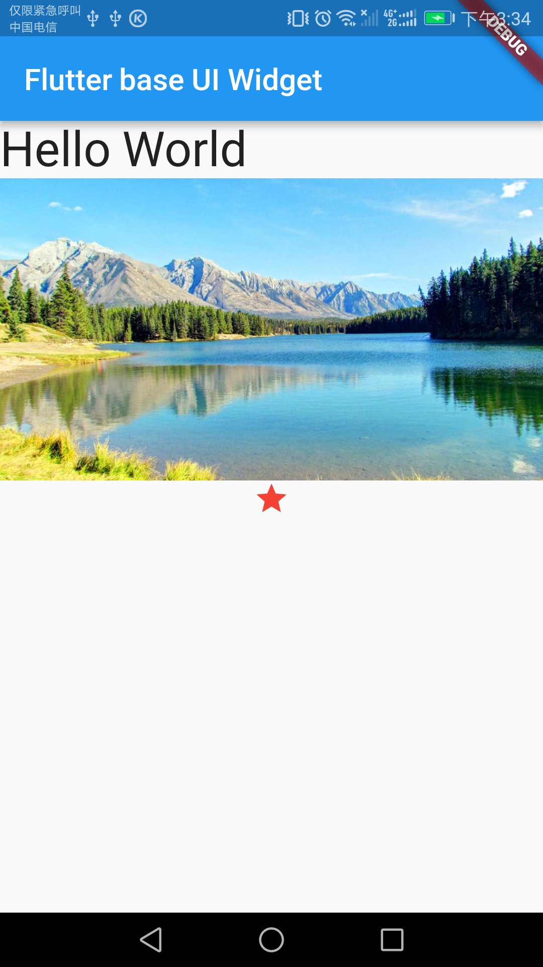
new Icon(Icons.star, color: Colors.red[500])这些基础控件的一些属性,大家就Command&鼠标左键点击Text类看看源码
好,我们把它们在APP里显示出来
修改main.dart文件,其中可以看得出来有两个顶层控件,一个appBar代表标题栏,一个body继承ListView代表主体内容
这个ListView默认是竖直方向的,和我们平常用的ListView很像,我们只需要把一些基础控件的对象放入其中,他会自动摆放的
class MyApp extends StatelessWidget {
  @override
  Widget build(BuildContext context) {

    return new MaterialApp(
      title: 'Flutter base UI Widget',
      home: new Scaffold(
        appBar: new AppBar(
          title: new Text('Flutter base UI Widget'),
        ),
        body: new ListView(
          children: <Widget>[
            //add code
            new Text('Hello World', style: new TextStyle(fontSize: 32.0)),
            new Image.asset('images/lake.jpeg', width: 200.0,height: 200.0, fit: BoxFit.cover),
            new Icon(Icons.star, color: Colors.red[500])


          ],
        ),
      ),
    );
  }
  }
安装看效果,很好,一切正常
如果我们只显示Text,并且放在屏幕中央,那就修改body这段代码,就可以完成最经典的Hello World例子
      body: new Center(
        child: new Text('Hello World', style: new TextStyle(fontSize: 32.0)),
      ),
2.Column、Row
Row指的是横向的一排,Column指的是竖直的一列,之前说过ListView,Row类似子控件排放方向是横向的ListView,Column则是子控件排放方向是竖直的ListView
比如下图就是一个Row完成的,一个Row包含了三个子控件,第一个子控件是Column,其他是Icon、Text,而这个Column又放入了两个Text

代码如下(Container只是一个容器,类似ViewGroup,他没有控制子控件的能够,所以需要通过Row和Column来控制子控件的排放)
class MyApp extends StatelessWidget {
  @override
  Widget build(BuildContext context) {

    Widget titleSection = new Container(
      padding: const EdgeInsets.all(32.0),
      child: new Row(
        children: [
          new Expanded(
            child: new Column(
              crossAxisAlignment: CrossAxisAlignment.start,
              children: [
                new Container(
                  padding: const EdgeInsets.only(bottom: 8.0),
                  child: new Text(
                    'Oeschinen Lake Campground',
                    style: new TextStyle(
                      fontWeight: FontWeight.bold,
                    ),
                  ),
                ),
                new Text(
                  'Kandersteg, Switzerland',
                  style: new TextStyle(
                    color: Colors.grey[500],
                  ),
                ),
              ],
            ),
          ),
          new Icon(
            Icons.star,
            color: Colors.red[500],
          ),
          new Text('41'),
        ],
      ),
    );

    return new MaterialApp(
      title: 'Flutter base UI Widget',
      home: new Scaffold(
        appBar: new AppBar(
          title: new Text('Flutter base UI Widget'),
        ),
        body: new ListView(
          children: <Widget>[
            //add code
            titleSection


          ],
        ),
      ),
    );
  }
  }
然后这个Row和Column有mainAxisAlignment、crossAxisAlignment和flex属性
对于Row,mainAxisAlignment是横向,crossAxisAlignment是竖直方向,对于Column则相反,而flex则类似weight,在Row、Column里的子控件这个flex属性默认为1,通过这个flex来计算子控件在mainAxisAlignment方向占有的长度
我修改titleSection的代码
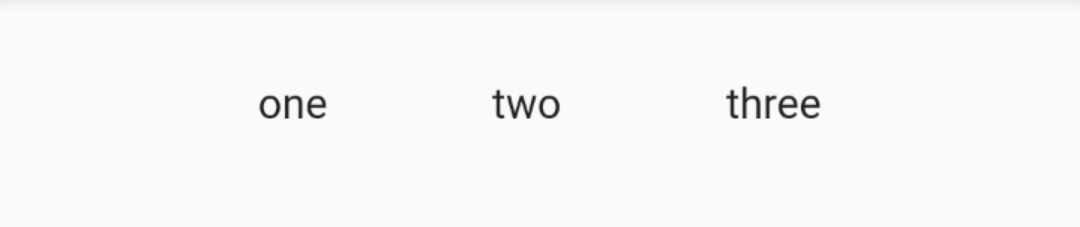
Widget titleSection = new Container(
padding: const EdgeInsets.all(32.0),
child: new Row(
children: [
new Text('one'),
new Text('two'),
new Text('three')
],
),
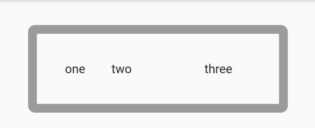
);显示如下:

如果我加上一行代码
    Widget titleSection = new Container(
      padding: const EdgeInsets.all(32.0),
      child: new Row(
        mainAxisAlignment: MainAxisAlignment.spaceEvenly,
        children: [
          new Text('one'),
          new Text('two'),
          new Text('three')
        ],
      ),
    );
效果,看得出来这个几个Text平均占用了宽度,如果是Column则是平均占用了高度,如果mainAxisAlignment设置为center,则是三个Text居中并且紧贴在一起
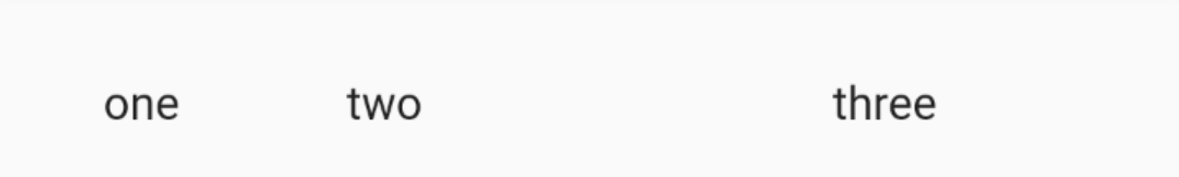
如果我添加flex属性
    Widget titleSection = new Container(
      padding: const EdgeInsets.all(32.0),
      child: new Row(

        children: [
          new Expanded(
             // flex:1,
              child: new Text('one')),
          new Expanded(
            flex: 2,
              child: new Text('two')),
          new Expanded(
             // flex:1,
              child: new Text('three'))
        ],
      ),
    );
这下子我们能够看得出来中间的子控件占有了屏幕一半的宽度
然后MainAxisSize.min这个属性能够是的子控件之间尽量贴在一起
3.Container
之前虽然使用了Container,但是好像没有看出来有啥作用,但是人家还是有一点作用的比如加边框

我试试
    Widget titleSection = new Container(
      decoration: new BoxDecoration(
        border: new Border.all(width: 10.0, color: Colors.black38),
        borderRadius:
        const BorderRadius.all(const Radius.circular(8.0)),

      ),
      margin: const EdgeInsets.all(32.0),
      padding: const EdgeInsets.all(32.0),
      child: new Row(

        children: [
          new Expanded(

             // flex:1,
              child: new Text('one')),
          new Expanded(
            flex: 2,
              child: new Text('two')),
          new Expanded(
             // flex:1,
              child: new Text('three'))
        ],
      ),
    );
4.GridView
表格布局,maxCrossAxisExtent指的是交叉方向的最大长度(GridView的主方向是竖直,交叉方向就是横向),padding和之前的Container一样,mainAxisSpacing和crossAxisSpacing指的是主方向和交叉方向,子控件之间的间距,children属性则是设置子控件(List<Widget>类型)
Widget buildGrid() {
  return new GridView.extent(
      maxCrossAxisExtent: 150.0,
      padding: const EdgeInsets.all(4.0),
      mainAxisSpacing: 4.0,
      crossAxisSpacing: 4.0,
      children: _buildGridTileList(30));
}
完整代码贴出
class MyApp extends StatelessWidget {
  @override
  Widget build(BuildContext context) {
    return new MaterialApp(
      title: 'Flutter Demo',
      theme: new ThemeData(
        primarySwatch: Colors.blue,
      ),
      home: new MyHomePage(title: 'Flutter Demo Home Page'),
    );
  }
}

class MyHomePage extends StatefulWidget {
  MyHomePage({Key key, this.title}) : super(key: key);

  final String title;

  @override
  _MyHomePageState createState() => new _MyHomePageState();
}

// The images are saved with names pic1.jpg, pic2.jpg...pic30.jpg.
// The List.generate constructor allows an easy way to create
// a list when objects have a predictable naming pattern.
List<Container> _buildGridTileList(int count) {
  List<Container> containers = new List<Container>.generate(
      count,
          (int index) =>
      new Container(child: new Image.asset('images/lake.jpeg',width: 100.0,height: 100.0, fit: BoxFit.cover)));
  return containers;
}

Widget buildGrid() {
  return new GridView.extent(
      maxCrossAxisExtent: 150.0,
      padding: const EdgeInsets.all(4.0),
      mainAxisSpacing: 4.0,
      crossAxisSpacing: 4.0,
      children: _buildGridTileList(30));
}

class _MyHomePageState extends State<MyHomePage> {
  @override
  Widget build(BuildContext context) {
    return new Scaffold(
      appBar: new AppBar(
        title: new Text(widget.title),
      ),
      body: new Center(
        child: buildGrid(),
      ),
    );
  }
}
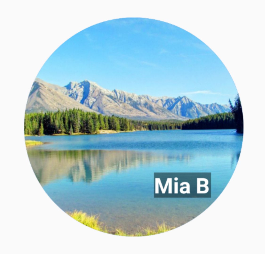
5.Stack
就是FrameLayout,帧布局,以左上角为起始点,按照子控件的先后顺序,直接覆盖上去,后来居上
CircleAvatar就是圆形控件,放入图片就能形成圆形图片。BoxDecoration就是设置当前Container的content背景颜色。
    var stack = new Stack(
      alignment: const Alignment(0.6, 0.6),
      children: [
        new CircleAvatar(
          backgroundImage: new AssetImage('images/lake.jpeg'),
          radius: 100.0,
        ),
        new Container(
          decoration: new BoxDecoration(
            color: Colors.black45,
          ),
          child: new Text(
            'Mia B',
            style: new TextStyle(
              fontSize: 20.0,
              fontWeight: FontWeight.bold,
              color: Colors.white,
            ),
          ),
        ),
      ],
    );
6.Card
CardView不多bb,elevation:阴影大小
    var card = new SizedBox(
      height: 95.0,
      child: new Card(
        margin: const EdgeInsets.all(10.0),
        elevation: 10.0,
        child: new Column(
          children: [
            new ListTile(
              title: new Text('1625 Main Street',
                  style: new TextStyle(fontWeight: FontWeight.w500)),
              subtitle: new Text('My City, CA 99984'),
              leading: new Icon(
                Icons.restaurant_menu,
                color: Colors.blue[500],
              ),
            )
          ],
        ),
      ),
    );
效果
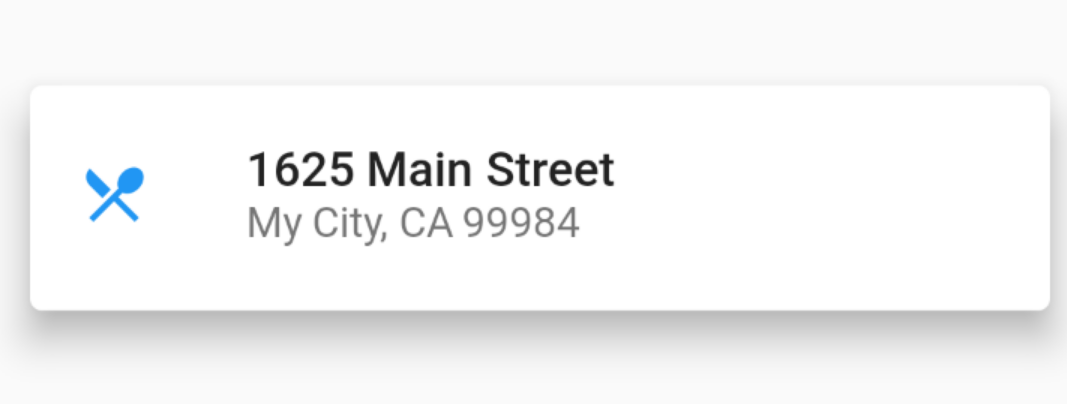
其中主体是ListTitle,ListTitle是一个特殊的Row,但是能过最多放入三排文字,并且可以放入图片
7.未完待续
因为还有不少的控件的使用我没有贴出,所以就有了这个标题,怎么说呢,我算是抛砖引玉,希望大家能够更好的灵活使用Flutter自带的控件