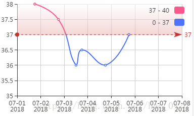
代码片段:
var data = [
    {name:'"2018-07-05 18:00:29"', value:["2018-07-05 18:00:29", 37]},
    {name:'2018-07-04 18:00:29', value:["2018-07-04 18:00:29", 36]},
    {name:'2018-07-03 18:00:29', value:["2018-07-03 18:00:29", 36.5]},
    {name:'2018-07-03 12:00:29', value:["2018-07-03 12:00:29", 36]},
    {name:'2018-07-02 18:00:29', value:["2018-07-02 18:00:29", 37.5]},
    {name:'2018-07-01 18:00:29', value:["2018-07-01 18:00:29", 38]}
];
//时间显示范围
var anchor = [
    {name:'2018-07-01', value:['2018-07-01', 0]},
    {name:'2018-07-08', value:['2018-07-08', 0]}
];
    // 指定图表的配置项和数据
    option = {
        backgroundColor: '#fff',//背景色
        grid: {
            left: 35,
            right: 20,
            top: 10,
            bottom:40,
            show:false
        },
        tooltip: {
            // trigger: 'axis',
            formatter: function (param) {
                return  param.value[0] + "<br>" + param.value[1] + "°C";
            }
        },
        xAxis: {
            type:"time",
            splitNumber: 10,
            axisLabel: {
                // rotate: 60,
                textStyle: {
                fontSize: 8
            }
        }
        },
        yAxis: {
            min: 35
        },
        visualMap: {
            top: 10,
            right: 10,
            pieces: [{
                gte: 0,
                lte: 37,
                color: '#4D74FA'
            },{
                gt: 37,
                lte: 40,
                color: '#FA578B'
            }],
            outOfRange: {
                color: '#FA578B'
            }
            // show : false
        },
        series: [{
            data: data,
            markLine: {
                silent: true,
                data: [{
                    yAxis: 37
                }]
            },
            type: 'line',
            smooth: true,
            markArea:{
                data: [
                    [
                        {yAxis: 37},
                        {}
                    ]
                ],
                itemStyle:{
                    opacity: 0.5,
                    color: {
                        type: 'linear',
                        x: 0,
                        y: 0,
                        x2: 0,
                        y2: 1,
                        colorStops: [{
                                offset: 0, color: '#fff' // 0% 处的颜色
                            },
                            {
                                offset: 1, color: '#E7AEAD' // 100% 处的颜色
                            }
                        ],
                        globalCoord: false // 缺省为 false
                    }
                }
            }
            // areaStyle: {
            //     normal: {
            //         color: new echarts.graphic.LinearGradient(0, 0, 0, 1, [{
            //             offset: 0,
            //             color: 'rgb(255, 158, 68)'
            //         }, {
            //             offset: 1,
            //             color: '#fff'
            //         }])
            //     }
            // },
        },
        {
            name:'.anchor',
            type:'line',
            showSymbol:false,
            data:anchor,
            itemStyle:{normal:{opacity:0}}, //不绘制该线条
            lineStyle:{normal:{opacity:0}}
        }]
    };
运行结果: