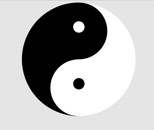
太极
首先要明白太极的原理,如果手动去画一个太极应该怎么画
如下图是一个不完整的太极但说明了其组成

最终效果图:
代码如下:
<!DOCTYPE html>
<html>
	<head>
		<meta charset="utf-8">
		<title></title>
		<style type="text/css">
			body {
				background-color: #e5e5e5;
			}
			.container {
				width: 400px;
				height: 400px;
				margin: 0 auto;
				border-radius: 50%;
				background-color: gray;
				overflow: hidden;
				position: relative;
			}
			.item {
				width: 50%;
				height: 100%;
			}
			.item1 {
				float: left;
				background-color: #000;
			}
			.item2 {
				float: right;
				background-color: #fff;
			}
			.top , .bottom {
				width: 50%;
				height: 50%;
				position: absolute;
				background-color: red;
				left: 25%;
				border-radius: 50%;
				text-align: center;
				line-height: 200px;
			}
			.top {
				background-color: #000;
			}
			.bottom {
				top: 50%;
				background-color: #fff;
			}
			.yin , .yang {
				width: 20%;
				height: 20%;
				background: red;
				border-radius: 50%;
				display: inline-block;
			}
			.yin {
				background-color: #000;
			}
			.yang {
				background-color: #fff;
			}
		</style>
	</head>
	<body>
		<div class="container">
			<div class="item item1"></div>
			<div class="item item2"></div>
			<div class="top">
				<div class="yang">
				</div>
			</div>
			<div class="bottom">
				<div class="yin">

				</div>
			</div>
		</div>
	</body>
</html>
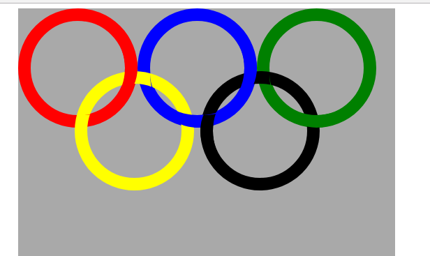
五环
代码如下:
<!DOCTYPE html>
<html>
	<head>
		<meta charset="utf-8">
		<title></title>
		<style type="text/css">
			.big {
				width: 600px;
				height: 500px;
				margin: 0 auto;
				background-color: darkgray;
				position: relative;
			}
			.item {
				width: 150px;
				height: 150px;
				border: 20px solid red;
				border-radius: 50%;
				position: absolute;
			}
			.item1 {

			}
			.item2 {
				left: 190px;
				border-color: blue;
			}
			.item3 {
				left: 380px;
				border-color: green;
			}
			.item4 {
				border-color: yellow;
				top:100px;
				left:90px;
			}
			.item5 {
				border-color: black;
				top:100px;
				left: 290px;
			}

			.child {
				width: 150px;
				height: 150px;
				border-radius: 50%;
				position: absolute;
			}
			.item1-child {
				border-right: 20px solid red;
				z-index: 1;
			}
			.item2-child {
				border-bottom: 20px solid blue;
				z-index: 3;
			}
			.item2-child2 {
				border-right: 20px solid blue;
				z-index: 5;
			}
			.item3-child {
				border-bottom: 20px solid green;
				z-index: 2;
			}
			.item5-child {
				left: -20px;
				border-left: 20px solid black;
				z-index: 4;

			}
		</style>
	</head>
	<body>
		<div class="big">
			<div class="item item1">
				<div class="child item1-child"></div>
			</div>
			<div class="item item2">
				<div class="child item2-child"></div>
				<div class="child item2-child2"></div>
			</div>
			<div class="item item3">
				<div class="child item3-child"></div>
			</div>
			<div class="item item4">
				<div class="child item4-child"></div>
			</div>
			<div class="item item5">
				<div class="child item5-child"></div>
			</div>
		</div>
	</body>
</html>
效果图如下: