下载所需依赖包:
cnpm i postcss-aspect-ratio-mini postcss-px-to-viewport postcss-write-svg postcss-cssnext postcss-viewport-units cssnano --S 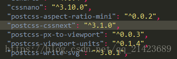
在项目根目录下找到.postcssrc.js并配置:

"plugins": {
		"postcss-import": {},
		"postcss-url": {},
		"postcss-aspect-ratio-mini": {},
		"postcss-write-svg": {
			"utf8": false
		},
		"postcss-cssnext": {},
		"postcss-px-to-viewport": {
			viewportWidth: 750, // 视窗的宽度,对应的是我们设计稿的宽度,一般是750
			viewportHeight: 1334, // 视窗的高度,根据750设备的宽度来指定,一般指定1334,也可以不配置
			unitPrecision: 3, // 指定`px`转换为视窗单位值的小数位数(很多时候无法整除)
			viewportUnit: 'vw', // 指定需要转换成的视窗单位,建议使用vw
			selectorBlackList: ['.ignore', '.hairlines'], // 指定不转换为视窗单位的类,可以自定义,可以无限添加,建议定义一至两个通用的类名
			minPixelValue: 1, // 小于或等于`1px`不转换为视窗单位,你也可以设置为你想要的值
			mediaQuery: false // 允许在媒体查询中转换`px`
		},
		"postcss-viewport-units": {},
		"cssnano": {
			"preset": "advanced",
			"autoprefixer": false,
			"postcss-zindex": false
		}

		// to edit target browsers: use "browserslist" field in package.json
		//				"autoprefixer": {}
}目前出视觉设计稿,我们都是使用750px宽度的,那么100vw = 750px,即1vw = 7.5px。那么我们可以根据设计图上的px值直接转换成对应的vw值。在实际撸码过程,不需要进行任何的计算,直接在代码中写px
.test {
border: .5px solid black;
border-bottom-width: 4px;
font-size: 14px;
line-height: 20px;
position: relative;
}
[w-188-246] {
width: 188px;
}
编译出来的CSS:
.test {
border: .5px solid #000;
border-bottom-width: .533vw;
font-size: 1.867vw;
line-height: 2.667vw;
position: relative;
}
[w-188-246] {
width: 25.067vw;
}
在不想要把px转换为vw的时候,首先在对应的元素(html)中添加配置中指定的类名.ignore或.hairlines(.hairlines一般用于设置border-width:0.5px的元素中):
<div class="box ignore"></div>
写CSS的时候:
.ignore {
margin: 10px;
background-color: red;
}
.box {
width: 180px;
height: 300px;
}
.hairlines {
border-bottom: 0.5px solid red;
}
编译出来的CSS:
.box {
width: 24vw;
height: 40vw;
}
.ignore {
margin: 10px; /*.box元素中带有.ignore类名,在这个类名写的`px`不会被转换*/
background-color: red;
}
.hairlines {
border-bottom: 0.5px solid red;
}
上面解决了px到vw的转换计算。那么在哪些地方可以使用vw来适配我们的页面。
容器适配,
可以使用vw文本的适配,
可以使用vw大于1px的边框、圆角、阴影都可以使用vw
内距和外距,可以使用vw
修改了配置文件一定要重启项目!!