带圆角和选择器的自定义文本按钮
示例
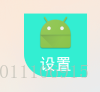
<包名.readcard.view.CustumShapeBgTextView
                android:layout_width="200dp"
                android:layout_height="200dp"
                android:drawableTop="@mipmap/ic_launcher"
                android:gravity="center"
                android:text="设置"
                android:textColor="#fff"
                android:textSize="36sp"
                apps:bottomLeftRadius="30dp"
                apps:shapeTpe="rectangle"
                apps:solidColor="#33EED2" />
1.java代码
import android.content.Context;
import android.content.res.TypedArray;
import android.graphics.Color;
import android.graphics.drawable.GradientDrawable;
import android.os.Build;
import android.util.AttributeSet;
import android.view.MotionEvent;
import android.widget.TextView;

import com.edu.wufengkeji.readcard.R;

/**
 * 带圆角和选择器的自定义文本按钮
 * 实现自定义圆角背景
 * 支持:
 * 1.四边圆角
 * 2.指定边圆角
 * 3.支持填充色以及边框色
 * 4.支持按下效果
 */
public class CustumShapeBgTextView extends TextView {

    public CustumShapeBgTextView(Context context, AttributeSet attrs) {
        super(context, attrs);
        init(context, attrs);
    }


    private GradientDrawable gd;
    //填充色
    private int solidColor = 0;
    //边框色
    private int strokeColor = 0;
    //按下填充色
    private int solidTouchColor = 0;
    //按下边框色
    private int strokeTouchColor = 0;
    //边框宽度
    private int strokeWith = 0;
    private int shapeTpe = 0;
    //按下字体色
    private int textTouchColor = 0;
    //字体色
    private int textColor = 0;

    float dashGap = 0;
    float dashWidth = 0;

    public void init(Context context, AttributeSet attrs) {
        TypedArray ta = context.getTheme().obtainStyledAttributes(attrs, R.styleable.CustumBgTextView, 0, 0);

        solidColor = ta.getInteger(R.styleable.CustumBgTextView_solidColor, 0x00000000);
        strokeColor = ta.getInteger(R.styleable.CustumBgTextView_strokeColor, 0x00000000);

        solidTouchColor = ta.getInteger(R.styleable.CustumBgTextView_solidTouchColor, 0x00000000);
        strokeTouchColor = ta.getInteger(R.styleable.CustumBgTextView_strokeTouchColor, 0x00000000);
        textTouchColor = ta.getInteger(R.styleable.CustumBgTextView_textTouchColor, 0x00000000);
        textColor = getCurrentTextColor();
        strokeWith = ta.getInteger(R.styleable.CustumBgTextView_strokeWith, 0);

        float radius = ta.getDimension(R.styleable.CustumBgTextView_radius, 0);
        float topLeftRadius = ta.getDimension(R.styleable.CustumBgTextView_topLeftRadius, 0);
        float topRightRadius = ta.getDimension(R.styleable.CustumBgTextView_topRightRadius, 0);
        float bottomLeftRadius = ta.getDimension(R.styleable.CustumBgTextView_bottomLeftRadius, 0);
        float bottomRightRadius = ta.getDimension(R.styleable.CustumBgTextView_bottomRightRadius, 0);
        dashGap = ta.getDimension(R.styleable.CustumBgTextView_dashGap, 0);
        dashWidth = ta.getDimension(R.styleable.CustumBgTextView_dashWidth, 0);


        shapeTpe = ta.getInt(R.styleable.CustumBgTextView_shapeTpe, GradientDrawable.RECTANGLE);

        gd = new GradientDrawable();

        gd.setShape(shapeTpe);
        //矩形
        if (shapeTpe == GradientDrawable.RECTANGLE) {
            gd.setShape(GradientDrawable.RECTANGLE);
            if (radius != 0) {
                gd.setCornerRadius(radius);
            } else {
                //分别表示 左上 右上 右下 左下
                gd.setCornerRadii(new float[]{topLeftRadius, topLeftRadius, topRightRadius, topRightRadius, bottomRightRadius, bottomRightRadius, bottomLeftRadius, bottomLeftRadius});
            }
        }


        drowBackgroud(false);
        ta.recycle();
    }

    public void setSelection(boolean selection) {
        drowBackgroud(selection);
    }

    /**
     * 设置按下颜色值
     */
    private void drowBackgroud(boolean isTouch) {
        if (isTouch) {
            if (solidTouchColor != 0)
                gd.setColor(solidTouchColor);

            if (strokeWith != 0 && strokeTouchColor != 0) {
                if (dashGap != 0 && dashGap != 0)
                    gd.setStroke(strokeWith, strokeTouchColor, dashGap, dashGap);
                else
                    gd.setStroke(strokeWith, strokeTouchColor);
            }
            if (textTouchColor != 0)
                setTextColor(textTouchColor);
        } else {
            if (solidColor != 0)
                gd.setColor(solidColor);
            else
                gd.setColor(Color.TRANSPARENT);

            if (strokeWith != 0 && strokeColor != 0) {

                if (dashGap != 0 && dashGap != 0)
                    gd.setStroke(strokeWith, strokeColor, dashGap, dashGap);
                else
                    gd.setStroke(strokeWith, strokeColor);
            } else
                gd.setStroke(0, Color.TRANSPARENT);


            if (textTouchColor != 0)
                setTextColor(textColor);
        }

        if (Build.VERSION.SDK_INT >= Build.VERSION_CODES.JELLY_BEAN) {
            setBackground(gd);
        }
        postInvalidate();

    }

    @Override
    public boolean onTouchEvent(MotionEvent event) {

        if (event.getAction() == MotionEvent.ACTION_DOWN) {
            drowBackgroud(true);
        } else {
            drowBackgroud(false);
        }

        return true;
    }
}
2.属性
<declare-styleable name="CustumBgTextView">
        <!--填充色-->
        <attr name="solidColor" format="color"></attr>
        <!--边框色-->
        <attr name="strokeColor" format="color"></attr>
        <!--按下填充色-->
        <attr name="solidTouchColor" format="color"></attr>
        <!---按下边框色-->
        <attr name="strokeTouchColor" format="color"></attr>
        <!--文字按下颜色 -->
        <attr name="textTouchColor" format="color"></attr>

        <attr name="strokeWith" format="integer"></attr>
        <attr name="radius" format="dimension"></attr>
        <attr name="topLeftRadius" format="dimension"></attr>
        <attr name="topRightRadius" format="dimension"></attr>
        <attr name="bottomLeftRadius" format="dimension"></attr>
        <attr name="bottomRightRadius" format="dimension"></attr>

        <!--虚线的间隙-->
        <attr name="dashGap" format="dimension"></attr>
        <!--虚线的宽度-->
        <attr name="dashWidth" format="dimension"></attr>

        <attr name="shapeTpe" format="enum">
            <enum name="rectangle" value="0"></enum>
            <enum name="oval" value="1"></enum>
            <enum name="line" value="2"></enum>
            <enum name="ring" value="3"></enum>
        </attr>

    </declare-styleable>