写在前面:
最近在搭建项目前台页面框子的时候,把iframe设置成了固定的高度,导致不同的电脑尺寸访问的时候,高度差异较大,故查了下,将iframe设置成自动适应屏幕高度的方式,这里记录下。
还是直接上代码吧
 <%--iframe页面内容--%>
    <div class="page-content" style="">
        <iframe id="iframe_0" src="login.jsp" width="100%" height="100%" onload="changeFrameHeight(this)" scrolling="yes" frameborder="no" border="0" marginwidth="0" marginheight="0" allowtransparency="yes">
        </iframe>
    </div>
黄色标记的代码部分就是主要的。首先将iframe的高度设置成100%,然后在iframe加载后自动调用js函数去改变自己的高度,以适应不同的屏幕
js方法:
function changeFrameHeight(that){
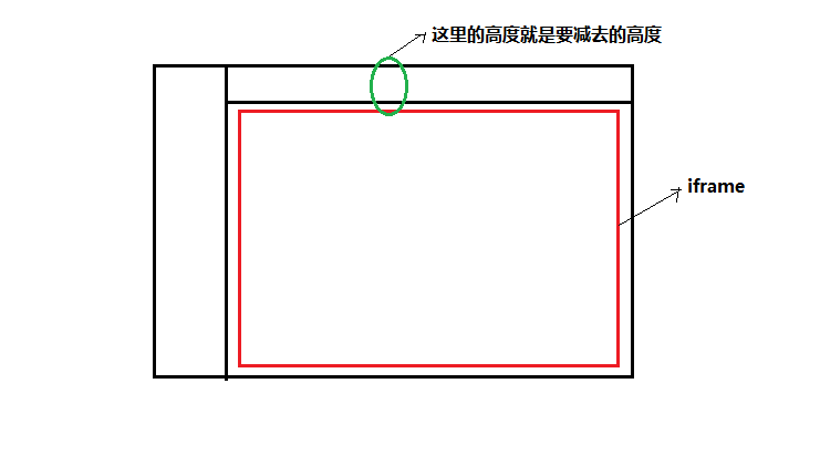
//电脑屏幕高度-iframe上面其他组件的高度
//例:我这里iframe上面还有其他一些div组件,一共的高度是120,则减去120
$(that).height(document.documentElement.clientHeight - 120);
}
给个图可能看的比较直观点,主要就是减去多余的高度就可以了