自定义View非常的常用,也是Android开发的一项基本技能,自定义View有三种方式:继承布局,继承原生控件,继承View。
一、继承布局
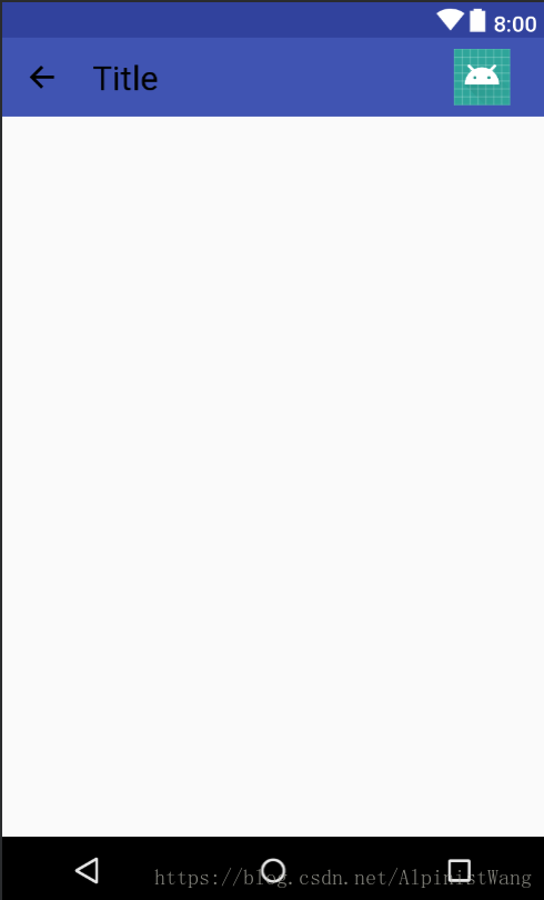
先看效果图:
代码实现:
1.在layout文件夹中创建布局title_view.xml,这一步根据自己需要写,本例中的布局如下:
布局代码:
<?xml version="1.0" encoding="utf-8"?>
<android.support.constraint.ConstraintLayout xmlns:android="http://schemas.android.com/apk/res/android"
    android:layout_width="match_parent"
    android:layout_height="?actionBarSize"
    android:id="@+id/title_view"
    xmlns:tools="http://schemas.android.com/tools"
    xmlns:app="http://schemas.android.com/apk/res-auto">
    <ImageView
        android:id="@+id/back"
        android:src="@drawable/ic_action_arrow_left"
        android:padding="16dp"
        android:adjustViewBounds="true"
        android:layout_width="wrap_content"
        android:layout_height="match_parent" />
    <TextView
        android:id="@+id/title"
        tools:text="Title"
        android:textColor="@android:color/black"
        android:textSize="24sp"
        android:gravity="center"
        app:layout_constraintLeft_toRightOf="@id/back"
        android:layout_marginLeft="8dp"
        android:layout_marginStart="8dp"
        android:layout_width="wrap_content"
        android:layout_height="match_parent" />
    <ImageView
        android:id="@+id/menu"
        tools:src="@mipmap/ic_launcher"
        android:padding="8dp"
        app:layout_constraintRight_toRightOf="parent"
        app:layout_constraintTop_toTopOf="parent"
        app:layout_constraintBottom_toBottomOf="parent"
        android:layout_width="wrap_content"
        android:layout_height="match_parent" />
</android.support.constraint.ConstraintLayout>
设置了一个返回图标,一个标题,一个菜单图标。
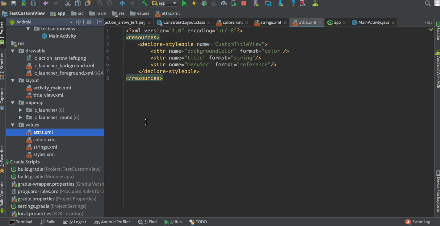
2.在values文件夹中新建attrs.xml,在其中声明自定义属性
<?xml version="1.0" encoding="utf-8"?>
<resources>
    <declare-styleable name="CustomTitleView">
        <attr name="backgroundColor" format="color"/>
        <attr name="title" format="string"/>
        <attr name="menuSrc" format="reference"/>
    </declare-styleable>
</resources>
本例中自定义了背景颜色,标题,菜单资源三个属性,format是指该属性的取值类型,format取值一共有string,color,demension,integer,enum,reference,float,boolean,fraction,flag这几种,其中reference是指引用资源文件。
3.新建CustomTitleView文件,并重写三个构造方法,在public CustomTitleView(Context context, AttributeSet attrs, int defStyleAttr)方法中绑定布局,并将其他两个构造方法修改成调用public CustomTitleView(Context context, AttributeSet attrs, int defStyleAttr)方法。这样就实现了每个构造方法都会绑定我们刚才写的布局。当然这里也可以在每个构造方法中都写一遍绑定布局。
4.找到控件并获取属性
public class CustomTitleView extends ConstraintLayout{
    private ConstraintLayout clTitleView;
    private ImageView ivBack;
    private TextView tvTitle;
    private ImageView ivMenu;
    //背景色
    private int backgroundColor;
    //标题
    private String title;
    //菜单图片资源
    private int menuSrc;
    public CustomTitleView(Context context) {
        this(context,null);
    }

    public CustomTitleView(Context context, AttributeSet attrs) {
        this(context, attrs,0);
    }

    public CustomTitleView(final Context context, AttributeSet attrs, int defStyleAttr) {
        super(context, attrs, defStyleAttr);
        //绑定布局
        LayoutInflater.from(context).inflate(R.layout.title_view,this);
        //找到控件
        clTitleView = findViewById(R.id.title_view);
        ivBack = findViewById(R.id.back);
        tvTitle = findViewById(R.id.title);
        ivMenu = findViewById(R.id.menu);

        //获取属性
        TypedArray typedArray = context.getTheme().obtainStyledAttributes(attrs,R.styleable.CustomTitleView,defStyleAttr,0);
        //获取背景色属性,默认透明
        backgroundColor = typedArray.getColor(R.styleable.CustomTitleView_backgroundColor, Color.TRANSPARENT);
        //获取标题属性
        title = typedArray.getString(R.styleable.CustomTitleView_title);
        //获取菜单图片资源属性,未设置菜单图片资源则默认为-1,后面通过判断此值是否为-1决定是否设置图片
        menuSrc = typedArray.getResourceId(R.styleable.CustomTitleView_menuSrc,-1);
        //TypedArray使用完后需手动回收
        typedArray.recycle();

        //设置属性
        clTitleView.setBackgroundColor(backgroundColor);
        tvTitle.setText(title);
        if(menuSrc!=-1){
            ivMenu.setImageResource(menuSrc);
        }
        //back图标点击事件,点击关闭activity
        ivBack.setOnClickListener(new OnClickListener() {
            @Override
            public void onClick(View v) {
                ((Activity)getContext()).finish();
            }
        });
    }
}
使用TypedArray typedArray = context.getTheme().obtainStyledAttributes(attrs,R.styleable.CustomTitleView,defStyleAttr,0);获取所有属性,再使用typedArray的getColor,getString,getResourceId方法分别获取format为color,string,reference的自定义属性。这些方法中有的需要传入两个参数,第二个参数就是没有设置此属性时的默认值,在绑定布局后找到控件,然后为控件设置属性。typedArray使用完之后需要手动调用typedArray.recycle()回收掉。
本例中我给返回图标添加了一个点击事件,点击就会将这个TitleView所在的activity关闭
5.在布局中使用CustomTitleView
<?xml version="1.0" encoding="utf-8"?>
<android.support.constraint.ConstraintLayout xmlns:android="http://schemas.android.com/apk/res/android"
    xmlns:app="http://schemas.android.com/apk/res-auto"
    android:layout_width="match_parent"
    android:layout_height="match_parent">
    <com.sample.studycustomview.CustomTitleView
        android:layout_width="match_parent"
        android:layout_height="wrap_content"
        app:backgroundColor="@color/colorPrimary"
        app:title="Title"
        app:menuSrc="@mipmap/ic_launcher"/>
</android.support.constraint.ConstraintLayout>
这样就完成了上面的效果图
二、继承原生控件
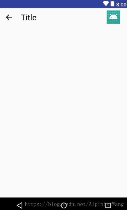
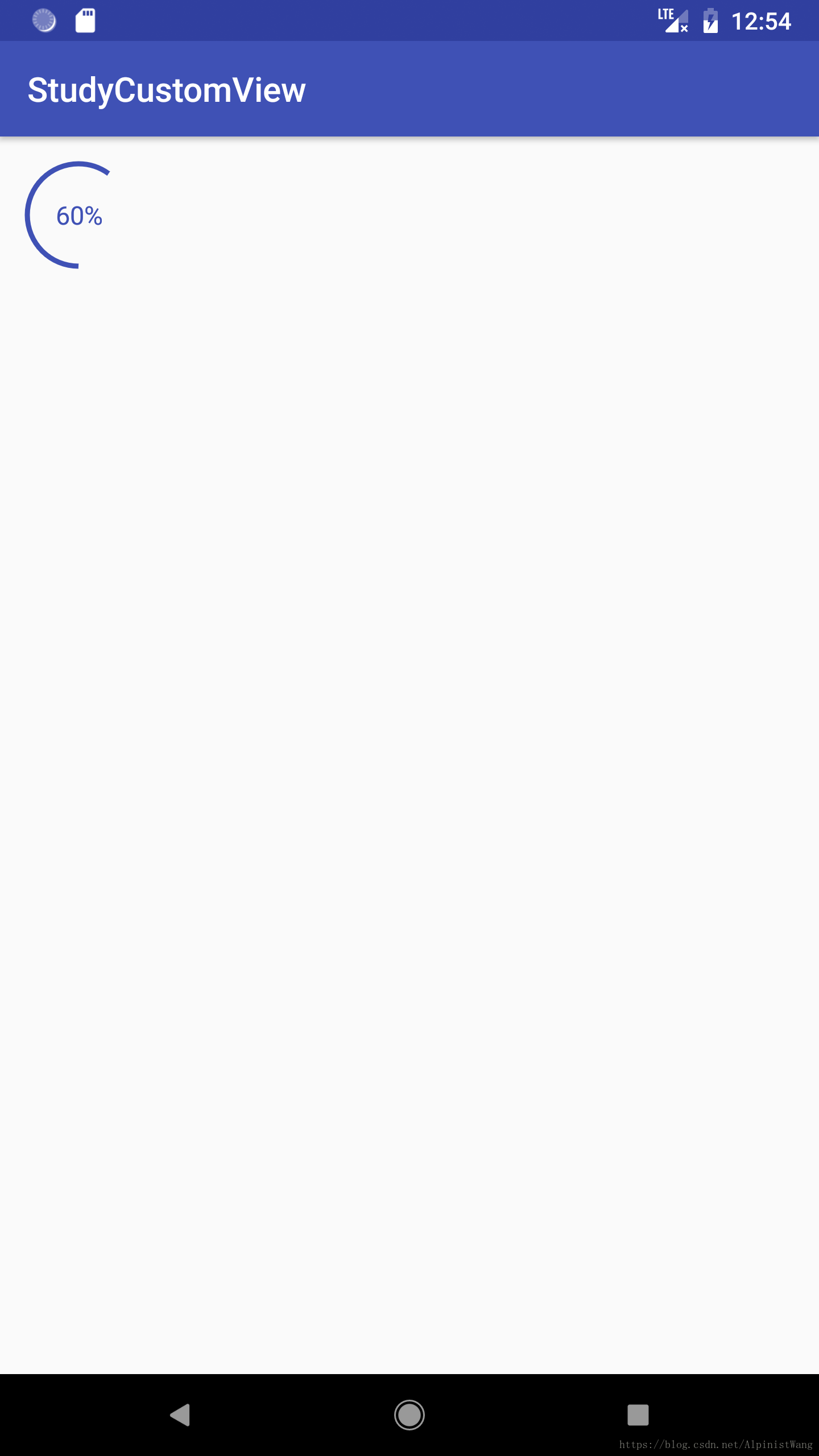
先看效果图
代码实现
1.在values文件夹下的attrs.xml中,声明自定义属性
<declare-styleable name="CustomProgressBar">
    <attr name="circleColor" format="color"/>
    <attr name="circleWidth" format="dimension"/>
    <attr name="startAngle" format="integer"/>
    <attr name="textSize" format="dimension"/>
    <attr name="textColor" format="color"/>
</declare-styleable>
2.新建CustomProgressbar,继承ProgressBar,重写三个构造方法,并获取自定义的属性
public class CustomProgressBar extends ProgressBar{
    private Paint mPaint;
    private int mCircleColor;//圆的颜色
    private int mCircleWidth;//圆的粗细
    private int mStartAngle;//起始角度
    private int mTextSize;//文字大小
    private int mTextColor;//文字颜色
    public CustomProgressBar(Context context) {
        this(context,null,0);
    }

    public CustomProgressBar(Context context, AttributeSet attrs) {
        this(context, attrs,0);
    }

    public CustomProgressBar(Context context, AttributeSet attrs, int defStyleAttr) {
        super(context, attrs, defStyleAttr);
        //获取属性
        TypedArray typedArray = context.getTheme().obtainStyledAttributes(attrs,R.styleable.CustomProgressBar,defStyleAttr,0);
        //获取圆的颜色,默认黑色
        mCircleColor = typedArray.getColor(R.styleable.CustomProgressBar_circleColor,Color.BLACK);
        //获取圆的粗细,默认5dp
        mCircleWidth = (int) typedArray.getDimension(R.styleable.CustomProgressBar_circleWidth,FormatUtil.dp2px(context,5));
        //获取圆的起始角度,默认0度
        mStartAngle = typedArray.getInteger(R.styleable.CustomProgressBar_startAngle,0);
        //获取文字大小,默认18sp
        mTextSize = (int) typedArray.getDimension(R.styleable.CustomProgressBar_textSize,FormatUtil.sp2px(getContext(),18));
        //获取文字颜色,默认黑色
        mTextColor = typedArray.getColor(R.styleable.CustomProgressBar_textColor,Color.BLACK);
        typedArray.recycle();
        mPaint = new Paint();
    }
}
3.重写onMeasure,计算宽高
@Override
protected void onMeasure(int widthMeasureSpec, int heightMeasureSpec) {
    int width = MeasureSpec.getSize(widthMeasureSpec);
    int height = MeasureSpec.getSize(heightMeasureSpec);
    //如果宽高为固定dp 或 match_parent 直接使用以上获得的width和height即可,如果是wrap_content 需要单独处理
    int widthMode = MeasureSpec.getMode(widthMeasureSpec);
    int heightMode = MeasureSpec.getMode(heightMeasureSpec);
    //默认宽度60dp,默认高度60dp
    if(widthMode == MeasureSpec.AT_MOST){
        width = getPaddingLeft() + getPaddingRight() + FormatUtil.dp2px(getContext(),60);
    }
    if(heightMode == MeasureSpec.AT_MOST){
        height = getPaddingTop() + getPaddingBottom() + FormatUtil.dp2px(getContext(),60);
    }
    setMeasuredDimension(width,height);
}
4.重写onDraw,画圆弧和文字
public class CustomProgressBar extends ProgressBar{
    private Paint mPaint;
    private int mCircleColor;//圆的颜色
    private int mCircleWidth;//圆的粗细
    private int mStartAngle;//起始角度
    private int mTextSize;//文字大小
    private int mTextColor;//文字颜色
    private RectF mRectF;//限制弧线的矩形
    private Rect mBounds;//测量文字的边缘
    public CustomProgressBar(Context context) {
        this(context,null,0);
    }

    public CustomProgressBar(Context context, AttributeSet attrs) {
        this(context, attrs,0);
    }

    public CustomProgressBar(Context context, AttributeSet attrs, int defStyleAttr) {
        super(context, attrs, defStyleAttr);
        //获取属性
        TypedArray typedArray = context.getTheme().obtainStyledAttributes(attrs,R.styleable.CustomProgressBar,defStyleAttr,0);
        //获取圆的颜色,默认黑色
        mCircleColor = typedArray.getColor(R.styleable.CustomProgressBar_circleColor,Color.BLACK);
        //获取圆的粗细,默认5dp
        mCircleWidth = (int) typedArray.getDimension(R.styleable.CustomProgressBar_circleWidth,FormatUtil.dp2px(context,5));
        //获取圆的起始角度,默认0度
        mStartAngle = typedArray.getInteger(R.styleable.CustomProgressBar_startAngle,0);
        //获取文字大小,默认18sp
        mTextSize = (int) typedArray.getDimension(R.styleable.CustomProgressBar_textSize,FormatUtil.sp2px(getContext(),18));
        //获取文字颜色,默认黑色
        mTextColor = typedArray.getColor(R.styleable.CustomProgressBar_textColor,Color.BLACK);
        typedArray.recycle();
        mRectF = new RectF();
        mBounds = new Rect();
        mPaint = new Paint();
    }

    @Override
    protected void onMeasure(int widthMeasureSpec, int heightMeasureSpec) {
        int width = MeasureSpec.getSize(widthMeasureSpec);
        int height = MeasureSpec.getSize(heightMeasureSpec);
        //如果宽高为固定dp 或 match_parent 直接使用以上获得的width和height即可,如果是wrap_content 需要单独处理
        int widthMode = MeasureSpec.getMode(widthMeasureSpec);
        int heightMode = MeasureSpec.getMode(heightMeasureSpec);
        //默认宽度60dp,默认高度60dp
        if(widthMode == MeasureSpec.AT_MOST){
            width = getPaddingLeft() + getPaddingRight() + FormatUtil.dp2px(getContext(),60);
        }
        if(heightMode == MeasureSpec.AT_MOST){
            height = getPaddingTop() + getPaddingBottom() + FormatUtil.dp2px(getContext(),60);
        }
        setMeasuredDimension(width,height);
    }

    @Override
    protected synchronized void onDraw(Canvas canvas) {
        //1.画圆弧
        mPaint.setAntiAlias(true);
        //设置只画边框模式
        mPaint.setStyle(Paint.Style.STROKE);
        mPaint.setColor(mCircleColor);
        mPaint.setStrokeWidth(mCircleWidth);
        //限制圆弧的左、上、右、下坐标
        mRectF.set(getPaddingLeft(),getPaddingTop(),getWidth() - getPaddingRight(),getHeight() - getPaddingBottom());
        //画圆弧,传入RectF,开始角度,扫过角度,是否连接中心,画笔
        canvas.drawArc(mRectF,mStartAngle,getProgress()*1.0f/getMax()*360,false,mPaint);
        //2.画文字
        String strProgress = getProgress()+"%";
        mPaint.setTextSize(mTextSize);
        mPaint.setColor(mTextColor);
        mPaint.setStrokeWidth(FormatUtil.dp2px(getContext(),1));
        //设置填充模式
        mPaint.setStyle(Paint.Style.FILL);
        //获取文字边缘
        mPaint.getTextBounds(strProgress,0,strProgress.length(),mBounds);
        //画文字,传入文字内容,文字左下角坐标,画笔
        canvas.drawText(strProgress
                ,(getWidth() - getPaddingLeft() - getPaddingRight() - mBounds.width())/2+getPaddingLeft()
                ,(getHeight() - getPaddingTop() - getPaddingBottom() - mBounds.height())/2+getPaddingTop()+mBounds.height(),mPaint);
    }
}
5.在布局中使用CustomProgressBar
<?xml version="1.0" encoding="utf-8"?>
<android.support.constraint.ConstraintLayout xmlns:android="http://schemas.android.com/apk/res/android"
    xmlns:app="http://schemas.android.com/apk/res-auto"
    android:layout_width="match_parent"
    android:layout_height="match_parent">
    <com.sample.studycustomview.CustomProgressBar
        android:progress="60"
        android:max="100"
        android:padding="16dp"
        android:layout_width="wrap_content"
        android:layout_height="wrap_content"
        app:circleColor="@color/colorPrimary"
        app:circleWidth="3dp"
        app:startAngle="90"
        app:textSize="15sp"
        app:textColor="@color/colorPrimary"/>
</android.support.constraint.ConstraintLayout>
附上FormatUtil工具类,主要是为了dp、sp、px互相转换
public class FormatUtil {
    private FormatUtil()
    {
        /* cannot be instantiated */
        throw new UnsupportedOperationException("cannot be instantiated");
    }

    /**
     * Value of dp to value of px.
     *
     * @param dpValue The value of dp.
     * @return value of px
     */
    public static int dp2px(Context context,final float dpValue) {
        final float scale = context.getResources().getDisplayMetrics().density;
        return (int) (dpValue * scale + 0.5f);
    }

    /**
     * Value of px to value of dp.
     *
     * @param pxValue The value of px.
     * @return value of dp
     */
    public static int px2dp(Context context,final float pxValue) {
        final float scale = context.getResources().getDisplayMetrics().density;
        return (int) (pxValue / scale + 0.5f);
    }

    /**
     * Value of sp to value of px.
     *
     * @param spValue The value of sp.
     * @return value of px
     */
    public static int sp2px(Context context,final float spValue) {
        final float fontScale = context.getResources().getDisplayMetrics().scaledDensity;
        return (int) (spValue * fontScale + 0.5f);
    }

    /**
     * Value of px to value of sp.
     *
     * @param pxValue The value of px.
     * @return value of sp
     */
    public static int px2sp(Context context,final float pxValue) {
        final float fontScale = context.getResources().getDisplayMetrics().scaledDensity;
        return (int) (pxValue / fontScale + 0.5f);
    }
}
这样就完成了上面的效果图
三、继承View
先看效果图:
代码实现:
1.在values文件夹下的attrs.xml中,声明自定义属性
<declare-styleable name="CustomAnimNumberView">
    <attr name="number" format="string"/>
    <attr name="numberColor" format="color"/>
    <attr name="numberSize" format="dimension"/>
    <attr name="animDuration" format="integer"/>
</declare-styleable>
2.新建CustomAnimNumberView,继承View,重写三个构造方法,并获取自定义的属性,其中用到的FormatUtil和上例中一样:
public class CustomAnimNumberView extends View {
    private Paint paint;
    private int number;//
    private int numberColor;//文字颜色
    private int numberSize;//文字大小
    private int animDuration;//动画时长

    public CustomAnimNumberView(Context context) {
        this(context,null);
    }

    public CustomAnimNumberView(Context context, @Nullable AttributeSet attrs) {
        this(context, attrs,0);
    }

    public CustomAnimNumberView(Context context, @Nullable AttributeSet attrs, int defStyleAttr) {
        super(context, attrs, defStyleAttr);
        //获取自定义属性
        TypedArray typedArray = context.getTheme().obtainStyledAttributes(attrs,R.styleable.CustomAnimNumberView,defStyleAttr,0);
        number = typedArray.getInt(R.styleable.CustomAnimNumberView_number,0);
        numberColor = typedArray.getColor(R.styleable.CustomAnimNumberView_numberColor, Color.BLACK);
        numberSize = typedArray.getDimensionPixelSize(R.styleable.CustomAnimNumberView_numberSize,FormatUtil.sp2px(context,18));
        animDuration = typedArray.getInt(R.styleable.CustomAnimNumberView_animDuration,1000);
        typedArray.recycle();
        paint = new Paint();
    }
}
3.重写onMeasure,计算宽高
public class CustomAnimNumberView extends View {
    private Paint paint;
    private int number;//
    private int numberColor;//文字颜色
    private int numberSize;//文字大小
    private int animDuration;//动画时长
    private Rect bounds;//文字边缘
    public CustomAnimNumberView(Context context) {
        this(context,null);
    }

    public CustomAnimNumberView(Context context, @Nullable AttributeSet attrs) {
        this(context, attrs,0);
    }

    public CustomAnimNumberView(Context context, @Nullable AttributeSet attrs, int defStyleAttr) {
        super(context, attrs, defStyleAttr);
        //获取自定义属性
        TypedArray typedArray = context.getTheme().obtainStyledAttributes(attrs,R.styleable.CustomAnimNumberView,defStyleAttr,0);
        number = typedArray.getInt(R.styleable.CustomAnimNumberView_number,0);
        numberColor = typedArray.getColor(R.styleable.CustomAnimNumberView_numberColor, Color.BLACK);
        numberSize = typedArray.getDimensionPixelSize(R.styleable.CustomAnimNumberView_numberSize,FormatUtil.sp2px(context,18));
        animDuration = typedArray.getInt(R.styleable.CustomAnimNumberView_animDuration,1000);
        typedArray.recycle();
        paint = new Paint();
        paint.setTextSize(numberSize);
        paint.setColor(numberColor);
        bounds = new Rect();
        paint.getTextBounds(String.valueOf(number),0,String.valueOf(number).length(),bounds);
    }

    @Override
    protected void onMeasure(int widthMeasureSpec, int heightMeasureSpec) {
        int width = MeasureSpec.getSize(widthMeasureSpec);
        int height = MeasureSpec.getSize(heightMeasureSpec);
        //如果宽高为固定dp 或 match_parent 直接使用以上获得的width和height即可,如果是wrap_content 需要单独处理
        int widthMode = MeasureSpec.getMode(widthMeasureSpec);
        int heightMode = MeasureSpec.getMode(heightMeasureSpec);
        if(widthMode == MeasureSpec.AT_MOST){
            width = getPaddingLeft() + getPaddingRight() + bounds.width();
        }
        if(heightMode == MeasureSpec.AT_MOST){
            height = getPaddingTop() + getPaddingBottom() + bounds.height();
        }
        setMeasuredDimension(width,height);
    }
}
4.重写onDraw,画动画的数字
public class CustomAnimNumberView extends View {
    private Paint paint;
    private int number;//
    private int numberColor;//文字颜色
    private int numberSize;//文字大小
    private int animDuration;//动画时长
    private ValueAnimator animation;//动画
    private Rect bounds;//文字边缘
    public CustomAnimNumberView(Context context) {
        this(context,null);
    }

    public CustomAnimNumberView(Context context, @Nullable AttributeSet attrs) {
        this(context, attrs,0);
    }

    public CustomAnimNumberView(Context context, @Nullable AttributeSet attrs, int defStyleAttr) {
        super(context, attrs, defStyleAttr);
        //获取自定义属性
        TypedArray typedArray = context.getTheme().obtainStyledAttributes(attrs,R.styleable.CustomAnimNumberView,defStyleAttr,0);
        number = typedArray.getInt(R.styleable.CustomAnimNumberView_number,0);
        numberColor = typedArray.getColor(R.styleable.CustomAnimNumberView_numberColor, Color.BLACK);
        numberSize = typedArray.getDimensionPixelSize(R.styleable.CustomAnimNumberView_numberSize,FormatUtil.sp2px(context,18));
        animDuration = typedArray.getInt(R.styleable.CustomAnimNumberView_animDuration,1000);
        typedArray.recycle();
        paint = new Paint();
        paint.setTextSize(numberSize);
        paint.setColor(numberColor);
        bounds = new Rect();
        paint.getTextBounds(String.valueOf(number),0,String.valueOf(number).length(),bounds);
    }

    @Override
    protected void onMeasure(int widthMeasureSpec, int heightMeasureSpec) {
        int width = MeasureSpec.getSize(widthMeasureSpec);
        int height = MeasureSpec.getSize(heightMeasureSpec);
        //如果宽高为固定dp 或 match_parent 直接使用以上获得的width和height即可,如果是wrap_content 需要单独处理
        int widthMode = MeasureSpec.getMode(widthMeasureSpec);
        int heightMode = MeasureSpec.getMode(heightMeasureSpec);
        if(widthMode == MeasureSpec.AT_MOST){
            width = getPaddingLeft() + getPaddingRight() + bounds.width();
        }
        if(heightMode == MeasureSpec.AT_MOST){
            height = getPaddingTop() + getPaddingBottom() + bounds.height();
        }
        setMeasuredDimension(width,height);
    }

    @Override
    protected void onDraw(Canvas canvas) {
        super.onDraw(canvas);
        //传入左下角
        paint.getTextBounds(String.valueOf(number),0,String.valueOf(number).length(),bounds);
        canvas.drawText(String.valueOf(number),getPaddingLeft(),getPaddingTop()+bounds.height(),paint);
        if(animation == null){
            animation = ValueAnimator.ofInt(0,number);
            animation.setDuration(animDuration);
            animation.addUpdateListener(new ValueAnimator.AnimatorUpdateListener() {
                @Override
                public void onAnimationUpdate(ValueAnimator animation) {
                    number = (int) animation.getAnimatedValue();
                    postInvalidate();
                }
            });
            animation.start();
        }
    }
}
5.在布局中使用CustomAnimNumberView
<?xml version="1.0" encoding="utf-8"?>
<android.support.constraint.ConstraintLayout xmlns:android="http://schemas.android.com/apk/res/android"
    xmlns:app="http://schemas.android.com/apk/res-auto"
    android:layout_width="match_parent"
    android:layout_height="match_parent">
    <com.sample.studycustomview.CustomAnimNumberView
        app:layout_constraintTop_toTopOf="parent"
        app:layout_constraintBottom_toBottomOf="parent"
        app:layout_constraintStart_toStartOf="parent"
        app:layout_constraintEnd_toEndOf="parent"
        android:layout_width="wrap_content"
        android:layout_height="wrap_content"
        android:padding="5dp"
        app:number="100"
        app:numberColor="@color/colorPrimary"
        app:numberSize="22sp"
        app:animDuration="2000"/>
</android.support.constraint.ConstraintLayout>
这样就完成了上面的效果图。
以上,就是自定义View的三种方式。
源码已上传:
https://github.com/wkxjc/StudyCustomView