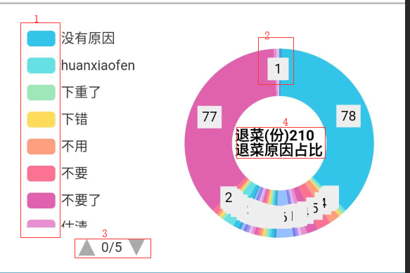
圆环中间空白处添加标题
对应圆环边上添加详细信息
https://blog.csdn.net/GRAY_KEY/article/details/80559054
如下图格式:
第一处:调整统计图主题颜色:
// 基于准备好的dom,初始化echarts实例
//初始化并绑定html页面中的div显示统计图形,第二个参数为主题颜色
mychart = echarts.init(document.getElementById('leaderchart'),"light");
第二处:让对应的数字显示在对应圆环上:position:'inner'
series: [
{
type:'pie',
radius: ['40%', '80%'],
center: ['70%', '50%'],
avoidLabelOverlap: false,
label: {
normal: {
show: true,
position:'inner',
formatter:'{c}',//'{a|{a}}{abg|}\n{hr|}\n {b|{b}:}{c} {per|{d}%} ', ,官方实例http://echarts.baidu.com/examples/editor.html?c=pie-nest
color:'#000'设置字体颜色
//backgroundColor:'#eee',添加背景颜色
//borderColor:'#eee',添加边框颜色
//borderWidth: 8添加边框宽度
}
},
把标示线去掉
labelLine: {
normal: {
show: false
}
},
data:tong_data
}
]
第三处:种类添加分页type: 'scroll',
legend: {
type: 'scroll',
orient: 'vertical',
x:"left",
left: 10,
selectedMode:false,
data:tong_reson
},
这个是固定统计图表的位置
grid: {
left: "5%",
bottom: "5%",
containLabel: true
},
第四处:空白处添加标题:
// 标题
title: [{
text: '退菜(份)'+all_num+'\r\n退菜原因占比',
top:'42%',//对比圆环中心center调整位置
left:'57%',
textStyle:{
color: '#000',
fontSize:13,
}
}],