
一、Pyecharts简介和安装
1、简介
Echarts 是一个由百度开源的数据可视化,凭借着良好的交互性,精巧的图表设计,得到了众多开发者的认可。而 Python 是一门富有表达力的语言,很适合用于数据处理。当数据分析遇上数据可视化时,pyecharts 诞生了。
-
简洁的 API 设计,使用如丝滑般流畅,支持链式调用
-
囊括了 30+ 种常见图表,应有尽有
-
支持主流 Notebook 环境,Jupyter Notebook 和 JupyterLab
-
可轻松集成至 Flask,Sanic,Django 等主流 Web 框架
-
高度灵活的配置项,可轻松搭配出精美的图表
-
详细的文档和示例,帮助开发者更快的上手项目
-
多达 400+ 地图文件,并且支持原生百度地图,为地理数据可视化提供强有力的支持
pyecharts版本v0.5.x 和 v1 间不兼容,v1 是一个全新的版本,语法也有很大不同。
2、安装
安装 pyecharts
pip install pyecharts -i http://pypi.douban.com/simple --trusted-host pypi.douban.com
import pyecharts

print(pyecharts.__version__)         # 查看pyecharts版本
安装相关的地图扩展包
pip install -i https://pypi.tuna.tsinghua.edu.cn/simple echarts-countries-pypkg           # 全球国家地图
pip install -i https://pypi.tuna.tsinghua.edu.cn/simple echarts-china-provinces-pypkg   # 中国省级地图
pip install -i https://pypi.tuna.tsinghua.edu.cn/simple echarts-china-cities-pypkg      # 中国市级地图
pip install -i https://pypi.tuna.tsinghua.edu.cn/simple echarts-china-counties-pypkg    # 中国县区级地图
二、绘制地理图表
1、世界地图—数据可视化
利用 Starbucks.csv 中的数据,首先计算每个国家(Country)对应的门店数量,然后使用世界地图表示星巴克门面店在全球的分布。
import pandas as pd
from pyecharts.charts import Map
from pyecharts import options as opts
from pyecharts.globals import ThemeType, CurrentConfig

CurrentConfig.ONLINE_HOST = 'D:/python/pyecharts-assets-master/assets/'

# 用pandas读取csv文件里的数据
df = pd.read_csv("Starbucks.csv")['Country']
data = df.value_counts()
datas = [(i, int(j)) for i, j in zip(data.index, data.values)]


# 实例化一个Map对象
map_ = Map(init_opts=opts.InitOpts(theme=ThemeType.PURPLE_PASSION))
# 世界地图
map_.add("门店数量", data_pair=datas, maptype="world")
map_.set_series_opts(label_opts=opts.LabelOpts(is_show=False))   # 不显示label
map_.set_global_opts(
     title_opts=opts.TitleOpts(title="星巴克门店数量在全球分布", pos_left='40%', pos_top='10'),   # 调整title位置
     legend_opts=opts.LegendOpts(is_show=False),
     visualmap_opts=opts.VisualMapOpts(max_=13608, min_=1, is_piecewise=True,
     pieces=[{

    "max": 9, "min": 1, "label": "1-9", "color": "#00FFFF"},        # 分段  添加图例注释和颜色
          {

    "max": 99, "min": 10, "label": "10-99", "color": "#A52A2A"},
          {

    "max": 499, "min": 100, "label": "100-499", "color": "#0000FF    "},
          {

    "max": 999, "min": 500, "label": "500-999", "color": "#FF00FF"},
          {

    "max": 2000, "min": 1000, "label": "1000-2000", "color": "#228B22"},
          {

    "max": 3000, "min": 2000, "label": "2000-3000", "color": "#FF0000"},
          {

    "max": 20000, "min": 10000, "label": ">=10000", "color": "#FFD700"}
             ])
     )

# 渲染在网页上   有交互性
map_.render('星巴克门店在全球的分布.html')
运行效果如下:

2、国家地图—数据可视化
涟漪散点图
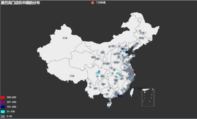
利用china.csv 中的数据,首先计算每个城市(City)对应的门店数量,然后使用 pyecharts包内 Geo 模块绘制星巴克门面店在中国分布的涟漪散点地图。
import pandas as pd
from pyecharts.globals import ThemeType, CurrentConfig, GeoType
from pyecharts import options as opts
from pyecharts.charts import Geo

CurrentConfig.ONLINE_HOST = 'D:/python/pyecharts-assets-master/assets/'
# pandas读取csv文件数据
df = pd.read_csv("china.csv")['City']
data = df.value_counts()

datas = [(i, int(j)) for i, j in zip(data.index, data.values)]
print(datas)

geo = Geo(init_opts=opts.InitOpts(width='1000px', height='600px', theme=ThemeType.DARK))
geo.add_schema(maptype='china', label_opts=opts.LabelOpts(is_show=True))   # 显示label  省名
geo.add('门店数量', data_pair=datas, type_=GeoType.EFFECT_SCATTER, symbol_size=8)
geo.set_series_opts(label_opts=opts.LabelOpts(is_show=False))
geo.set_global_opts(title_opts=opts.TitleOpts(title='星巴克门店在中国的分布'),
                    visualmap_opts=opts.VisualMapOpts(max_=550, is_piecewise=True,
                    pieces=[{

    "max": 50, "min": 0, "label": "0-50", "color": "#708090"},        # 分段  添加图例注释  和颜色
                              {

    "max": 100, "min": 51, "label": "51-100", "color": "#00FFFF"},
                              {

    "max": 200, "min": 101, "label": "101-200", "color": "#00008B"},
                              {

    "max": 300, "min": 201, "label": "201-300", "color": "#8B008B"},
                              {

    "max": 600, "min": 500, "label": "500-600", "color": "#FF0000"},
                                 ])
                    )

geo.render("星巴克门店在中国的分布.html")
运行效果如下:
动态轨迹图
from pyecharts import options as opts
from pyecharts.charts import Geo
from pyecharts.globals import ChartType, SymbolType, CurrentConfig

CurrentConfig.ONLINE_HOST = 'D:/python/pyecharts-assets-master/assets/'
# 链式调用
c = (
    Geo()
    .add_schema(
        maptype="china",
        itemstyle_opts=opts.ItemStyleOpts(color="#323c48", border_color="#111"),
        label_opts=opts.LabelOpts(is_show=True)
    )
    .add(
        "",
        [("广州", 55), ("北京", 66), ("杭州", 77), ("重庆", 88), ('成都', 100), ('海口', 80)],
        type_=ChartType.EFFECT_SCATTER,
        color="white",
    )
    .add(
        "",
        [("广州", "上海"), ("广州", "北京"), ("广州", "杭州"), ("广州", "重庆"),
         ('成都', '海口'), ('海口', '北京'), ('海口', '重庆'), ('重庆', '上海')
         ],
        type_=ChartType.LINES,
        effect_opts=opts.EffectOpts(
            symbol=SymbolType.ARROW, symbol_size=6, color="blue"
        ),
        linestyle_opts=opts.LineStyleOpts(curve=0.2),
    )
    .set_series_opts(label_opts=opts.LabelOpts(is_show=False))
    .set_global_opts(title_opts=opts.TitleOpts(title="动态轨迹图"))
    .render("geo_lines_background.html")
)
运行效果如下:

3、省市地图—数据可视化
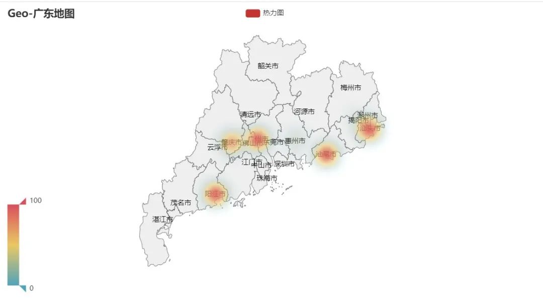
热力图
代码如下:
from pyecharts import options as opts
from pyecharts.charts import Geo
from pyecharts.faker import Faker
from pyecharts.globals import GeoType, CurrentConfig

CurrentConfig.ONLINE_HOST = 'D:/python/pyecharts-assets-master/assets/'

c = (
    Geo()
    .add_schema(maptype="广东", label_opts=opts.LabelOpts(is_show=True))
    .add(
        "热力图",
        [list(z) for z in zip(Faker.guangdong_city, Faker.values())],
        type_=GeoType.HEATMAP,
    )
    .set_series_opts(label_opts=opts.LabelOpts(is_show=True))
    .set_global_opts(
        visualmap_opts=opts.VisualMapOpts(), title_opts=opts.TitleOpts(title="Geo-广东地图")
    )
    .render("geo_guangdong.html")
)
运行效果如下:
在地图上批量添加地址、经纬度数据,地理数据可视化
代码如下:
import pandas as pd     # 导入数据分析模块
from pyecharts.charts import Geo    # 导入地理信息处理模块
from pyecharts import options as opts   # 配置
from pyecharts.globals import GeoType, CurrentConfig, ThemeType

CurrentConfig.ONLINE_HOST = 'D:/python/pyecharts-assets-master/assets/'

df = pd.read_excel("hotel.xlsx")

# 获取 地点  经纬度信息
geo_sight_coord = {

    df.iloc[i]['酒店地址']: [df.iloc[i]['经度'], df.iloc[i]['纬度']] for i in range(len(df))}
data = [(df['酒店地址'][j], f"{int(df['最低价'][j])}元(最低价)") for j in range(len(df))]
# print(data)
# print(geo_sight_coord)

g = Geo(init_opts=opts.InitOpts(theme=ThemeType.PURPLE_PASSION, width="1000px", height="600px"))
g.add_schema(maptype="北京")
for k, v in list(geo_sight_coord.items()):
    # 添加地址、经纬度数据
    g.add_coordinate(k, v[0], v[1])

# 涟漪散点图
g.add("", data_pair=data, type_=GeoType.EFFECT_SCATTER, symbol_size=6)
g.set_series_opts(label_opts=opts.LabelOpts(is_show=False))
g.set_global_opts(title_opts=opts.TitleOpts(title="北京-酒店地址分布"))
g.render("酒店地址分布.html")
运行效果如下:

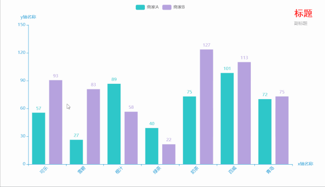
三、柱形图
代码如下:
from pyecharts.charts import Bar
from pyecharts.faker import Faker
from pyecharts.globals import ThemeType, CurrentConfig
from pyecharts import options as opts


CurrentConfig.ONLINE_HOST = 'D:/python/pyecharts-assets-master/assets/'
# 链式调用
c = (
    Bar(
        init_opts=opts.InitOpts(           # 初始配置项
            theme=ThemeType.MACARONS,
            animation_opts=opts.AnimationOpts(
                animation_delay=1000, animation_easing="cubicOut"   # 初始动画延迟和缓动效果
            ))
        )
    .add_xaxis(xaxis_data=Faker.choose())      # x轴
    .add_yaxis(series_name="商家A", yaxis_data=Faker.values())       # y轴
    .add_yaxis(series_name="商家B", yaxis_data=Faker.values())       # y轴
    .set_global_opts(
        title_opts=opts.TitleOpts(title='标题', subtitle='副标题',   # 标题配置和调整位置
                                  title_textstyle_opts=opts.TextStyleOpts(
                                  font_family='SimHei', font_size=25, font_weight='bold', color='red',
                                  ), pos_left="90%", pos_top="10",
                                  ),
        xaxis_opts=opts.AxisOpts(name='x轴名称', axislabel_opts=opts.LabelOpts(rotate=45)),  # 设置x名称和Label rotate解决标签名字过长使用
        yaxis_opts=opts.AxisOpts(name='y轴名称'),

    )
    .render("bar_001.html")
)
运行效果如下:
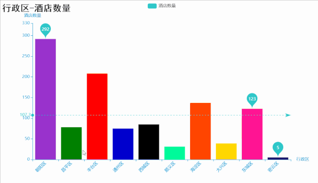
代码如下:
import pandas as pd
import collections
from pyecharts import options as opts
from pyecharts.charts import Bar
from pyecharts.globals import ThemeType, CurrentConfig
import random

CurrentConfig.ONLINE_HOST = 'D:/python/pyecharts-assets-master/assets/'

df = pd.read_excel("hotel.xlsx")
area = list(df['酒店地址'])
area_list = []
for i in area:
    _index = i.find("区")
    # 字符串切片得到行政区名
    i = i[:_index + 1]
    area_list.append(i)

area_count = collections.Counter(area_list)
area_dic = dict(area_count)

# 两个列表对应   行政区  对应的酒店数量
area = [x for x in list(area_dic.keys())][0:10]
nums = [y for y in list(area_dic.values())][:10]

# 定制风格
bar = Bar(init_opts=opts.InitOpts(theme=ThemeType.MACARONS))
colors = ['red', '#0000CD', '#000000', '#008000', '#FF1493', '#FFD700', '#FF4500', '#00FA9A', '#191970', '#9932CC']
random.shuffle(colors)
# 配置y轴数据  Baritem
y = []
for i in range(10):
    y.append(
        opts.BarItem(
            value=nums[i],
            itemstyle_opts=opts.ItemStyleOpts(color=colors[i])   # 设置每根柱子的颜色
        )
    )
bar.add_xaxis(xaxis_data=area)
bar.add_yaxis("酒店数量", yaxis_data=y)
bar.set_global_opts(xaxis_opts=opts.AxisOpts(
                                    name='行政区',
                                    axislabel_opts=opts.LabelOpts(rotate=45)
                                    ),
                    yaxis_opts=opts.AxisOpts(
                                    name='酒店数量', min_=0, max_=330,     # y轴刻度的最小值 最大值
                    ),
                    title_opts=opts.TitleOpts(
                        title="行政区-酒店数量",
                        title_textstyle_opts=opts.TextStyleOpts(
                            font_family="KaiTi", font_size=25, color="black"
                        )
                    ))
# 标记最大值  最小值  平均值   标记平均线
bar.set_series_opts(label_opts=opts.LabelOpts(is_show=False),
                    markpoint_opts=opts.MarkPointOpts(
                    data=[
                        opts.MarkPointItem(type_="max", name="最大值"),
                        opts.MarkPointItem(type_="min", name="最小值"),
                        opts.MarkPointItem(type_="average", name="平均值")]),
                    markline_opts=opts.MarkLineOpts(
                    data=[
                        opts.MarkLineItem(type_="average", name="平均值")]))
bar.render("行政区酒店数量最多的Top10.html")
运行效果如下:
代码如下:
from pyecharts import options as opts
from pyecharts.charts import Bar
from pyecharts.faker import Faker
from pyecharts.globals import ThemeType, CurrentConfig

CurrentConfig.ONLINE_HOST = 'D:/python/pyecharts-assets-master/assets/'
c = (
    Bar(init_opts=opts.InitOpts(theme=ThemeType.DARK))
    .add_xaxis(xaxis_data=Faker.days_attrs)
    .add_yaxis("商家A", yaxis_data=Faker.days_values)
    .set_global_opts(
        title_opts=opts.TitleOpts(title="Bar-DataZoom(slider+inside)"),
        datazoom_opts=[opts.DataZoomOpts(), opts.DataZoomOpts(type_="inside")],
    )
    .render("bar_datazoom_both.html")
)
运行效果如下:

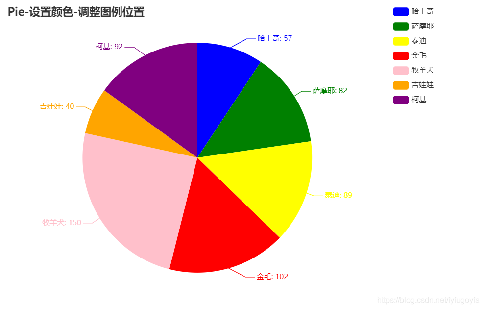
四、饼图
代码如下:
from pyecharts import options as opts
from pyecharts.charts import Pie
from pyecharts.faker import Faker
from pyecharts.globals import CurrentConfig

CurrentConfig.ONLINE_HOST = 'D:/python/pyecharts-assets-master/assets/'
c = (
    Pie()
    .add(
        "",
        [list(z) for z in zip(Faker.choose(), Faker.values())],
        # 饼图的中心(圆心)坐标,数组的第一项是横坐标,第二项是纵坐标
        # 默认设置成百分比,设置成百分比时第一项是相对于容器宽度,第二项是相对于容器高度
        center=["35%", "50%"],
    )
    .set_colors(["blue", "green", "yellow", "red", "pink", "orange", "purple"])   # 设置颜色
    .set_global_opts(
        title_opts=opts.TitleOpts(title="Pie-设置颜色-调整图例位置"),
        legend_opts=opts.LegendOpts(type_="scroll", pos_left="70%", orient="vertical"),  # 调整图例位置
    )
    .set_series_opts(label_opts=opts.LabelOpts(formatter="{b}: {c}"))
    .render("pie_set_color.html")
)
运行效果如下:
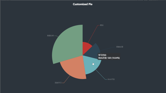
代码如下:
import pyecharts.options as opts
from pyecharts.charts import Pie
from pyecharts.globals import CurrentConfig

CurrentConfig.ONLINE_HOST = 'D:/python/pyecharts-assets-master/assets/'

x_data = ["深度学习", "数据分析", "Web开发", "爬虫", "图像处理"]
y_data = [688, 888, 560, 388, 480]
data_pair = [list(z) for z in zip(x_data, y_data)]
data_pair.sort(key=lambda x: x[1])

c = (
    # 宽  高  背景颜色
    Pie(init_opts=opts.InitOpts(width="1200px", height="800px", bg_color="#2c343c"))
    .add(
        series_name="学习方向",    # 系列名称
        data_pair=data_pair,      # 系列数据项,格式为 [(key1, value1), (key2, value2)]
        rosetype="radius",        # radius:扇区圆心角展现数据的百分比,半径展现数据的大小
        radius="55%",             # 饼图的半径
        center=["50%", "50%"],    # 饼图的中心(圆心)坐标,数组的第一项是横坐标,第二项是纵坐标
        label_opts=opts.LabelOpts(is_show=False, position="center"),   #  标签配置项
    )
    .set_global_opts(
        title_opts=opts.TitleOpts(
            title="Customized Pie",
            pos_left="center",
            pos_top="20",
            title_textstyle_opts=opts.TextStyleOpts(color="#fff"),
        ),
        legend_opts=opts.LegendOpts(is_show=False),
    )
    .set_series_opts(
        tooltip_opts=opts.TooltipOpts(
            trigger="item", formatter="{a} <br/>{b}: {c} ({d}%)"  # 'item': 数据项图形触发,主要在散点图,饼图等无类目轴的图表中使用
         ),
        label_opts=opts.LabelOpts(color="rgba(255, 255, 255, 0.3)"),
    )
    .render("customized_pie.html")
)
运行效果如下:
五、环图
代码如下:
from pyecharts import options as opts
from pyecharts.charts import Pie
from pyecharts.faker import Faker
from pyecharts.globals import CurrentConfig

CurrentConfig.ONLINE_HOST = 'D:/python/pyecharts-assets-master/assets/'
c = (
    Pie()
    .add(
        "",
        [list(z) for z in zip(Faker.choose(), Faker.values())],
        # 饼图的半径,数组的第一项是内半径,第二项是外半径
        # 默认设置成百分比,相对于容器高宽中较小的一项的一半
        radius=["40%", "60%"],
    )
    .set_colors(["blue", "green", "    #800000", "red", "#000000", "orange", "purple"])
    .set_global_opts(
        title_opts=opts.TitleOpts(title="Pie-Radius"),
        legend_opts=opts.LegendOpts(orient="vertical", pos_top="15%", pos_left="2%"),
    )
    .set_series_opts(label_opts=opts.LabelOpts(formatter="{b}: {c}"))
    .render("pie_radius.html")
)
运行效果如下:

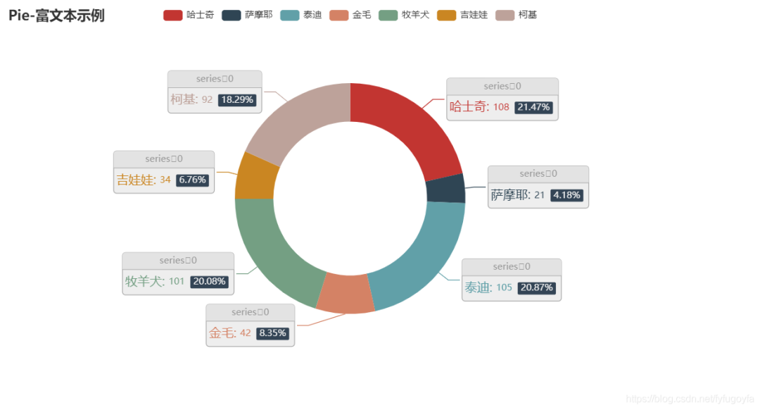
代码如下:
from pyecharts import options as opts
from pyecharts.charts import Pie
from pyecharts.faker import Faker
from pyecharts.globals import CurrentConfig

CurrentConfig.ONLINE_HOST = 'D:/python/pyecharts-assets-master/assets/'
c = (
    Pie()
    .add(
        "",
        [list(z) for z in zip(Faker.choose(), Faker.values())],
        radius=["40%", "60%"],
        label_opts=opts.LabelOpts(
            position="outside",
            formatter="{a|{a}}{abg|}\n{hr|}\n {b|{b}: }{c}  {per|{d}%}  ",
            background_color="#eee",
            border_color="#aaa",
            border_width=1,
            border_radius=4,
            rich={


                "a": {

    "color": "#999", "lineHeight": 22, "align": "center"},
                "abg": {


                    "backgroundColor": "#e3e3e3",
                    "width": "100%",
                    "align": "right",
                    "height": 22,
                    "borderRadius": [4, 4, 0, 0],
                },
                "hr": {


                    "borderColor": "#aaa",
                    "width": "100%",
                    "borderWidth": 0.5,
                    "height": 0,
                },
                "b": {

    "fontSize": 16, "lineHeight": 33},
                "per": {


                    "color": "#eee",
                    "backgroundColor": "#334455",
                    "padding": [2, 4],
                    "borderRadius": 2,
                },
            },
        ),
    )
    .set_global_opts(title_opts=opts.TitleOpts(title="Pie-富文本示例"))
    .render("pie_rich_label.html")
)
运行效果如下:
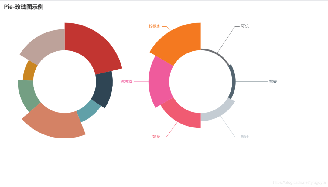
六、玫瑰图
代码如下:
from pyecharts import options as opts
from pyecharts.charts import Pie
from pyecharts.faker import Faker
from pyecharts.globals import CurrentConfig

CurrentConfig.ONLINE_HOST = 'D:/python/pyecharts-assets-master/assets/'
labels = ['可乐', '雪碧', '橙汁', '奶茶', '冰啤酒', '柠檬水']
values = [6, 12, 28, 52, 72, 96]
v = Faker.choose()
c = (
    Pie()
    .add(
        "",
        [list(z) for z in zip(v, Faker.values())],
        radius=["40%", "75%"],
        center=["22%", "50%"],
        rosetype="radius",
        label_opts=opts.LabelOpts(is_show=False),
    )
    .add(
        "",
        [list(z) for z in zip(labels, values)],
        radius=["40%", "75%"],
        center=["70%", "50%"],
        rosetype="area",
    )
    .set_global_opts(title_opts=opts.TitleOpts(title="Pie-玫瑰图示例"),
                     legend_opts=opts.LegendOpts(is_show=False)
                     )
    .render("pie_rosetype.html")
)
from pyecharts import options as opts
from pyecharts.charts import Pie
from pyecharts.globals import CurrentConfig
import pandas as pd

CurrentConfig.ONLINE_HOST = 'D:/python/pyecharts-assets-master/assets/'
provinces = ['北京','上海','黑龙江','吉林','辽宁','内蒙古','新疆','西藏','青海','四川','云南','陕西','重庆',
             '贵州','广西','海南','澳门','湖南','江西','福建','安徽','浙江','江苏','宁夏','山西','河北','天津']
num = [1,1,1,17,9,22,23,42,35,7,20,21,16,24,16,21,37,12,13,14,13,7,22,8,16,13,13]
color_series = ['#FAE927','#E9E416','#C9DA36','#9ECB3C','#6DBC49',
                '#37B44E','#3DBA78','#14ADCF','#209AC9','#1E91CA',
                '#2C6BA0','#2B55A1','#2D3D8E','#44388E','#6A368B'
                '#7D3990','#A63F98','#C31C88','#D52178','#D5225B',
                '#D02C2A','#D44C2D','#F57A34','#FA8F2F','#D99D21',
                '#CF7B25','#CF7B25','#CF7B25']

# 创建DataFrame
df = pd.DataFrame({

    'provinces': provinces, 'num': num})
# 降序排序
df.sort_values(by='num', ascending=False, inplace=True)

# 提取数据
v = df['provinces'].values.tolist()
d = df['num'].values.tolist()
# 绘制饼图
pie1 = Pie(init_opts=opts.InitOpts(width='1250px', height='750px'))
# 设置颜色
pie1.set_colors(color_series)

pie1.add("", [list(z) for z in zip(v, d)],
        radius=["30%", "100%"],
        center=["50%", "50%"],
        rosetype="area"
        )
# 设置全局配置项
pie1.set_global_opts(title_opts=opts.TitleOpts(title='多省区市\n确诊病例连续多日',subtitle='零新增',
                                               title_textstyle_opts=opts.TextStyleOpts(font_size=25,color= '#0085c3'),
                                               subtitle_textstyle_opts= opts.TextStyleOpts(font_size=50,color= '#003399'),
                                               pos_right= 'center',pos_left= 'center',pos_top='42%',pos_bottom='center'
                                              ),
                     legend_opts=opts.LegendOpts(is_show=False),
                     toolbox_opts=opts.ToolboxOpts())
# 设置系列配置项
pie1.set_series_opts(label_opts=opts.LabelOpts(is_show=True, position="inside", font_size=12,
                                               formatter="{b}:{c}天", font_style="italic",
                                               font_weight="bold", font_family="SimHei"
                                               ),
                     )
# 渲染在html页面上
pie1.render('南丁格尔玫瑰图示例.html')
运行效果如下:

七、词云图
词云就是通过形成关键词云层或关键词渲染,过滤掉大量的文本信息,对网络文本中出现频率较高的关键词的视觉上的突出。
import jieba
import collections
import re
from pyecharts.charts import WordCloud
from pyecharts.globals import SymbolType
from pyecharts import options as opts
from pyecharts.globals import ThemeType, CurrentConfig

CurrentConfig.ONLINE_HOST = 'D:/python/pyecharts-assets-master/assets/'

with open('barrages.txt') as f:
    data = f.read()

# 文本预处理  去除一些无用的字符   只提取出中文出来
new_data = re.findall('[\u4e00-\u9fa5]+', data, re.S)  # 只要字符串中的中文
new_data = " ".join(new_data)

# 文本分词--精确模式
seg_list_exact = jieba.cut(new_data, cut_all=False)

result_list = []
with open('stop_words.txt', encoding='utf-8') as f:
    con = f.readlines()
    stop_words = set()
    for i in con:
        i = i.replace("\n", "")   # 去掉读取每一行数据的\n
        stop_words.add(i)

for word in seg_list_exact:
    # 设置停用词并去除单个词
    if word not in stop_words and len(word) > 1:
        result_list.append(word)
print(result_list)

# 筛选后统计
word_counts = collections.Counter(result_list)
# 获取前100最高频的词
word_counts_top100 = word_counts.most_common(100)
# 打印出来看看统计的词频
print(word_counts_top100)

# 链式调用
c = (
    WordCloud(
        init_opts=opts.InitOpts(width='1350px', height='750px', theme=ThemeType.MACARONS)
    )
    .add(
        series_name="词频",               # 系列名称
        data_pair=word_counts_top100,   # 系列数据项 [(word1, count1), (word2, count2)]
        word_size_range=[15, 108],      # 单词字体大小范围
        textstyle_opts=opts.TextStyleOpts(     # 词云图文字的配置
            font_family='KaiTi',
        ),
        shape=SymbolType.DIAMOND,  # 词云图轮廓,有 'circle', 'cardioid', 'diamond', 'triangle-forward', 'triangle', 'pentagon', 'star' 可选
        pos_left='100',  # 距离左侧的距离
        pos_top='50',    # 距离顶部的距离
    )
    .set_global_opts(
        title_opts=opts.TitleOpts(           # 标题配置项
            title='弹幕词云图',
            title_textstyle_opts=opts.TextStyleOpts(
                font_family='SimHei',
                font_size=25,
                color='black'
            ),
            pos_left='500',
            pos_top='10',
        ),
        tooltip_opts=opts.TooltipOpts(       # 提示框配置项
            is_show=True,
            background_color='red',
            border_color='yellow',
        ),
        toolbox_opts=opts.ToolboxOpts(       # 工具箱配置项
            is_show=True,
            orient='vertical',
        )
    )
    .render('弹幕词云图.html')
)
运行效果如下:

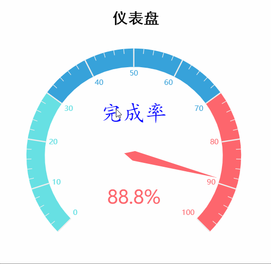
八、仪表盘
from pyecharts.charts import Gauge
from pyecharts.globals import CurrentConfig
from pyecharts import options as opts

CurrentConfig.ONLINE_HOST = 'D:/python/pyecharts-assets-master/assets/'

c = (
    Gauge()
    .add(
        series_name='业务指标',            # 系列名称,用于 tooltip 的显示,legend 的图例筛选。
        data_pair=[['完成率', 88.8]],      # 系列数据项,格式为 [(key1, value1), (key2, value2)]
        radius='70%',                      # 仪表盘半径,可以是相对于容器高宽中较小的一项的一半的百分比,也可以是绝对的数值。
        axisline_opts=opts.AxisLineOpts(
            linestyle_opts=opts.LineStyleOpts(  # 坐标轴轴线配置项
                color=[(0.3, "#67e0e3"), (0.7, "#37a2da"), (1, "#fd666d")],
                width=30,
            )
        ),
        title_label_opts=opts.LabelOpts(          # 轮盘内标题文本项标签配置项
            font_size=25, color='blue', font_family='KaiTi'
        )
    )
    .set_global_opts(
        title_opts=opts.TitleOpts(          # 标题配置项
            title='仪表盘',
            title_textstyle_opts=opts.TextStyleOpts(
                font_size=25, font_family='SimHei',
                color='black', font_weight='bold',
            ),
        pos_left="410", pos_top="8",
        ),
        legend_opts=opts.LegendOpts(        # 图例配置项
            is_show=False
        ),
        tooltip_opts=opts.TooltipOpts(         # 提示框配置项
            is_show=True,
            formatter="{a} <br/>{b} : {c}%",
        )
    )
    .render('gauge.html')
)
运行效果如下:
九、水球图
from pyecharts import options as opts
from pyecharts.charts import Grid, Liquid
from pyecharts.commons.utils import JsCode
from pyecharts.globals import CurrentConfig, ThemeType

CurrentConfig.ONLINE_HOST = 'D:/python/pyecharts-assets-master/assets/'

lq_1 = (
    Liquid()
    .add(
        series_name='电量',        # 系列名称,用于 tooltip 的显示,legend 的图例筛选。
        data=[0.25],               # 系列数据,格式为 [value1, value2, ....]
        center=['60%', '50%'],
        # 水球外形,有' circle', 'rect', 'roundRect', 'triangle', 'diamond', 'pin', 'arrow' 可选。
        # 默认 'circle'   也可以为自定义的 SVG 路径
        shape='circle',
        color=['yellow'],          # 波浪颜色   Optional[Sequence[str]] = None,
        is_animation=True,         # 是否显示波浪动画
        is_outline_show=False,     # 是否显示边框
    )
    .set_global_opts(title_opts=opts.TitleOpts(title='多个Liquid显示'))
)

lq_2 = (
    Liquid()
    .add(
        series_name='数据精度',
        data=[0.8866],
        center=['25%', '50%'],
        label_opts=opts.LabelOpts(
            font_size=50,
            formatter=JsCode(
                """function (param) {


                        return (Math.floor(param.value * 10000) / 100) + '%';
                    }"""
            ),
            position='inside'
        )

    )
)

grid = Grid(init_opts=opts.InitOpts(theme=ThemeType.DARK)).add(lq_1, grid_opts=opts.GridOpts()).add(lq_2, grid_opts=opts.GridOpts())
grid.render("multiple_liquid.html")
运行效果如下:

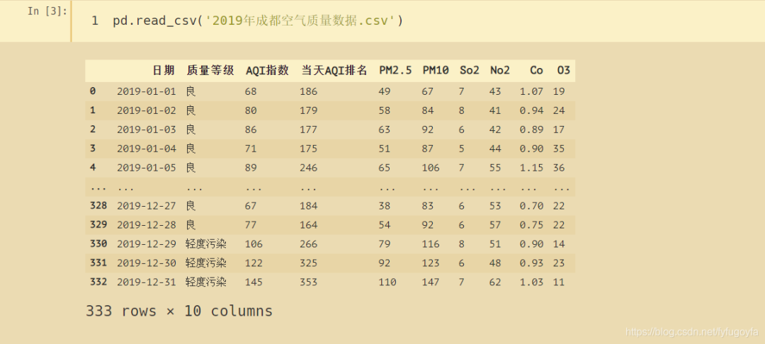
数据获取
数据来源:http://www.tianqihoubao.com/aqi/chengdu-201901.html
爬取2019年全年成都空气质量数据
import pandas as pd

dates = pd.date_range('20190101', '20191201', freq='MS').strftime('%Y%m')   # 构造出日期序列  便于之后构造url
for i in range(len(dates)):
    df = pd.read_html(f'http://www.tianqihoubao.com/aqi/chengdu-{dates[i]}.html', encoding='gbk', header=0)[0]
    if i == 0:
        df.to_csv('2019年成都空气质量数据.csv', mode='a+', index=False)     # 追加写入
        i += 1
    else:
        df.to_csv('2019年成都空气质量数据.csv', mode='a+', index=False, header=False)
查看爬取的数据
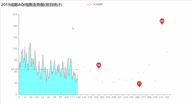
十、折线图
折线图是排列在工作表的列或行中的数据可以绘制到折线图中。折线图可以显示随时间(根据常用比例设置)而变化的连续数据,因此非常适用于显示在相等时间间隔下数据的趋势。
绘制2019年成都AQI指数走势图
import pandas as pd
import pyecharts.options as opts
from pyecharts.charts import Line
from pyecharts.globals import CurrentConfig

CurrentConfig.ONLINE_HOST = 'D:/python/pyecharts-assets-master/assets/'
df = pd.read_csv('2019年成都空气质量数据.csv')

date = [x for x in range(len(df['日期']))]
value = [int(i) for i in df['AQI指数']]

# 绘制折线图
line = Line()
line.add_xaxis(xaxis_data=date)
line.add_yaxis(
    "AQI指数",       # 系列数据项
    value,           # y轴数据
    areastyle_opts=opts.AreaStyleOpts(opacity=0.5, color='#00FFFF'),  # 设置图形透明度  填充颜色
    label_opts=opts.LabelOpts(is_show=False),   # 标签配置项
    markpoint_opts=opts.MarkPointOpts(          # 标记点配置项
        data=[
                opts.MarkPointItem(type_="max", name="最大值"),
                opts.MarkPointItem(type_="min", name="最小值"),
                opts.MarkPointItem(type_="average", name="平均值")
        ]
    ),
    markline_opts=opts.MarkLineOpts(            # 标记线配置项
        data=[opts.MarkLineItem(type_="average", name="平均值")])
)
line.set_global_opts(
    title_opts=opts.TitleOpts(title='2019成都AQI指数走势图(按日统计)')
)
line.render('2019成都AQI指数走势图(按日统计).html')
运行效果如下:
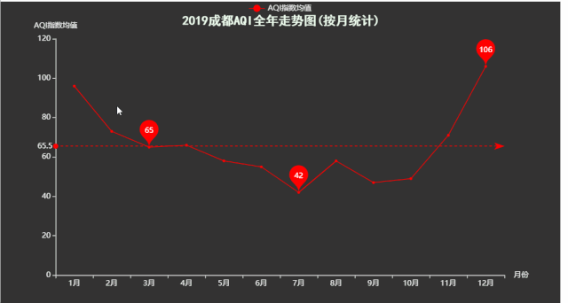
import pandas as pd
import pyecharts.options as opts
from pyecharts.charts import Line
from pyecharts.globals import CurrentConfig, ThemeType
import math

CurrentConfig.ONLINE_HOST = 'D:/python/pyecharts-assets-master/assets/'
df = pd.read_csv('2019年成都空气质量数据.csv')[['日期', 'AQI指数']]
data = df['日期'].str.split('-', expand=True)[1]
df['月份'] = data

# 按月份分组 聚合 统计每月AQI指数平均值
counts = df.groupby('月份').agg({

    'AQI指数': 'mean'})

date = [f'{x}月' for x in range(1, 13)]
value = [math.ceil(i) for i in counts['AQI指数']]

line = Line(init_opts=opts.InitOpts(theme=ThemeType.DARK))
line.set_colors(['red'])
line.add_xaxis(xaxis_data=date)
line.add_yaxis(
    "AQI指数均值",    # 系列数据项   用于图例筛选
    value,            # y轴数据
    label_opts=opts.LabelOpts(is_show=False),
    markpoint_opts=opts.MarkPointOpts(    # 标记点配置项
        data=[
                opts.MarkPointItem(type_="max", name="最大值"),
                opts.MarkPointItem(type_="min", name="最小值"),
                opts.MarkPointItem(type_="average", name="平均值")
        ]
    ),
    markline_opts=opts.MarkLineOpts(         # 标记线配置项
        data=[opts.MarkLineItem(type_="average", name="平均值")])
)
line.set_global_opts(      # 全局配置项
    title_opts=opts.TitleOpts(
        title='2019成都AQI全年走势图(按月统计)',
        pos_left='32%', pos_top='3%',
        title_textstyle_opts=opts.TextStyleOpts(
            font_family='SimHei', font_size=20, color='#F0FFF0'
        )
    ),
    xaxis_opts=opts.AxisOpts(name='月份'),          # x轴标签
    yaxis_opts=opts.AxisOpts(name='AQI指数均值')    # y轴标签
)
line.render('2019成都AQI指数走势图(按月统计).html')
运行效果如下:
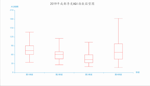
十一、箱形图
箱形图(Box-plot)又称为盒须图、盒式图或箱线图,是一种用作显示一组数据分散情况资料的统计图。因形状如箱子而得名。在各种领域也经常被使用,常见于品质管理。它主要用于反映原始数据分布的特征,还可以进行多组数据分布特征的比 较。箱线图的绘制方法是:先找出一组数据的上边缘、下边缘、中位数和两个四分位数;然后, 连接两个四分位数画出箱体;再将上边缘和下边缘与箱体相连接,中位数在箱体中间。

import pandas as pd
from pyecharts import options as opts
from pyecharts.charts import Boxplot
from pyecharts.globals import CurrentConfig, ThemeType

CurrentConfig.ONLINE_HOST = 'D:/python/pyecharts-assets-master/assets/'

df = pd.read_csv('2019年成都空气质量数据.csv')[['日期', 'AQI指数']]
df.sort_values(by='AQI指数', inplace=True)     # 按AQI指数大小排序 升序
data = df['日期'].str.split('-', expand=True)[1]
df['月份'] = data
item1, item2, item3, item4 = [], [], [], []

# 分为4个季度
for i, j in zip(df['月份'], df['AQI指数']):
    if i in ['01', '02', '03']:
        item1.append(j)
    elif i in ['04', '05', '06']:
        item2.append(j)
    elif i in ['07', '08', '09']:
        item3.append(j)
    elif i in ['10', '11', '12']:
        item4.append(j)

x_data = [f'第{i}季度' for i in range(1, 5)]
y_data = [item1, item2, item3, item4]
boxplot = Boxplot(init_opts=opts.InitOpts(theme=ThemeType.MACARONS))
boxplot.set_colors(['red'])
boxplot.add_xaxis(xaxis_data=x_data)
boxplot.add_yaxis(series_name='', y_axis=boxplot.prepare_data(y_data))
boxplot.set_global_opts(
    title_opts=opts.TitleOpts(
        title='2019年成都季度AQI指数箱型图',
        pos_left='300', pos_top='5',
        title_textstyle_opts=opts.TextStyleOpts(
            font_family='KaiTi', font_size=20, color='black'
        )
    ),
    xaxis_opts=opts.AxisOpts(name='季度'),
    yaxis_opts=opts.AxisOpts(name='AQI指数')
)
boxplot.render('2019年成都季度AQI指数箱型图.html')
运行效果如下:
感兴趣的小伙伴,赠送全套Python学习资料,包含面试题、简历资料等具体看下方。

一、Python所有方向的学习路线
Python所有方向的技术点做的整理,形成各个领域的知识点汇总,它的用处就在于,你可以按照下面的知识点去找对应的学习资源,保证自己学得较为全面。


二、Python必备开发工具
工具都帮大家整理好了,安装就可直接上手!
三、最新Python学习笔记
当我学到一定基础,有自己的理解能力的时候,会去阅读一些前辈整理的书籍或者手写的笔记资料,这些笔记详细记载了他们对一些技术点的理解,这些理解是比较独到,可以学到不一样的思路。

四、Python视频合集
观看全面零基础学习视频,看视频学习是最快捷也是最有效果的方式,跟着视频中老师的思路,从基础到深入,还是很容易入门的。

五、实战案例
纸上得来终觉浅,要学会跟着视频一起敲,要动手实操,才能将自己的所学运用到实际当中去,这时候可以搞点实战案例来学习。
六、面试宝典

简历模板
若有侵权,请联系删除