导包
import numpy as np
import pandas as pd

import matplotlib
import matplotlib.pyplot as plt

%matplotlib inline

plt.rcParams['font.sans-serif'] = "Microsoft YaHei"

import seaborn as sns
加载数据集
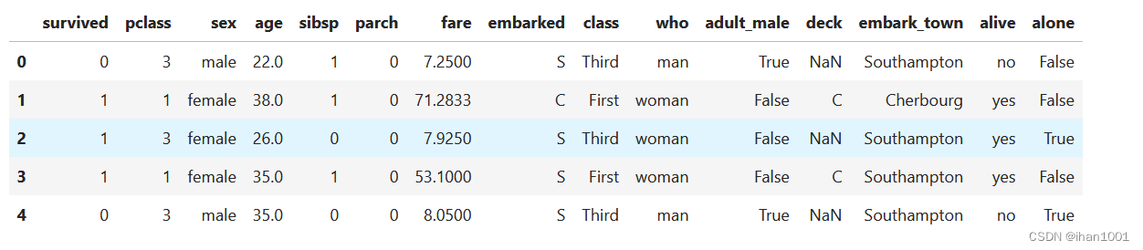
titanic = sns.load_dataset("titanic")

titanic.head()
查看数据集情况
titanic.info()

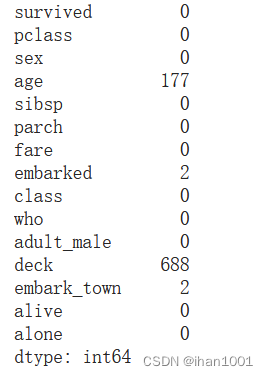
titanic.isnull().sum()
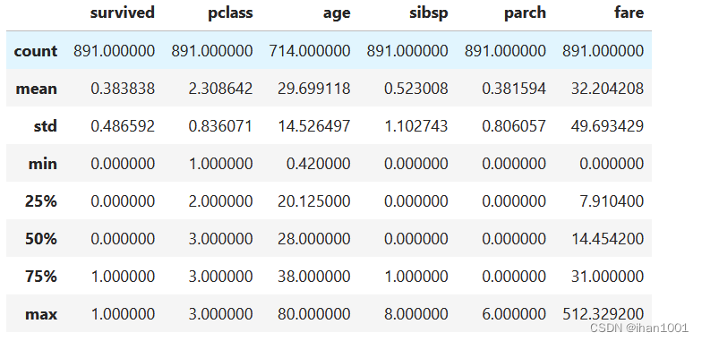
titanic.describe()
titanic = titanic.drop(['sibsp', 'parch', 'who', 'deck', 'alone'], axis=1)
titanic.head()
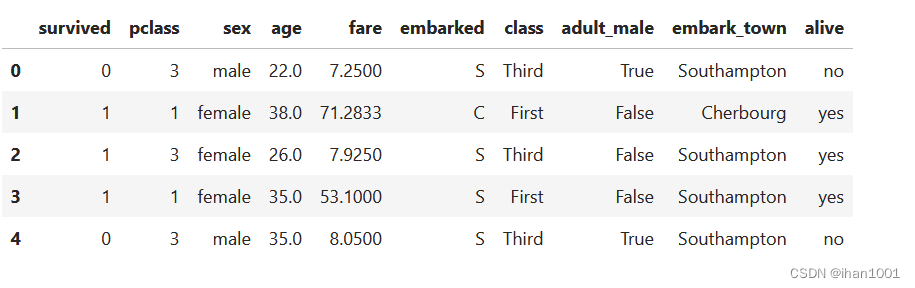
titanic.alive.isna().sum()
0
sns.countplot(data=titanic, x='alive')
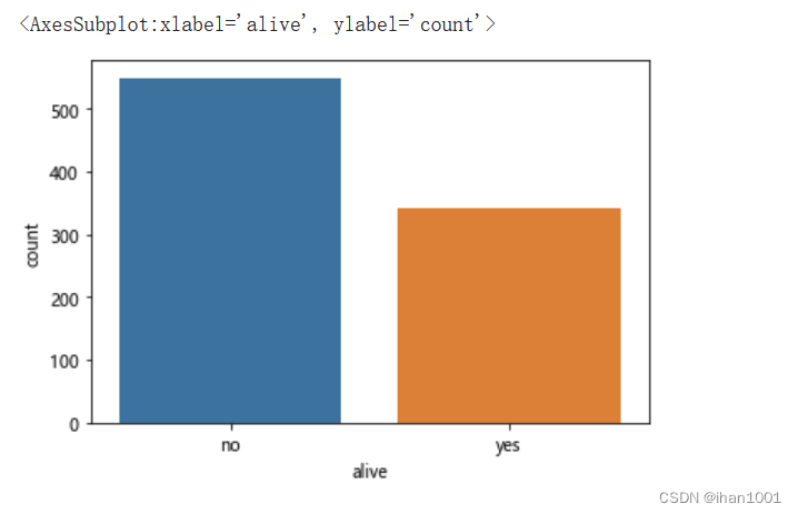
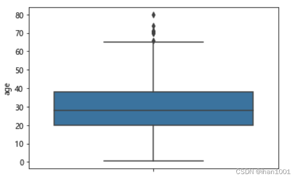
年龄分布情况
titanic.age.isna().sum()
177
new_age = titanic.dropna()['age']
new_age.isna().sum()
0
sns.displot(data=new_age, kind='hist', kde=True, rug=True)
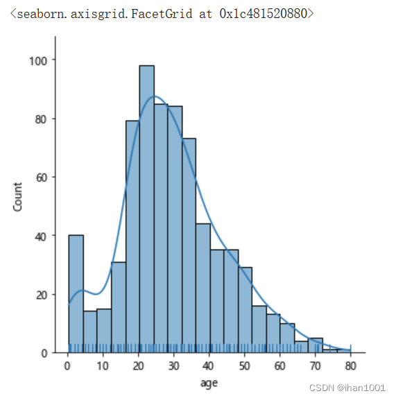
sns.stripplot(x='survived',y='age', data=titanic, jitter=0.2)
sns.boxplot(y=new_age,)
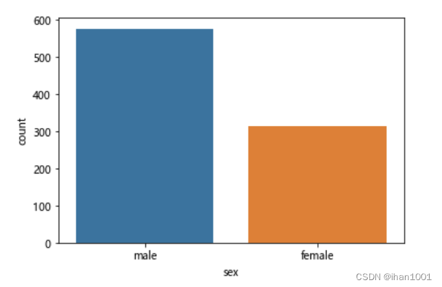
性别情况
titanic.sex.isna().sum()
0
sns.countplot(x='sex', data=titanic)
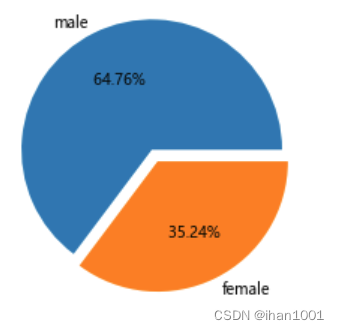
male_count = titanic[titanic.sex == 'male']['sex'].count()
female_count = titanic[titanic.sex == 'female']['sex'].count()

male_count,
female_count
314
fig, ax = plt.subplots()
ax.pie([male_count, female_count], labels=['male', 'female'], autopct="% .2f%%", explode=[0.1, 0])

plt.show()
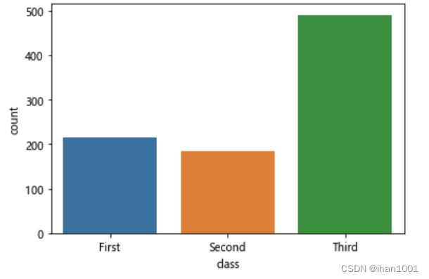
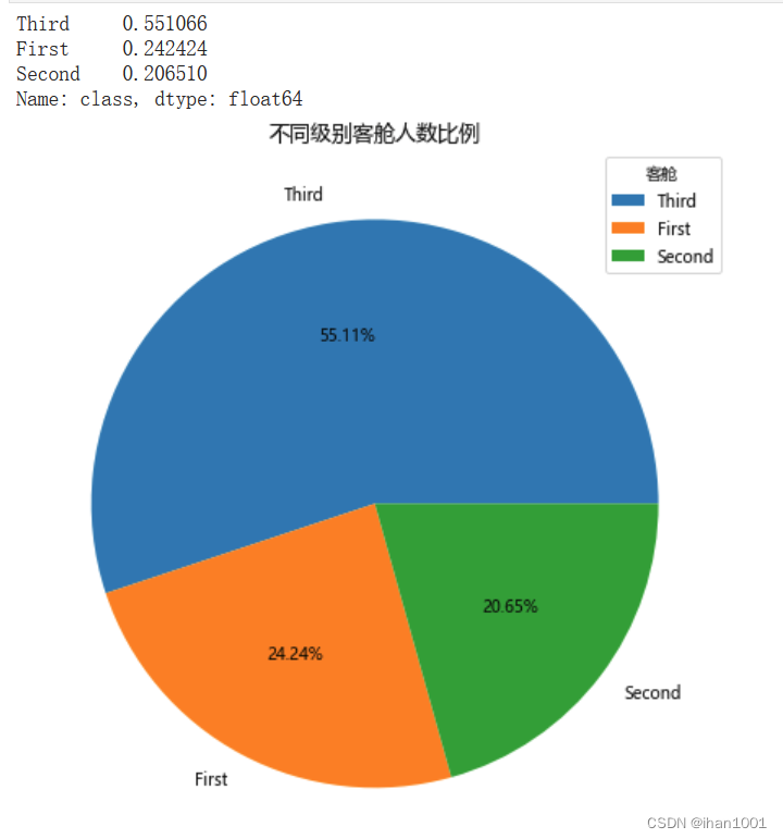
不同级别的客舱和比例
titanic.pclass.value_counts()
sns.countplot(x='class', data=titanic)
class_rate = titanic['class'].value_counts(normalize=True)  # 设置normalize占比
print(class_rate)
fig, ax = plt.subplots(figsize=(10, 8))
ax.pie(x=class_rate, labels=class_rate.index, autopct='%.2f%%')
ax.set_title('不同级别客舱人数比例', fontdict={

    'size':13})
ax.legend(title='客舱', loc='upper right')
plt.show()
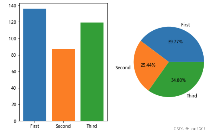
不同客舱的生还人数占总人数的比例
titanic[['pclass', 'survived', 'class']].isna().sum()
pclass 0
survived 0
class 0
dtype: int64
survived = titanic[titanic.survived == 1].groupby('class')['class'].count()
survived
class
First 136
Second 87
Third 119
Name: class, dtype: int64
fig, axs = plt.subplots(1, 2, figsize=(8, 5))
axs[0].bar(survived.index, survived, color=sns.color_palette())
不同客舱生还人数占总人数比例
axs[1].pie(survived, labels=survived.index, autopct="%.2f%%")
plt.show()
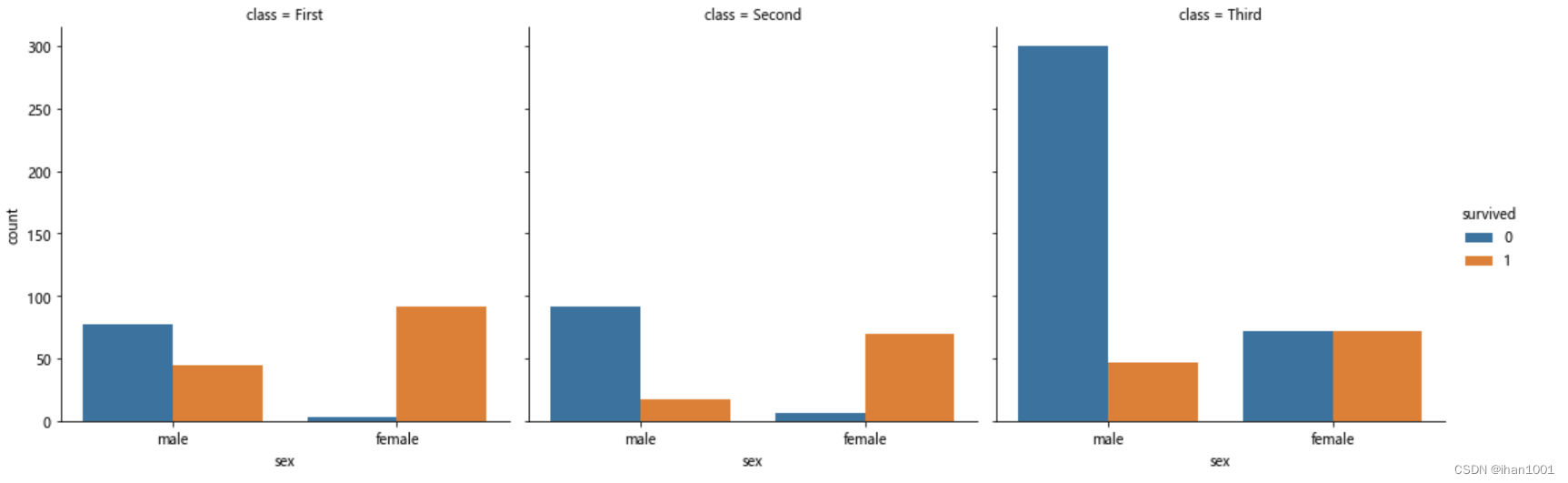
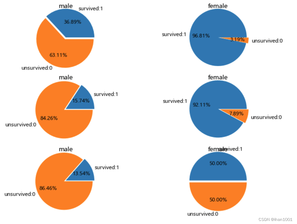
不同客舱不同性别分别的生还和未生还人数及生还率
sns.catplot(x='sex', hue='survived', data=titanic, kind='count', col='class')
pclass_1 = titanic[titanic["pclass"] == 1]; pclass_2 = titanic[titanic['pclass'] == 2]; pclass_3 = titanic[titanic['pclass'] == 3]
fig, axs = plt.subplots(3, 2, dpi=80, figsize=(8, 6))
for i, pclass in enumerate([pclass_1, pclass_2, pclass_3]):
    male_survived = pclass[(pclass.sex == 'male')&(pclass.survived == 1)]['pclass'].sum()
    male_unsurvived = pclass[(pclass.sex == 'male')&(pclass.survived == 0)]['pclass'].sum()
    axs[i, 0].pie([male_survived, male_unsurvived], radius=3, labels=['survived:1', 'unsurvived:0'], autopct='%.2f%%', explode=[0, 0.2]);
    axs[i, 0].set_title('male', pad=35)
    female_survived = pclass[(pclass.sex == 'female')&(pclass.survived == 1)]['pclass'].sum()
    female_unsurvived = pclass[(pclass.sex == 'female')&(pclass.survived == 0)]['pclass'].sum()
    axs[i, 1].pie([female_survived, female_unsurvived],radius=3,labels=["survived:1", "unsurvived:0"], autopct="%.2f%%", explode=[0, 0.2]) ; axs[i, 1].set_title('female', pad=35)

plt.subplots_adjust(wspace=1, hspace=2)
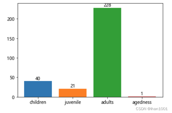
按照年龄,将乘客划分为儿童、少年、成年人和老年人,分析四个群体生还情况
titanic.age.isna().sum()
177
age_df = titanic[(~titanic.age.isna() & titanic.survived == 1)]
children = age_df[ age_df['age'] <= 12]
juvenile = age_df[(age_df['age'] > 12) & (age_df['age'] < 18)]
adults = age_df[(age_df['age'] >= 18) & (age_df['age'] < 65)]
agedness = age_df[age_df['age'] >= 65]

children_survived_sum = children['survived'].sum()
juvenile_survived_sum = juvenile['survived'].sum()
adults_survived_sum = adults['survived'].sum()
agedness_survived_sum = agedness['survived'].sum()
ax = plt.bar(x=['children', 'juvenile', 'adults', 'agedness'], height=[children_survived_sum, juvenile_survived_sum, adults_survived_sum, agedness_survived_sum]
       ,color=sns.color_palette(), align='center')
plt.bar_label(ax, label_type='edge')
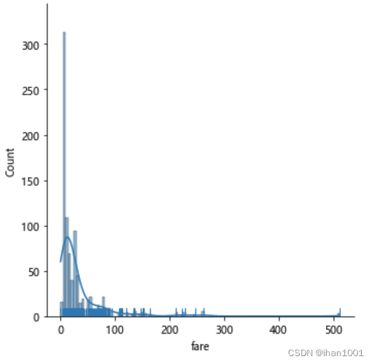
票价分布
titanic.fare.isna().sum()
sns.displot(data=titanic.fare, kde=True, rug=True)
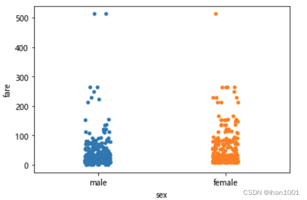
不同性别,票价情况
sns.stripplot(x='sex', y='fare', data=titanic)
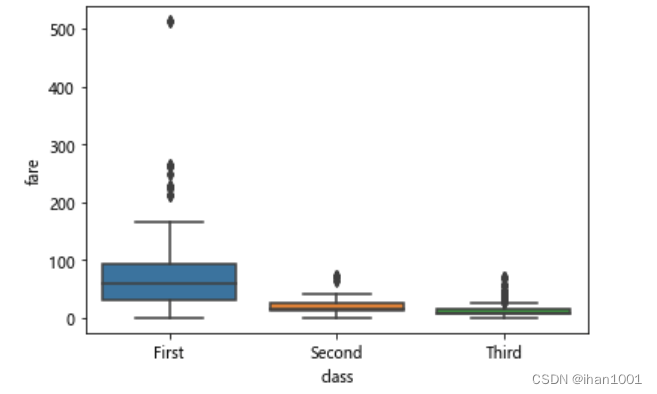
不同船舱,票价箱型图
sns.boxplot(x='class', y='fare', data=titanic)
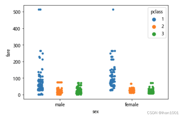
不同性别,不同船舱,票价情况
sns.stripplot(x='sex', y='fare', hue='pclass', data=titanic, dodge=True)
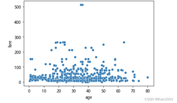
不同年龄,票价情况
sns.scatterplot(x='age', y='fare', data=titanic)
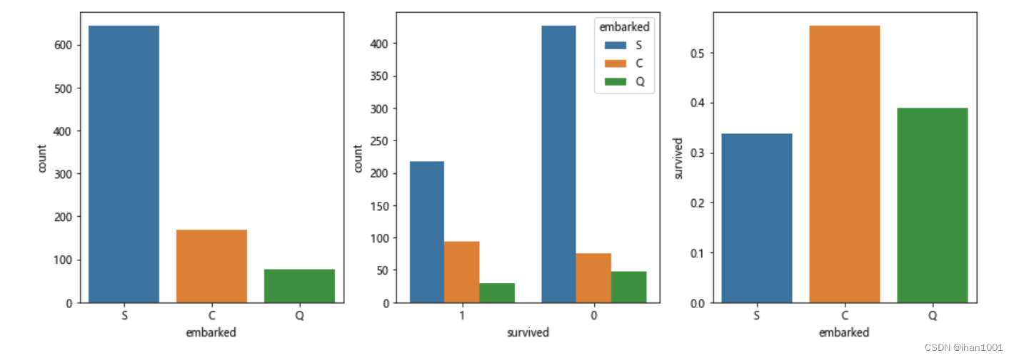
各港口上船人数、生还人数及生还率
fig, axs = plt.subplots(1,3,figsize=(15,5))
sns.countplot(x='embarked', data=titanic, ax=axs[0])
sns.countplot(x='survived', hue="embarked", data=titanic, order=[1,0], ax=axs[1])
embark_perc = titanic[["embarked", "survived"]].groupby(['embarked'], as_index=False).mean() # as_index默认为True会返回embarked为索引,将其置为False,使索引从0开始
sns.barplot(x='embarked', y='survived', data=embark_perc,order=['S','C','Q'],ax=axs[2])
plt.show()