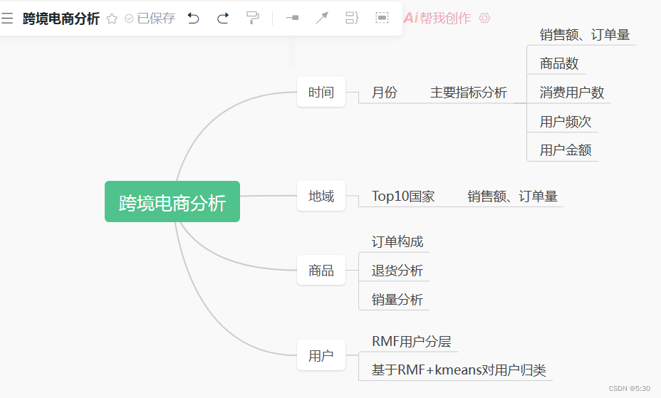
思路
 #### 数据说明
kaggle描述:这是一个跨国数据集,其中包含在 2010 年 1 月 12 日到 2011 年 9 月 12 日之间发生的英国某电商在线零售的交易数据。
数据量很庞大,在分析思路上可以使用机器学习K-Means 等算法,根据客户在市场上的购买行为来细分客户。

代码
读取数据
#读取数据
data = pd.read_excel('./Online Retail.xlsx',encoding='gb18030')
#退货数据
data_return = data[data.InvoiceNo.str.contains('C',na=False)==True]
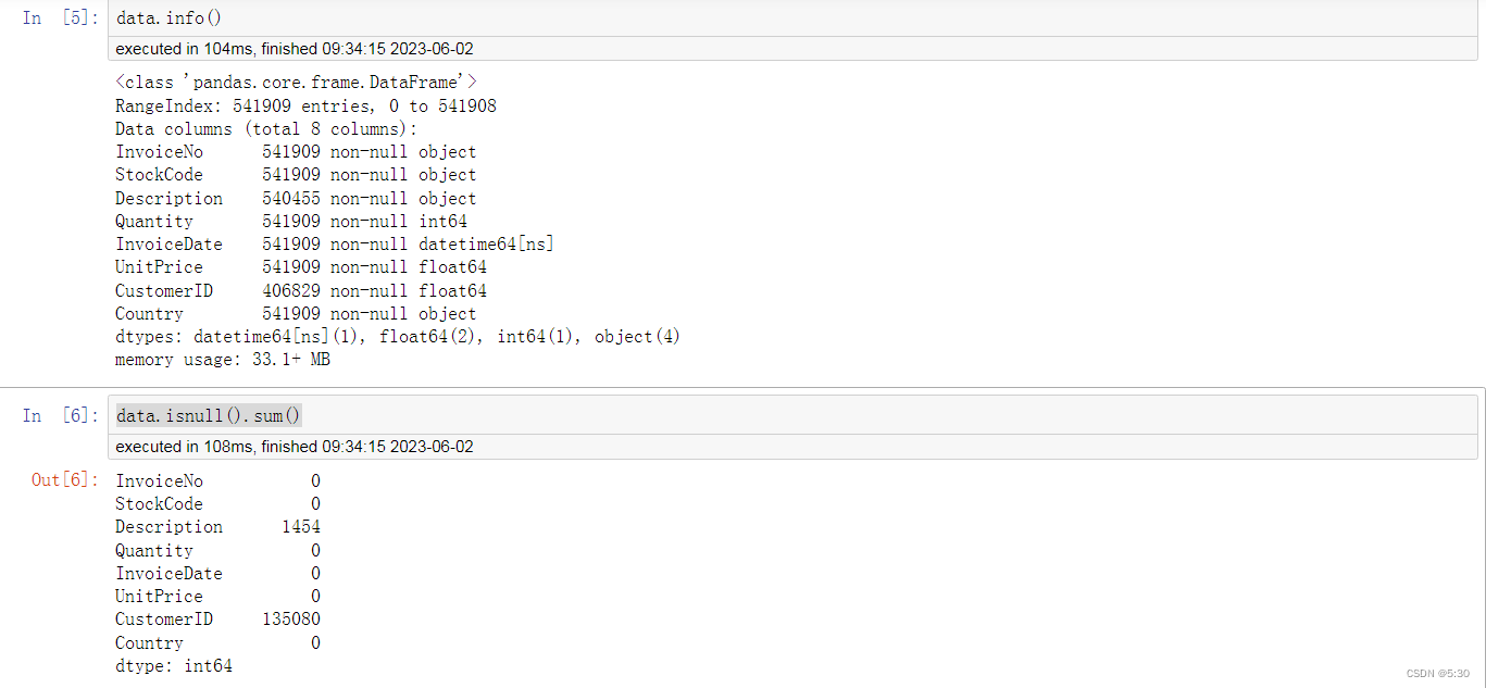
#查看缺失值,用户ID缺失较多,做用户分析时应该进行剔除
data.isnull().sum()
数据处理
# 删除缺失的用户,对于商品名称,暂时保留
data.dropna(subset=['CustomerID'], inplace=True)
# 增加营收
data['Amount'] = data['Quantity']*data['UnitPrice']
# 国家名称统一化
data.replace({

    'EIRE':'Ireland','USA':'United States','RSA':'South Africa','Czech Republic':'Czech','Channel Islands':'United Kingdom'},
        inplace=True)
# 增加订单状态
data['Transaction_status'] = data['InvoiceNo'].map(lambda x:'0' if str(x).startswith('C') else '1')
#增加月份
data['month'] = data['InvoiceDate'].apply(lambda x:format(x,'%Y-%m'))
#删除退货的数据
data = data[~data.InvoiceNo.str.contains('C',na=False)==True]
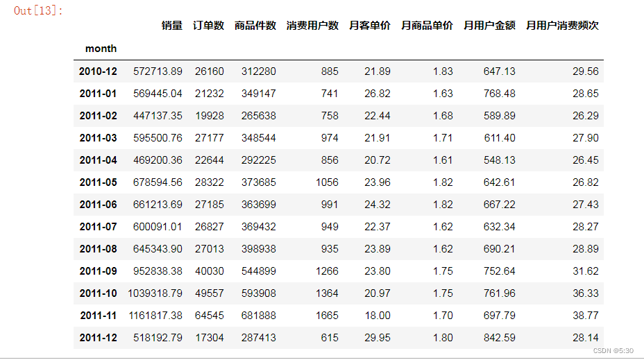
月度主要指标分析
# 算月份的销售额
df_month =data.groupby(['month'])['Amount'].agg({'sum'})
df_month_c = data.groupby(['month'])['CustomerID'].agg({'nunique'})
df_month_num =data.groupby(['month'])['Amount'].agg({'count'})
df_month_Quantity = data.groupby(['month'])['Quantity'].agg({'sum'})
df_all = pd.merge(df_month,df_month_num,left_index=True,right_index=True)
df_all = pd.merge(df_all,df_month_Quantity,left_index=True,right_index=True)
df_all = pd.merge(df_all,df_month_c,left_index=True,right_index=True)
df_all.columns = ['销量','订单数','商品件数','消费用户数']
df_all['月客单价'] = df_all['销量']/df_all['订单数']
df_all['月商品单价'] = df_all['销量']/df_all['商品件数']
df_all['月用户金额'] = df_all['销量']/df_all['消费用户数']
df_all['月用户消费频次'] = df_all['订单数']/df_all['消费用户数']
国家销售额 、订单量
# 算国家的销售额
df_Country_s = data.groupby('Country')['Amount'].agg({

    'sum'}).sort_values(by='sum',ascending=False)
df_Country_c = data.groupby('Country')['Amount'].agg({

    'count'}).sort_values(by='count',ascending=False)
## 去除未确定的数据('Unspecified'、'European Community')
df_c = data['Country'].value_counts().reset_index()
df_c.drop([20,28],inplace=True)
可视化(月度指标可视化)
# 创建柱状图通用函数
def bar_chart(desc, title_pos, data):
    chart = Bar()
    chart.add_xaxis(
        [i[0][:10]+'...' if len(i[0])>10 else i[0] for i in data]
    )
    chart.add_yaxis(
        '',
        [int(round(i[1], 0)) for i in data]
    )

    chart.set_global_opts(
        xaxis_opts=opts.AxisOpts(
            is_scale=True,
            name='',
            axislabel_opts={'rotate': '-25' if len(data) >= 5 else '0', 'interval': '0'},
            splitline_opts=opts.SplitLineOpts(
                is_show=True,
                linestyle_opts=opts.LineStyleOpts(
                    type_='dashed'))
        ),
        yaxis_opts=opts.AxisOpts(
            is_scale=True,
            name='',
            type_='value',
            splitline_opts=opts.SplitLineOpts(
                is_show=True,
                linestyle_opts=opts.LineStyleOpts(
                    type_='dashed'))
        ),
        title_opts=opts.TitleOpts(
            title=desc,
            pos_left=title_pos[0],
            pos_top=title_pos[1],
            title_textstyle_opts=opts.TextStyleOpts(
                color='#ea513f',
                font_family='cursive',
                font_size=19)
        ),
    )
    return chart
from pyecharts.charts import Grid
grid = Grid(
    init_opts=opts.InitOpts(
        theme='light',
        width='1000px',
        height='1400px')
)
grid.add(
    bar_chart('月度销售额', ['5%', '2%'], [[i,df_month.loc[i,'sum']]for i in df_month.index]),
    grid_opts=opts.GridOpts(
        pos_top='5%',  # 指定Grid中子图的位置
        pos_bottom='83%',
        pos_left='10%',
        pos_right='60%'
    )
)
grid.add(
    bar_chart('月消费用户数', ['55%', '2%'],[[i,df_month_c.loc[i,'nunique']]for i in df_month_c.index]),
    grid_opts=opts.GridOpts(
        pos_top='5%',
        pos_bottom='83%',
        pos_left='60%',
        pos_right='10%'
    )
)
grid.add(
    bar_chart('国家销售额TOP10', ['5%', '22%'],[[i,df_Country_s.loc[i,'sum']]for i in df_Country_s.head(10).index]),
    grid_opts=opts.GridOpts(
        pos_top='25%',
        pos_bottom='63%',
        pos_left='10%',
        pos_right='60%'
    )
)
grid.add(
    bar_chart('国家订单量TOP10', ['55%', '22%'], [[i,df_Country_c.loc[i,'count']]for i in df_Country_c.head(10).index]),
    grid_opts=opts.GridOpts(
        pos_top='25%',
        pos_bottom='63%',
        pos_left='60%',
        pos_right='10%'
    )
)
grid.add(
    bar_chart('商品购买TOP10', ['5%', '42%'], [[i,df_Description_c.loc[i,'sum']]for i in df_Description_c.index]),
    grid_opts=opts.GridOpts(
        pos_top='45%',
        pos_bottom='43%',
        pos_left='10%',
        pos_right='60%'
    )
)
grid.add(
    bar_chart('商品退货TOP10', ['55%', '42%'],[[i,df_Description_r.loc[i,'sum']]for i in df_Description_r.index]),
    grid_opts=opts.GridOpts(
        pos_top='45%',
        pos_bottom='43%',
        pos_left='60%',
        pos_right='10%'
    )
)
grid.add(
    bar_chart('客单价', ['5%', '62%'], [[i,df_all.loc[i, '月客单价']]for i in df_all.index]),
    grid_opts=opts.GridOpts(
        pos_top='65%',
        pos_bottom='23%',
        pos_left='10%',
        pos_right='60%'
    )
)
grid.add(
    bar_chart_1('商品单价', ['55%', '62%'],[[i,df_all.loc[i,'月商品单价']]for i in df_all.index]),
    grid_opts=opts.GridOpts(
        pos_top='65%',
        pos_bottom='23%',
        pos_left='60%',
        pos_right='10%'
    )
)
grid.add(
    bar_chart('用户消费金额', ['5%', '82%'], [[i,df_all.loc[i, '月用户金额']]for i in df_all.index]),
    grid_opts=opts.GridOpts(
        pos_top='85%',
        pos_bottom='3%',
        pos_left='10%',
        pos_right='60%'
    )
)
grid.add(
    bar_chart('用户消费频次', ['55%', '82%'],[[i,df_all.loc[i, '月用户消费频次']]for i in df_all.index]),
    grid_opts=opts.GridOpts(
        pos_top='85%',
        pos_bottom='3%',
        pos_left='60%',
        pos_right='10%'
    )
)
grid.render_notebook()

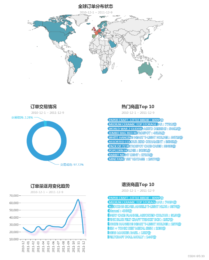
地域情况可视化
attr = df_c['index'].tolist()
values = df_c['Country'].tolist()
map_= (
    Map(init_opts=opts.InitOpts(width='980px',height='400px'))
    .add("订单数量", [list(z) for z in zip(attr, values)], "world",is_map_symbol_show=False,is_roam=False,zoom='0.9')
    .set_series_opts(label_opts=opts.LabelOpts(is_show=False))
    .set_global_opts(
        title_opts=opts.TitleOpts(
            title='全球订单分布状态',
            subtitle=' 2010-12-1 ~ 2011-12-9',
            pos_left='center',
            pos_top='2%'
            ),
        visualmap_opts=opts.VisualMapOpts(
            max_=10000,
            is_show=False
            ),
        legend_opts=opts.LegendOpts(
            is_show=False
        ),
    )
)
label = df_Description_num.head(10).index.tolist()
value = df_Description_num.head(10)['sum'].values.tolist()
bar = (Bar(init_opts=opts.InitOpts(width='500px',height='300px',theme='light'))
    .add_xaxis(label[::-1])
    .add_yaxis('',value[::-1],itemstyle_opts={
            'barBorderRadius': [10, 10, 10, 10],
            },
        )
    .set_series_opts(
        label_opts = opts.LabelOpts(
            position='insideLeft',
            formatter='{b}:{c}份'
        )
    )
    .set_global_opts(
        title_opts = opts.TitleOpts(
            title='热门商品Top 10',
            subtitle = '2010-12-1 ~ 2011-12-9',
            pos_right = '18%'
        ),
        legend_opts = opts.LegendOpts(
                pos_left="25%"
            ),
        xaxis_opts=opts.AxisOpts(
                is_show=False
            ),
        yaxis_opts=opts.AxisOpts(
                is_show=False
            ),
        )
    )
label = df_Description_r.head(10).index.tolist()
value = df_Description_r.head(10)['sum'].values.tolist()
bar2 = (Bar(init_opts=opts.InitOpts(width='500px',height='300px',theme='light'))
    .add_xaxis(label[::-1])
    .add_yaxis('',value[::-1],itemstyle_opts={
            'barBorderRadius': [10, 10, 10, 10],
            },
        )
    .set_series_opts(
        label_opts = opts.LabelOpts(
            position='insideLeft',
            formatter='{b}:{c}份'
        )
    )
    .set_global_opts(
        title_opts = opts.TitleOpts(
            title='退货商品Top 10',
            subtitle = '2010-12-1 ~ 2011-12-9',
            pos_right = '18%'
        ),
        legend_opts = opts.LegendOpts(
                is_show=False
            ),
        xaxis_opts=opts.AxisOpts(
                is_show=False
            ),
        yaxis_opts=opts.AxisOpts(
                is_show=False
            ),
        )
    )
line_style = {
    'normal': {
        'width': 4,
        'shadowColor': 'rgba(155, 18, 184, .3)',
        'shadowBlur': 10,
        'shadowOffsetY': 10,
        'shadowOffsetX': 10,
        'curve': 0.5
    }
}
line = (Line(init_opts=opts.InitOpts(height='300px',width='500px'))
    .add_xaxis(df_month_num.index.tolist())
    .add_yaxis('',df_month_num['count'].tolist(),is_symbol_show=False,is_smooth=True,linestyle_opts=line_style)
    .set_global_opts(
        title_opts=opts.TitleOpts(
            title='订单量逐月变化趋势',
            subtitle='2010-12-1 ~ 2011-12-9',
            pos_left='24%',
            pos_top='2%'
        ),
        xaxis_opts=opts.AxisOpts(
            axislabel_opts={'rotate':'90'},
        ),
        yaxis_opts=opts.AxisOpts(
            min_=10000,
            max_=70000,
            axisline_opts=opts.AxisLineOpts(
                is_show=False
            ),
            splitline_opts=opts.SplitLineOpts(
                is_show=True
            )
        ),
        tooltip_opts=opts.TooltipOpts(
            is_show = True,
            trigger = 'axis',
            trigger_on = 'mousemove|click',
            axis_pointer_type = 'shadow'
        )
    )
)
##可视化--订单交易状态
label = ['交易成功','交易取消']
value = [len(data),len(data_return)]
pie=(
    Pie(init_opts=opts.InitOpts(theme='light',height='350px'))
    .add("",[list(z) for z in zip(label, value)],radius=["40%", "55%"],center=['32%','52%'])
    .set_series_opts(
        label_opts=opts.LabelOpts(
            formatter="{b}: {d}%"
            )
        )
    .set_global_opts(
        title_opts=opts.TitleOpts(
            title='订单交易情况',
            subtitle=' 2010-12-1 ~ 2011-12-9',
            pos_left='24%'
        ),
        legend_opts=opts.LegendOpts(
            is_show=False
        )
    )
)
融合
grid = Grid(init_opts=opts.InitOpts(height='300px',theme='light'))
grid.add(bar.reversal_axis(), grid_opts=opts.GridOpts(pos_left="60%"))
grid.add(pie, grid_opts=opts.GridOpts(pos_left="60%"))

grid1 = Grid(init_opts=opts.InitOpts(height='300px',theme='light'))
grid1.add(line, grid_opts=opts.GridOpts(pos_right="50%",pos_left='20%'))
grid1.add(bar2.reversal_axis(), grid_opts=opts.GridOpts(pos_left="60%"))

page = Page()
page.add(map_)
page.add(grid)
page.add(grid1)
page.render_notebook()
RMF
t = '2011-12-09 23:59:59'
t = pd.to_datetime(t)
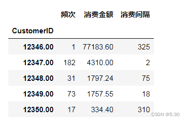
df_c = data.groupby(['CustomerID'])['InvoiceNo','Amount','InvoiceDate'].agg({
'InvoiceNo':'count','Amount':'sum','InvoiceDate':"max"})
df_c['interval_time'] = (t-df_c.InvoiceDate).dt.days
df_c['interval_time'].max(),df_c['InvoiceDate'].min(),data['InvoiceDate'].min()
df_rmf = df_c[['InvoiceNo','Amount','interval_time']]
df_rmf.columns = ['频次','消费金额','消费间隔']
df_rmf.head()
rmd = df_rmf['消费间隔'].mean()
mmd= df_rmf['消费金额'].mean()
fmd = df_rmf['频次'].mean()
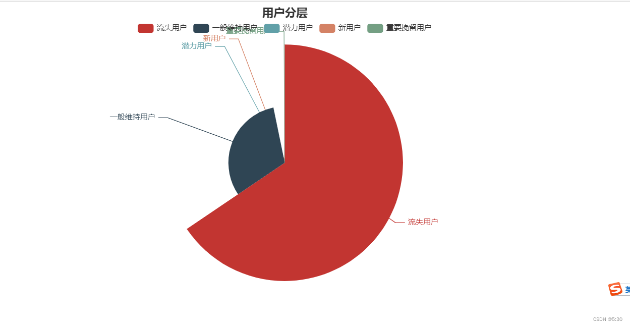
def customer_type(frame):
customer_type = []
for i in range(len(frame)):
if frame.iloc[i,1]<=rmd and frame.iloc[i,2]>=fmd and frame.iloc[i,0]>=mmd:
customer_type.append('重要价值用户')
elif frame.iloc[i,1]>rmd and frame.iloc[i,2]>=fmd and frame.iloc[i,0]>=mmd:
customer_type.append('重要唤回用户')
elif frame.iloc[i,1]<=rmd and frame.iloc[i,2]<fmd and frame.iloc[i,0]>=mmd:
customer_type.append('重要深耕用户')
elif frame.iloc[i,1]>rmd and frame.iloc[i,2]<fmd and frame.iloc[i,0]>=mmd:
customer_type.append('重要挽留用户')
elif frame.iloc[i,1]<=rmd and frame.iloc[i,2]>=fmd and frame.iloc[i,0]<mmd:
customer_type.append('潜力用户')
elif frame.iloc[i,1]>rmd and frame.iloc[i,2]>=fmd and frame.iloc[i,0]<mmd:
customer_type.append('一般维持用户')
elif frame.iloc[i,1]<=rmd and frame.iloc[i,2]<fmd and frame.iloc[i,0]<mmd:
customer_type.append('新用户')
elif frame.iloc[i,1]>rmd and frame.iloc[i,2]<fmd and frame.iloc[i,0]<mmd:
customer_type.append('流失用户')
frame['classification'] = customer_type
customer_type(df_rmf)
占比
c = (
    Pie()
    .add("", [i for i in zip(df5.index,df5['count'])],rosetype="radius",)
    .set_global_opts(title_opts=opts.TitleOpts(title="用户分层",pos_left='center'),legend_opts=opts.LegendOpts(pos_top='5%'))
)
c.render_notebook()
kmeans
## 数据标准化
model_scaler = MinMaxScaler()
data_scaled = model_scaler.fit_transform(df_rmf[['频次','消费金额','消费间隔']])
K = range(1, 10)
meandistortions = []
for k in K:
    kmeans = KMeans(n_clusters=k)
    kmeans.fit(data_scaled)
    meandistortions.append(sum(np.min(cdist(data_scaled, kmeans.cluster_centers_, 'euclidean'), axis=1))/data_scaled.shape[0])
plt.plot(K, meandistortions, marker='o')
plt.xlabel('K')
plt.ylabel('Average distortion degree')
plt.title('Use the Elbow Method to select the best K value')
plt.show()
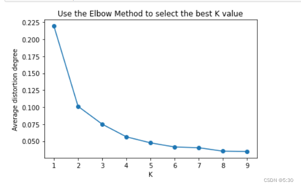
Kmeans = KMeans(n_clusters=4,max_iter=50)
Kmeans.fit(data_scaled)
cluster_labels_k = Kmeans.labels_  #输出归类结果
# 把结果加入到df_rmf里面
df_rmf = df_rmf.reset_index()
cluster_labels = pd.DataFrame(cluster_labels_k, columns=['clusters'])
res = pd.concat((df_rmf, cluster_labels), axis=1)
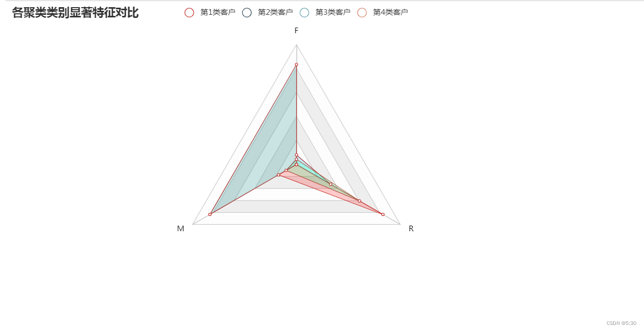
显著性对比
c = (
    Radar(init_opts=opts.InitOpts())
    .add_schema(
        schema=[
             opts.RadarIndicatorItem(name="F",max_=1.2),
             opts.RadarIndicatorItem(name="M", max_=1.2),
             opts.RadarIndicatorItem(name="R", max_=1.2),
         ],
        splitarea_opt=opts.SplitAreaOpts(
            is_show=True, areastyle_opts=opts.AreaStyleOpts(opacity=1)
        ),
        textstyle_opts=opts.TextStyleOpts(color="#000000"),
    )
    .add(
        series_name="第1类客户",
        data=[num_sets_max_min[0]],
        areastyle_opts=opts.AreaStyleOpts(color="#FF0000",opacity=0.2), # 区域面积,透明度
    )
    .add(
        series_name="第2类客户",
        data=[num_sets_max_min[1]],
        areastyle_opts=opts.AreaStyleOpts(color="#00BFFF",opacity=0.2), # 区域面积,透明度
    )
    .add(
        series_name="第3类客户",
        data=[num_sets_max_min[2]],
        areastyle_opts=opts.AreaStyleOpts(color="#00FF7F",opacity=0.2), # 区域面积,透明度
    )
    .add(
        series_name="第4类客户",
        data=[num_sets_max_min[3]],
        areastyle_opts=opts.AreaStyleOpts(color="#007F7F",opacity=0.2), # 区域面积,透明度
    )
    .set_series_opts(label_opts=opts.LabelOpts(is_show=False))
    .set_global_opts(
        title_opts=opts.TitleOpts(title="各聚类类别显著特征对比"),
    )
)
c.render_notebook()
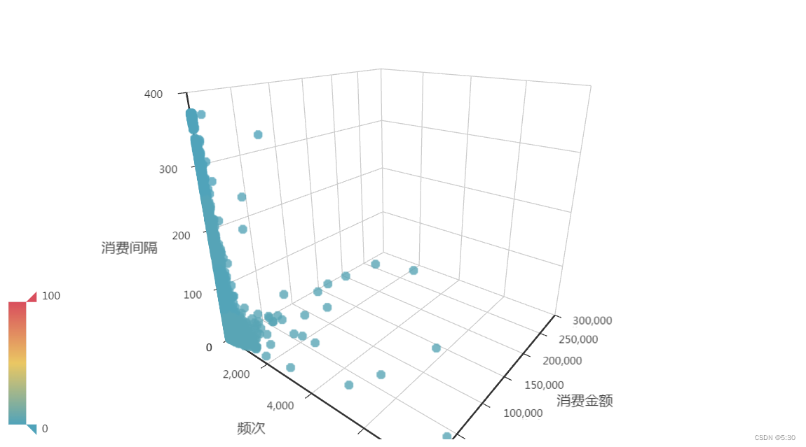
3D散点图
import asyncio
from aiohttp import TCPConnector, ClientSession

import pyecharts.options as opts
from pyecharts.charts import Scatter3D

"""
Gallery 使用 pyecharts 1.1.0
参考地址: https://echarts.apache.org/examples/editor.html?c=scatter3d&gl=1&theme=dark

目前无法实现的功能:

1、暂时无法对 Grid3D 设置 轴线和轴坐标的 style (非白色背景下有问题)
"""


async def get_json_data(url: str) -> dict:
    async with ClientSession(connector=TCPConnector(ssl=False)) as session:
        async with session.get(url=url) as response:
            return await response.json()


symbol_list = ['circle', 'rect', 'roundRect', 'triangle']

# 配置 config
config_xAxis3D = "频次"
config_yAxis3D = "消费金额"
config_zAxis3D = "消费间隔"
config_color = "clusters"
# # config_symbolSize = "vitaminc"
res2 = res1.to_dict(orient='records')
# # 构造数据
data = [
    [
        item[config_xAxis3D],
        item[config_yAxis3D],
        item[config_zAxis3D],
        item[config_color],
#         item['index'],

    ]
    for item in res2
]

c = (
    Scatter3D()  # bg_color="black"
    .add(
        series_name="",
        data=data,
        xaxis3d_opts=opts.Axis3DOpts(
            name=config_xAxis3D,
            type_="value",
            # textstyle_opts=opts.TextStyleOpts(color="#fff"),
        ),
        yaxis3d_opts=opts.Axis3DOpts(
            name=config_yAxis3D,
            type_="value",
            # textstyle_opts=opts.TextStyleOpts(color="#fff"),
        ),
        zaxis3d_opts=opts.Axis3DOpts(
            name=config_zAxis3D,
            type_="value",
            # textstyle_opts=opts.TextStyleOpts(color="#fff"),
        ),
        grid3d_opts=opts.Grid3DOpts(width=100, height=100, depth=100),


    )
#     .set_global_opts(
# #         visualmap_opts=none,
#         legend_opts=opts.LegendOpts(is_show=True)
#     )
    .set_series_opts(
#         label_opts=opts.LabelOpts(
#             is_show=False,  # 隐藏数据标签
#         ),
        itemstyle_opts=opts.ItemStyleOpts(
            color=lambda params: symbol_list[params.res['clusters']],  # 设置数据点颜色
        ),
    )
)
c.render_notebook()