一、文本组件
1.1Text
Column(modifier = Modifier
        .fillMaxSize()
        .background(Color.Green)
        .padding(10.dp)){


        Text(text= stringResource(id = R.string.title_content),
            modifier= Modifier
                .fillMaxWidth()
                .border(BorderStroke(1.dp, Color.White)),
            fontSize = 20.sp,
            textAlign = TextAlign.Center,
            maxLines = 5)
        Text(text= "测试文本2",
            modifier= Modifier
                .fillMaxWidth()
                .border(BorderStroke(1.dp, Color.White)),
            fontSize = 20.sp,
            textAlign = TextAlign.Center)
            }
Text显示的文本来源可以引用res->values->strings.xml中的资源,如第一个显示文本所示。
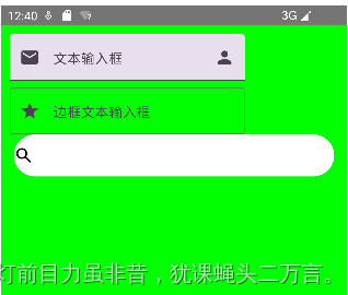
1.2文本输入框
    var text by remember {

     mutableStateOf("")}

    Column(modifier = Modifier
        .fillMaxSize()
        .background(Color.Green)
        .padding(10.dp)){


        TextField(value = text,
                  onValueChange = {

    it:String->
                      text = it
                  },
                  label ={

    Text("文本输入框")},
                  leadingIcon = {


                      Icon(imageVector = Icons.Default.Email,contentDescription = "账号")
                  },
                  trailingIcon={


                      Icon(imageVector = Icons.Default.Person, contentDescription = "用户名")
                  }
        )

        OutlinedTextField(
            value = text,
            onValueChange ={


            text = it},
            label={

    Text("边框文本输入框")},
            leadingIcon = {


                Icon(imageVector = Icons.Filled.Star, contentDescription = "密码")
            }
        )

        BasicTextField(value = text,
                       onValueChange = {


                        text = it
                       },
                       decorationBox = {

    innerTextField ->
                           Row(verticalAlignment = Alignment.CenterVertically){


                               Icon(imageVector = Icons.Default.Search,contentDescription = "搜索")
                               innerTextField()
                           }

                       },
                       modifier = Modifier
                           .padding(horizontal = 5.dp)
                           .background(Color.White, CircleShape)
                           .height(50.dp)
                           .fillMaxWidth()
        )
    }
二、按钮组件
  var clickIcon by remember {


        mutableStateOf(Icons.Filled.ShoppingCart)
  }
  val clickInteraction = remember {

     MutableInteractionSource()}

  val pressState = clickInteraction.collectIsPressedAsState()
  Column(modifier = Modifier
        .fillMaxWidth()
        .padding(10.dp),
        verticalArrangement = Arrangement.Center
        ){


        Button(modifier = Modifier.clickable {


                 /*内部已经被占用,会被拦截,因此日志不会显示*/
                 Log.d("TAG","点击按钮")
             },
            onClick = {


            clickState = !clickState
            clickIcon =  if(clickState) Icons.Filled.Star else Icons.Filled.ShoppingCart
        }, interactionSource = clickInteraction, //监听组件状态
        border = BorderStroke(5.dp,borderColor)
        ){


            Text("按钮:"+pressState.value)
        }

        IconButton(onClick = {


        }) {


            Icon(imageVector = clickIcon,contentDescription = "图标按钮")
        }

        TextButton(onClick = {


        }){


            Text("文本按钮")
        }
    }
点击按钮前:
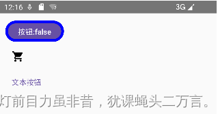
点击按钮后:
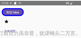
点击第一个圆角按钮不放时,显示为按钮:true
Button有两方面需要注意:
(1) Buttton有一个参数interactionSource,用来监听组件状态的事件源,通过它获取组件的状态来设置不同的样式。获取的组件的状态可以是:
interactionSource.collectIsPressedAsState():判断是否按下状态
interactionSource.collectIsFocusedAsState():判断是否获取焦点的状态
interactionSource.collectIsDraggedAsState():判断是否拖动
(2) 所有的Composable的组件都具有Modifier.clickable修饰符,用来处理组合组件的事件,如Material Design风格的水波纹等,是通过内部拦截Modifier.clickable来实现。因为Modifier.clickable已经被内部占用,需要额外定义Button的onClick用来处理点击开发者定义事件。
三、图片组件
定义图片可以通过Image和Icon来实现,调用的形式如下述代码:
Column(modifier= Modifier
        .fillMaxSize()
        .padding(20.dp)){


        //必须是png,jpg的图片
        Image(painter = painterResource(id = R.mipmap.laugh),
              contentDescription = "不支持使用")
        //Icon默认的背景颜色是黑色
        Icon(imageVector = Icons.Default.Face,
             tint = Color.Green,
             contentDescription = "图标示例1")
        Icon(painter= painterResource(id = R.mipmap.laugh),
             contentDescription = "图标示例2",
             tint = Color.Blue)
        Icon(bitmap = ImageBitmap.imageResource(id = R.mipmap.laugh),
             contentDescription = "图标示例3",
             tint=Color.Unspecified)
    }
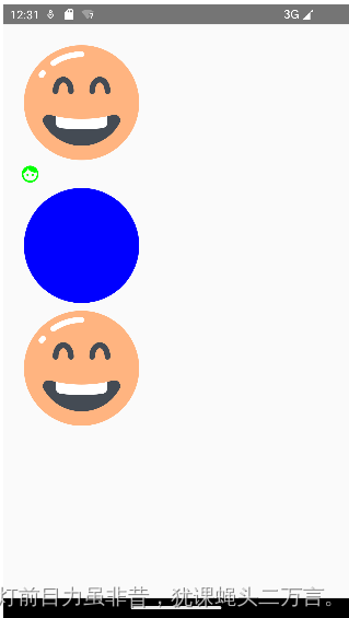
一共定义了四张图,第2张图是调用系统内部的图标。引用图片资源主要有三种形式:
    Icon(imageVector = Icons.Default.Face,
         contentDescription = "图标示例1")

    Icon(painter= painterResource(id = R.mipmap.laugh),
         contentDescription = "图标示例2",
         tint = Color.Blue)

    Icon(bitmap = ImageBitmap.imageResource(id = R.mipmap.laugh),
         contentDescription = "图标示例3",
         tint=Color.Unspecified)
tint设置图标的颜色,如果设置为Color.Unspecified表示不设置,则采用原来的颜色。
四、选择器相关组件
//复选按钮状态
var checkedState by remember {
mutableStateOf(false)
}
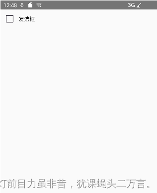
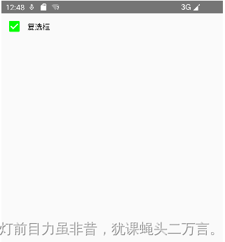
//复选框
Row(verticalAlignment = Alignment.CenterVertically){
Checkbox(checked = checkedState ,
onCheckedChange ={
it:Boolean->
checkedState = it
},
colors = CheckboxDefaults.colors(checkedColor = Color.Green))
Text("复选框")
}
扫描二维码关注公众号,回复:
17248203 查看本文章

var selectedState by remember {
mutableStateOf(false)
}
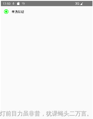
//单选按钮
var selectedColor = Color.Green
Row(verticalAlignment = Alignment.CenterVertically){
RadioButton(selected = selectedState,
onClick = {
selectedState = !selectedState
},
colors = RadioButtonDefaults.colors(selectedColor = selectedColor))
Text("单选按钮")
}
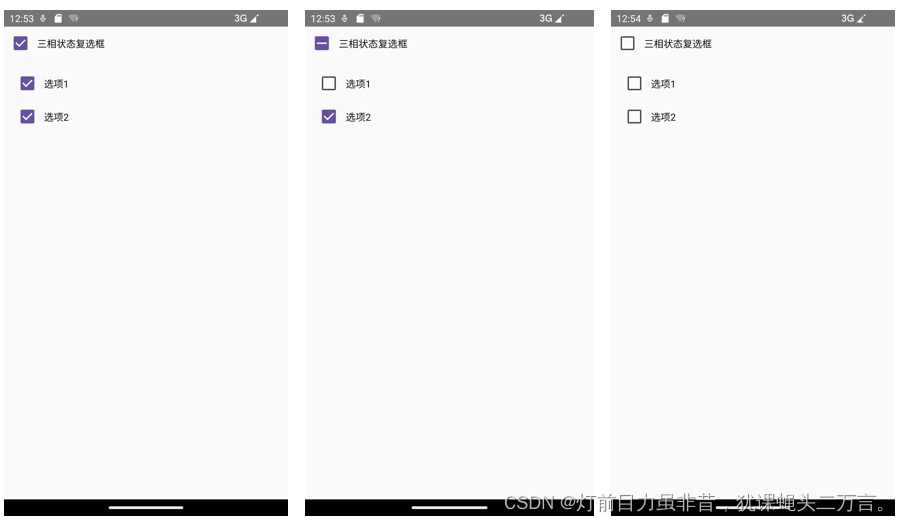
    //三相复选按钮状态
    val (triState1,onStateChange1) = remember {

     mutableStateOf(false) }
    val (triState2,onStateChange2) = remember {

     mutableStateOf(false) }
    val triState = remember(triState1,triState2){


        if(triState1 && triState2) ToggleableState.On
        else if (!triState1 && !triState2) ToggleableState.Off
        else ToggleableState.Indeterminate
    }
       //三相状态复选框
       Column(modifier = Modifier.fillMaxWidth()){


           Row(verticalAlignment = Alignment.CenterVertically){


               TriStateCheckbox(state = triState ,
                   onClick = {


                       val s = triState!=ToggleableState.On
                       onStateChange1(s)
                       onStateChange2(s)
                   },
                   colors = CheckboxDefaults.colors(checkedColor = MaterialTheme.colorScheme.primary))
               Text("三相状态复选框")
           }
           Column(modifier = Modifier.padding(10.dp)){


               Row(verticalAlignment = Alignment.CenterVertically) {


                   Checkbox(triState1, onStateChange1)
                   Text("选项1")
               }
               Row(verticalAlignment = Alignment.CenterVertically){


                   Checkbox(triState2,onStateChange2)
                   Text("选项2")
               }
           }
       }
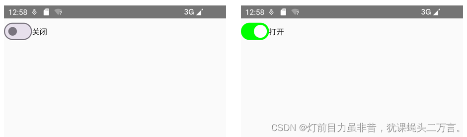
      //switch开关状态
       var openState by remember{

     mutableStateOf(false) }
       //Switch单选开关
       Row(verticalAlignment = Alignment.CenterVertically){


           Switch(checked = openState,
               onCheckedChange = {

    it:Boolean->
                   openState = it
               },
               colors = SwitchDefaults.colors(disabledCheckedTrackColor = Color.DarkGray, checkedTrackColor = Color.Green))
           Text(if(openState) "打开" else "关闭")
       }
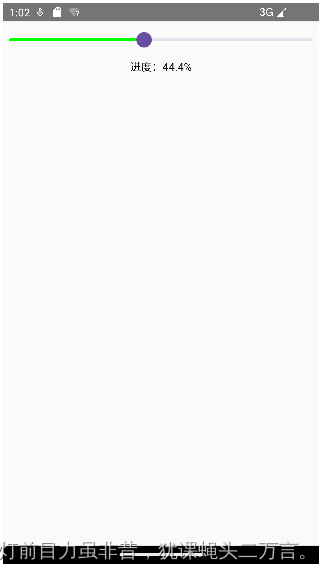
     //sliderProgress值:进度条的值
      var sliderProgress by remember{

     mutableStateOf(0f) }
       //定义Slider组件
       Column(horizontalAlignment = Alignment.CenterHorizontally){


           Slider(value = sliderProgress ,
                  onValueChange ={

    it:Float->
                    sliderProgress = it
                  },
                  colors = SliderDefaults.colors(activeTrackColor = Color.Green))
           Text(text = "进度:%.1f%%".format(sliderProgress*100))
       }
   }
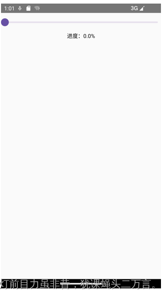
拖方进度条,则类似如下显示:
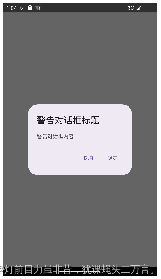
五、定义对话框
    var openState2 by remember {

     mutableStateOf(true) }
    Column(modifier = Modifier.fillMaxSize()) {


        if(openState2){


            AlertDialog(onDismissRequest = {

    openState2 = !openState2},
                title = {


                    Text("警告对话框标题")
                },
                text={


                    Text("警告对话框内容")
                },
                confirmButton = {


                    TextButton(onClick={


                        openState2 = true
                    }){


                        Text("确定")
                    }
                },
                dismissButton = {


                    TextButton(onClick={


                        openState2 = false
                    }){


                        Text("取消")
                    }
                }
            )

        }
    }
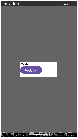
   var openState1 by remember{

     mutableStateOf(true) }

    Column(modifier = Modifier.fillMaxSize()) {


        if(openState1){


            Dialog(onDismissRequest = {

    openState1 = !openState1}){


                Column(modifier = Modifier
                    .size(200.dp, 80.dp)
                    .background(Color.White)){


                    Text("对话框")
                    Button(onClick = {

    openState1 = !openState1}){


                        Text("关闭对话框")
                    }
                }
            }
        }
    }