随着技术的发展,开发的复杂度也越来越高,传统开发方式将一个系统做成了整块应用,经常出现的情况就是一个小小的改动或者一个小功能的增加可能会引起整体逻辑的修改,造成牵一发而动全身。通过组件化开发,可以有效实现单独开发,单独维护,而且他们之间可以随意的进行组合。大大提升开发效率低,降低维护成本。
组件化对于任何一个业务场景复杂的前端应用以及经过多次迭代之后的产品来说都是必经之路。组件化要做的不仅仅是表面上看到的模块拆分解耦,其背后还有很多工作来支撑组件化的进行,例如结合业务特性的模块拆分策略、模块间的交互方式和构建系统等等 。
本文给大家介绍的组件是:
快速实现前端vue uni-app自定义弹框组件、弹框组件, 请访问uni-app插件市场地址:https://ext.dcloud.net.cn/plugin?id=12491
更多前端组件信息请关注微信公众号: 前端组件开发

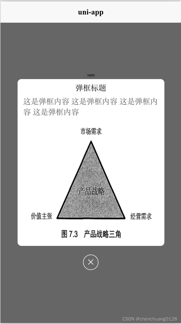
效果图如下:
# 自定义弹框使用方法
#### HTML代码部分
```html
<template>
<view class="content">
<image class="logo" src="/static/logo.png"></image>
<view class="logo" style="background-color: aquamarine;line-height: 100px;text-align: center;" @click="popupClick">点击弹框</view>
<!-- 使用组件 -->
<ccPopup :ishide='isshow' width="calc(100vw - 70px)" height="346px" radius="16rpx">
<!-- 自定义展示内容 -->
<view class="modelContent">
<view style="margin-top: 6px;">
弹框标题
</view>
<view style="margin-top: 20px; color: #666666; margin: 6px 12px;">
这是弹框内容 这是弹框内容 这是弹框内容 这是弹框内容
</view>
<image class="imageV" :src="mySrc" ></image>
</view>
<!-- 自定义关闭按钮 -->
<view class="close" @click="isshow=false">✕</view>
</ccPopup>
</view>
</template>
```
#### JS代码 (引入组件 填充数据)
```javascript
<script>
import ccPopup from '@/components/cc-popup.vue';
export default {
components: {
ccPopup
},
data() {
return {
title: 'Hello',
companyList:[{},{},{}],
isshow:false,
mySrc:'../../static/logo.png'
}
},
onLoad() {
},
methods: {
popupClick(){
this.isshow = !this.isshow;
}
}
}
</script>
```
#### CSS
```CSS
<style>
.content {
display: flex;
flex-direction: column;
}
.logo {
height: 200rpx;
width: 200rpx;
margin-top: 200rpx;
margin-left: auto;
margin-right: auto;
margin-bottom: 50rpx;
}
.text-area {
display: flex;
justify-content: center;
}
.title {
font-size: 36rpx;
color: #8f8f94;
}
.modelContent {
width: 100%;
height: 100%;
display: flex;
align-items: center;
flex-direction: column;
justify-content: center;
}
.imageV {
margin-top: 0px;
width: calc(100vw - 100px);
height: calc((100vw - 100px) * 1.027) ;
}
.close {
width: 60rpx;
height: 60rpx;
color: #FFFFFF;
line-height: 60rpx;
text-align: center;
border-radius: 50%;
border: 1px solid #FFFFFF;
position: relative;
bottom: -10%;
left: 50%;
transform: translate(-50%, -50%);
}
</style>
```