一、实现效果
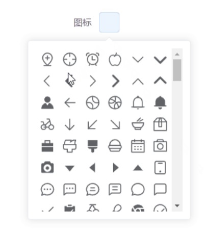
效果一:
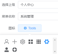
效果二:
效果一的这个是把全部的icon图标都让它显示出来,让我们自己选择说选图标
二、效果一实现步骤
2.1. 全局注册 icon 组件
// main.ts
import App from './App.vue';
import { createApp } from 'vue';
import * as ElementPlusIconsVue from '@element-plus/icons-vue'

const app = createApp(App);

// 全局挂载和注册 element-plus 的所有 icon
app.config.globalProperties.$icons = []
for (const [key, component] of Object.entries(ElementPlusIconsVue)) {
    app.config.globalProperties.$icons.push(key)
    app.component(key, component)
}

app.mount('#app');
2.2. 组件实现
<script setup lang="ts">
import { ComponentInternalInstance, defineEmits, defineProps, getCurrentInstance } from 'vue'

const { appContext: {app: { config: { globalProperties } } } } = getCurrentInstance() as ComponentInternalInstance

interface Props {
  modelValue: string
}
const props = defineProps<Props>()

const emits = defineEmits(['update:modelValue'])
</script>

<template>
  <el-popover trigger="focus" :width="256">
    <template #reference>
      <el-button :icon="modelValue">{

   { modelValue }}</el-button>
    </template>
    <div class="el-icon-picker">
      <component v-for="icon in globalProperties.$icons" :key="icon"
        :class="[icon, 'icon', { 'icon-active': icon == modelValue }]"
        :is="icon"
        @click="emits('update:modelValue', icon)">
      </component>
    </div>
  </el-popover>
</template>

<style scoped>
.el-icon-picker {
  height: 256px;
  overflow-y: scroll;
  display: flex;
  justify-content: space-around;
  flex-wrap: wrap;
}

.icon {
  display: inline-block;
  width: 24px;
  height: 24px;
  color: var(--el-text-color-regular);
  font-size: 20px;
  border-radius: 4px;
  cursor: pointer;
  text-align: center;
  line-height: 45px;
  margin: 5px;
}

.icon:hover {
  color: var(--el-color-primary);
}

.icon-active {
  color: var(--el-color-primary);
}
</style>
2.3. 使用
<script setup lang="ts">
import { ref } from 'vue';
import ElIconPicker from './components/el-icon-picker.vue';

const icon = ref<string>('');
</script>

<template>
  <el-form>
    <el-form-item label="图标">
      <ElIconPicker v-model="icon"></ElIconPicker>
    </el-form-item>
  </el-form>
</template>
效果二的这个是渲染后端返回的icon图标
三、效果二实现步骤
3.1. 全局注册 icon 组件
// main.ts
import App from './App.vue';
import { createApp } from 'vue';
import * as ElementPlusIconsVue from '@element-plus/icons-vue'

const app = createApp(App);

// 全局挂载和注册 element-plus 的所有 icon
app.config.globalProperties.$icons = []
for (const [key, component] of Object.entries(ElementPlusIconsVue)) {
    app.config.globalProperties.$icons.push(key)
    app.component(key, component)
}

app.mount('#app');
3.2. 组件实现
<template>
  <el-popover trigger="focus" :width="256">
    <template #reference>
      <el-button style="width: 100px" :icon="props.modelValue">{

   { modelValue }}</el-button>
    </template>
    <div class="el-icon-picker">
      <component v-for="icon in props.fatherIcon" :key="icon.value"
                 :class="[icon.value, 'icon', { 'icon-active': icon.value == props.modelValue }]"
                 :is="icon.value"
                 @click="emits('update:modelValue', icon.value)">
      </component>
    </div>
  </el-popover>
</template>
<script lang="ts" setup>

interface Props {
  modelValue: string,
  fatherIcon: any[]
}
const props = defineProps<Props>();

console.log(props)

const emits = defineEmits(['update:modelValue']);
</script>

<style scoped>
.el-icon-picker {
  min-height: 20px;
  overflow-y: scroll;
  display: flex;
  flex-wrap: wrap;
}

.icon {
  display: inline-block;
  width: 24px;
  height: 24px;
  color: var(--el-text-color-regular);
  font-size: 20px;
  border-radius: 4px;
  cursor: pointer;
  text-align: center;
  line-height: 45px;
  margin: 5px;
}

.icon:hover {
  color: var(--el-color-primary);
}

.icon-active {
  color: var(--el-color-primary);
}
</style>
3.3. 使用
<script setup lang="ts">
import { ref } from 'vue';
import ElIconPicker from './components/el-icon-picker.vue';

const icon = ref<string>('');
</script>

<template>
  <el-form>
    <el-form-item label="图标">
     <ElIconPicker v-model="ic" :fatherIcon="icon"></ElIconPicker>
    </el-form-item>
  </el-form>
</template>