左侧菜单栏是前端项目中基本都会碰到的一个需求,本文基于antd组件,结合vue递归组件的概念,封装了一个通用的左侧菜单栏组件,菜单目录可自由配置层级。
项目用到的版本如下:
1、实现sideBar.vue组件
<template>
  <a-layout-sider v-model:collapsed="collapsed" collapsible>
    <a-menu
      :selectedKeys="selectedKeys"
      @update:selectedKeys="updateSelectedKeys"
      theme="dark"
      mode="inline"
      :openKeys="openKeys"
      @update:openKeys="updateOpenKeys"
    >
      <template v-for="item in menuList" :key="item.key">
        <template v-if="!item.children">
          <a-menu-item :key="item.key" @click="menuItemClick(item)">
            <template #icon>
              <SettingOutlined />
            </template>
            {

    {

     item.title }}
          </a-menu-item>
        </template>
        <template v-else>
          <sub-menu
            :key="item.key"
            :menu-info="item"
            @menuItemClick="menuItemClick"
          ></sub-menu>
        </template>
      </template>
    </a-menu>
  </a-layout-sider>
</template>

<script lang="ts" setup>
import SubMenu from './subMenu.vue';

import {

     SettingOutlined } from '@ant-design/icons-vue';
import {

     log } from 'console';

interface MenuItem {


  key: string;
  title: string;
  path?: string;
  icon?: string;
  children?: MenuItem[];
}

interface Props {


  menuList: Array<MenuItem>;
  selectedKeys: string[];
  openKeys: string[];
  collapsed?: boolean;
}

withDefaults(defineProps<Props>(), {


  collapsed: false
});

const emit = defineEmits([
  'menuItemClick',
  'update:selectedKeys',
  'update:openKeys'
]);

const updateSelectedKeys = (...res: string[][]) => {


  emit('update:selectedKeys', ...res);
};

const updateOpenKeys = (...res: string[][]) => {


  emit('update:openKeys', ...res);
};

const menuItemClick = (item: MenuItem) => {


  emit('menuItemClick', item);
};
</script>
2、实现sideBar.vue组件中用到的子组件SubMenu.vue,且该子组件是一个递归组件
<template>
  <a-sub-menu :key="menuInfo.key">
    <template #icon><SettingOutlined /></template>
    <template #title>{

    { menuInfo.title }}</template>
    <template v-for="item in menuInfo.children" :key="item.key">
      <template v-if="!item.children">
        <a-menu-item :key="item.key" @click="menuItemClick(item)">
          {

    {

     item.title }}
        </a-menu-item>
      </template>
      <template v-else>
        <sub-menu
          :key="item.key"
          :menu-info="item"
          @menuItemClick="menuItemClick(item)"
        ></sub-menu>
      </template>
    </template>
  </a-sub-menu>
</template>

<script lang="ts" setup name="SubMenu">
import {

     SettingOutlined } from '@ant-design/icons-vue';

interface MenuInfo {


  key: string;
  title: string;
  path?: string;
  icon?: string;
  children?: MenuInfo[];
}

defineProps<{


  menuInfo: MenuInfo;
}>();

const emit = defineEmits(['menuItemClick']);

const menuItemClick = (item: MenuInfo) => {


  emit('menuItemClick', item);
};
</script>
3、使用示例
<template>
<a-layout style="min-height: 100vh">
<side-bar
:menuList="menuList"
v-model:openKeys="openKeys"
v-model:selectedKeys="selectedKeys"
@menuItemClick="menuItemClick"
></side-bar>
<a-layout>
<a-layout-header style="background: #fff; padding: 0 0 0 16px">
{
{
title }}
</a-layout-header>
<a-layout-content style="margin: 0 16px"> 内容展示区 </a-layout-content>
</a-layout>
</a-layout>
</template>
<script lang="ts" setup>
import {
reactive, ref } from 'vue';
import SideBar from '../components/sideBar.vue';
interface MenuItem {
key: string;
title: string;
children?: MenuItem[];
[x: string]: any;
}
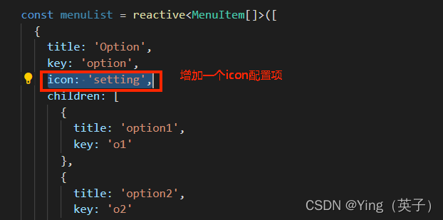
const menuList = reactive<MenuItem[]>([
{
title: 'Option',
key: 'option',
icon: '<SettingOutlined />',
children: [
{
title: 'option1',
key: 'o1'
},
{
title: 'option2',
key: 'o2'
}
]
},
{
title: 'User',
key: 'user',
children: [
{
title: 'user1',
key: 'user1'
},
{
title: 'user2',
key: 'user1',
children: [
{
title: 'user3',
key: 'user3'
}
]
}
]
},
{
title: 'Team',
key: 'team'
}
]);
const openKeys = ref<string[]>(['option', 'user']);
const selectedKeys = ref<string[]>(['option']);
const title = ref<string>('');
const menuItemClick = (item: MenuItem) => {
title.value = item.title;
};
</script>
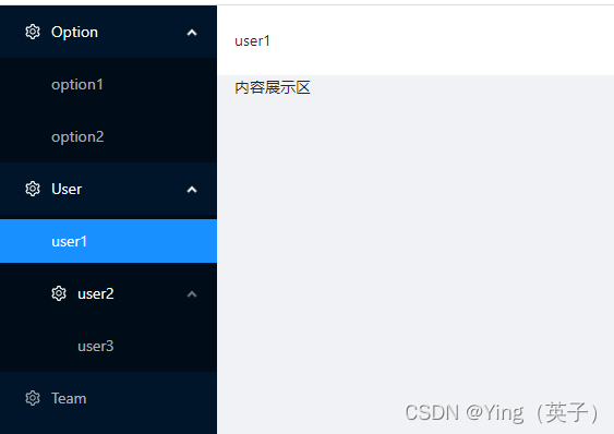
4、效果展示
5、不足之处
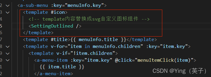
从最终的效果展示可以看到,一个可自定义菜单层级的通用组件功能是实现了,但是也可以从实现的代码中看到,每个菜单前的小图标还是固定的,这是因为使用了antd组件库自带的图标,不太好通过动态传参配置实现,要想实现小图标也可以配置化然后动态渲染,可以引入外部iconFont图标实现,大致实现如下:
1)引入iconFont图标,步骤可参看:Ant Design Vue 引入外部IconFont图标,本文不做细述;
2)分别替换sidBar.vue和SubItem.vue中使用了图标的地方,如下:

3)使用的时候可增加一个配置项icon,表示对应的icon类型名称。