文章底部有个人公众号:热爱技术的小郑。主要分享开发知识、学习资料、毕业设计指导等。个人B站主页热爱技术的小郑 ,视频内容主要是对应文章的视频讲解形式。有兴趣的可以关注一下。为何分享? 踩过的坑没必要让别人在再踩,自己复盘也能加深记忆。利己利人、所谓双赢。
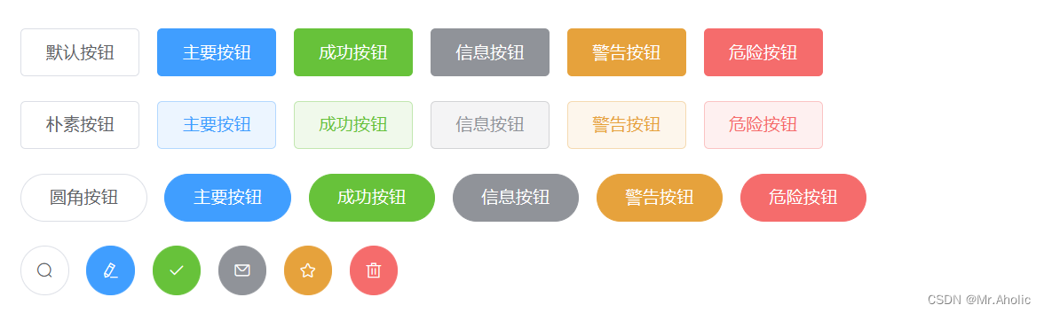
1、基础用法
基础的按钮用法
定义 Button 的样式。type 、plain 、round 、circle
按钮直接拿入到项目中就可以使用,可以根据提供的样式,切换按钮样式。如果不符合需求,可以深层次改变按钮的样式。
按钮添加标签样式: icon=“el-icon-delete”
按钮边框样式: circle 、round
<el-row>
  <el-button>默认按钮</el-button>
  <el-button type="primary">主要按钮</el-button>
  <el-button type="success">成功按钮</el-button>
  <el-button type="info">信息按钮</el-button>
  <el-button type="warning">警告按钮</el-button>
  <el-button type="danger">危险按钮</el-button>
</el-row>

<el-row>
  <el-button plain>朴素按钮</el-button>
  <el-button type="primary" plain>主要按钮</el-button>
  <el-button type="success" plain>成功按钮</el-button>
  <el-button type="info" plain>信息按钮</el-button>
  <el-button type="warning" plain>警告按钮</el-button>
  <el-button type="danger" plain>危险按钮</el-button>
</el-row>

<el-row>
  <el-button round>圆角按钮</el-button>
  <el-button type="primary" round>主要按钮</el-button>
  <el-button type="success" round>成功按钮</el-button>
  <el-button type="info" round>信息按钮</el-button>
  <el-button type="warning" round>警告按钮</el-button>
  <el-button type="danger" round>危险按钮</el-button>
</el-row>

<el-row>
  <el-button icon="el-icon-search" circle></el-button>
  <el-button type="primary" icon="el-icon-edit" circle></el-button>
  <el-button type="success" icon="el-icon-check" circle></el-button>
  <el-button type="info" icon="el-icon-message" circle></el-button>
  <el-button type="warning" icon="el-icon-star-off" circle></el-button>
  <el-button type="danger" icon="el-icon-delete" circle></el-button>
</el-row>
2、禁用状态
按钮不可用状态
可以使用 disabled 属性来定义按钮是否可用,它接受一个值。
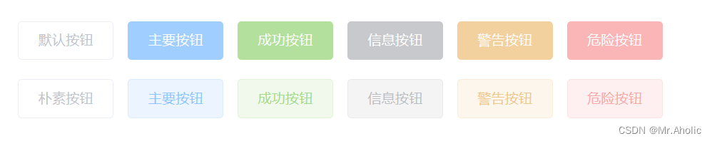
<el-row>
  <el-button disabled>默认按钮</el-button>
  <el-button type="primary" disabled>主要按钮</el-button>
  <el-button type="success" disabled>成功按钮</el-button>
  <el-button type="info" disabled>信息按钮</el-button>
  <el-button type="warning" disabled>警告按钮</el-button>
  <el-button type="danger" disabled>危险按钮</el-button>
</el-row>

<el-row>
  <el-button plain disabled>朴素按钮</el-button>
  <el-button type="primary" plain disabled>主要按钮</el-button>
  <el-button type="success" plain disabled>成功按钮</el-button>
  <el-button type="info" plain disabled>信息按钮</el-button>
  <el-button type="warning" plain disabled>警告按钮</el-button>
  <el-button type="danger" plain disabled>危险按钮</el-button>
</el-row>
3、文字按钮
没有边框和背景色的按钮
将按钮的 type赋值为 text ;不想要按钮,也不想要超链接,就可以用这个没有边框的按钮。通过点击这个文字触发某个方法等。
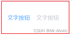
<el-button type="text">文字按钮</el-button>
<el-button type="text" disabled>文字按钮</el-button>
4、图标按钮
带图标的按钮可增强辨识度(有文字)或节省空间(无文字)
设置属性即可,icon 的列表可以参考 Element 的 icon 组件,也可以设置在文字右边的 icon ,只要使用标签即可,可以使用自定义图标。i、coni
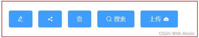
<el-button type="primary" icon="el-icon-edit"></el-button>
<el-button type="primary" icon="el-icon-share"></el-button>
<el-button type="primary" icon="el-icon-delete"></el-button>
<el-button type="primary" icon="el-icon-search">搜索</el-button>
<el-button type="primary">上传<i class="el-icon-upload el-icon--right"></i></el-button>
5、按钮组
以按钮组的方式出现,常用于多项类似操作
使用标签来嵌套你的按钮。<el-button-group>
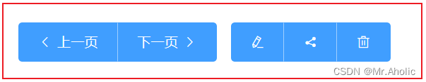
<el-button-group>
  <el-button type="primary" icon="el-icon-arrow-left">上一页</el-button>
  <el-button type="primary">下一页<i class="el-icon-arrow-right el-icon--right"></i></el-button>
</el-button-group>
<el-button-group>
  <el-button type="primary" icon="el-icon-edit"></el-button>
  <el-button type="primary" icon="el-icon-share"></el-button>
  <el-button type="primary" icon="el-icon-delete"></el-button>
</el-button-group>
6、加载中
点击按钮后进行数据加载操作,在按钮上显示加载状态
要设置为 load 状态,只要设置属性为即可。loading、true
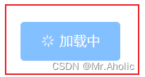
<el-button type="primary" :loading="true">加载中</el-button>
7、不同尺寸
Button 组件提供除了默认值以外的三种尺寸,可以在不同场景下选择合适的按钮尺寸。
额外的尺寸:通过设置size属性来配置它们。medium、small、mini
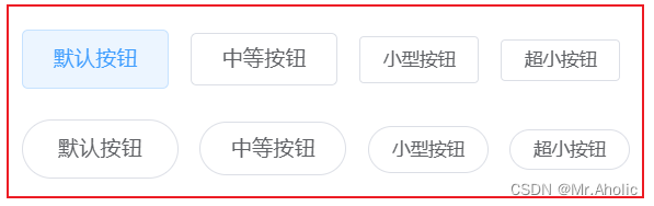
<el-row>
  <el-button>默认按钮</el-button>
  <el-button size="medium">中等按钮</el-button>
  <el-button size="small">小型按钮</el-button>
  <el-button size="mini">超小按钮</el-button>
</el-row>
<el-row>
  <el-button round>默认按钮</el-button>
  <el-button size="medium" round>中等按钮</el-button>
  <el-button size="small" round>小型按钮</el-button>
  <el-button size="mini" round>超小按钮</el-button>
</el-row>
8、属性说明
| 参数 | 说明 | 类型 | 可选值 | 默认值 |
|---|---|---|---|---|
| size | 尺寸 | string | medium / small / mini | - |
| type | 类型 | string | primary / success / warning / danger / info / text | - |
| plain | 是否朴素按钮 | boolean | - | false |
| round | 是否圆角按钮 | boolean | - | false |
| circle | 是否圆形按钮 | boolean | - | false |
| loading | 是否加载中状态 | boolean | - | false |
| disabled | 是否禁用状态 | boolean | - | false |
| icon | 图标类名 | string | - | - |
| autofocus | 是否默认聚焦 | boolean | - | false |
| native-type | 原生 type 属性 | string | button / submit / reset | button |
9、实际应用
按钮中也可以绑定方法、执行某些操作
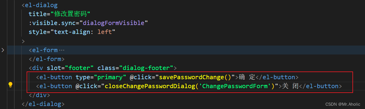
实际效果