写过很多页面,可是在实际中用到文字特效的地方还是很少,最多的就是给文字添加text-shadow阴影效果。
今天在浏览网页的时候发现了一组文字特效,虽然很简单但是你让我来写我肯定是写不出来,所以研究了一会,写了几个小样式。
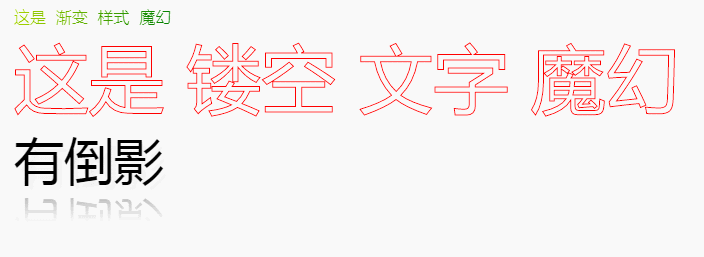
一、文字渐变
主要样式有
linear-gradient(文字渐变方向,指定颜色,渐变颜色 渐变起始位置)
text-fill-color(指定文字的填充颜色) PS:如果和color一起用将会覆盖color的颜色
<style>
@-webkit-keyframes bgp {
0% { background-position: 0 0;}
100% { background-position: -100% 0;}
}
.text{
-webkit-mask-image: linear-gradient(to right, red, orange, yellow, green, cyan, blue, purple);
background-image: -webkit-linear-gradient(left, red, orange, yellow, green, yellow, orange, red, orange, yellow, green, yellow, orange, red);
background-image: -o-linear-gradient(left, red, orange, yellow, green, yellow, orange, red, orange, yellow, green, yellow, orange, red);
background-image: linear-gradient(to right, red, orange, yellow, green, yellow, orange, red, orange, yellow, green, yellow, orange, red);
-webkit-background-clip: text;
-webkit-text-fill-color: transparent;
-webkit-background-size: 200% 100%;
animation: bgp 5s infinite linear;
}
</style>
二、镂空文字

<style>
.stroke{
-webkit-text-fill-color: transparent;
-webkit-text-stroke: 1px red;
font-size: 75px;
}
</style>
三、倒影文字
<style>
.reffect{
font-size: 50px;
text-shadow: 5px 5px 5px #eee;
-webkit-box-reflect:below 0 -webkit-linear-gradient(transparent,transparent 50%,rgba(255,255,255,.3));
}
</style>