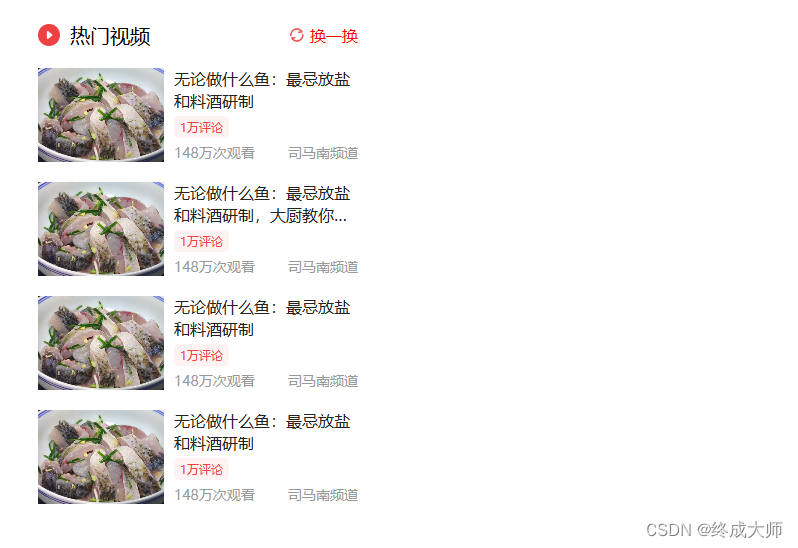
flex弹性布局-今日头条首页热门视频栏
代码实现
<!DOCTYPE html>
<html>
<head>
<meta charset="utf-8">
<title>flex弹性布局-今日头条首页热门视频栏</title>
<style type="text/css">
body {
margin: 0;
padding: 0;
}
a{
text-decoration: none;
}
.show-monitor {
width: 320px;
height: 600px;
margin: 50px 0px 0px 50px;
}
.panel-head {
display: flex;
align-items: center;
}
.panel-head span.panel-head-title {
flex-grow: 1;
font-size: 20px;
margin-left: 10px;
}
.panel-head .panel-head-sx {
font-size: 16px;
color: red;
margin-left: 5px;
}
.panel-con {
height: 94px;
margin-top: 20px;
display: flex;
}
.panel-con .panel-con-img {
width: 126px;
margin-right: 10px;
flex-shrink: 0;
}
.panel-con .panel-con-img img {
width: 100%;
height: 100%;
object-fit: cover;
}
.panel-con .panel-con-txt {
flex-grow: 1;
display: flex;
flex-direction: column;
text-overflow: ellipsis;
}
.panel-con .panel-con-txt a{
font-size: 16px;
color: #222;
max-height: 44px;
overflow: hidden;
line-height: 22px;
display: -webkit-box;
-webkit-box-orient: vertical;
-webkit-line-clamp: 2;
text-overflow: ellipsis;
}
.panel-con .panel-con-txt span.like{
font-size: 12px;
background-color: #fff2f2;
color: #f04142;
align-self: flex-start;
padding: 3px 6px;
border-radius: 5px;
margin-top: 5px;
}
.panel-con .panel-con-txt .desc{
font-size: 14px;
color: #999;
display: flex;
justify-content: space-between;
margin-top: 5px;
}
</style>
</head>
<body>
<div class="show-monitor">
<div class="panel-head">
<img src="images/icon-play.png" alt="" width="22">
<span class="panel-head-title">热门视频</span>
<img src="images/icon-sx2.png" alt="" width="16">
<span class="panel-head-sx">换一换</span>
</div>
<div class="panel-con">
<div class="panel-con-img">
<a href=""><img src="images/toutiao-01.jpeg" alt=""></a>
</div>
<div class="panel-con-txt">
<a href="">司马南:中国与俄罗斯的战线</a>
<span class="like">1万评论</span>
<div class="desc">
<span>148万次观看</span>
<span>司马南频道</span>
</div>
</div>
</div>
<div class="panel-con">
<div class="panel-con-img">
<a href=""><img src="images/toutiao-02.jpeg" alt=""></a>
</div>
<div class="panel-con-txt">
<a href="">无论做什么鱼:最忌放盐和料酒研制,大厨教你绝招.</a>
<span class="like">1万评论</span>
<div class="desc">
<span>148万次观看</span>
<span>司马南频道</span>
</div>
</div>
</div>
<div class="panel-con">
<div class="panel-con-img">
<a href=""><img src="images/toutiao-03.jpeg" alt=""></a>
</div>
<div class="panel-con-txt">
<a href="">司马南:中国与俄罗斯的战线</a>
<span class="like">1万评论</span>
<div class="desc">
<span>148万次观看</span>
<span>司马南频道</span>
</div>
</div>
</div>
<div class="panel-con">
<div class="panel-con-img">
<a href=""><img src="images/toutiao-04.jpeg" alt=""></a>
</div>
<div class="panel-con-txt">
<a href="">司马南:中国与俄罗斯的战线</a>
<span class="like">1万评论</span>
<div class="desc">
<span>148万次观看</span>
<span>司马南频道</span>
</div>
</div>
</div>
</div>
</body>
</html>
效果
flex弹性布局-微博热搜榜单
代码实现
<!DOCTYPE html>
<html>
<head>
<meta charset="utf-8">
<title>flex弹性布局-微博热搜榜单</title>
<style type="text/css">
body{
margin: 0;
padding: 0;
background-color: #f5f5f5;
}
a{
text-decoration: none;
}
.wbpro-side{
width: 240px;
background-color: #fff;
margin:50px 0 0 50px;
padding: 10px 15px;
}
.wbpro-side .wbpro-side-head{
height: 40px;
display: flex;
align-items: center;
border-bottom: 1px solid #f9f9f9;
cursor: pointer;
}
.wbpro-side .wbpro-side-head span.title{
flex-grow: 1;
font-size: 14px;
}
.wbpro-side .wbpro-side-head span.sx{
font-size: 12px;
color: #939393;
margin-left: 5px;
}
.wbpro-side .wbpro-side-panel{
height: 40px;
border-bottom: 1px solid #f9f9f9;
font-size: 12px;
display: flex;
}
.wbpro-side .wbpro-side-panel a{
display: flex;
align-items: center;
width: 100%;
}
.wbpro-side-panel a span.title{
flex-grow: 1;
color: #333;
white-space: nowrap;
overflow: hidden;
text-overflow: ellipsis;
}
.wbpro-side-panel a span.icon{
font-size: 16px;
font-weight: bold;
color: #ff9406;
margin-right: 10px;
}
.wbpro-side-panel .num{
color: #939393;
flex-shrink: 0;
}
.wbpro-side-panel .mark{
color: #fff;
padding: 2px 4px;
border-radius: 5px;
margin-left: 5px;
}
.wbpro-side-panel:nth-child(-n+5) a span.icon{
color: red;
}
.bg1{
background-color: #ff9406;
}
.bg2{
background-color: pink;
}
.bg3{
background-color: skyblue;
}
</style>
</head>
<body>
<div class="wbpro-side">
<div class="wbpro-side-head">
<span class="title">微博热搜</span>
<img src="images/icon-sx.png" alt="">
<span class="sx">点击刷新</span>
</div>
<div class="wbpro-side-panel">
<a href="">
<span class="icon">
<img src="images/icon_top.png" alt="">
</span>
<span class="title">新的赶考之路考卷常出常新新的赶考之路考卷常出常新新的赶考之路考卷常出常新</span>
<span class="num">246万</span>
<span class="mark bg1">新</span>
</a>
</div>
<div class="wbpro-side-panel">
<a href="">
<span class="icon">2</span>
<span class="title">新的赶考之路考卷常出常新</span>
<span class="num">246万</span>
<span class="mark bg3">新</span>
</a>
</div>
<div class="wbpro-side-panel">
<a href="">
<span class="icon">3</span>
<span class="title">新的赶考之路考卷常出常新</span>
<span class="num">246万</span>
<span class="mark bg2">新</span>
</a>
</div>
<div class="wbpro-side-panel">
<a href="">
<span class="icon">4</span>
<span class="title">新的赶考之路考卷常出常新</span>
<span class="num">246万</span>
<span class="mark bg3">新</span>
</a>
</div>
<div class="wbpro-side-panel">
<a href="">
<span class="icon">5</span>
<span class="title">新的赶考之路考卷常出常新</span>
<span class="num">246万</span>
<span class="mark bg1">新</span>
</a>
</div>
<div class="wbpro-side-panel">
<a href="">
<span class="icon">6</span>
<span class="title">新的赶考之路考卷常出常新</span>
<span class="num">246万</span>
<span class="mark bg3">新</span>
</a>
</div>
<div class="wbpro-side-panel">
<a href="">
<span class="icon">7</span>
<span class="title">新的赶考之路考卷常出常新</span>
<span class="num">246万</span>
<span class="mark bg2">新</span>
</a>
</div>
<div class="wbpro-side-panel">
<a href="">
<span class="icon">8</span>
<span class="title">新的赶考之路考卷常出常新</span>
<span class="num">246万</span>
<span class="mark bg3">新</span>
</a>
</div>
<div class="wbpro-side-panel">
<a href="">
<span class="icon">9</span>
<span class="title">新的赶考之路考卷常出常新</span>
<span class="num">246万</span>
<span class="mark bg1">新</span>
</a>
</div>
</div>
</body>
</html>
效果

grid网格布局-360图片展示
代码实现
<!DOCTYPE html>
<html>
<head>
<meta charset="utf-8">
<title>grid网格布局-360图片展示</title>
<style type="text/css">
body{
margin: 0;
padding: 0;
}
.container{
width: 100%;
margin-top: 100px;
display: grid;
grid-template-rows: 207px 155px 259px;
grid-template-columns: 420px 365px 299px 118px 296px;
justify-content: center;
grid-template-areas: 'a b d d f'
'a b e h h'
'a c e h h';
gap: 3px 3px;
}
.item:nth-child(1){
grid-area: a;
}
.item:nth-child(2){
grid-area: b;
}
.item:nth-child(3){
grid-area: c;
}
.item:nth-child(4){
grid-area: d;
}
.item:nth-child(5){
grid-area: e;
}
.item:nth-child(6){
grid-area: f;
background-color: pink;
}
.item:nth-child(7){
grid-area: h;
}
</style>
</head>
<body>
<div class="container">
<div class="item"><img src="images/grid-01.jpg" alt=""></div>
<div class="item"><img src="images/grid-02.jpg" alt=""></div>
<div class="item"><img src="images/grid-03.jpg" alt=""></div>
<div class="item"><img src="images/grid-04.jpg" alt=""></div>
<div class="item"><img src="images/grid-05.jpg" alt=""></div>
<div class="item"></div>
<div class="item "><img src="images/grid-06.jpg" alt=""></div>
</div>
</body>
</html>
效果

综合实例-小米商城左侧二级菜单
代码实现
<!DOCTYPE html>
<html>
<head>
<meta charset="utf-8">
<title>小米商城左侧二级菜单</title>
<style type="text/css">
body {
margin: 0;
padding: 0;
background-image: linear-gradient(to right, skyblue, #fff);
}
a {
text-decoration: none;
}
.menu {
width: 230px;
height: 420px;
padding: 20px 0;
background-color: rgba(0, 0, 0, 0.5);
margin: 50px 0 0 50px;
position: relative;
}
.menu .item {
height: 42px;
color: #fff;
font-size: 14px;
line-height: 42px;
padding-left: 30px;
background: url('images/right-jiantou.png') no-repeat 200px 10px;
cursor: pointer;
}
.menu .item:hover {
background-color: #ff6700;
background-image: url('images/right-jiantou2.png');
}
.menu .item .nav {
min-width: 250px;
height: 460px;
background-color: #fff;
border: 1px solid #666;
position: absolute;
top: 0;
left: 100%;
box-sizing: border-box;
display: grid;
grid-template-rows: repeat(6, 1fr);
grid-template-columns: 250px;
grid-auto-flow: column;
grid-auto-columns: 250px;
padding: 20px;
display: none;
}
.item .nav a {
color: #000;
display: flex;
align-items: center;
}
.item .nav a img {
margin-right: 10px;
}
.item .nav a:hover {
color: #ff6700;
}
.item:hover .nav {
display: grid;
}
</style>
</head>
<body>
<div class="menu">
<div class="item">手机
<div class="nav">
<a href=""><img src="images/grid-mi-01.webp" alt="" width="40">黑鲨5 Pro</a>
<a href=""><img src="images/grid-mi-02.webp" alt="" width="40">黑鲨5</a>
<a href=""><img src="images/grid-mi-03.webp" alt="" width="40">Redmi 10A</a>
<a href=""><img src="images/grid-mi-04.webp" alt="" width="40">Redmi K50 Pro</a>
<a href=""><img src="images/grid-mi-05.webp" alt="" width="40">Redmi K40S</a>
<a href=""><img src="images/grid-mi-06.webp" alt="" width="40">黑鲨5 Pro</a>
<a href=""><img src="images/grid-mi-07.webp" alt="" width="40">黑鲨5</a>
<a href=""><img src="images/grid-mi-08.webp" alt="" width="40">Redmi 10A</a>
<a href=""><img src="images/grid-mi-09.webp" alt="" width="40">Redmi K50 Pro</a>
<a href=""><img src="images/grid-mi-05.webp" alt="" width="40">Redmi K40S</a>
</div>
</div>
<div class="item">电视
<div class="nav">
<a href=""><img src="images/grid-mi-01.webp" alt="" width="40">黑鲨5 Pro</a>
<a href=""><img src="images/grid-mi-02.webp" alt="" width="40">黑鲨5</a>
<a href=""><img src="images/grid-mi-03.webp" alt="" width="40">Redmi 10A</a>
<a href=""><img src="images/grid-mi-04.webp" alt="" width="40">Redmi K50 Pro</a>
<a href=""><img src="images/grid-mi-05.webp" alt="" width="40">Redmi K40S</a>
<a href=""><img src="images/grid-mi-06.webp" alt="" width="40">黑鲨5 Pro</a>
<a href=""><img src="images/grid-mi-07.webp" alt="" width="40">黑鲨5</a>
<a href=""><img src="images/grid-mi-08.webp" alt="" width="40">Redmi 10A</a>
<a href=""><img src="images/grid-mi-09.webp" alt="" width="40">Redmi K50 Pro</a>
<a href=""><img src="images/grid-mi-05.webp" alt="" width="40">Redmi K40S</a>
<a href=""><img src="images/grid-mi-09.webp" alt="" width="40">Redmi K50 Pro</a>
<a href=""><img src="images/grid-mi-05.webp" alt="" width="40">Redmi K40S</a>
</div>
</div>
<div class="item">笔记本 平板
<div class="nav">
<a href=""><img src="images/grid-mi-01.webp" alt="" width="40">黑鲨5 Pro</a>
<a href=""><img src="images/grid-mi-02.webp" alt="" width="40">黑鲨5</a>
<a href=""><img src="images/grid-mi-03.webp" alt="" width="40">Redmi 10A</a>
<a href=""><img src="images/grid-mi-04.webp" alt="" width="40">Redmi K50 Pro</a>
<a href=""><img src="images/grid-mi-05.webp" alt="" width="40">Redmi K40S</a>
<a href=""><img src="images/grid-mi-07.webp" alt="" width="40">黑鲨5</a>
<a href=""><img src="images/grid-mi-08.webp" alt="" width="40">Redmi 10A</a>
<a href=""><img src="images/grid-mi-09.webp" alt="" width="40">Redmi K50 Pro</a>
<a href=""><img src="images/grid-mi-05.webp" alt="" width="40">Redmi K40S</a>
<a href=""><img src="images/grid-mi-01.webp" alt="" width="40">黑鲨5 Pro</a>
<a href=""><img src="images/grid-mi-02.webp" alt="" width="40">黑鲨5</a>
<a href=""><img src="images/grid-mi-03.webp" alt="" width="40">Redmi 10A</a>
<a href=""><img src="images/grid-mi-04.webp" alt="" width="40">Redmi K50 Pro</a>
<a href=""><img src="images/grid-mi-05.webp" alt="" width="40">Redmi K40S</a>
<a href=""><img src="images/grid-mi-06.webp" alt="" width="40">黑鲨5 Pro</a>
<a href=""><img src="images/grid-mi-07.webp" alt="" width="40">黑鲨5</a>
<a href=""><img src="images/grid-mi-08.webp" alt="" width="40">Redmi 10A</a>
<a href=""><img src="images/grid-mi-09.webp" alt="" width="40">Redmi K50 Pro</a>
<a href=""><img src="images/grid-mi-05.webp" alt="" width="40">Redmi K40S</a>
</div>
</div>
<div class="item">家电</div>
<div class="item">出行 穿戴</div>
<div class="item">智能 路由器</div>
<div class="item">电源 配件</div>
<div class="item">健康 儿童</div>
<div class="item">耳机 音箱</div>
<div class="item">生活 箱包</div>
</div>
</body>
</html>
效果

资源包
相关代码及其图片素材,持续更新中。。。