table
实现盒子3等分
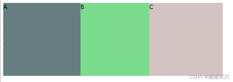
 <style >
    .father{


        width: 600px;
        height: 200px;

        /* display: table-row;不行,是行内元素了 */
        display: table;
        background-color: #db7b7b;
    }
    .inner{


        display: table-cell;
    }
  </style>
<body>
    <div class="father">
        <div class="inner" style="background-color: #677e80;"> A </div>
        <div class="inner" style="background-color: #7bdb8d;"> B </div>
        <div class="inner" style="background-color: #d3c3c3;"> C </div>
    </div>

</body>
实现盒子2等分
同上
三栏布局,中间自适应
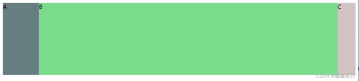
<style >
    .father{


        width: 100%;
        height: 200px;

        /* display: table-row;不行,是行内元素了 */
        display: table;
        background-color: #db7b7b;
    }
    .inner{


        display: table-cell;
    }
    .inner1{


        width: 100px;
    }
    .inner2{


    }
    .inner3{


        width: 50px;
    }
  </style>
<body>
    <div class="father">
        <div class="inner inner1" style="background-color: #677e80;"> A </div>
        <div class="inner"        style="background-color: #7bdb8d;"> B </div>
        <div class="inner inner3" style="background-color: #d3c3c3;"> C </div>
    </div>

</body>
两栏布局,右侧自适应
同上
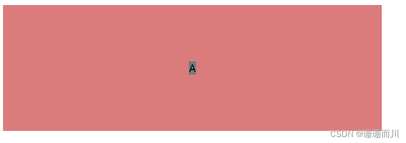
水平垂直居中
<style >
    .father{


        width: 600px;
        height: 200px;

        display: table-cell;
        text-align: center;
        vertical-align: middle;

        background-color: #db7b7b;
    }
    .son{


        display: inline-block;
    }

  </style>
<body>
    <div class="father">
        <div class="son" style="background-color: #677e80;"> A </div>

    </div>

</body>
grid
http://t.csdn.cn/PF8mC
详细介绍:http://t.csdn.cn/rSSqq
实现盒子3等分
 <style >
    .father{


        width: 600px;
        height: 200px;

        display: grid;

        /* 这三个都行 */
        /* grid-template-columns:  repeat(3,33.3%)  ; */
        grid-template-columns: repeat(3,200px);
        /* grid-template-columns: 1fr 1fr 1fr; */

        background-color: #db7b7b;
    }


  </style>
<body>
    <div class="father">
        <div class="inner inner1" style="background-color: #677e80;"> A </div>
        <div class="inner inner2" style="background-color: #7bdb8d;"> B </div>
        <div class="inner inner2" style="background-color: #dbc07b;"> C </div>
    </div>

</body>
实现盒子2等分
同上
三栏布局,中间自适应
 <style >
    .father{


        width: 600px;
        height: 200px;

        display: grid;

        grid-template-columns: 100px auto 50px;

        background-color: #db7b7b;
    }


  </style>
<body>
    <div class="father">
        <div class="inner inner1" style="background-color: #677e80;"> A </div>
        <div class="inner inner2" style="background-color: #7bdb8d;"> B </div>
        <div class="inner inner2" style="background-color: #dbc07b;"> C </div>
    </div>

</body>
两栏布局,右侧自适应
同上
水平垂直居中
<style >
    .father{


        width: 600px;
        height: 200px;

        display: grid;
        place-items: center;

        background-color: #db7b7b;
    }


  </style>
<body>
    <div class="father">
        <div class="son" style="background-color: #677e80;"> A </div>

    </div>

</body>