一、延迟列表 LazyColumn、LazyRow
可滚动,类似RecyclerView( Column、Row 用 Modifier 设置滚动是相当于ScrollView)。
@Composable
fun Demo(dataList: List<String>) {
    val state = rememberLazyListState()
    LazyColumn(
        modifier = Modifier.height(100.dp),
        state = state,  //管理列表的状态,可通过这个操作列表滚动
        contentPadding = PaddingValues(horizontal = 5.dp),    //内容内边距
        reverseLayout = false,  //是否反转显示
        verticalArrangement = Arrangement.Top,    //排列方式,使用Arrangement.spacedBy(4.dp)就是设置间距
        horizontalAlignment = Alignment.Start,    //对齐方式
        flingBehavior = ScrollableDefaults.flingBehavior(),
        userScrollEnabled = true,   //是否允许滑动
    ) { }
}
1.1 条目 item()、items()
LazyListScope DSL 提供多种函数来描述列表中的条目,item() 添加单个条目,items() 添加多个条目。
fun Demo(dataList: List<String>) {
    LazyColumn {
        //添加单个条目
        item { Text(text = "单个条目") }
        //添加多个条目
        items(5) {index -> Text(text = "条目索引:$index") }
        //根据数据源创建
        items(
            items = dataList,    //可传入、数组、集合、Paging的LazyPagingItems
            key = { element ->
                element.id    //key设为element的唯一值
            }
        ) { item ->
            //对条目布局使用该修饰符来对列表的更改添加动画效果
            Row(Modifier.animateItemPlacement()) {}
        }
        //带索引
        itemsIndexed(dataList) { index: Int, item: String ->
            Text(text = "$index:$item", modifier = Modifier.padding(1.dp).background(Color.Red))
        }
    }
}
1.2 内容内边距 contentPadding
围绕内容边缘添加内边距,是添加在内容上的而不是列表本身,vertical边距添加到首尾条目上,horizontal边距添加到所有条目的左右。
LazyColumn(
    contentPadding = PaddingValues(horizontal = 16.dp, vertical = 8.dp)
) { }
1.3 内容间距 verticalArrangement
LazyColumn(
    //使用Arrangement.Top就是排列方式
    verticalArrangement = Arrangement.spacedBy(4.dp)
) { }
1.4 key 提升重组性能
不像 RecyclerView 在修改了数据源后会手动通过 Adapter 告知数据变化(位移、新增、移除、内容),声明式的列表组合项只传递数据源集合会无脑整个刷新,条目全部重组。 key设置为元素的唯一值(如id),使得列表能感知元素位置是否发生变化或新增移除,对于内容是否改变列表能自动通过元素对象自身的equals来感知。这样当数据源发生变化时列表可以高效重组,只需要处理那些发生过变化的条目对应的组合项即可,而不是全部更新。
items(
    items = dataList,
    key = { it.id }    //it是dataBean
) { }
1.5 contentType 提升重组性能
v1.2版本开始,当列表由多种不同类型的条目组成时,可以为条目指定类型来确保 Compose 不会尝试在属于B类型的组合项上组合A类型的条目。
LazyColumn {
    items(elements, contentType = { it.type }) {...}
}
1.6 条目动画
对条目布局使用修饰符来对列表的更改添加动画效果。
items(dataList, key = { it.id }) {
    Row(Modifier.animateItemPlacement()) { }
}
1.7 列表状态 rememberLazyListState()
1.7.1 滚动位置简单监听
通常只需要监听第一个可见条目的信息,LazyListState 提供了 firstVisibleItemIndex(第一个可见条目的索引)和 firstVisibleItemScrollOffset(第一个可见条目偏移量)属性。
@Composable
fun MessageList(messages: List<Message>) {
    Box {
        val listState = rememberLazyListState()
        LazyColumn(state = listState) {
            //...
        }
        val showButton by remember {
            derivedStateOf { listState.firstVisibleItemIndex > 0 }
        }
        AnimatedVisibility(visible = showButton) {
            ScrollToTopButton()
        }
    }
}
1.7.2 滚动位置复杂监听
当您需要更新其他界面可组合项时,在组合中直接读取状态非常有效,但在某些情况下,系统无需在同一组合中处理此事件。一个常见的例子是,系统会在用户滚动经过某个点后发送分析事件。为了高效地解决此问题,我们可以使用 snapshotFlow():
val listState = rememberLazyListState()

LazyColumn(state = listState) {
    // ...
}

LaunchedEffect(listState) {
    snapshotFlow { listState.firstVisibleItemIndex }
        .map { index -> index > 0 }
        .distinctUntilChanged()
        .filter { it == true }
        .collect {
            MyAnalyticsService.sendScrolledPastFirstItemEvent()
        }
}
1.7.3 控制滚动位置
LazyListState 通过 scrollToItem() 立即滚动和 animateScrollToItem() 使用动画滚动(平滑滚动)。
@Composable
fun MessageList(messages: List<Message>) {
    val listState = rememberLazyListState()
    val coroutineScope = rememberCoroutineScope()
    LazyColumn(state = listState) {
        // ...
    }
    ScrollToTopButton(
        onClick = {
            coroutineScope.launch {
                listState.animateScrollToItem(index = 0)
            }
        }
    )
}
1.8 粘性标题 stickyHeader()
不会跟随滚动,背景默认透明滑动后会穿透显示.
1.8.1 单个粘性标题

@Composable
fun Dode() {
    LazyColumn(Modifier.height(100.dp)) {
        stickyHeader {
            Text(text = "头部", modifier = Modifier.background(Color.Gray))
        }
        items(10) { Text(text = "条目索引:$it") }
    }
}
1.8.2 多个粘性标题
@Composable
fun ContactsList(grouped: Map<Char, List<Contact>>) {
    LazyColumn {
        grouped.forEach { (lastName, contactsForLastName) ->
            stickyHeader {
                CharacterHeader(lastName)
            }
            items(contactsForLastName) { contact ->
                ContactListItem(contact)
            }
        }
    }
}
1.9 大型数据集(分页)
Paging 3.0 及更高版本通过
androidx.paging:paging-compose库提供 Compose 支持。
1.10 滑动嵌套
应避免内部嵌套一个没有固定大小的同向可滚动子组合项,会抛出 IllegalStateException。可封装在同一个 LazyColumn 中,使用 LazyListScope DSL 传入不同类型的内容,得到相同的效果。
// Throws IllegalStateException
Column(modifier = Modifier.verticalScroll(state)) {
    LazyColumn {...}
}
LazyColumn {
item { Header() }
items(data) { item ->
Item(item)
}
item { Footer() }
}二、延迟表格 LazyVerticalGrid、LazyHorizontalGrid
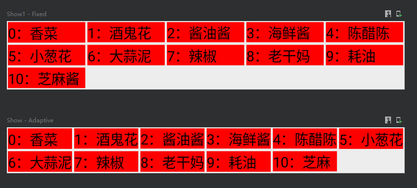
@Preview(showBackground = true, name = "Fixed")
@Composable
fun Show1() {
    Demo(GridCells.Fixed(5))
}

@Preview(showBackground = true, name = "Adaptive")
@Composable
fun Show() {
    Demo(GridCells.Adaptive(60.dp))
}

@Composable
fun Demo(style: GridCells) {
    val dataList = listOf("香菜", "酒鬼花生", "酱油酱油酱油", "海鲜酱海鲜酱", "陈醋陈醋", "小葱花", "大蒜泥", "辣椒", "老干妈", "耗油", "芝麻酱")
    val lazyGridState = rememberLazyGridState()
    LazyVerticalGrid(
        columns = style,    //描述单元格展现形式:fixed设置固定尺寸、Adaptive设置最小尺寸后内容自适应网格大小
        modifier = Modifier.fillMaxWidth(),
        state = lazyGridState,
        contentPadding = PaddingValues(0.dp),   //边距
        reverseLayout = false,  //是否反转显示
        verticalArrangement = Arrangement.Top,
        horizontalArrangement = Arrangement.Start,
        flingBehavior = ScrollableDefaults.flingBehavior(),
        userScrollEnabled = true    //是否允许滑动
    ){
        itemsIndexed(dataList){index: Int, item: String ->
            Text(text = "${index}:$item", maxLines = 1, modifier = Modifier
                .padding(1.dp)
                .background(Color.Red))
        }
    }
}
三、 LazyVerticalStaggeredGrid、LazyHorizontalStaggeredGrid
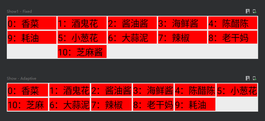
@Preview(showBackground = true, name = "Fixed")
@Composable
fun Show1() {
    Demo(StaggeredGridCells.Fixed(5))
}

@Preview(showBackground = true, name = "Adaptive")
@Composable
fun Show() {
    Demo(StaggeredGridCells.Adaptive(60.dp))
}

@Composable
fun Demo(style: StaggeredGridCells) {
    val dataList = listOf("香菜", "酒鬼花生", "酱油酱油酱油", "海鲜酱海鲜酱", "陈醋陈醋", "小葱花", "大蒜泥", "辣椒", "老干妈", "耗油", "芝麻酱")
    val state = rememberLazyStaggeredGridState()
    LazyVerticalStaggeredGrid(
        columns = style,//描述单元格展现形式:fixed设置固定尺寸、Adaptive设置最小尺寸后内容自适应网格大小
        modifier = Modifier.fillMaxWidth(),
        state = state,
        contentPadding = PaddingValues(0.dp),   //边距
        reverseLayout = false,  //是否反转显示
        verticalItemSpacing = 0.dp, //行间距
        horizontalArrangement = Arrangement.Start,
        flingBehavior = ScrollableDefaults.flingBehavior(),
        userScrollEnabled = true    //是否允许滑动
    ) {
        itemsIndexed(dataList){index: Int, item: String ->
            Text(text = "${index}:$item", maxLines = 1, modifier = Modifier
                .padding(1.dp)
                .background(Color.Red))
        }
    }
}
四、弹窗 Dialog

var showDialog by remember { mutableStateOf(false) }
Column {
    Button(onClick = { showDialog = !showDialog }) {
        Text(text = "点击弹窗")
    }
    if (showDialog) {
        Dialog(
            onDismissRequest = { showDialog = false }, //消失回调
            properties = DialogProperties(
                dismissOnBackPress = true,  //消失响应返回键
                dismissOnClickOutside = true,   //消失响应外围点击
                securePolicy = SecureFlagPolicy.Inherit,    //是否可以被截屏(Inherit跟随父元素、SecureOn禁止、SecureOff允许)
            )
        ) {
            Box(modifier = Modifier.size(100.dp).background(Color.Red))
        }
    }
}
五、对话框 AlertDialog
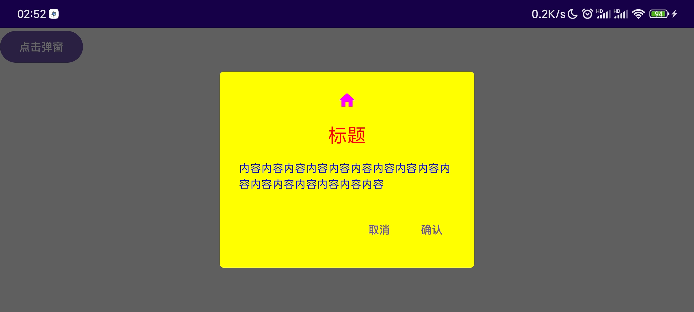
var showDialog by remember { mutableStateOf(false) }
Column {
    Button(onClick = { showDialog = !showDialog }) {
        Text(text = "点击弹窗")
    }
    if (showDialog) {
        AlertDialog(
            modifier = Modifier,
            //确认按钮
            confirmButton = { TextButton(onClick = { showDialog = false }) { Text(text = "确认") } },
            //取消按钮
            dismissButton = { TextButton(onClick = { showDialog = false }) { Text(text = "取消") } },
            //图标
            icon = { Icon(imageVector = Icons.Default.Home, contentDescription = null) },
            iconContentColor = Color.Magenta,
            //标题
            title = { Text(text = "标题") },
            titleContentColor = Color.Red,
            //内容
            text = { Text(text = "内容内容内容内容内容内容内容内容内容内容内容内容内容内容内容内容") },
            textContentColor = Color.Blue,
            //背景
            shape = RoundedCornerShape(5.dp),
            containerColor = Color.Yellow,
            tonalElevation = 10.dp,
            //配置
            properties = DialogProperties(
                dismissOnBackPress = true,  //消失响应返回键
                dismissOnClickOutside = true,   //消失响应外围点击
                securePolicy = SecureFlagPolicy.Inherit,//是否可以被截屏(Inherit跟随父元素、SecureOn禁止、SecureOff允许)
            ),
            //消失回调
            onDismissRequest = {
                showDialog = false
            }
        )
    }
}
六、滑动界面 HorizontalPager、VerticalPager
类似于 ViewPager,1.4 版本之前需要借助 accompanis 库,底层基于 LazyColumn、LazyRow 实现,在使用上也基本相同。
fun HorizontalPager(
    pageCount: Int,    //页面数量
    modifier: Modifier = Modifier,
    state: PagerState = rememberPagerState(),    //控制监听页面状态的对象
    contentPadding: PaddingValues = PaddingValues(0.dp),    //内容内边距
    pageSize: PageSize = PageSize.Fill,
    beyondBoundsPageCount: Int = 0,
    pageSpacing: Dp = 0.dp,
    verticalAlignment: Alignment.Vertical = Alignment.CenterVertically,
    flingBehavior: SnapFlingBehavior = PagerDefaults.flingBehavior(state = state),    //描述滑动行为的逻辑
    userScrollEnabled: Boolean = true,    //是否允许通过用户手势或辅助功能进行滚动
    reverseLayout: Boolean = false,    //反转页面顺序
    key: ((index: Int) -> Any)? = null,    //滚动的位置将根据键保持
    pageNestedScrollConnection: NestedScrollConnection = PagerDefaults.pageNestedScrollConnection(
        Orientation.Horizontal
    ),
    pageContent: @Composable (page: Int) -> Unit
)
6.1 简单使用
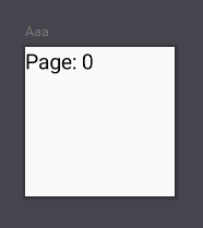
HorizontalPager(
    pageCount = 10,
    modifier = Modifier.size(100.dp)
) { page ->
    // 每一页的内容,比如显示个文本
    Text(
        text = "Page: $page",
        modifier = Modifier.fillMaxSize()
    )
}
6.2 添加指示器 Indicator
七、选项卡 TabRow

var selectedIndex by remember { mutableStateOf(0) }
TabRow(
    modifier = Modifier,
    selectedTabIndex = selectedIndex,    //选中的索引
    containerColor = Color.Green, //背景色
    contentColor = Color.Yellow, //内容色(子Tab设置未选中颜色会覆盖这个)
    indicator = {},  //设置指示器
    divider = {}    //设置分割线
) {
    //图片和文字是横向的
    LeadingIconTab(
        modifier = Modifier,
        selected = selectedIndex == 0,  //是否选中
        onClick = { selectedIndex = 0 },    //点击监听
        text = { Text(text = "选项0") },  //选项文字
        icon = { Icon( imageVector = Icons.Default.AccountBox, contentDescription = null ) },   //选项图片
        enabled = true, //是否启用
        selectedContentColor = Color.Red,    //选中颜色
        unselectedContentColor = Color.Blue, //未选中颜色
    )
    //图片和文字是纵向的
    Tab(
        modifier = Modifier,
        selected = selectedIndex == 1,  //是否选中
        onClick = { selectedIndex = 1 },    //点击监听
        text = { Text(text = "选项1") },    //选项文字
        icon = { Icon( imageVector = Icons.Default.AccountBox, contentDescription = null ) },   //选项图片
        enabled = true, //是否启用
        selectedContentColor = Color.Red,    //选中颜色
        unselectedContentColor = Color.Blue, //未选中颜色
    )
}
八、可滑动选项卡 ScrollableTabRow

val dataList = listOf("热点", "世界杯", "数码科技", "英雄联盟", "视频", "在线直播", "娱乐圈")
var selectedIndex by remember { mutableStateOf(0) }
ScrollableTabRow(
    modifier = Modifier,
    selectedTabIndex = selectedIndex,    //选中的索引
    containerColor = Color.Green, //背景色
    contentColor = Color.Yellow, //内容色(子Tab设置未选中颜色会覆盖这个)
    indicator = {},  //设置指示器
    divider = {}    //设置分割线
) {
    dataList.onEachIndexed { index, str ->
        Tab(
            selected = selectedIndex == index,  //是否选中
            text = { Text(text = dataList[index]) },    //选项文字
            onClick = { selectedIndex = index },    //点击监听
            selectedContentColor = Color.Red,    //选中颜色
            unselectedContentColor = Color.Blue, //未选中颜色
        )
    }
}
九、卡片 Card
Card(
    modifier = Modifier,
    shape = CircleShape,
    colors = CardDefaults.cardColors(),
    elevation = CardDefaults.cardElevation(),
    border = BorderStroke(width = 1.dp, color = Color.Red),
) {
    //子元素
}
十、下拉菜单 DropdownMenu
本身不会占用布局中的空间,是在一个单独的窗口中显示的,在其他内容之上。

var expandedState by remember { mutableStateOf(false) }
Column {
    Button(onClick = { expandedState = !expandedState }) {
        Text(text = "点击打开")
    }
    DropdownMenu(
        modifier = Modifier,
        expanded = expandedState,  //是否展开
        offset = DpOffset(10.dp, 10.dp),    //展开菜单的偏移量
        properties = PopupProperties(
            focusable = true,   //是否聚焦
            dismissOnBackPress = true,  //消失响应返回键
            dismissOnClickOutside = true,   //消失响应外围点击
            securePolicy = SecureFlagPolicy.SecureOn    //是否可以被截屏(Inherit跟随父元素、SecureOn禁止、SecureOff允许)
        ),
        onDismissRequest = {    //消失回调
            expandedState = false
        }
    ) {
        DropdownMenuItem(
            modifier = Modifier,
            text = { Text(text = "苹果") },
            leadingIcon = { Icon(imageVector = Icons.Default.Home, contentDescription = null) },   //左侧图标
            trailingIcon = { Icon(imageVector = Icons.Default.Email, contentDescription = null) },  //右侧图标
            enabled = true, //是否启用
            colors = MenuDefaults.itemColors(),
            contentPadding = PaddingValues(5.dp),
            onClick = { /*TODO*/ }  //点击事件
        )
        DropdownMenuItem(text = { Text(text = "桔子") }, onClick = {  })
        DropdownMenuItem(text = { Text(text = "香蕉") }, onClick = {  })
    }
}
十一、平面 Surface

Surface(
    modifier = Modifier.size(50.dp).padding(5.dp),
    shape = RectangleShape, //形状(RectangleShape矩形、CircleShape圆形、RoundedCornerShape圆角、CutCornerShape切角)
    color = Color.Red,  //背景色(默认是主题中的surface颜色)
    contentColor = Color.Blue,  //内容主色
    tonalElevation = 0.dp,  //当color=ColorScheme.surface时,值越大,浅色主题越深,深色主题越浅
    shadowElevation = 0.dp, //阴影大小
    border = BorderStroke(width = 1.dp, color = Color.Black),   //边框粗细和颜色
) {
    //子元素
}
十一、流式布局 FlowRow、FlowColumn
当一行(或一列)放不下里面的内容时,会自动换行。这些流式布局还允许使用权重进行动态调整大小,以将项目分配到容器中。

@Composable
fun Filters() {
    val filters = listOf("Washer/Dryer", "Ramp access", "Garden", "Cats OK", "Dogs OK", "Smoke-free")
    FlowRow(horizontalArrangement = Arrangement.spacedBy(8.dp)) {
        filters.forEach { title ->
            var selected by remember { mutableStateOf(false) }
            val leadingIcon: @Composable () -> Unit = { Icon(Icons.Default.Check, null) }
            FilterChip(
                selected = selected,
                onClick = { selected = !selected },
                label = { Text(title) },
                leadingIcon = if (selected) leadingIcon else null
            )
        }
    }
}