可自定义设置以下属性:
- 卡片宽度(width),类型:number | string,默认 ‘auto’
- 是否有边框(bordered),类型:boolean,默认 true
- 卡片右上角的操作区域(extra),类型:string | slot,默认 ‘’
- 卡片的尺寸(size),类型:‘default’ | ‘small’,默认:‘default’
- 卡片标题(title),类型:string | slot,默认 ‘’
- 标题区域自定义样式(headStyle),类型:CSSProperties,默认:{}
- 内容区域自定义样式(bodyStyle),类型:CSSProperties,默认:{}
效果如下图:在线预览


创建卡片组件Card.vue
<script setup lang="ts">
import {

     ref, computed, onMounted } from 'vue'
import type {

     CSSProperties } from 'vue'
interface Props {


  width?: number|string // 卡片宽度
  bordered?: boolean // 是否有边框
  extra?: string // 卡片右上角的操作区域 string | slot
  size?: 'default'|'small' // 卡片的尺寸
  title?: string // 卡片标题 string | slot
  headStyle?: CSSProperties //	标题区域自定义样式
  bodyStyle?: CSSProperties // 内容区域自定义样式
}
const props = withDefaults(defineProps<Props>(), {


  width: 'auto',
  bordered: true,
  extra: '',
  size: 'default',
  title: '',
  headStyle: () => {

     return {

    } },
  bodyStyle: () => {

     return {

    } }
})
const cardWidth = computed(() => {


  if (typeof props.width === 'number') {


    return props.width + 'px'
  }
  return props.width
})
const headRef = ref() // 声明一个同名的模板引用
const showHead = ref(1)
onMounted(() => {


  showHead.value = headRef.value.offsetHeight
})
</script>
<template>
  <div
    class="m-card"
    :class="{'bordered': bordered, 'm-small-card': size === 'small'}"
    :style="`width: ${cardWidth};`">
    <div class="m-card-head" :style="headStyle" v-if="showHead">
      <div class="m-head-wrapper" ref="headRef">
        <div class="u-title">
          <slot name="title">{

    {

     title }}</slot>
        </div>
        <div class="u-extra">
          <slot name="extra">{

    {

     extra }}</slot>
        </div>
      </div>
    </div>
    <div class="m-card-body" :style="bodyStyle">
      <slot></slot>
    </div>
  </div>
</template>
<style lang="less" scoped>
.bordered {


  border: 1px solid #f0f0f0;
}
.m-card {


  font-size: 14px;
  color: rgba(0, 0, 0, 0.88);
  line-height: 1.5714285714285714;
  position: relative;
  background: #ffffff;
  border-radius: 8px;
  text-align: left;
  .m-card-head {


    display: flex;
    justify-content: center;
    flex-direction: column;
    min-height: 56px;
    margin-bottom: -1px;
    padding: 0 24px;
    color: rgba(0, 0, 0, 0.88);
    font-weight: 600;
    font-size: 16px;
    background: transparent;
    border-bottom: 1px solid #f0f0f0;
    border-radius: 8px 8px 0 0;
    .m-head-wrapper {


      width: 100%;
      display: flex;
      align-items: center;
      .u-title {


        display: inline-block;
        flex: 1;
        overflow: hidden;
        white-space: nowrap;
        text-overflow: ellipsis;
      }
      .u-extra {


        margin-inline-start: auto;
        font-weight: normal;
        font-size: 14px;
      }
    }
  }
  .m-card-body {


    padding: 24px;
    border-radius: 0 0 8px 8px;
  }
}
.m-small-card {


  .m-card-head {


    min-height: 38px;
    padding: 0 12px;
    font-size: 14px;
  }
  .m-card-body {


    padding: 12px;
  }
}
</style>
在要使用的页面引入
其中引入使用了 Vue3栅格(Grid)
<script setup lang="ts">
import Card from './Card.vue'
</script>
<template>
<div>
<h1>Card 卡片</h1>
<h2 class="mt30 mb10">基本使用</h2>
<Card title="Default size card" :width="300">
<template #extra><a href="#">more</a></template>
<p>card content</p>
<p>card content</p>
<p>card content</p>
</Card>
<h2 class="mt30 mb10">小尺寸卡片</h2>
<Card size="small" title="Small size card" :width="300">
<template #extra><a href="#">more</a></template>
<p>card content</p>
<p>card content</p>
<p>card content</p>
</Card>
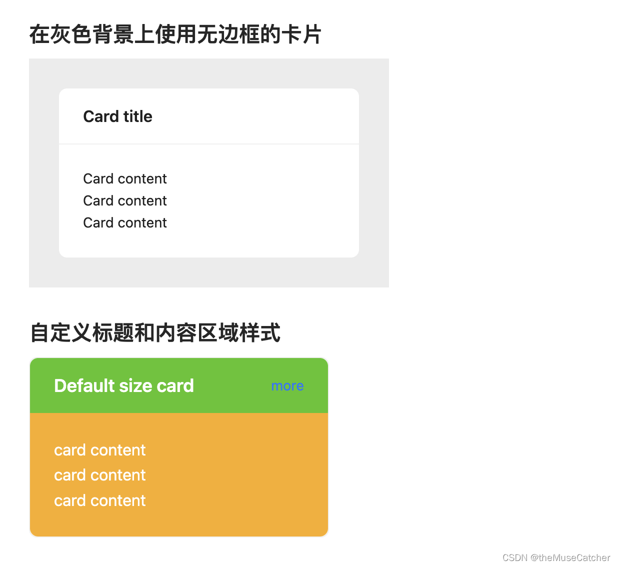
<h2 class="mt30 mb10">在灰色背景上使用无边框的卡片</h2>
<div style="display: inline-block; background: #ececec; padding: 30px;">
<Card title="Card title" :bordered="false" :width="300">
<p>Card content</p>
<p>Card content</p>
<p>Card content</p>
</Card>
</div>
<h2 class="mt30 mb10">自定义标题和内容区域样式</h2>
<Card
title="Default size card"
:width="300"
:headStyle="{ fontSize: '18px', color: '#fff', backgroundColor: '#52c41a'}"
:bodyStyle="{ fontSize: '16px', color: '#fff', backgroundColor: '#faad14'}">
<template #extra><a href="#">more</a></template>
<p>card content</p>
<p>card content</p>
<p>card content</p>
</Card>
<h2 class="mt30 mb10">内部卡片</h2>
<Card title="Card title" :width="360">
<p style="font-size: 14px; color: rgba(0, 0, 0, 0.85); margin-bottom: 16px; font-weight: 500;">
Group title
</p>
<Card title="Inner card title">
<template #extra>
<a href="#">More</a>
</template>
Inner Card content
</Card>
<Card title="Inner card title" :style="{ marginTop: '16px' }">
<template #extra>
<a href="#">More</a>
</template>
Inner Card content
</Card>
</Card>
<h2 class="mt30 mb10">栅格卡片</h2>
<div style="background-color: #ececec; padding: 20px;">
<Row :gutter="16">
<Col :span="8">
<Card title="Card title" :bordered="false">
<p>card content</p>
</Card>
</Col>
<Col :span="8">
<Card title="Card title" :bordered="false">
<p>card content</p>
</Card>
</Col>
<Col :span="8">
<Card title="Card title" :bordered="false">
<p>card content</p>
</Card>
</Col>
</Row>
</div>
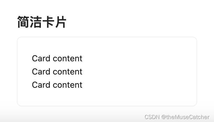
<h2 class="mt30 mb10">简洁卡片</h2>
<Card :width="300">
<p>Card content</p>
<p>Card content</p>
<p>Card content</p>
</Card>
</div>
</template>