
Pipes
Every application starts out with what seems like a simple task: get data, transform them, and show them to users. Getting data could be as simple as creating a local variable or as complex as streaming data over a WebSocket.
Once data arrive, you could push their raw toString values directly to the view, but that rarely makes for a good user experience. For example, in most use cases, users prefer to see a date in a simple format like April 15, 1988 rather than the raw string format Fri Apr 15 1988 00:00:00 GMT-0700 (Pacific Daylight Time).
Clearly, some values benefit from a bit of editing. You may notice that you desire many of the same transformations repeatedly, both within and across many applications. You can almost think of them as styles. In fact, you might like to apply them in your HTML templates as you do styles.
Introducing Angular pipes, a way to write display-value transformations that you can declare in your HTML.
You can run the live example / download example in Stackblitz and download the code from there.
Using pipes
A pipe takes in data as input and transforms it to a desired output. In this page, you'll use pipes to transform a component's birthday property into a human-friendly date.
src/app/hero-birthday1.component.tscontent_copyimport { Component } from '@angular/core';
@Component({
selector: 'app-hero-birthday',
template: `<p>The hero's birthday is {{ birthday | date }}</p>`
})
export class HeroBirthdayComponent {
birthday = new Date(1988, 3, 15); // April 15, 1988
}
Focus on the component's template.
src/app/app.component.htmlcontent_copy<p>The hero's birthday is {{ birthday | date }}</p>
Inside the interpolation expression, you flow the component's birthday value through the pipe operator ( | ) to the Date pipe function on the right. All pipes work this way.
Built-in pipes
Angular comes with a stock of pipes such as DatePipe, UpperCasePipe, LowerCasePipe, CurrencyPipe, and PercentPipe. They are all available for use in any template.
Read more about these and many other built-in pipes in the pipes topics of the API Reference; filter for entries that include the word "pipe".
Angular doesn't have a FilterPipe or an OrderByPipe for reasons explained in the Appendix of this page.
Parameterizing a pipe
A pipe can accept any number of optional parameters to fine-tune its output. To add parameters to a pipe, follow the pipe name with a colon ( : ) and then the parameter value (such as currency:'EUR'). If the pipe accepts multiple parameters, separate the values with colons (such as slice:1:5)
Modify the birthday template to give the date pipe a format parameter. After formatting the hero's April 15th birthday, it renders as 04/15/88:
src/app/app.component.htmlcontent_copy<p>The hero's birthday is {{ birthday | date:"MM/dd/yy" }} </p>
The parameter value can be any valid template expression, (see the Template expressions section of the Template Syntax page) such as a string literal or a component property. In other words, you can control the format through a binding the same way you control the birthday value through a binding.
Write a second component that binds the pipe's format parameter to the component's format property. Here's the template for that component:
content_copytemplate: `
  <p>The hero's birthday is {{ birthday | date:format }}</p>
  <button (click)="toggleFormat()">Toggle Format</button>
`
You also added a button to the template and bound its click event to the component's toggleFormat() method. That method toggles the component's format property between a short form ('shortDate') and a longer form ('fullDate').
content_copyexport class HeroBirthday2Component {
  birthday = new Date(1988, 3, 15); // April 15, 1988
  toggle = true; // start with true == shortDate

  get format()   { return this.toggle ? 'shortDate' : 'fullDate'; }
  toggleFormat() { this.toggle = !this.toggle; }
}
As you click the button, the displayed date alternates between "04/15/1988" and "Friday, April 15, 1988".

Read more about the DatePipe format options in the Date Pipe API Reference page.
Chaining pipes
You can chain pipes together in potentially useful combinations. In the following example, to display the birthday in uppercase, the birthday is chained to the DatePipe and on to the UpperCasePipe. The birthday displays as APR 15, 1988.
content_copyThe chained hero's birthday is
{{ birthday | date | uppercase}}
This example—which displays FRIDAY, APRIL 15, 1988—chains the same pipes as above, but passes in a parameter to date as well.
content_copyThe chained hero's birthday is
{{  birthday | date:'fullDate' | uppercase}}
Custom pipes
You can write your own custom pipes. Here's a custom pipe named ExponentialStrengthPipe that can boost a hero's powers:
content_copyimport { Pipe, PipeTransform } from '@angular/core';
/*
 * Raise the value exponentially
 * Takes an exponent argument that defaults to 1.
 * Usage:
 *   value | exponentialStrength:exponent
 * Example:
 *   {{ 2 | exponentialStrength:10 }}
 *   formats to: 1024
*/
@Pipe({name: 'exponentialStrength'})
export class ExponentialStrengthPipe implements PipeTransform {
  transform(value: number, exponent: string): number {
    let exp = parseFloat(exponent);
    return Math.pow(value, isNaN(exp) ? 1 : exp);
  }
}
This pipe definition reveals the following key points:
- A pipe is a class decorated with pipe metadata.
- The pipe class implements the
PipeTransforminterface'stransformmethod that accepts an input value followed by optional parameters and returns the transformed value. - There will be one additional argument to the
transformmethod for each parameter passed to the pipe. Your pipe has one such parameter: theexponent. - To tell Angular that this is a pipe, you apply the
@Pipedecorator, which you import from the core Angular library. - The
@Pipedecorator allows you to define the pipe name that you'll use within template expressions. It must be a valid JavaScript identifier. Your pipe's name isexponentialStrength.
The PipeTransform interface
The transform method is essential to a pipe. The PipeTransform interface defines that method and guides both tooling and the compiler. Technically, it's optional; Angular looks for and executes the transform method regardless.
Now you need a component to demonstrate the pipe.
src/app/power-booster.component.tscontent_copyimport { Component } from '@angular/core';
@Component({
selector: 'app-power-booster',
template: `
<h2>Power Booster</h2>
<p>Super power boost: {{2 | exponentialStrength: 10}}</p>
`
})
export class PowerBoosterComponent { }

Note the following:
- You use your custom pipe the same way you use built-in pipes.
- You must include your pipe in the
declarationsarray of theAppModule.
You must register custom pipes. If you don't, Angular reports an error. Angular CLI's generator registers the pipe automatically.
To probe the behavior in the live example / download example, change the value and optional exponent in the template.
Power Boost Calculator
It's not much fun updating the template to test the custom pipe. Upgrade the example to a "Power Boost Calculator" that combines your pipe and two-way data binding with ngModel.
content_copy
- import { Component } from '@angular/core';
- @Component({
- selector: 'app-power-boost-calculator',
- template: `
- <h2>Power Boost Calculator</h2>
- <div>Normal power: <input [(ngModel)]="power"></div>
- <div>Boost factor: <input [(ngModel)]="factor"></div>
- <p>
- Super Hero Power: {{power | exponentialStrength: factor}}
- </p>
- `
- })
- export class PowerBoostCalculatorComponent {
- power = 5;
- factor = 1;
- }

Pipes and change detection
Angular looks for changes to data-bound values through a change detection process that runs after every DOM event: every keystroke, mouse move, timer tick, and server response. This could be expensive. Angular strives to lower the cost whenever possible and appropriate.
Angular picks a simpler, faster change detection algorithm when you use a pipe.
No pipe
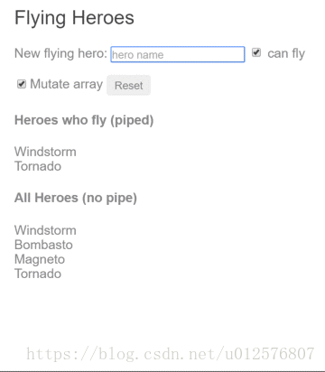
In the next example, the component uses the default, aggressive change detection strategy to monitor and update its display of every hero in the heroes array. Here's the template:
content_copyNew hero:
  <input type="text" #box
          (keyup.enter)="addHero(box.value); box.value=''"
          placeholder="hero name">
  <button (click)="reset()">Reset</button>
  <div *ngFor="let hero of heroes">
    {{hero.name}}
  </div>
The companion component class provides heroes, adds heroes into the array, and can reset the array.
src/app/flying-heroes.component.ts (v1)content_copyexport class FlyingHeroesComponent {
heroes: any[] = [];
canFly = true;
constructor() { this.reset(); }
addHero(name: string) {
name = name.trim();
if (!name) { return; }
let hero = {name, canFly: this.canFly};
this.heroes.push(hero);
}
reset() { this.heroes = HEROES.slice(); }
}
You can add heroes and Angular updates the display when you do. If you click the reset button, Angular replaces heroes with a new array of the original heroes and updates the display. If you added the ability to remove or change a hero, Angular would detect those changes and update the display as well.
FlyingHeroesPipe
Add a FlyingHeroesPipe to the *ngFor repeater that filters the list of heroes to just those heroes who can fly.
content_copy<div *ngFor="let hero of (heroes | flyingHeroes)">
  {{hero.name}}
</div>
Here's the FlyingHeroesPipe implementation, which follows the pattern for custom pipes described earlier.
content_copyimport { Pipe, PipeTransform } from '@angular/core';

import { Flyer } from './heroes';

@Pipe({ name: 'flyingHeroes' })
export class FlyingHeroesPipe implements PipeTransform {
  transform(allHeroes: Flyer[]) {
    return allHeroes.filter(hero => hero.canFly);
  }
}
Notice the odd behavior in the live example / download example: when you add flying heroes, none of them are displayed under "Heroes who fly."
Although you're not getting the behavior you want, Angular isn't broken. It's just using a different change-detection algorithm that ignores changes to the list or any of its items.
Notice how a hero is added:
src/app/flying-heroes.component.tscontent_copythis.heroes.push(hero);
You add the hero into the heroes array. The reference to the array hasn't changed. It's the same array. That's all Angular cares about. From its perspective, same array, no change, no display update.
To fix that, create an array with the new hero appended and assign that to heroes. This time Angular detects that the array reference has changed. It executes the pipe and updates the display with the new array, which includes the new flying hero.
If you mutate the array, no pipe is invoked and the display isn't updated; if you replace the array, the pipe executes and the display is updated. The Flying Heroes application extends the code with checkbox switches and additional displays to help you experience these effects.
Replacing the array is an efficient way to signal Angular to update the display. When do you replace the array? When the data change. That's an easy rule to follow in this example where the only way to change the data is by adding a hero.
More often, you don't know when the data have changed, especially in applications that mutate data in many ways, perhaps in application locations far away. A component in such an application usually can't know about those changes. Moreover, it's unwise to distort the component design to accommodate a pipe. Strive to keep the component class independent of the HTML. The component should be unaware of pipes.
For filtering flying heroes, consider an impure pipe.
Pure and impure pipes
There are two categories of pipes: pure and impure. Pipes are pure by default. Every pipe you've seen so far has been pure. You make a pipe impure by setting its pure flag to false. You could make the FlyingHeroesPipe impure like this:
content_copy@Pipe({
  name: 'flyingHeroesImpure',
  pure: false
})
Before doing that, understand the difference between pure and impure, starting with a pure pipe.
Pure pipes
Angular executes a pure pipe only when it detects a pure change to the input value. A pure change is either a change to a primitive input value (String, Number, Boolean, Symbol) or a changed object reference (Date, Array, Function, Object).
Angular ignores changes within (composite) objects. It won't call a pure pipe if you change an input month, add to an input array, or update an input object property.
This may seem restrictive but it's also fast. An object reference check is fast—much faster than a deep check for differences—so Angular can quickly determine if it can skip both the pipe execution and a view update.
For this reason, a pure pipe is preferable when you can live with the change detection strategy. When you can't, you canuse the impure pipe.
Or you might not use a pipe at all. It may be better to pursue the pipe's purpose with a property of the component, a point that's discussed later in this page.
Impure pipes
Angular executes an impure pipe during every component change detection cycle. An impure pipe is called often, as often as every keystroke or mouse-move.
With that concern in mind, implement an impure pipe with great care. An expensive, long-running pipe could destroy the user experience.
An impure FlyingHeroesPipe
A flip of the switch turns the FlyingHeroesPipe into a FlyingHeroesImpurePipe. The complete implementation is as follows:
content_copy@Pipe({
  name: 'flyingHeroesImpure',
  pure: false
})
export class FlyingHeroesImpurePipe extends FlyingHeroesPipe {}
You inherit from FlyingHeroesPipe to prove the point that nothing changed internally. The only difference is the pure flag in the pipe metadata.
This is a good candidate for an impure pipe because the transform function is trivial and fast.
content_copyreturn allHeroes.filter(hero => hero.canFly);
You can derive a FlyingHeroesImpureComponent from FlyingHeroesComponent.
content_copy<div *ngFor="let hero of (heroes | flyingHeroesImpure)">
  {{hero.name}}
</div>
The only substantive change is the pipe in the template. You can confirm in the live example / download example that the flying heroes display updates as you add heroes, even when you mutate the heroes array.
The impure AsyncPipe
The Angular AsyncPipe is an interesting example of an impure pipe. The AsyncPipe accepts a Promise or Observable as input and subscribes to the input automatically, eventually returning the emitted values.
The AsyncPipe is also stateful. The pipe maintains a subscription to the input Observable and keeps delivering values from that Observable as they arrive.
This next example binds an Observable of message strings (message$) to a view with the async pipe.
content_copy
- import { Component } from '@angular/core';
- import { Observable, interval } from 'rxjs';
- import { map, take } from 'rxjs/operators';
- @Component({
- selector: 'app-hero-message',
- template: `
- <h2>Async Hero Message and AsyncPipe</h2>
- <p>Message: {{ message$ | async }}</p>
- <button (click)="resend()">Resend</button>`,
- })
- export class HeroAsyncMessageComponent {
- message$: Observable<string>;
- private messages = [
- 'You are my hero!',
- 'You are the best hero!',
- 'Will you be my hero?'
- ];
- constructor() { this.resend(); }
- resend() {
- this.message$ = interval(500).pipe(
- map(i => this.messages[i]),
- take(this.messages.length)
- );
- }
- }
The Async pipe saves boilerplate in the component code. The component doesn't have to subscribe to the async data source, extract the resolved values and expose them for binding, and have to unsubscribe when it's destroyed (a potent source of memory leaks).
An impure caching pipe
Write one more impure pipe, a pipe that makes an HTTP request.
Remember that impure pipes are called every few milliseconds. If you're not careful, this pipe will punish the server with requests.
In the following code, the pipe only calls the server when the request URL changes and it caches the server response. The code uses the Angular http client to retrieve data:
src/app/fetch-json.pipe.tscontent_copy
- import { Pipe, PipeTransform } from '@angular/core';
- import { HttpClient } from '@angular/common/http';
- @Pipe({
- name: 'fetch',
- pure: false
- })
- export class FetchJsonPipe implements PipeTransform {
- private cachedData: any = null;
- private cachedUrl = '';
- constructor(private http: HttpClient) { }
- transform(url: string): any {
- if (url !== this.cachedUrl) {
- this.cachedData = null;
- this.cachedUrl = url;
- this.http.get(url).subscribe( result => this.cachedData = result );
- }
- return this.cachedData;
- }
- }
Now demonstrate it in a harness component whose template defines two bindings to this pipe, both requesting the heroes from the heroes.json file.
content_copy
- import { Component } from '@angular/core';
- @Component({
- selector: 'app-hero-list',
- template: `
- <h2>Heroes from JSON File</h2>
- <div *ngFor="let hero of ('assets/heroes.json' | fetch) ">
- {{hero.name}}
- </div>
- <p>Heroes as JSON:
- {{'assets/heroes.json' | fetch | json}}
- </p>`
- })
- export class HeroListComponent { }
The component renders as the following:

A breakpoint on the pipe's request for data shows the following:
- Each binding gets its own pipe instance.
- Each pipe instance caches its own URL and data.
- Each pipe instance only calls the server once.
JsonPipe
In the previous code sample, the second fetch pipe binding demonstrates more pipe chaining. It displays the same hero data in JSON format by chaining through to the built-in JsonPipe.
The JsonPipe provides an easy way to diagnosis a mysteriously failing data binding or inspect an object for future binding.
Pure pipes and pure functions
A pure pipe uses pure functions. Pure functions process inputs and return values without detectable side effects. Given the same input, they should always return the same output.
The pipes discussed earlier in this page are implemented with pure functions. The built-in DatePipe is a pure pipe with a pure function implementation. So are the ExponentialStrengthPipe and FlyingHeroesPipe. A few steps back, you reviewed the FlyingHeroesImpurePipe—an impure pipe with a pure function.
But always implement a pure pipe with a pure function. Otherwise, you'll see many console errors regarding expressions that changed after they were checked.
Next steps
Pipes are a great way to encapsulate and share common display-value transformations. Use them like styles, dropping them into your template's expressions to enrich the appeal and usability of your views.
Explore Angular's inventory of built-in pipes in the API Reference. Try writing a custom pipe and perhaps contributing it to the community.
Appendix: No FilterPipe or OrderByPipe
Angular doesn't provide pipes for filtering or sorting lists. Developers familiar with AngularJS know these as filter and orderBy. There are no equivalents in Angular.
This isn't an oversight. Angular doesn't offer such pipes because they perform poorly and prevent aggressive minification. Both filter and orderBy require parameters that reference object properties. Earlier in this page, you learned that such pipes must be impure and that Angular calls impure pipes in almost every change-detection cycle.
Filtering and especially sorting are expensive operations. The user experience can degrade severely for even moderate-sized lists when Angular calls these pipe methods many times per second. filter and orderBy have often been abused in AngularJS apps, leading to complaints that Angular itself is slow. That charge is fair in the indirect sense that AngularJS prepared this performance trap by offering filter and orderBy in the first place.
The minification hazard is also compelling, if less obvious. Imagine a sorting pipe applied to a list of heroes. The list might be sorted by hero name and planet of origin properties in the following way:
content_copy<!-- NOT REAL CODE! -->
<div *ngFor="let hero of heroes | orderBy:'name,planet'"></div>
You identify the sort fields by text strings, expecting the pipe to reference a property value by indexing (such as hero['name']). Unfortunately, aggressive minification manipulates the Hero property names so that Hero.name and Hero.planet become something like Hero.a and Hero.b. Clearly hero['name'] doesn't work.
While some may not care to minify this aggressively, the Angular product shouldn't prevent anyone from minifying aggressively. Therefore, the Angular team decided that everything Angular provides will minify safely.
The Angular team and many experienced Angular developers strongly recommend moving filtering and sorting logic into the component itself. The component can expose a filteredHeroes or sortedHeroes property and take control over when and how often to execute the supporting logic. Any capabilities that you would have put in a pipe and shared across the app can be written in a filtering/sorting service and injected into the component.
If these performance and minification considerations don't apply to you, you can always create your own such pipes (similar to the FlyingHeroesPipe) or find them in the community.
Animations
Motion is an important aspect in the design of modern web applications. Good user interfaces transition smoothly between states with engaging animations that call attention where it's needed. Well-designed animations can make a UI not only more fun but also easier to use.
Overview
Angular's animation system lets you build animations that run with the same kind of native performance found in pure CSS animations. You can also tightly integrate your animation logic with the rest of your application code, for ease of control.
Angular animations are built on top of the standard Web Animations API and run natively on browsers that support it.
As of Angular 6, If the Web Animations API is not supported natively by the browser, then Angular will use CSS keyframes as a fallback instead (automatically). This means that the polyfill is no longer required unless any code uses AnimationBuilder. If your code does use AnimationBuilder, then uncomment the web-animations-js polyfill from the polyfills.ts file generated by Angular CLI.
The examples in this page are available as a live example / download example.
Setup
Before you can add animations to your application, you need to import a few animation-specific modules and functions to the root application module.
app.module.ts (animation module import excerpt)content_copyimport { BrowserModule } from '@angular/platform-browser';
import { BrowserAnimationsModule } from '@angular/platform-browser/animations';
@NgModule({
imports: [ BrowserModule, BrowserAnimationsModule ],
// ... more stuff ...
})
export class AppModule { }
Example basics
The animations examples in this guide animate a list of heroes.
A Hero class has a name property, a state property that indicates if the hero is active or not, and a toggleState()method to switch between the states.
content_copyexport class Hero {
  constructor(public name: string, public state = 'inactive') { }

  toggleState() {
    this.state = this.state === 'active' ? 'inactive' : 'active';
  }
}
Across the top of the screen (app.hero-team-builder.component.ts) are a series of buttons that add and remove heroes from the list (via the HeroService). The buttons trigger changes to the list that all of the example components see at the same time.
Transitioning between two states

You can build a simple animation that transitions an element between two states driven by a model attribute.
Animations can be defined inside @Component metadata.
content_copyimport {
  Component,
  Input
} from '@angular/core';
import {
  trigger,
  state,
  style,
  animate,
  transition
} from '@angular/animations';
With these, you can define an animation trigger called heroState in the component metadata. It uses animations to transition between two states: active and inactive. When a hero is active, the element appears in a slightly larger size and lighter color.
content_copyanimations: [
  trigger('heroState', [
    state('inactive', style({
      backgroundColor: '#eee',
      transform: 'scale(1)'
    })),
    state('active',   style({
      backgroundColor: '#cfd8dc',
      transform: 'scale(1.1)'
    })),
    transition('inactive => active', animate('100ms ease-in')),
    transition('active => inactive', animate('100ms ease-out'))
  ])
]
In this example, you are defining animation styles (color and transform) inline in the animation metadata.
Now, using the [@triggerName] syntax, attach the animation that you just defined to one or more elements in the component's template.
content_copytemplate: `
  <ul>
    <li *ngFor="let hero of heroes"
        [@heroState]="hero.state"
        (click)="hero.toggleState()">
      {{hero.name}}
    </li>
  </ul>
`,
Here, the animation trigger applies to every element repeated by an ngFor. Each of the repeated elements animates independently. The value of the attribute is bound to the expression hero.state and is always either active or inactive.
With this setup, an animated transition appears whenever a hero object changes state. Here's the full component implementation:
hero-list-basic.component.tscontent_copy
- import {
- Component,
- Input
- } from '@angular/core';
- import {
- trigger,
- state,
- style,
- animate,
- transition
- } from '@angular/animations';
- import { Hero } from './hero.service';
- @Component({
- selector: 'app-hero-list-basic',
- template: `
- <ul>
- <li *ngFor="let hero of heroes"
- [@heroState]="hero.state"
- (click)="hero.toggleState()">
- {{hero.name}}
- </li>
- </ul>
- `,
- styleUrls: ['./hero-list.component.css'],
- animations: [
- trigger('heroState', [
- state('inactive', style({
- backgroundColor: '#eee',
- transform: 'scale(1)'
- })),
- state('active', style({
- backgroundColor: '#cfd8dc',
- transform: 'scale(1.1)'
- })),
- transition('inactive => active', animate('100ms ease-in')),
- transition('active => inactive', animate('100ms ease-out'))
- ])
- ]
- })
- export class HeroListBasicComponent {
- @Input() heroes: Hero[];
- }
States and transitions
Angular animations are defined as logical states and transitions between states.
An animation state is a string value that you define in your application code. In the example above, the states 'active'and 'inactive' are based on the logical state of hero objects. The source of the state can be a simple object attribute, as it was in this case, or it can be a value computed in a method. The important thing is that you can read it into the component's template.
You can define styles for each animation state:
src/app/hero-list-basic.component.tscontent_copystate('inactive', style({
backgroundColor: '#eee',
transform: 'scale(1)'
})),
state('active', style({
backgroundColor: '#cfd8dc',
transform: 'scale(1.1)'
})),
These state definitions specify the end styles of each state. They are applied to the element once it has transitioned to that state, and stay as long as it remains in that state. In effect, you're defining what styles the element has in different states.
After you define states, you can define transitions between the states. Each transition controls the timing of switching between one set of styles and the next:
src/app/hero-list-basic.component.tscontent_copytransition('inactive => active', animate('100ms ease-in')),
transition('active => inactive', animate('100ms ease-out'))

If several transitions have the same timing configuration, you can combine them into the same transition definition:
content_copytransition('inactive => active, active => inactive',
 animate('100ms ease-out'))
When both directions of a transition have the same timing, as in the previous example, you can use the shorthand syntax <=>:
content_copytransition('inactive <=> active', animate('100ms ease-out'))
You can also apply a style during an animation but not keep it around after the animation finishes. You can define such styles inline, in the transition. In this example, the element receives one set of styles immediately and is then animated to the next. When the transition finishes, none of these styles are kept because they're not defined in a state.
content_copytransition('inactive => active', [
  style({
    backgroundColor: '#cfd8dc',
    transform: 'scale(1.3)'
  }),
  animate('80ms ease-in', style({
    backgroundColor: '#eee',
    transform: 'scale(1)'
  }))
]),
The wildcard state *
The * ("wildcard") state matches any animation state. This is useful for defining styles and transitions that apply regardless of which state the animation is in. For example:
- The
active => *transition applies when the element's state changes fromactiveto anything else. - The
* => *transition applies when any change between two states takes place.

The void state
The special state called void can apply to any animation. It applies when the element is not attached to a view, perhaps because it has not yet been added or because it has been removed. The void state is useful for defining enter and leave animations.
For example the * => void transition applies when the element leaves the view, regardless of what state it was in before it left.

The wildcard state * also matches void.
Example: Entering and leaving

Using the void and * states you can define transitions that animate the entering and leaving of elements:
- Enter:
void => * - Leave:
* => void
For example, in the animations array below there are two transitions that use the void => * and * => void syntax to animate the element in and out of the view.
content_copyanimations: [
  trigger('flyInOut', [
    state('in', style({transform: 'translateX(0)'})),
    transition('void => *', [
      style({transform: 'translateX(-100%)'}),
      animate(100)
    ]),
    transition('* => void', [
      animate(100, style({transform: 'translateX(100%)'}))
    ])
  ])
]
Note that in this case the styles are applied to the void state directly in the transition definitions, and not in a separate state(void) definition. Thus, the transforms are different on enter and leave: the element enters from the left and leaves to the right.
These two common animations have their own aliases:
content_copytransition(':enter', [ ... ]); // void => *
transition(':leave', [ ... ]); // * => void
Example: Entering and leaving from different states

You can also combine this animation with the earlier state transition animation by using the hero state as the animation state. This lets you configure different transitions for entering and leaving based on what the state of the hero is:
- Inactive hero enter:
void => inactive - Active hero enter:
void => active - Inactive hero leave:
inactive => void - Active hero leave:
active => void
This gives you fine-grained control over each transition:

hero-list-enter-leave.component.ts (excerpt)
content_copyanimations: [
  trigger('heroState', [
    state('inactive', style({transform: 'translateX(0) scale(1)'})),
    state('active',   style({transform: 'translateX(0) scale(1.1)'})),
    transition('inactive => active', animate('100ms ease-in')),
    transition('active => inactive', animate('100ms ease-out')),
    transition('void => inactive', [
      style({transform: 'translateX(-100%) scale(1)'}),
      animate(100)
    ]),
    transition('inactive => void', [
      animate(100, style({transform: 'translateX(100%) scale(1)'}))
    ]),
    transition('void => active', [
      style({transform: 'translateX(0) scale(0)'}),
      animate(200)
    ]),
    transition('active => void', [
      animate(200, style({transform: 'translateX(0) scale(0)'}))
    ])
  ])
]
Animatable properties and units
Since Angular's animation support builds on top of Web Animations, you can animate any property that the browser considers animatable. This includes positions, sizes, transforms, colors, borders, and many others. The W3C maintainsa list of animatable properties on its CSS Transitions page.
For positional properties that have a numeric value, you can define a unit by providing the value as a string with the appropriate suffix:
'50px''3em''100%'
If you don't provide a unit when specifying dimension, Angular assumes the default of px:
50is the same as saying'50px'
Automatic property calculation

Sometimes you don't know the value of a dimensional style property until runtime. For example, elements often have widths and heights that depend on their content and the screen size. These properties are often tricky to animate with CSS.
In these cases, you can use a special * property value so that the value of the property is computed at runtime and then plugged into the animation.
In this example, the leave animation takes whatever height the element has before it leaves and animates from that height to zero:
src/app/hero-list-auto.component.tscontent_copyanimations: [
trigger('shrinkOut', [
state('in', style({height: '*'})),
transition('* => void', [
style({height: '*'}),
animate(250, style({height: 0}))
])
])
]
Animation timing
There are three timing properties you can tune for every animated transition: the duration, the delay, and the easing function. They are all combined into a single transition timing string.
Duration
The duration controls how long the animation takes to run from start to finish. You can define a duration in three ways:
- As a plain number, in milliseconds:
100 - In a string, as milliseconds:
'100ms' - In a string, as seconds:
'0.1s'
Delay
The delay controls the length of time between the animation trigger and the beginning of the transition. You can define one by adding it to the same string following the duration. It also has the same format options as the duration:
- Wait for 100ms and then run for 200ms:
'0.2s 100ms'
Easing
The easing function controls how the animation accelerates and decelerates during its runtime. For example, an ease-infunction causes the animation to begin relatively slowly but pick up speed as it progresses. You can control the easing by adding it as a third value in the string after the duration and the delay (or as the second value when there is no delay):
- Wait for 100ms and then run for 200ms, with easing:
'0.2s 100ms ease-out' - Run for 200ms, with easing:
'0.2s ease-in-out'

Example
Here are a couple of custom timings in action. Both enter and leave last for 200 milliseconds, that is 0.2s, but they have different easings. The leave begins after a slight delay of 10 milliseconds as specified in '0.2s 10 ease-out':
content_copyanimations: [
  trigger('flyInOut', [
    state('in', style({opacity: 1, transform: 'translateX(0)'})),
    transition('void => *', [
      style({
        opacity: 0,
        transform: 'translateX(-100%)'
      }),
      animate('0.2s ease-in')
    ]),
    transition('* => void', [
      animate('0.2s 0.1s ease-out', style({
        opacity: 0,
        transform: 'translateX(100%)'
      }))
    ])
  ])
]
Multi-step animations with keyframes

Animation keyframes go beyond a simple transition to a more intricate animation that goes through one or more intermediate styles when transitioning between two sets of styles.
For each keyframe, you specify an offset that defines at which point in the animation that keyframe applies. The offset is a number between zero, which marks the beginning of the animation, and one, which marks the end.
This example adds some "bounce" to the enter and leave animations with keyframes:
hero-list-multistep.component.ts (excerpt)content_copyanimations: [
trigger('flyInOut', [
state('in', style({transform: 'translateX(0)'})),
transition('void => *', [
animate(300, keyframes([
style({opacity: 0, transform: 'translateX(-100%)', offset: 0}),
style({opacity: 1, transform: 'translateX(15px)', offset: 0.3}),
style({opacity: 1, transform: 'translateX(0)', offset: 1.0})
]))
]),
transition('* => void', [
animate(300, keyframes([
style({opacity: 1, transform: 'translateX(0)', offset: 0}),
style({opacity: 1, transform: 'translateX(-15px)', offset: 0.7}),
style({opacity: 0, transform: 'translateX(100%)', offset: 1.0})
]))
])
])
]
Note that the offsets are not defined in terms of absolute time. They are relative measures from zero to one. The final timeline of the animation is based on the combination of keyframe offsets, duration, delay, and easing.
Defining offsets for keyframes is optional. If you omit them, offsets with even spacing are automatically assigned. For example, three keyframes without predefined offsets receive offsets 0, 0.5, and 1.
Parallel animation groups

You've seen how to animate multiple style properties at the same time: just put all of them into the same style() definition.
But you may also want to configure different timings for animations that happen in parallel. For example, you may want to animate two CSS properties but use a different easing function for each one.
For this you can use animation groups. In this example, using groups both on enter and leave allows for two different timing configurations. Both are applied to the same element in parallel, but run independently of each other:
hero-list-groups.component.ts (excerpt)content_copyanimations: [
trigger('flyInOut', [
state('in', style({width: 120, transform: 'translateX(0)', opacity: 1})),
transition('void => *', [
style({width: 10, transform: 'translateX(50px)', opacity: 0}),
group([
animate('0.3s 0.1s ease', style({
transform: 'translateX(0)',
width: 120
})),
animate('0.3s ease', style({
opacity: 1
}))
])
]),
transition('* => void', [
group([
animate('0.3s ease', style({
transform: 'translateX(50px)',
width: 10
})),
animate('0.3s 0.2s ease', style({
opacity: 0
}))
])
])
])
]
One group animates the element transform and width; the other group animates the opacity.
Animation callbacks
A callback is fired when an animation is started and also when it is done.
In the keyframes example, you have a trigger called @flyInOut. You can hook those callbacks like this:
content_copytemplate: `
  <ul>
    <li *ngFor="let hero of heroes"
        (@flyInOut.start)="animationStarted($event)"
        (@flyInOut.done)="animationDone($event)"
        [@flyInOut]="'in'">
      {{hero.name}}
    </li>
  </ul>
`,
The callbacks receive an AnimationEvent that contains useful properties such as fromState, toState and totalTime.
Those callbacks will fire whether or not an animation is picked up.
未完待续,下一章节,つづく