HandyControl是一套WPF控件库,它几乎重写了所有原生样式,同时包含80余款自定义控件(正逐步增加),下面我们开始使用。
1、准备
1.1 创建项目
C# WPF应用(.NET Framework)创建项目
1.2 添加包

1.3 在App.xaml中引用HandyControl的皮肤和主题:
<Application.Resources>
        <ResourceDictionary>
            <ResourceDictionary.MergedDictionaries>
                <ResourceDictionary Source="pack://application:,,,/HandyControl;component/Themes/SkinDefault.xaml"/>
                <ResourceDictionary Source="pack://application:,,,/HandyControl;component/Themes/Theme.xaml"/>
            </ResourceDictionary.MergedDictionaries>
        </ResourceDictionary>
</Application.Resources>

1.4 窗体文件xaml添加引用
xmlns:hc="https://handyorg.github.io/handycontrol"
2、窗体
2.1 改Window为hc:Window
<hc:Window x:Class="HandyControlTest.MainWindow"
xmlns="http://schemas.microsoft.com/winfx/2006/xaml/presentation"
xmlns:x="http://schemas.microsoft.com/winfx/2006/xaml"
xmlns:d="http://schemas.microsoft.com/expression/blend/2008"
xmlns:mc="http://schemas.openxmlformats.org/markup-compatibility/2006"
xmlns:hc="https://handyorg.github.io/handycontrol"
xmlns:local="clr-namespace:HandyControlTest"
mc:Ignorable="d"
Title="MainWindow" Height="450" Width="800">
<Grid>
</Grid>
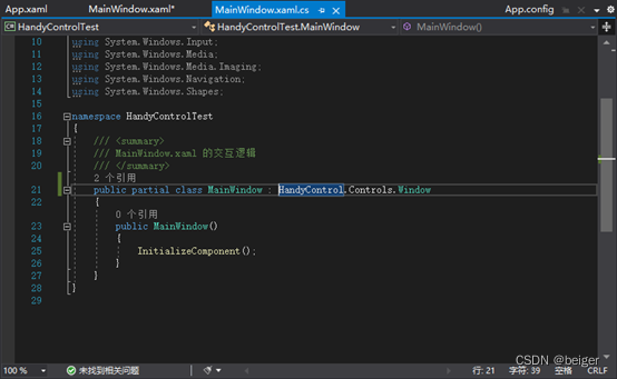
</hc:Window>2.2 修改窗体的xaml.cs文件
修改窗体类名,否则报错:“分部声明一定不能指定不同的基类”
public partial class MainWindow : Window
↓
public partial class MainWindow : HandyControl.Controls.Window
2.3 扩展属性

2.4 代码修改
CloseButtonBackground="Blue" CloseButtonForeground="White"
CloseButtonHoverBackground="Red" CloseButtonHoverForeground="Black"
OtherButtonBackground="Green" OtherButtonForeground="White"
OtherButtonHoverBackground="Yellow" OtherButtonHoverForeground="Black"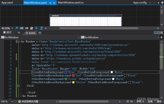
2.5 运行结果

2.6 其它参数
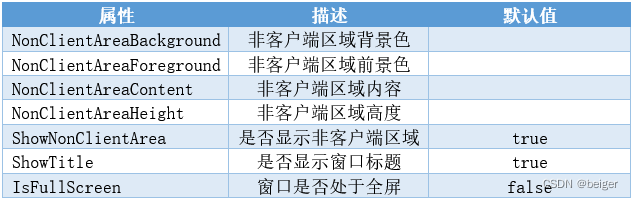
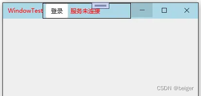
NonClientAreaBackground用来设置了标题栏的背景色。NonClientAreaForeground用来设置标题栏的前景色,不仅仅可以用来设置标题的前景色,也可以设置NonClientAreaContent中控件的默认前景色。NonClientAreaHeight用来设置标题栏的高度。下面看一段代码:
<hc:Window x:Class="TestDemo.View.WindowTest"
        xmlns="http://schemas.microsoft.com/winfx/2006/xaml/presentation"
        xmlns:x="http://schemas.microsoft.com/winfx/2006/xaml"
        xmlns:hc="https://handyorg.github.io/handycontrol"
        Title="WindowTest" Height="200" Width="400"
        NonClientAreaBackground ="LightBlue" NonClientAreaForeground="Red"
        NonClientAreaHeight="100">
    <hc:Window.NonClientAreaContent >
        <Border BorderThickness="1" BorderBrush="Black">
            <StackPanel HorizontalAlignment="Left" Orientation="Horizontal">
                <Button Margin="5,0,0,0" Content="登录"/>
                <TextBlock Text="服务未连接" VerticalAlignment="Center" Margin="5,0,0,0" />
            </StackPanel>
        </Border>
    </hc:Window.NonClientAreaContent>
</hc:Window>
运行效果:
3、 按钮
3.1 代码
<Grid>
        <StackPanel Orientation="Vertical">
            <StackPanel Orientation="Horizontal">
                <Button Content="按钮" Margin="10,10" Width="75"
                        Style="{StaticResource ButtonBaseBaseStyle}" Foreground="Black" />
                <Button Content="按钮" Margin="10,10" Width="75"
                        Style="{StaticResource ButtonDanger}" />
                <Button Content="按钮" Margin="10,10" Width="75"
                        Style="{StaticResource ButtonDashedDanger}" />
                <Button Content="按钮" Margin="10,10" Width="75"
                        Style="{StaticResource ButtonDashedInfo}" />
                <Button Content="按钮" Margin="10,10" Width="75"
                        Style="{StaticResource ButtonInfo}" />
                <Button Content="按钮" Margin="10,10" Width="75"
                        Style="{StaticResource ButtonPrimary}" />
            </StackPanel>
            <StackPanel Orientation="Horizontal">
                <Button Content="按钮" Margin="10,10" Width="75"
                        Style="{StaticResource ButtonWarning}" />
                <Button Content="按钮" Margin="10,10" Width="75"
                        Style="{StaticResource ButtonSuccess}" />
                <Button Content="按钮" Margin="10,10" Width="75"
                        Style="{StaticResource ButtonSuccess}"
                        hc:BorderElement.CornerRadius="15"/>
                <Button Content="按钮" Margin="10,10" Width="75"
                        Style="{StaticResource ButtonDanger.Small}" />
                <Button Margin="10,10" Width="45"
                        Style="{StaticResource ButtonIcon}"
                        hc:IconElement.Geometry="{StaticResource AddGeometry}"
                        Foreground="Green"/>
                <Button Margin="10,10" Width="45"
                        Style="{StaticResource ButtonIcon}"
                        hc:IconElement.Geometry="{StaticResource RemoveGeometry}"
                        Foreground="Green"/>
                <Button Margin="10,10" Width="45" Height="45"
                        Style="{StaticResource ButtonIcon}"
                        hc:IconElement.Geometry="{StaticResource SuccessGeometry}"
                        Foreground="White"
                        Background="{DynamicResource {x:Static SystemColors.HighlightBrushKey}}"/>
                <Button Content="按钮" Margin="10,10" Width="75"
                        Style="{StaticResource ButtonWarning}"
                        hc:IconElement.Geometry="{StaticResource SuccessGeometry}"
                        Foreground="Black"/>
            </StackPanel>
        </StackPanel>
</Grid>
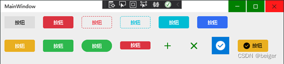
3.2 运行效果