Flutter中实现轮播图的方式有很多种,比如使用三方flutter_swiper,card_swiper等等,使用这些三方,可以很快很方便的实现一个轮播图展示,基本上也能满足我们日常的开发需求,如果说,想要一些定制化的操作,那么就不得不去更改源码或者自己自定义一个,自己定义的话,Flutter中提供了原生组件PageView,可以使用它很方便的来实现一个轮播图。
PageView类似于Android中的ViewPager,可以实现页面的横向或者纵向滑动,具体的使用方式可以直接PageView(),或者使用PageView.builder(),这两种方式都可以实现,区别就是前者会把所有页面一次性初始化出来,而后者则不会,为了便于大家了解这个组件,我们会简单的举一个小案例。
按照以往惯例,我们先看下本篇文章的大纲,大概如下:
1、最终的实现效果一览
2、PageView组件的属性和具体使用
3、轮播图封装注意事项
4、案例源码刨析
5、封装后的源码及使用方式
6、总结
一、最终的实现效果一览
利用PageView,封装了一些特定的效果,比如文字指示器,圆角指示器,以及指示器的位置,轮播图片的缩进展示等等,录制了一个Gif效果图,如下:

二、PageView组件的属性和具体使用
毕竟是使用PageView来实现一个轮播图,那么针对这个组件,我们需要简单的做个介绍:
先看一下基本的常见属性:
| 属性 |
类型 |
概述 |
| scrollDirection |
Axis |
滚动方向,水平或者垂直,默认水平。 水平:Axis.horizontal 垂直:Axis.vertical |
| controller |
PageController |
滚动控制器,可以定位页面,获取页面等信息 |
| onPageChanged |
ValueChanged<int> |
页面发生改变时的回调 |
| physics |
ScrollPhysics |
滑动效果,不设置,会根据不同平台有不同的滚动效果 NeverScrollableScrollPhysics 设置后,页面就不可滚动 BouncingScrollPhysics 表示滚动到底了会有弹回的效果,就是iOS的默认交互 ClampingScrollPhysics 表示滚动到底了就给一个效果,就是Android的默认交互 FixedExtentScrollPhysics 就是iOS经典选择时间组件UIDatePicker那种交互 |
| pageSnapping |
bool |
是否是整页滑动,默认为true |
在实际的开发中,PageView.builder()方式使用是居多的,也建议大家以这种方式作为使用,很简单,只需要在itemBuilder里返回页面视图即可,代码如下:
PageView.builder(
            itemCount: 6,
            onPageChanged: (position) {
              print("当前索引为:$position");
            },
            itemBuilder: (context, index) {
              return Container(
                  color: Colors.amber,
                  alignment: Alignment.center,
                  child: Text("我是第$index个页面"));
            })
基本效果如下:

三、轮播图封装注意事项
基本掌握了PageView的用法之后,我们就开始着手封装一个轮播图,先分析一下,构成轮播图的几个要素,第一,满足自动轮播的要求,而且可以动态设置轮播时长,第二,要能满足多种指示器要求,而且位置可以动态设置,第三,要满足手动轮播和自动轮播要求,并且要处理好手势和定时直接的冲突,第四,最主要的就是使用起来要简单。
定时器注意事项
简单的确定要素之后,我们就可以动手书写了,自动轮播很简单,我们只需要开启一个定时器即可,但是定时器需要注意开启和暂停,也就是什么时候开始,什么时候暂停,否则很容易造成轮播混乱现象。
轮播图开始,其一,也就是主动设置了自动轮播属性,进入到页面,我们就需要开启定时,如果页面退入后台,再重新回到前台,我们也是需要开启轮播的,其二就是暂停,除了退入后台暂停之外,还有就是手势滑动的时候也需要暂停,否则就会和定时造成冲突。
手势注意事项
关于手势,如果我们直接监听页面组件的手势,发现是和PageView有冲突的,为了解决这个手势问题,我们可以采用原始指针事件Listener来监听手势滑动。
部分代码如下,手指按下后,取消定时,手指抬起后,开启定时,当然了如果只有按下和抬起,那么则是一个点击事件,我们可以把这个事件回调给用户。
Listener(
          onPointerDown: (event) {
            //手指按下,定时取消
            _pauseTimer();
            _isClick = true;
          },
          onPointerMove: (event) {
            _isClick = false;
          },
          onPointerUp: (event) {
            //手指抬起,定时开启
            _startTimer();
            //作为点击事件
            if (_isClick && widget.bannerClick != null) {
              widget.bannerClick!(_currentPage);
            }
          },
          child: PageView.builder()t
)
指示器注意事项
指示器需要注意,如果说自己用,一种指示器无可厚非,如果是给他人用,那么就要丰富多彩,尽量满足多的需求。
四、案例源码刨析
1、创建定时器
定时器使用的是Timer,定义了两个方法,便于开启和暂停,当轮播时间到时,就可以执行页面切换操作,使用PageController的animateToPage来切换。
/*
  * 开启定时
  * */
  void _startTimer() {
    if (!_isRunning) {
      _isRunning = true;
      _timer = Timer.periodic(Duration(seconds: widget.delay!), (timer) {
        _controller.animateToPage(_pagePosition + 1,
            duration: const Duration(milliseconds: 800),
            curve: Curves.easeInOut);
      });
    }
  }

  /*
  * 暂停定时
  * */
  void _pauseTimer() {
    if (_isRunning) {
      _isRunning = false;
      _timer?.cancel(); //取消计时器
    }
  }

  @override
  void dispose() {
    _controller.dispose();
    _timer?.cancel();
    super.dispose();
  }
2、感知生命周期变化
当页面退入后台和回到前台,我们需要做暂停和开启定时,那么就需要针对页面做监听操作,添加监听后,记得当前类with WidgetsBindingObserver。
// 添加监听
    WidgetsBinding.instance.addObserver(this);


  /*
  * 感知生命周期变化
  * */
  @override
  void didChangeAppLifecycleState(AppLifecycleState state) {
    super.didChangeAppLifecycleState(state);
    if (state == AppLifecycleState.resumed && widget.autoPlay!) {
      _startTimer(); //页面可见,开启定时
    } else if (state == AppLifecycleState.paused && _isRunning) {
      _pauseTimer(); //页面不可见,关闭定时
    }
  }
3、图片圆角
图片的圆角实现就比较多了,比如Container的装饰器,或者使用组件ClipRRect都可以的。
ClipRRect(
         //设置图片圆角
          borderRadius: BorderRadius.circular(widget.radius!),
          child: getBannerImage(imageUrl)))
4、指示器类型和位置
指示器类型,可以根据业务需求,进行专项定制,目前源码中的类型,有以下几种,分别是,圆形,圆角,矩形,文字,其位置,可以放到中间,左右两边以及轮播图的下方。
/*
  * 指示器
  * */
  Widget _buildIndicators(mainAxisAlignment) {
    if (widget.indicatorType == IndicatorType.text) {
      //文字
      return Container(
        alignment: widget.textIndicatorAlignment,
        child: VipText(
          "${_currentPage + 1}/${widget.imageList!.length}",
          style: widget.textIndicatorStyle,
          backgroundColor: widget.textIndicatorBgColor,
          padding: widget.textIndicatorPadding,
          paddingLeft: widget.textIndicatorPaddingLeft,
          paddingTop: widget.textIndicatorPaddingTop,
          paddingRight: widget.textIndicatorPaddingRight,
          paddingBottom: widget.textIndicatorPaddingBottom,
        ),
      );
    }
    return Row(
      mainAxisAlignment: mainAxisAlignment,
      children: List.generate(widget.imageList!.length, (index) {
        return Container(
          width: _currentPage == index
              ? widget.indicatorWidth
              : widget.indicatorUnWidth ?? widget.indicatorWidth,
          height: _currentPage == index
              ? widget.indicatorHeight
              : widget.indicatorUnHeight ?? widget.indicatorHeight,
          margin: EdgeInsets.symmetric(horizontal: widget.indicatorMargin!),
          decoration: BoxDecoration(
            shape: widget.indicatorType == IndicatorType.circle
                ? BoxShape.circle
                : BoxShape.rectangle,
            borderRadius: widget.indicatorType == IndicatorType.rectangle
                ? BorderRadius.all(Radius.circular(widget.indicatorRadius!))
                : null,
            color: _currentPage == index
                ? widget.indicatorSelectColor
                : widget.indicatorUnSelectColor,
          ),
        );
      }),
    );
  }
5、轮播图缩进效果
缩进的话,有两种,一种除了当前图片,左右图片会变小,当滑动到当前图片之后才会放大,一种就是很简单的缩进。
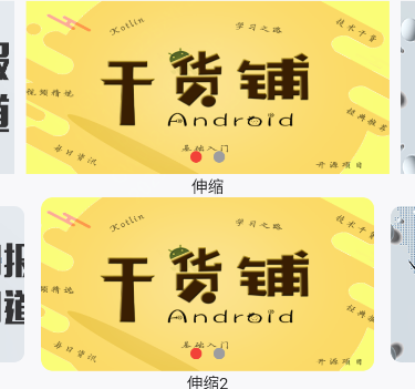
viewportFraction 可以理解为一页内容占据屏幕的比例,铺满就是1,小于1就是不铺满。
PageController(viewportFraction: widget.viewportFraction!)如果说,在滑动的时候,想要图片实现放大和缩小动画,那么我们需要执行一个放大和缩小动画Transform.scale。
return Transform.scale(
                    scale: endScale,
                    child: Container(
                        margin: widget.imageMargin != null
                            ? EdgeInsets.all(widget.imageMargin!)
                            : EdgeInsets.only(
                                left: widget.imageMarginLeft!,
                                top: widget.imageMarginTop!,
                                right: widget.imageMarginRight!,
                                bottom: widget.imageMarginBottom!),
                        child: ClipRRect(
                            //设置图片圆角
                            borderRadius: BorderRadius.circular(widget.radius!),
                            child: getBannerImage(imageUrl))))
五、封装后的源码及使用方式
目前源码已经上传至了Github,大家需要的话,可以查看,由于篇幅有限,就不全部粘贴了,地址:
https://github.com/AbnerMing888/flutter_widget/blob/master/lib/ui/widget/vip_banner.dart
可用属性一览
| 属性 |
类型 |
概述 |
| imageList |
List<String> |
图片地址集合 |
| titleList |
List<String> |
标题集合 |
| radius |
double |
图片圆角 |
| height |
double |
图片高度 |
| delay |
int |
多少时间轮播一次 |
| autoPlay |
bool |
是否自动轮播 |
| bannerClick |
Function(int) |
条目点击事件 |
| showIndicators |
bool |
是否展示指示器 |
| imageMarginLeft |
double |
图片距离左边的距离 |
| imageMarginTop |
double |
图片距离上边的距离 |
| imageMarginRight |
double |
图片距离右边的距离 |
| imageMarginBottom |
double |
图片距离下边的距离 |
| imageMargin |
double |
图片距离左上右下的距离,统一设置 |
| marginLeft |
double |
轮播图整体距离左边的距离 |
| marginTop |
double |
轮播图整体距离上边的距离 |
| marginRight |
double |
轮播图整体距离右边的距离 |
| marginBottom |
double |
轮播图整体距离下边的距离 |
| margin |
double |
轮播图整体距离左上右下的距离 |
| indicatorMarginLeft |
double |
指示器距离左边的距离 |
| indicatorMarginRight |
double |
指示器距离右边的距离 |
| indicatorMarginBottom |
double |
指示器距离底部的距离 |
| indicatorSelectColor |
Color |
指示器选中的颜色 |
| indicatorUnSelectColor |
Color |
指示器未选中的颜色 |
| indicatorWidth |
double |
指示器宽 |
| indicatorHeight |
double |
指示器高 |
| indicatorUnWidth |
double |
指示器未选中宽 |
| indicatorUnHeight |
double |
指示器未选中高 |
| indicatorMargin |
double |
指示器边距 |
| indicatorType |
IndicatorType |
指示器类型 circle, rectangle, text |
| indicatorRadius |
double |
指示器圆角度数 |
| indicatorBannerBottom |
bool |
指示器位置,是在banner上还是Banner下 |
| indicatorBottomColor |
Color |
指示器在Banner下的背景,默认是透明 |
| indicatorBottomHeight |
double |
指示器在Banner下的高度 |
| indicatorBottomMarginRight |
double |
指示器在Banner下的 距离右边 |
| indicatorBottomMarginLeft |
double |
指示器在Banner下的 距离左边 |
| indicatorBottomMainAxisAlignment |
MainAxisAlignment |
指示器在Banner下的位置 左,中,右 |
| viewportFraction |
double |
banner缩进 |
| textIndicatorAlignment |
Alignment |
文字的位置 |
| textIndicatorStyle |
TextStyle |
文字样式 |
| textIndicatorBgColor |
Color |
文字指示器背景 |
| textIndicatorPadding |
double |
文字指示器内边距 |
| textIndicatorPaddingLeft |
double |
文字指示器内边距左 |
| textIndicatorPaddingTop |
double |
文字指示器内边距上 |
| textIndicatorPaddingRight |
double |
文字指示器内边距右 |
| textIndicatorPaddingBottom |
double |
文字指示器内边距下 |
| titleBgColor |
Color |
文字Title背景 |
| titleHeight |
double |
文字Title高度 |
| titleAlignment |
Alignment |
文字Title的位置 |
| titleStyle |
TextStyle |
文字Title样式 |
| titleMarginBottom |
double |
文字Title距离底部 |
| bannerOtherScale |
double |
除中间外的其他图片缩放比例 |
| placeholderImage |
String |
Banner 占位图 |
| errorImage |
String |
Banner 错误图 |
| imageBoxFit |
BoxFit |
图片伸缩模式 |
使用方式
普通加载
VipBanner(
          imageList: const [
            "https://www.vipandroid.cn/ming/image/gan.png",
            "https://www.vipandroid.cn/ming/image/zao.png"
          ],
          bannerClick: (position) {
            //条目点击
            Toast.toast(context, msg: position.toString());
          })
文字指示器
VipBanner(
          imageList: const [
            "https://www.vipandroid.cn/ming/image/gan.png",
            "https://www.vipandroid.cn/ming/image/zao.png"
          ],
          indicatorType: IndicatorType.text,
          bannerClick: (position) {
            Toast.toast(context, msg: position.toString());
          })
圆角指示器
VipBanner(
          imageList: const [
            "https://www.vipandroid.cn/ming/image/gan.png",
            "https://www.vipandroid.cn/ming/image/zao.png"
          ],
          indicatorType: IndicatorType.rectangle,
          indicatorRadius: 5,
          indicatorWidth: 20,
          indicatorHeight: 5,
          bannerClick: (position) {
            Toast.toast(context, msg: position.toString());
          })
使用方式呢,有很多的类型,就不一一举例了,大家可以看源码中的页面,地址是:
https://github.com/AbnerMing888/flutter_widget/blob/master/lib/ui/page/view/banner/banner_page.dart
六、总结
在封装的时候,务必要确定的有以下几个要素,一是定时轮播,二是手势和定时冲突解决,三是无限轮播,四是指示器的设置,五是图片轮播的效果,搞定这些潜在的要素,一个简简单单的轮播图封装起来并不难。