很高兴在雪易的CSDN遇见你 ,给你糖糖
欢迎大家加入雪易社区-CSDN社区云
前言
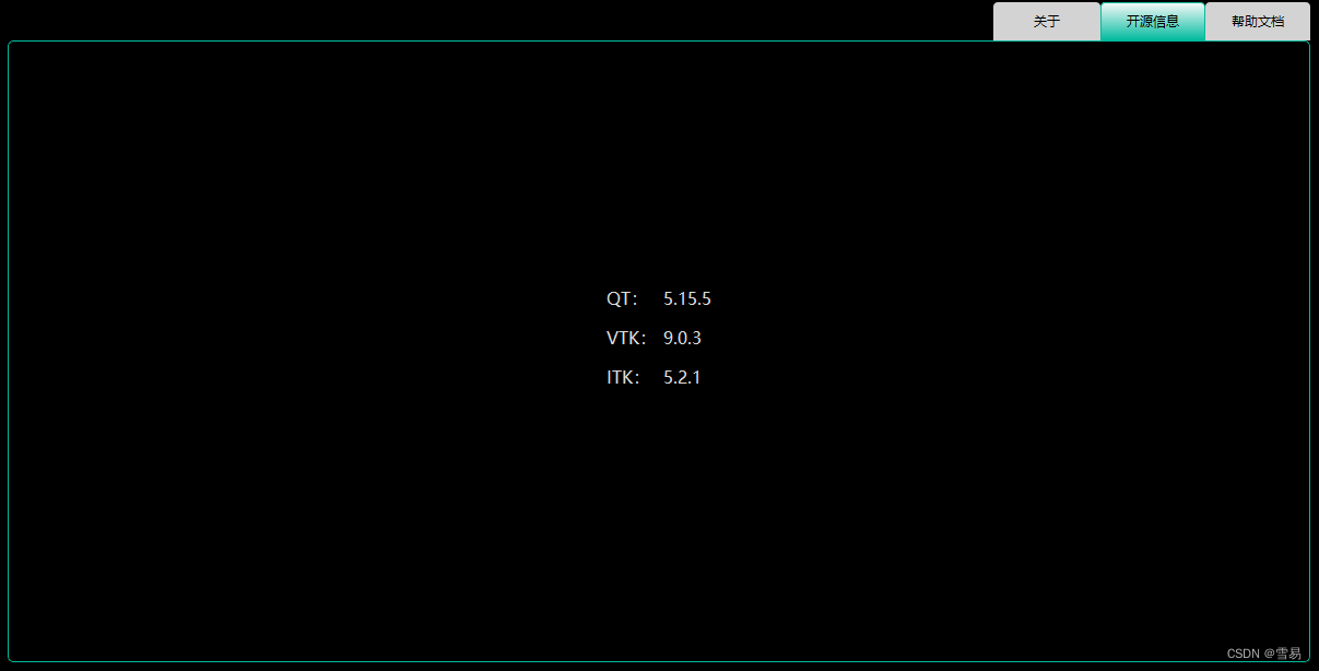
本文分享QT控件QTabWidget&QTabBar的样式设计,介绍两者可以自定义的内容,以及如何定义,希望对各位小伙伴有所帮助!
感谢各位小伙伴的点赞+关注,小易会继续努力分享,一起进步!
你的点赞就是我的动力(^U^)ノ~YO
我将收获到的:
1.
2.
3.
目录
1. QTabWidget可自定义内容
》QTabWidget::pane{} 定义tabWidgetFrame
》QTabWidget::tab-bar{} 定义TabBar的位置
》QTabWidget::tab{}定义Tab的样式
》QTabWidget::tab:selected{}定义Tab被选中时的样式
》QTabWidget::tab:hover{}定义Tab鼠标悬停时的样式
》QTabWidget::tab:!selected{}定义Tab在非选中时的样式
2. QTabBar可自定义内容
》QTabBar::tear{}
》QTabBar::scroller{}
》QTabBar QToolButton{} 定义QTabBar下的QToolButton的样式
》QTabBar QToolButton::right-arrow{} /* the arrow mark in the tool buttons */
》QTabBar QToolButton::left-arrow{}
》QTabBar::close-button{}
》QTabBar::close-button:hover{}
3. 可直接复制的QTableWidget样式
》雪易样式
/*style-dark*/
QTabWidget::pane { /* The tab widget frame */
    border: 1px solid #00BB9E;
	border-radius:5px;

}

QTabWidget::tab-bar {
    alignment: right;
}

/* Style the tab using the tab sub-control. Note that
    it reads QTabBar _not_ QTabWidget */
QTabBar::tab {
    background: #D3D3D3;/*qlineargradient(x1: 0, y1: 0, x2: 0, y2: 1,
                                stop: 0 #E1E1E1, stop: 0.4 #DDDDDD,
                                stop: 0.5 #D8D8D8, stop: 1.0 #D3D3D3);*/
    border: none;
    border-top-left-radius: 4px;
    border-top-right-radius: 4px;
    min-width: 80px;
    padding: 8px;
	color:#000000;
}

QTabBar::tab:selected, QTabBar::tab:hover {
    background: qlineargradient(x1: 0, y1: 0, x2: 0, y2: 1,
                                stop: 0 #fafafa, stop: 1.0 #00BB9E);

}/**/

QTabBar::tab:selected {
    border: 1px solid #00BB9E;
    /*border-bottom-color: #00BB9E;  same as pane color*/
}
》QT提供样式1
QTabWidget::pane { /* The tab widget frame */
border-top: 2px solid #C2C7CB;
}
QTabWidget::tab-bar {
left: 5px; /* move to the right by 5px */
}
/* Style the tab using the tab sub-control. Note that
it reads QTabBar _not_ QTabWidget */
QTabBar::tab {
background: qlineargradient(x1: 0, y1: 0, x2: 0, y2: 1,
stop: 0 #E1E1E1, stop: 0.4 #DDDDDD,
stop: 0.5 #D8D8D8, stop: 1.0 #D3D3D3);
border: 2px solid #C4C4C3;
border-bottom-color: #C2C7CB; /* same as the pane color */
border-top-left-radius: 4px;
border-top-right-radius: 4px;
min-width: 8ex;
padding: 2px;
}
QTabBar::tab:selected, QTabBar::tab:hover {
background: qlineargradient(x1: 0, y1: 0, x2: 0, y2: 1,
stop: 0 #fafafa, stop: 0.4 #f4f4f4,
stop: 0.5 #e7e7e7, stop: 1.0 #fafafa);
}
QTabBar::tab:selected {
border-color: #9B9B9B;
border-bottom-color: #C2C7CB; /* same as pane color */
}
QTabBar::tab:!selected {
margin-top: 2px; /* make non-selected tabs look smaller */
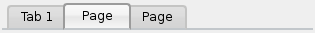
}》QT提供样式2
QTabWidget::pane { /* The tab widget frame */
    border-top: 2px solid #C2C7CB;
}

QTabWidget::tab-bar {
    left: 5px; /* move to the right by 5px */
}

/* Style the tab using the tab sub-control. Note that
    it reads QTabBar _not_ QTabWidget */
QTabBar::tab {
    background: qlineargradient(x1: 0, y1: 0, x2: 0, y2: 1,
                                stop: 0 #E1E1E1, stop: 0.4 #DDDDDD,
                                stop: 0.5 #D8D8D8, stop: 1.0 #D3D3D3);
    border: 2px solid #C4C4C3;
    border-bottom-color: #C2C7CB; /* same as the pane color */
    border-top-left-radius: 4px;
    border-top-right-radius: 4px;
    min-width: 8ex;
    padding: 2px;
}

QTabBar::tab:selected, QTabBar::tab:hover {
    background: qlineargradient(x1: 0, y1: 0, x2: 0, y2: 1,
                                stop: 0 #fafafa, stop: 0.4 #f4f4f4,
                                stop: 0.5 #e7e7e7, stop: 1.0 #fafafa);
}

QTabBar::tab:selected {
    border-color: #9B9B9B;
    border-bottom-color: #C2C7CB; /* same as pane color */
}

QTabBar::tab:!selected {
    margin-top: 2px; /* make non-selected tabs look smaller */
}

/* make use of negative margins for overlapping tabs */
QTabBar::tab:selected {
    /* expand/overlap to the left and right by 4px */
    margin-left: -4px;
    margin-right: -4px;
}

QTabBar::tab:first:selected {
    margin-left: 0; /* the first selected tab has nothing to overlap with on the left */
}

QTabBar::tab:last:selected {
    margin-right: 0; /* the last selected tab has nothing to overlap with on the right */
}

QTabBar::tab:only-one {
    margin: 0; /* if there is only one tab, we don't want overlapping margins */
}
》QT提供样式3
QTabWidget::pane { /* The tab widget frame */
    border-top: 2px solid #C2C7CB;
    position: absolute;
    top: -0.5em;
}

QTabWidget::tab-bar {
    alignment: center;
}

/* Style the tab using the tab sub-control. Note that
    it reads QTabBar _not_ QTabWidget */
QTabBar::tab {
    background: qlineargradient(x1: 0, y1: 0, x2: 0, y2: 1,
                                stop: 0 #E1E1E1, stop: 0.4 #DDDDDD,
                                stop: 0.5 #D8D8D8, stop: 1.0 #D3D3D3);
    border: 2px solid #C4C4C3;
    border-bottom-color: #C2C7CB; /* same as the pane color */
    border-top-left-radius: 4px;
    border-top-right-radius: 4px;
    min-width: 8ex;
    padding: 2px;
}

QTabBar::tab:selected, QTabBar::tab:hover {
    background: qlineargradient(x1: 0, y1: 0, x2: 0, y2: 1,
                                stop: 0 #fafafa, stop: 0.4 #f4f4f4,
                                stop: 0.5 #e7e7e7, stop: 1.0 #fafafa);
}

QTabBar::tab:selected {
    border-color: #9B9B9B;
    border-bottom-color: #C2C7CB; /* same as pane color */
}
结论:
本文介绍了QTabWidget和QTabBar在进行样式设计时可设置的选项,并给出了几个示例,各位小伙伴可以自行选择!
感谢各位小伙伴的点赞+关注,小易会继续努力分享,一起进步!
你的赞赏是我的最最最最大的动力(^U^)ノ~YO
