♦
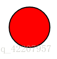
<circle cx="100" cy="50" r="40" stroke="black" stroke-width="2" fill="red" />
cx:坐标x位置;cy:坐标y位置;r:圆的半径;stroke:圆的外框颜色;stroke-width:圆的外框宽度;fill:填充颜色
------------------------------------------------------------------
♦
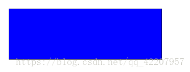
<rect width="300" height="100" style="fill:rgb(0,0,255);stroke-width:1;stroke:rgb(0,0,0)" />
style 属性用来定义 CSS 属性
-------------------------------------------------------------------------------------
♦
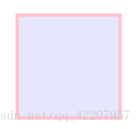
<rect x="50" y="20" width="150" height="150" style="fill:blue;stroke:pink;stroke-width:5;fill-opacity:0.1;stroke-opacity:0.9" />
x 属性定义矩形的左侧位置(例如,x="0" 定义矩形到浏览器窗口左侧的距离是 0px)
y 属性定义矩形的顶端位置(例如,y="0" 定义矩形到浏览器窗口顶端的距离是 0px)
CSS 的 fill-opacity 属性定义填充颜色透明度(合法的范围是:0 - 1)
CSS 的 stroke-opacity 属性定义笔触颜色的透明度(合法的范围是:0 - 1)
--------------------------------------------------------------------------------
♦ <rect x="50" y="20" width="150" height="150" style="fill:blue;stroke:pink;stroke-width:5;opacity:0.5" />
定义整个元素的不透明度
--------------------------------------------------------------------------------
♦

<rect x="50" y="20" rx="20" ry="20" width="150" height="150" style="fill:red;stroke:black;stroke-width:5;opacity:0.5" />
rx 和 ry 属性可使矩形产生圆角。
--------------------------------------------------------------------------------
♦
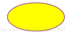
<ellipse cx="300" cy="80" rx="100" ry="50" style="fill:yellow;stroke:purple;stroke-width:2" />
RX属性定义的水平半径,RY属性定义的垂直半径
--------------------------------------------------------------------------------
♦
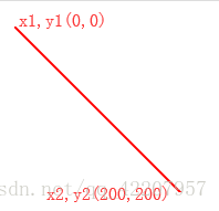
<line x1="0" y1="0" x2="200" y2="200" style="stroke:rgb(255,0,0);stroke-width:2" />
x1 属性在 x 轴定义线条的开始
y1 属性在 y 轴定义线条的开始
x2 属性在 x 轴定义线条的结束
y2 属性在 y 轴定义线条的结束
--------------------------------------------------------------------------------
♦
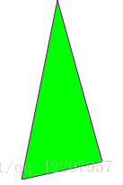
<polygon points="200,10 250,190 160,210" style="fill:lime;stroke:purple;stroke-width:1"/>
points 属性定义多边形每个角的 x 和 y 坐标
· <polygon> 标签用来创建含有不少于三个边的图形。
· 多边形是由直线组成,其形状是"封闭"的(所有的线条 连接起来)
--------------------------------------------------------------------------------
♦
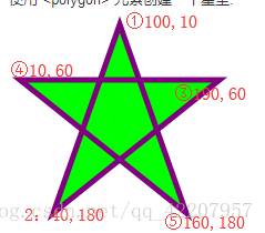
<polygon points="100,10 40,180 190,60 10,60 160,180" style="fill:lime;stroke:purple;stroke-width:5;fill-rule:nonzero;" />
points:按顺序连接
--------------------------------------------------------------------------------
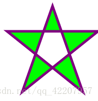
改变 fill-rule 属性为 "evenodd":
--------------------------------------------------------------------------------
♦
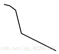
<polyline points="20,20 40,25 60,40 80,120 120,140 200,180" style="fill:none;stroke:black;stroke-width:3" />
--------------------------------------------------------------------------------
♦

<path d="M150 0 L75 200 L225 200 Z" />
开始于位置150 0,到达位置75 200,然后从那里开始到225 200,最后在150 0关闭路径。
--------------------------------------------------------------------------------
♦
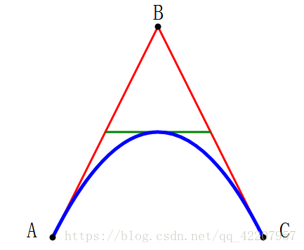
<svg xmlns="http://www.w3.org/2000/svg" version="1.1">
  <path id="lineAB" d="M 100 350 l 150 -300" stroke="red"  stroke-width="3" fill="none" /> //ab直线
  <path id="lineBC" d="M 250 50 l 150 300" stroke="red"  stroke-width="3" fill="none" />  //bc直线
  <path d="M 175 200 l 150 0" stroke="green" stroke-width="3"  fill="none" />  //绿色横线
  <path d="M 100 350 q 150 -300 300 0" stroke="blue"  stroke-width="5" fill="none" />  //曲线本体
  <!-- Mark relevant points -->
  <g stroke="black" stroke-width="3" fill="black">  //三个黑点
    <circle id="pointA" cx="100" cy="350" r="3" />
    <circle id="pointB" cx="250" cy="50" r="3" />
    <circle id="pointC" cx="400" cy="350" r="3" />
  </g>
  <!-- Label the points -->
  <g font-size="30" font="sans-serif" fill="black" stroke="none"  text-anchor="middle">  //文字……
    <text x="100" y="350" dx="-30">A</text>
    <text x="250" y="50" dy="-10">B</text>
    <text x="400" y="350" dx="30">C</text>
  </g>
</svg>
实际只有
<path d="M 100 350 q 150 -300 300 0" stroke="blue" stroke-width="5" fill="none" />
是曲线
--------------------------------------------------------------------------------
- M = moveto //开始
- L = lineto //拉线到
- H = horizontal lineto
- V = vertical lineto
- C = curveto
- S = smooth curveto
- Q = quadratic Bézier curve //二次贝塞尔曲线
- T = smooth quadratic Bézier curveto
- A = elliptical Arc
- Z = closepath / 关闭路径
- --------------------------------------------------------------------------------
♦

<text x="0" y="15" fill="red" transform="rotate(30 20,40)">I love SVG</text>
文字旋转rotate(30【角度】 20,40【xy坐标】)
--------------------------------------------------------------------------------
♦

<defs>
<path id="path1" d="M75,20 a1,1 0 0,0 100,0" /> //路径</defs>
<text x="10" y="100" style="fill:red;">
<textPath xlink:href="#path1">I love SVG I love SVG</textPath> //文字
</text>
路径上的文字,<defs>:引用的元素容器
--------------------------------------------------------------------------------
♦

<text x="10" y="20" style="fill:red;">Several lines:
<tspan x="30" y="45">First line</tspan>
<tspan x="10" y="70">Second line</tspan>
</text>
文字分小组,每个<tspan> 元素可以包含不同的格式和位置。
--------------------------------------------------------------------------------
♦ <a xlink:href="http://www.w3schools.com/svg/" target="_blank">
<text x="0" y="15" fill="red">I love SVG</text>
</a>
链接文字
--------------------------------------------------------------------------------
♦

<g fill="none" stroke="black" stroke-width="6">
<path stroke-linecap ="butt" d="M5 20 l215 0" /><path stroke-linecap="round" d="M5 40 l215 0" />
<path stroke-linecap="square" d="M5 60 l215 0" />
</g>
· <g>在svg中提供了如g元素这样的将多个元素组织在一起的元素。由g元素编组在一起的可以设置相同的颜色,可以进行坐标变换,
· strokelinecap属性定义不同类型的开放路径的终结:
--------------------------------------------------------------------------------
♦
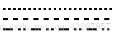
<g fill="none" stroke="black" stroke-width="4">
<path stroke-dasharray="5,5" d="M5 20 l215 0" />
<path stroke-dasharray="10,10" d="M5 40 l215 0" />
<path stroke-dasharray="20,10,5,5,5,10" d="M5 60 l215 0" />
</g>
strokedasharray属性用于创建虚线:
--------------------------------------------------------------------------------
♦ SVG滤镜定义在<defs>元素中。
<filter>标签用来定义SVG滤镜。<filter>标签使用必需的id属性来定义向图形应用哪个滤镜
--------------------------------------------------------------------------------
♦
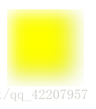
<defs>
<filter id="f1" x="0" y="0"> //id为f1的效果
< feGaussianBlur in="SourceGraphic" stdDeviation="15" /></filter>
</defs>
<rect width="90" height="90" stroke="green" stroke-width="3" fill="yellow" filter="url(#f1)" /> //一个矩形,效果为#f1
<filter>元素id属性定义一个滤镜的唯一名称
<feGaussianBlur>元素定义模糊效果——高斯模糊
in="SourceGraphic"这个部分定义了由整个图像创建效果
stdDeviation属性定义模糊量
<rect>元素的滤镜属性用来把元素链接到"f1"滤镜
--------------------------------------------------------------------------------
♦

<defs>
     <linearGradient id="grad1" x1="0%" y1="0%" x2="100%" y2="0%"> //渐变效果#grad1
      <stop offset="0%" style="stop-color:rgb(255,255,0);stop-opacity:.5" /> //渐变效果开始
      <stop offset="30%" style="stop-color:rgb(255,0,0);stop-opacity:.3" /> //渐变效果结束
    </linearGradient>
  </defs>
  <ellipse cx="200" cy="70" rx="85" ry="55" fill="url(#grad1)" /> //椭圆,调用渐变效果#grad1
- <linearGradient>标签的X1,X2,Y1,Y2属性定义渐变开始和结束位置
- 渐变的颜色范围可由两种或多种颜色组成。每种颜色通过一个<stop>标签来规定。offset属性用来定义渐变的开始和结束位置。
- 填充属性把 ellipse 元素链接到此渐变
- --------------------------------------------------------------------------------
<defs>
    <linearGradient id="grad1" x1="0%" y1="0%" x2="0%" y2="100%">
      <stop offset="0%" style="stop-color:rgb(255,0,0);stop-opacity:1" />
      <stop offset="100%" style="stop-color:rgb(255,255,0);stop-opacity:1" />
    </linearGradient>
  </defs>
  <ellipse cx="200" cy="70" rx="85" ry="55" fill="url(#grad1)" />
垂直渐变
--------------------------------------------------------------------------------
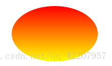
♦

<defs>
    <linearGradient id="grad1" x1="0%" y1="0%" x2="0%" y2="100%">
      <stop offset="0%" style="stop-color:rgb(255,0,0);stop-opacity:1" />
      <stop offset="100%" style="stop-color:rgb(255,255,0);stop-opacity:1" />
    </linearGradient>
  </defs>
  <ellipse cx="200" cy="70" rx="85" ry="55" fill="url(#grad1)" />
--------------------------------------------------------------------------------
♦
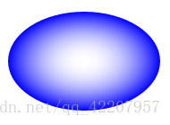
  <defs>
    <radialGradient id="grad1" cx="50%" cy="50%" r="50%" fx="50%" fy="50%"> //CX,CY和r属性定义渐变最外层圆,Fx和Fy定义渐变的最内层圆
      <stop offset="0%" style="stop-color:rgb(255,255,255);stop-opacity:0" />  //起始(圆心)
      <stop offset="100%" style="stop-color:rgb(0,0,255);stop-opacity:1" />  //结束(边缘)
    </radialGradient>
  </defs>
  <ellipse cx="200" cy="70" rx="85" ry="55" fill="url(#grad1)" />
- CX,CY和r属性定义的最外层圆和Fx和Fy定义的最内层圆
- 渐变颜色范围可以由两个或两个以上的颜色组成。每种颜色用一个<stop>标签指定。offset属性用来定义渐变色开始和结束
- --------------------------------------------------------------------------------
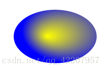
<radialGradient id="grad1" cx="70%" cy="40%" r="60%" fx="40%" fy="50%">
- 矩形 <rect>
- 圆形 <circle>
- 椭圆 <ellipse>
- 线 <line>
- 折线 <polyline>
- 多边形 <polygon>
- 路径 <path>