所有的热爱都要不遗余力,真正喜欢它便给它更高的优先级,和更多的时间吧!
GIT工程文件在这里: QmlLearningPro ,编译选择 Popup
QML其它文章请点击这里: QT QUICK QML 学习笔记
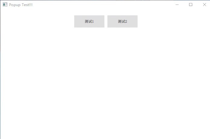
一、演示
● 效果如下:
二、实现过程
在 QML 文件中,不论子文件有多少层,只需在根节点文件中添加 Popup 组件,都可以在界面中弹出置顶。
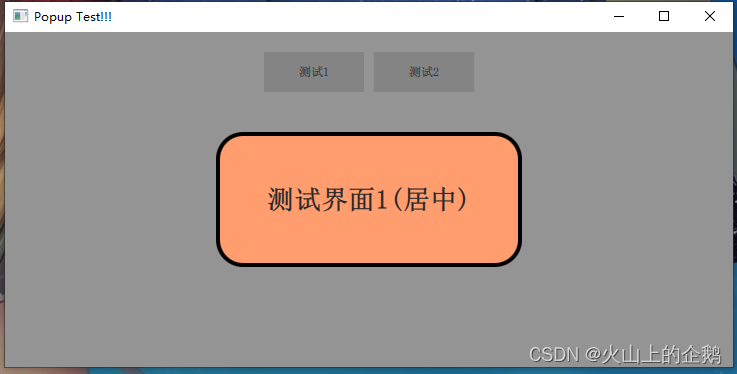
1. 居中弹出
点击 “测试1”,弹出如下:
● 关键代码:
popup 根文件:
///-------------------------居中弹窗-------------------------\\\
function showPopupCenter(raiseItem) {


    popupCenter.raiseItem = raiseItem
    popupCenter.open()
}
Popup {


    id:             popupCenter
    modal:          true            //模态, 为 true后弹出窗口会叠加一个独特的背景调光效果
    focus:          true            //焦点,  当弹出窗口实际接收到焦点时,activeFocus将为真
    padding:        0
    closePolicy:    Popup.CloseOnEscape | Popup.CloseOnPressOutside
    property var    raiseItem:          null
    background: Rectangle {


        color:      Qt.rgba(0,0,0,0)   //背景为无色
    }
    Loader {


        id:             loaderCenter
        onLoaded: {


            popupCenter.x = (rootWindow.width - loaderCenter.width) * 0.5
            popupCenter.y = (rootWindow.height - loaderCenter.height) * 0.5
        }
    }
    onOpened: {


        loaderCenter.sourceComponent = popupCenter.raiseItem
    }
    onClosed: {


        loaderCenter.sourceComponent = null
        popupCenter.raiseItem = null
    }
}
要弹出的 component:
Button {


    id:     btn1
    text:  "测试1"
    onClicked: {


        rootWindow.showPopupCenter(display1)

    }
}
Component {


    id:     display1
    Rectangle {


        width:                  lab1.width*1.5
        height:                 lab1.height*5
        radius:                 height*0.2
        color:                  "#FF9D6F"
        border.width:           4
        border.color:           "black"
        Label {


            id:                 lab1
            anchors.centerIn:   parent
            font.bold:          true
            font.pointSize:     20
            text:               "测试界面1(居中)"
        }
    }
}
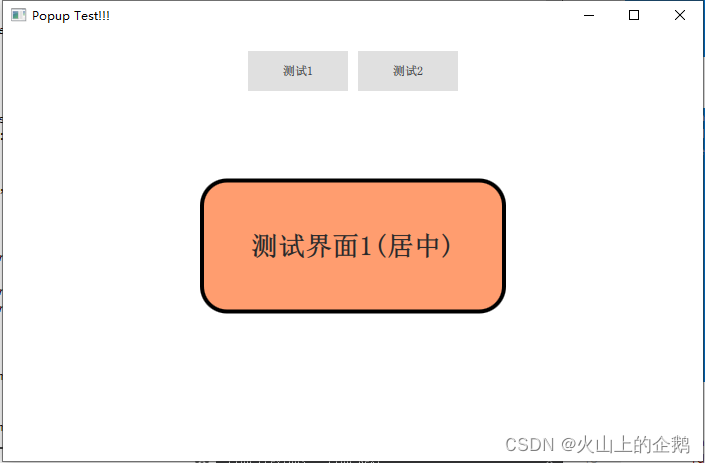
注意 modal 和 padding 参数:
如果 modal 为 false,则弹出没有遮光的效果如下:
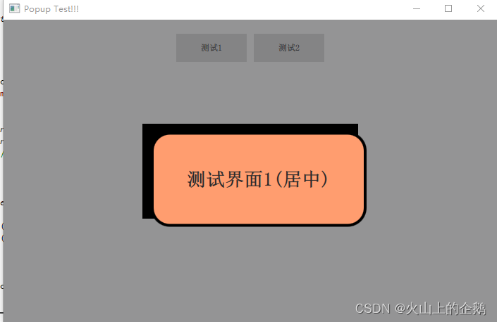
如果不指定 padding = 0,则不在正中间,如下:
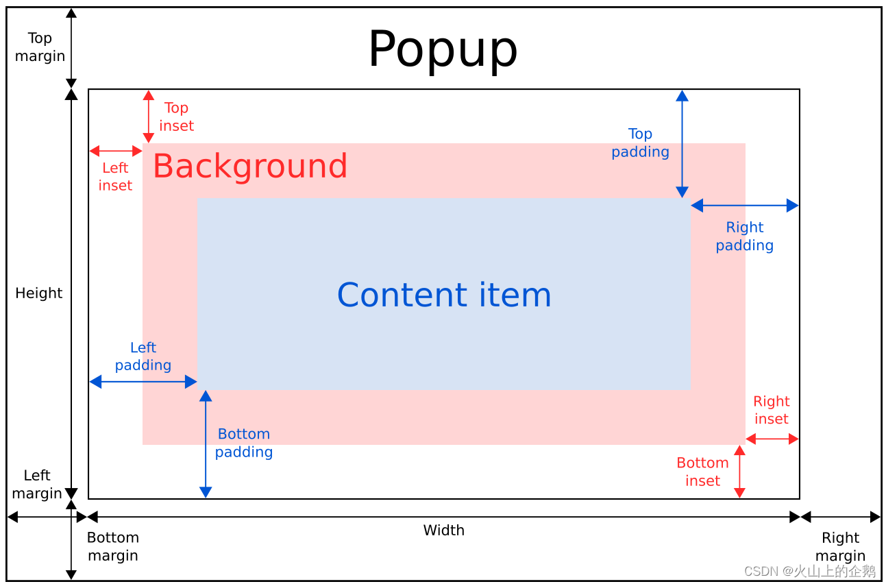
具体 popup 的布局如下:可以看官方的说明:
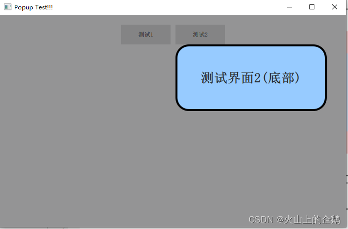
2. 正下方弹出
点击 “测试2” 按钮,弹出如下:
● 关键代码:
popup 根文件:
///----------------------正下方弹窗-------------------------\\\
function showPopupBottom(raiseItem, btnItem) {


    popupBottom.raiseItem = raiseItem
    popupBottom.btnItem = btnItem
    popupBottom.open()
}

Popup {


    id:             popupBottom
    modal:          true        //模态, 为 true后弹出窗口会叠加一个独特的背景调光效果
    focus:          true        //焦点,  当弹出窗口实际接收到焦点时,activeFocus将为真
    closePolicy:    Popup.CloseOnEscape | Popup.CloseOnPressOutside
    padding:        0           //很重要
    property var    raiseItem:     null  //要显示的组件
    property var    btnItem:       null  //提供位置的组件
    background: Rectangle {


        color:  Qt.rgba(0,0,0,0)    //背景为无色
    }
    Loader {


        id:             loaderBottom
        onLoaded: {


            var item =  rootWindow.contentItem.mapFromItem(popupBottom.btnItem, 0 ,0)
            popupBottom.x = item.x
            //考虑右边边界问题
            if(popupBottom.x + loaderBottom.width > rootWindow.width) {


                popupBottom.x = rootWindow.width - loaderBottom.width
            }
            //考虑左边边界问题
            popupBottom.y = item.y + popupBottom.btnItem.height
            if(popupBottom.y + loaderBottom.height > rootWindow.height) {


                popupBottom.y = rootWindow.height - loaderBottom.height
            }
        }
    }
    onOpened: {


        loaderBottom.sourceComponent = popupBottom.raiseItem
    }
    onClosed: {


        loaderBottom.sourceComponent = null
        popupBottom.raiseItem = null
    }
}
要弹出的 component:
Button {


        id:     btn2
        text:  "测试2"
        onClicked: {


            rootWindow.showPopupBottom(display2,btn2)
        }
    }
}
Component {


    id:     display2
    Rectangle {


        width:                  lab2.width*1.5
        height:                 lab2.height*5
        radius:                 height*0.2
        color:                  "#97CBFF"
        border.width:           4
        border.color:           "black"
        Label {


            id:                 lab2
            anchors.centerIn:   parent
            font.bold:          true
            font.pointSize:     20
            text:               "测试界面2(底部)"
        }
    }
}
● 重点1: mapFromItem
var item =  rootWindow.contentItem.mapFromItem(popupBottom.btnItem, 0 ,0)
popupBottom.x = item.x
popupBottom.y = item.y
将 btnItem 按键的 (0,0) 坐标映射到根文件 rootWindow 中的相对位置上
● 重点2: 考虑边界条件:
//考虑右边边界问题
if(popupBottom.x + loaderBottom.width > rootWindow.width) {


    popupBottom.x = rootWindow.width - loaderBottom.width
}
//考虑左边边界问题
popupBottom.y = item.y + popupBottom.btnItem.height
if(popupBottom.y + loaderBottom.height > rootWindow.height) {


    popupBottom.y = rootWindow.height - loaderBottom.height
}
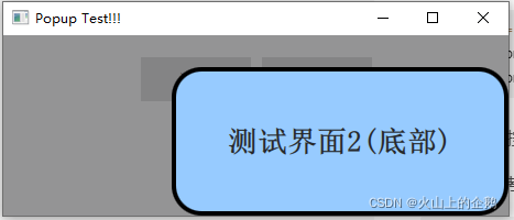
如下当界面缩小的时候,不会越界:
GIT 工程文件点击这里: QmlLearningPro ,编译选择 Popup
QML 其它文章请点击这里: QT QUICK QML 学习笔记