
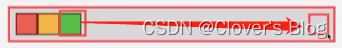
方式:【具体代码1】
<!DOCTYPE html>
<html lang="en">
<head>
    <meta charset="UTF-8">
    <meta http-equiv="X-UA-Compatible" content="IE=edge">
    <meta name="viewport" content="width=device-width, initial-scale=1.0">
    <title>Document</title>
    <style>
        *{


            margin: 0;
            padding: 0;
        }
        .box{


            width: 100%;
            height: 100vh;
        }
        .box1{


            width: 100%;
            height: 30vh;
            background-color: blue;
            display: flex;
            justify-content: center;
            align-items: center;
        }
        .content1{


            width: 50%;
            height: 50%;
            background-color: lightgray;
        }
    </style>
</head>
<body>
    <div class="box">
        <div class="box1">
            <div class="content1"></div>
        </div>
    </div>
</body>
</html>
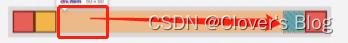
【具体代码2】:
<!DOCTYPE html>
<html lang="en">
<head>
    <meta charset="UTF-8">
    <meta http-equiv="X-UA-Compatible" content="IE=edge">
    <meta name="viewport" content="width=device-width, initial-scale=1.0">
    <title>Document</title>
    <style>
        *{


            margin: 0;
            padding: 0;
        }
        .box{


            width: 100%;
            height: 100vh;
        }
        .box1{


            width: 100%;
            height: 30vh;
            background-color: blue;
            display: flex;
            justify-content: center;
            align-items: center;
        }
        .content1{


            width: 50%;
            height: 50%;
            background-color: lightgray;
            margin: auto;
        }
    </style>
</head>
<body>
    <div class="box">
        <div class="box1">
            <div class="content1"></div>
        </div>
    </div>
</body>
</html>
【具体代码】
<!DOCTYPE html>
<html lang="en">
<head>
    <meta charset="UTF-8">
    <meta http-equiv="X-UA-Compatible" content="IE=edge">
    <meta name="viewport" content="width=device-width, initial-scale=1.0">
    <title>Document</title>
    <style>
        *{


            margin: 0;
            padding: 0;
        }
        .box{


            width: 100%;
            height: 100vh;
        }
        .box1{


            width: 100%;
            height: 30vh;
            background-color: blue;
            display: flex;
        }
        .content1{


            width: 20%;
            height: 30%;
            background-color: lightgray;
        }
        .content2{


            width: 20%;
            height: 30%;
            background-color: lightgoldenrodyellow;
        }
        .content3{


            width: 20%;
            height: 30%;
            background-color: pink;
            margin-left: auto;
        }
    </style>
</head>
<body>
    <div class="box">
        <div class="box1">
            <div class="content1"></div>
            <div class="content2"></div>
            <div class="content3"></div>
        </div>
    </div>
</body>
</html>
【代码具体实现】:
<!DOCTYPE html>
<html lang="en">
<head>
    <meta charset="UTF-8">
    <meta http-equiv="X-UA-Compatible" content="IE=edge">
    <meta name="viewport" content="width=device-width, initial-scale=1.0">
    <title>Document</title>
    <style>
        *{


            margin: 0;
            padding: 0;
        }
        .box{


            width: 100%;
            height: 100vh;
        }
        .box1{


            width: 100%;
            height: 30vh;
            background-color: blue;
            display: flex;
        }
        .content1{


            width: 20%;
            height: 30%;
            background-color: lightgray;
        }
        .content2{


            width: 20%;
            height: 30%;
            background-color: lightgoldenrodyellow;
        }
        .content3{


            width: 20%;
            height: 30%;
            background-color: pink;
            margin-left: auto;
        }
        .content4{


            width: 20%;
            height: 30%;
            background-color: purple;
        }
    </style>
</head>
<body>
    <div class="box">
        <div class="box1">
            <div class="content1"></div>
            <div class="content2"></div>
            <div class="content3"></div>
            <div class="content4"></div>
        </div>
    </div>
</body>
</html>
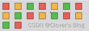
【代码实现】:
<!DOCTYPE html>
<html lang="en">
<head>
    <meta charset="UTF-8">
    <meta http-equiv="X-UA-Compatible" content="IE=edge">
    <meta name="viewport" content="width=device-width, initial-scale=1.0">
    <title>Document</title>
    <style>
        *{


            margin: 0;
            padding: 0;
        }
        .box{


            width: 100%;
            height: 100vh;
        }
        .box1{


            width: 100%;
            height: 30vh;
            background-color: blue;
            display: flex;
        }
        .content1{


            width: 20%;
            height: 30%;
            background-color: lightgray;
        }
        .content2{


            width: 20%;
            height: 30%;
            background-color: lightgoldenrodyellow;
        }
        .content3{


            width: 20%;
            height: 30%;
            background-color: pink;
            margin-left: auto;
        }
        .content4{


            width: 20%;
            height: 30%;
            background-color: purple;
        }
        .content5{


            width: 20%;
            height: 30%;
            background-color: lightgray;
        }
        .content6{


            width: 20%;
            height: 30%;
            background-color: lightgoldenrodyellow;
        }
        .content7{


            width: 20%;
            height: 30%;
            background-color: pink;
        }
        .content8{


            width: 20%;
            height: 30%;
            background-color: purple;
        }
        .content9{


            width: 20%;
            height: 30%;
            background-color: lightgray;
        }
        .content10{


            width: 20%;
            height: 30%;
            background-color: lightgoldenrodyellow;
        }
        .content11{


            width: 20%;
            height: 30%;
            background-color: pink;
        }
        .content12{


            width: 20%;
            height: 30%;
            background-color: purple;
        }
        .content13{


            width: 20%;
            height: 30%;
            background-color: lightgray;
        }
        .content14{


            width: 20%;
            height: 30%;
            background-color: lightgoldenrodyellow;
        }
        .content15{


            width: 20%;
            height: 30%;
            background-color: pink;
        }
        .content16{


            width: 20%;
            height: 30%;
            background-color: purple;
        }
        #item{


            /* --n:7;
            --$ap: calc((100%-50px*7) / 7/2);
            margin: 18px var(--$ap); */
            margin: 10px calc(100% - 50px*7)/7/2;
        }
    </style>
</head>
<body>
    <div class="box">
        <div class="box1">
            <div class="content1" id="item"></div>
            <div class="content2" id="item"></div>
            <div class="content3" id="item"></div>
            <div class="content4" id="item"></div>
            <div class="content4" id="item"></div>
            <div class="content5" id="item"></div>
            <div class="content6" id="item"></div>
            <div class="content7" id="item"></div>
            <div class="content8" id="item"></div>
            <div class="content9" id="item"></div>
            <div class="content10" id="item"></div>
            <div class="content11" id="item"></div>
            <div class="content12" id="item"></div>
            <div class="content13" id="item"></div>
            <div class="content14" id="item"></div>
            <div class="content15" id="item"></div>
            <div class="content16" id="item"></div>
        </div>
    </div>
</body>
</html>